Six eCommerce Design Trends for 2015 to Level up Your Online Shop
Just like any other type of web design, eCommerce design is subject to certain trends. If you have been planning to change your design, this is the right time. The trends of 2015 can turn your eCommerce website into a beautiful sales machine. You can put our examples on the next meeting agenda with your designer. With these trends, your site will be well-prepared for the next two to three years. And the big advantage is that they are not only beautiful but also user-friendly and perfect for mobile use.

 Basus
Basus
 Couteaux – TB Groupe
 The New World Order NYC
 April 77
 BIMBA Y LOLA
 Loobow
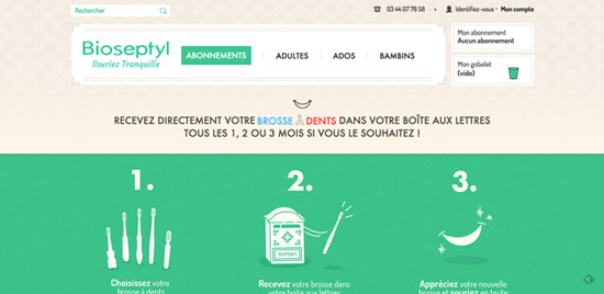
 Bioseptyl
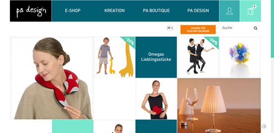
 PA Design
 Important Links
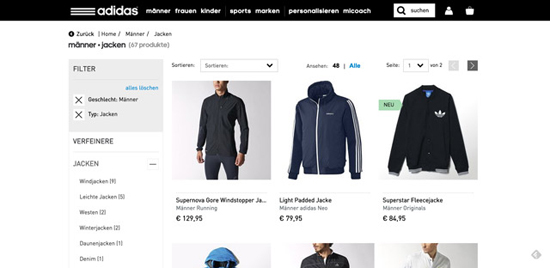
 Adidas
 Zalando
 Housen Deco
 IWC Schaffhausen
 L’unità
 Oelwein
 Daniella Draper
 Gladz Footwear
 A Book Apart
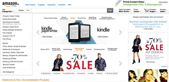 The Amazon app for: iPhone • iPad und iPad mini • Android Phone • Android Tablets • Windows Phone
Tchibo
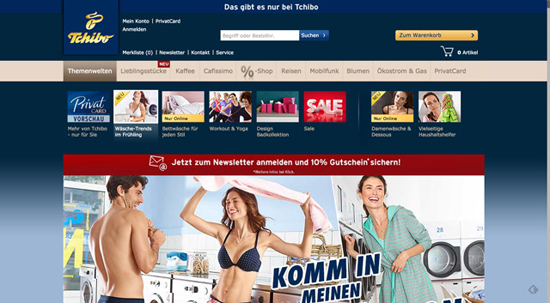 The Tchibo app for: Tablets • Smartphones

1. – Full Page Background Images
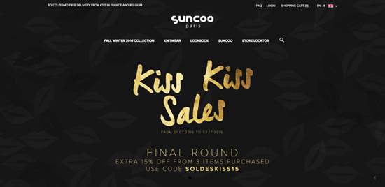
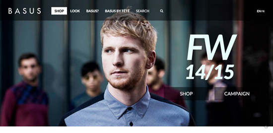
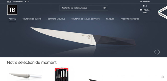
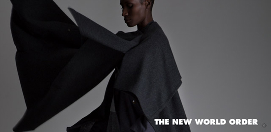
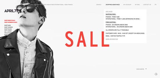
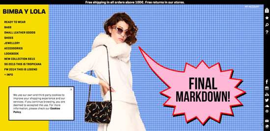
If you have worked with good product images before, you’re ready for full page background images. Good product images can not only be incorporated into the slider, but work as well as full-page background in hero areas. Choose your best photos and be surprised how beautiful and vibrant such a design concept can be. Need a few templates and suitable photography? Read our extensive article on hero areas and this one on the best implementation of ghost buttons. Here are some well-made examples: Suncoo Basus
Basus
 Couteaux – TB Groupe
 The New World Order NYC
 April 77
 BIMBA Y LOLA

2. – Flat and Material Design in Pleasant Colors
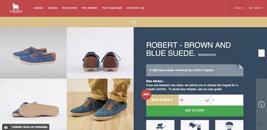
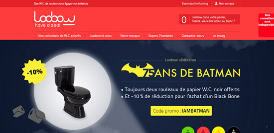
Flat design has been trending since 2014, and it continues to stir up the web landscape. The trend goes, however, towards material design. Flat design has an impressive, simple and clear style, omitting unnecessary gimmicks. Material design goes one step further by creating the right – not too exaggerated – colorful accent. A bold design with clear structures and bright colors can have beneficial effects, especially for young brands. An example for a well-implemented material design is PA Design. Boutique M Moustache Loobow
 Bioseptyl
 PA Design
 Important Links
- Google material design guide
- Material design for Bootstrap 3
- An overview of the elements of the material design theme for Bootstrap 3
3. – Card Design
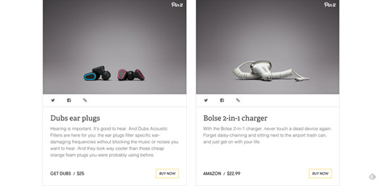
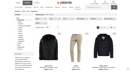
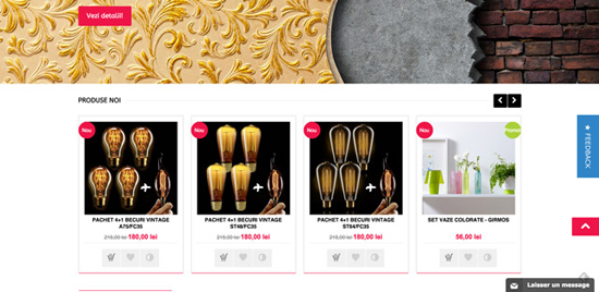
The card design is probably one of the biggest upcoming trends and offers tremendous advantages not only in terms of design. User-friendliness is excellent as the visitor gets to see all relevant information at a glance. These cards basically contain short texts, an image/or several share buttons, as well as the most relevant information about the product. It helps potential customers to decide at a glance if the product is right for them. A great example is The Verge, which has an informative and well-implemented card design. The Verge Adidas
 Zalando
 Housen Deco

4. – Parallax Scrolling and Background Effects
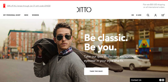
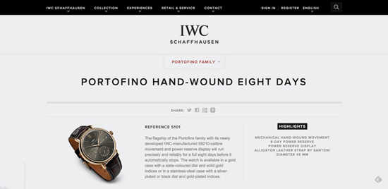
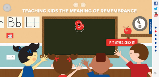
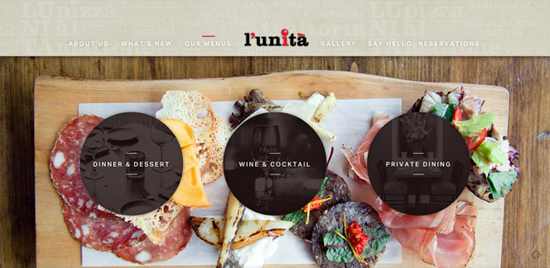
You have probably come across websites that use parallax to achieve a wow-factor. The effects can be impressive if applied correctly. However, they easily distract from what is important and should be, for this reason, implemented thoroughly and with caution. Parallax effects are only recommended if they highlight the actual content – that is your product. Ditto is restrained in the use of the effect whereas at IWC Schaffhausen it is more evident. I added two websites from outside the industry which use the effect professionally. L’unità makes use of the parallax scroll effect whereas The Royal British Legion animate almost their whole website. DITTO IWC Schaffhausen

Examples From Outside the Industry
The Royal British Legion L’unità

5. – Minimalist Buttons (Ghost Buttons)
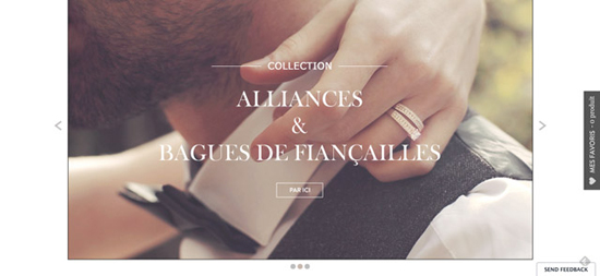
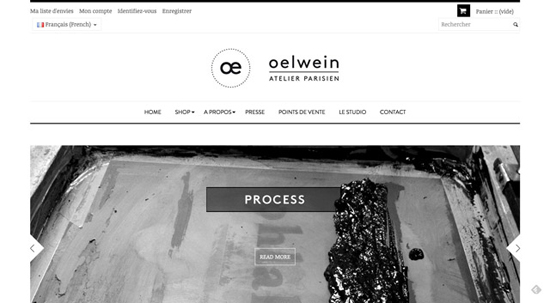
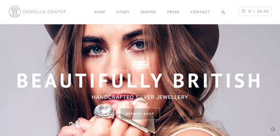
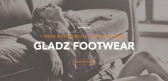
Minimalist ghost buttons are hot since 2014, and they will become even more famous in 2015. The reason is simple: They work perfectly as call to action (encourage to response) buttons on sliders or full page hero backgrounds without distracting too much from the foreground and its message. Minimalist buttons fit perfectly in modern, fresh designs. Zeina Alliances Oelwein
 Daniella Draper
 Gladz Footwear

6. – Optimized for Mobile Devices
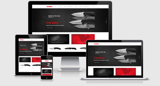
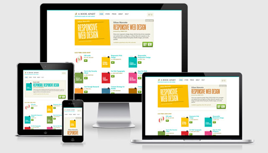
More and more people tend to solely use the mobile web via smartphone or tablet. If you want your business to succeed in the future, I strongly recommend you to think about optimizing your website for mobile devices. You have two options: A good and a better one. The good one is a responsive design. This means that your website adjusts to any screen resolution automatically. The better and more constructive option would probably be offering an app as users prefer to get information and order via smartphone or tablet app. The best advice is: Do the one without abandoning the other. Add a professional app to your responsive website – if you can afford it.Responsive Shop Examples
Kershaw Knives A Book Apart

E-Commerce Shops with Apps
Amazon The Amazon app for: iPhone • iPad und iPad mini • Android Phone • Android Tablets • Windows Phone
Tchibo
 The Tchibo app for: Tablets • Smartphones
TLDR: For Those Who Are in a Hurry
The end of the flat design trend is not in sight. In all likelihood, material design is going to establish itself further throughout 2015. Shop owners are rewarded with a simple but remarkable design which will stay in the minds of visitors. Full page background images whet appetite for more. Minimalist buttons assist you in not distracting too much from the message of your images. Parallax effects also become more popular with eCommerce websites and look best when they stay under the radar. They should be used carefully as they can easily distract from what is important. The responsive design and mobile apps are not only short-lived trends but – they really are – the future.
Related Links
- Google Material Design Guide
- Material Design for Bootstrap 3
- An overview of the elements of the material design theme for Bootstrap 3
- The Amazon app for: iPhone • iPad and iPad mini • Android Phone • Android Tablets • Windows Phone
- The Tchibo app for: Tablets • Smartphones
(dpe)
Image by Gerd Altmann from Pixabay

The designs are extra-ordinary. Nice collections of ecommerce designs.