SITE123: This Intuitive Homepage Builder Delivers Websites in No Time
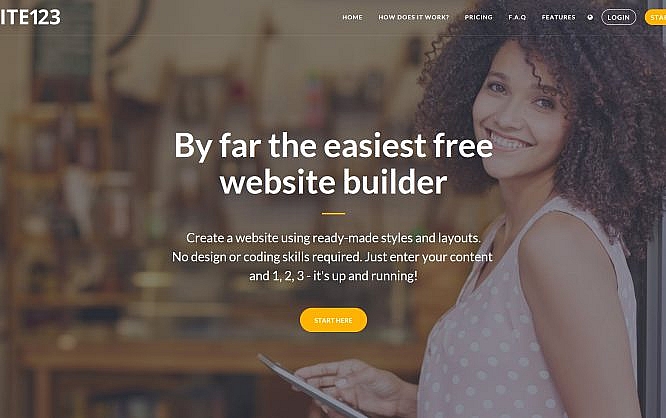
Today's website builders are almost too complicated for the average user. SITE123 deliberately avoids the way of maximum freedom and feature overload, focusing more on quick, but at the same time professional results.
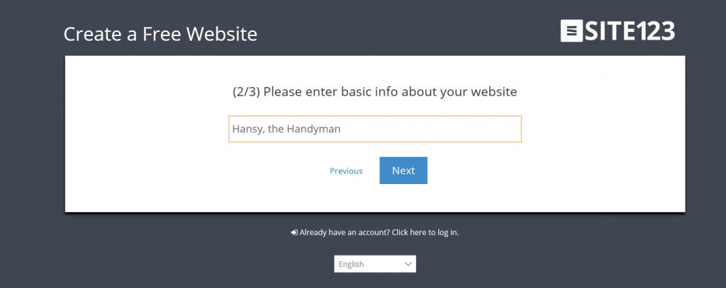
 In the second step, we assign a name to our website:
 The third step is where we have to register. This can either be done the traditional way, using the name, email, and password or via OAuth using Google or Facebook:
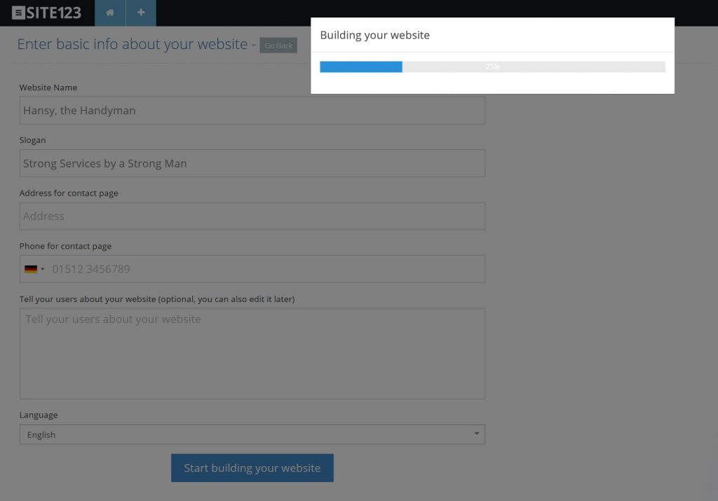
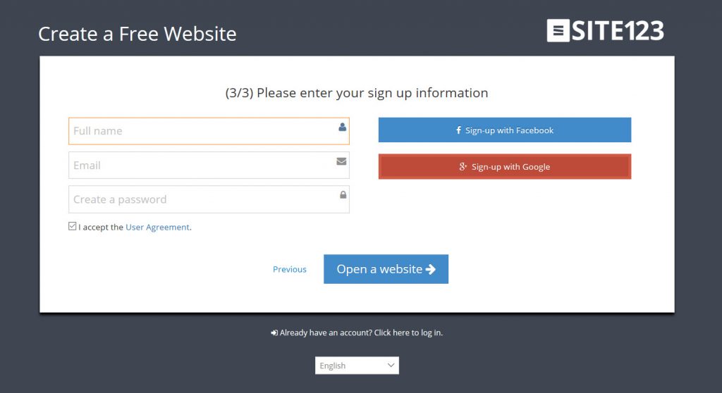 If you opt for OAuth, you will have to add a few more information. Once done, SITE123 will generate a website for you:
 At the end of this process, the SITE123 editor opens, providing a design suggestion, and a tour through the user interface, which is soothingly short, as there's no focus on feature overload here.
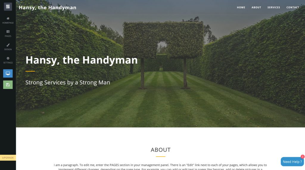 On the left side of the browser window, we find a vertically aligned navigation that is divided into the areas homepage, pages, design, and settings, while also offering a preview and publishment options.
Every single menu item comes with a straightforward functionality. For example, the item "Homepage" lets you configure your homepage the way you need it to be.
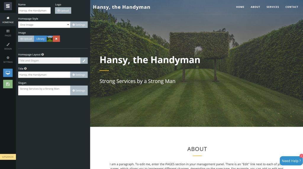 Here, it's possible to use a homepage layout that's entirely different from the predefined one. However, we can not freely create our own. The changes are not made directly on the page either, but via dialogs and text fields that can only be reached using the left-side navigation.
Now before somebody cries about how inflexible this supposedly is, keep in mind that this makes for a very clear creation process. We start with the homepage; then we deal with the single pages that, in the case of my layout, are attached to the homepage as slides, in the style of a one-page website. We can choose if we want it to be a one pager or not in the "Settings," the last item in the left-sided navigation.
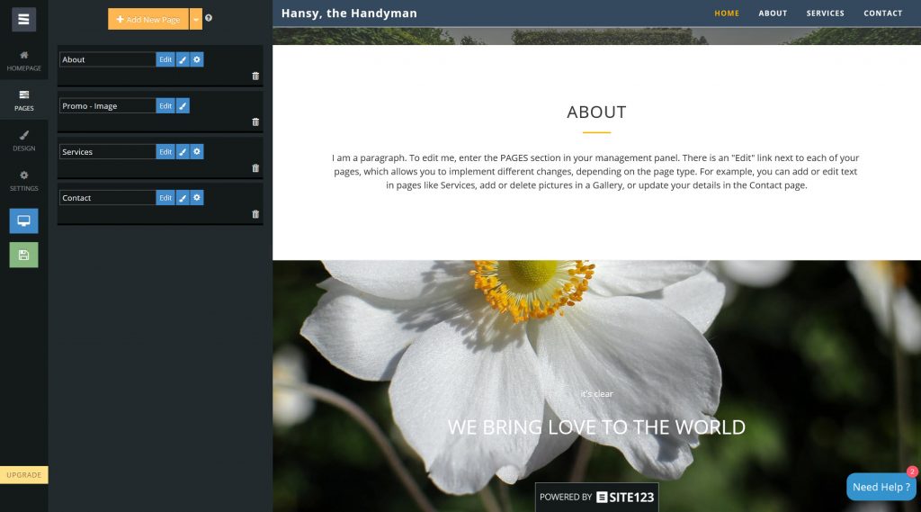 The sub menu "pages" is structured very clearly as well. Here, we'll find a list of the individual pages, and get to change up the order via drag and drop, or add new pages using the orange button at the top. Each page can be deleted, edited, or provided with a new page layout. We decide if the page is supposed to be visible in menu and footer depending on the type of content.
The menu item "design" lets us edit general design aspects. Here, SITE123 divides the options into six categories, with the first one, called "Layouts" having the most essential impact.
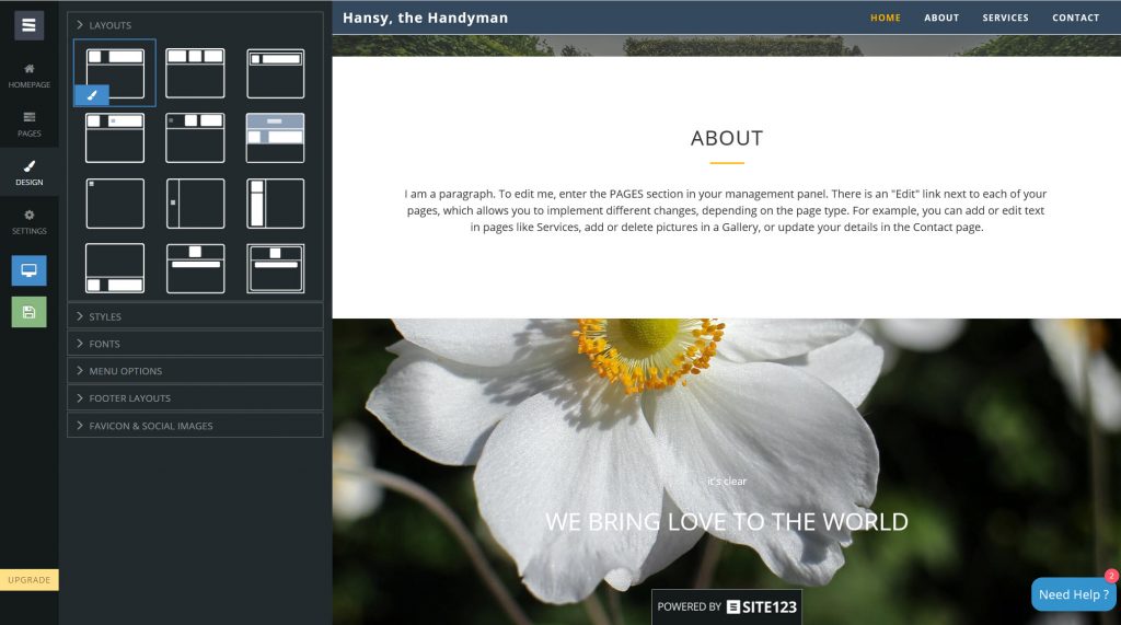 This is where we alter the entire page structure. We deposit the menu as a hamburger, create a left-side navigation, place it in the footer, and a lot more. Even parallax layouts can be created with just one click.
Under "Styles," we change things like the pages color scheme, as well as other details such as the button design. "Fonts" allows us to access Google Fonts, and set font sizes for menu and logo. In the "Menu Options" we can integrate a search function into the menu, or display social networks and a lot more. We place our social media links or our mailing list via MailChimp into the footer using "Footer Layouts". Last but not least "Favicon and Social Media Images" is where we define our Favicon, as well as the image that we want to integrate when users wish to share our page on social media.
Speaking about images: SITE123 offers a library with hundreds of license-free images for access directly from the backend. Of course, in times of Pixabay, Pexels, and Co., this is not a purchase-determining factor anymore, but still nice to know, and potentially useful in the workflow.
Among other things, the menu item "Settings" allows us to make basic SEO settings. An XML sitemap is generated automatically. Relevant information, such as the GTC, the data protection regulations and the implementation of the cookie guidelines is entered here. The texts are to be designed according to your own taste; there are no templates here.
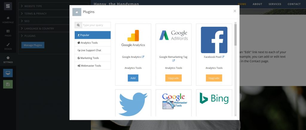 The subitem "plugins" is especially interesting. Here's where we find interesting expansion options for analysis, marketing, and support, as well as different tools for webmasters, including both Google's and Bing's Webmaster Tools. Most plugins only work with a paid account.
Now, before we click the yellow button to publish the website, we'll check how our site looks in different resolutions via the responsive view behind the blue button.
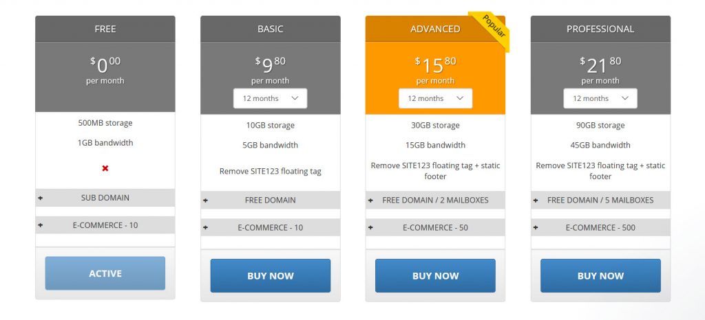 Not so great, however, is the fact that even in the "Basic" plan for a solid 9,80 USD a month with annual payment, there's still a reference to Site123 on your page. While it's not the rather obnoxious floating tag anymore, I still don't think that a reference in the footer is necessary at this comparably not really low price.
As usual for homepage kits, it is not possible to register the website externally, and linking to SITE123 via the Cname record. Instead, we are forced to host the domain via SITE123. Principally, this is not a problem if we don't need more than two domains. Once more, this makes the target group very clear.
The fact that we at least need the "Advanced" plan to get two mailboxes isn't all that nice either. Here, a CName entry in the DNS would be a lot more flexible.
Are Homepage Builders Off Track?
First things first, I've been working as a web developer since 1994, and I pretty much know all the tools that have ever been relevant to our branch. Even in the very beginning, there were homepage kits already. But their results could clearly be distinguished from those a professional designer was able to achieve. Geocities and Co. allowed inexperienced page owners to publish simple self-presentations on the web, those that wanted more than that went to professionals. And that's the right thing to do, as the average customer may have a rough idea of what he wants to convey, but he has close to no knowledge of information architecture, or communication design.Homepage Builder on Steroids: Feature Overload Where it's not Needed
For a couple of years now, we're seeing that homepage kits, which nowadays prefer to be called website builders, or online design software, have shown such a massive growth in features, that their target group is shifting. Increasingly more services try to cover both the typical consumer and the designer, acting as if one product could easily serve both groups. That's nonsense, however. A product for a professional designer has to provide both a variety of features and flexibility which even an ambitioned DIY page operator will only need on very rare occasions. "So what" is what you could say now, he'll just use the features that he needs for his lower aspirations. But that's exactly that wrong track that I'm driving at. A page owner without a design background, which was the core target group of original homepage kits, doesn't need a feature overkill. Instead, he needs a lot of guidance within the scope of best practices.Digression: Android vs. iOS
It's a bit like a comparison between Android, and iOS. Android clearly is the more flexible, more open system. It lets you do almost anything you want, and customize it infinitely. On a wayward path, you can even install malware on it. Android is a system that has to be learned. If you know how to use it, it is superior to iOS. iOS, on the other hand, defines defaults, makes decisions for the user, and is only flexible within its own borders. It's impossible to screw up the system. It's not even allowed to download apps from outside the app store. This does restrict the usage, but it does it on purpose. According to the Apple philosophy, users get a system that is designed exactly the way it should be - made on the basis of expert knowledge. Those that don't agree with these decisions are almost exclusively the people that are fit enough to handle an Android responsibly. I have never heard a "default" iPhone user say that the system was too limited.The Alternative Approach to the Multi-Functional Homepage Builder
Transferred over to our homepage builder topic, this means that it would be better for the "normal" users of this type of service, if the service operator defined more defaults based on his expert knowledge, instead of trying to make everything possible. The interested page operator that may only view his page as part of his communication mix, and maybe not even as the strongest part of said mix would be better off if the homepage builder came with some professional knowledge that a designer would use to approach the project. If that was the case, the service could take the user by the hand, and lead him to the result by applying best practices of his branch. This is where the self-proclaimed "easiest free website builder" called SITE123 comes into play. SITE123 speaks 15 languages, with English certainly being one of them.How to Build a Website Using SITE123
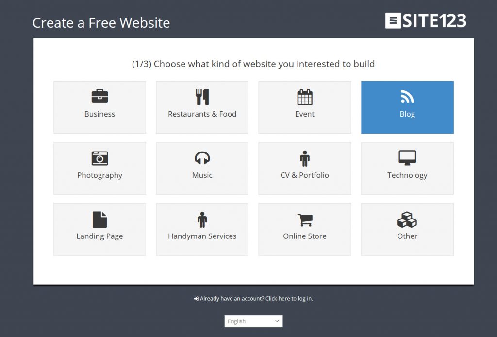
The name SITE123 is to be seen as a promise. You are supposed to get to your own website as easy as 1, 2, 3. The process promises to be as simple as possible while still leading to professional results. The target audience includes private, but also commercial users that want to get their internet presence online quickly without any programming and design knowledge. Let's walk through the process together. First, we visit the service's landing page. There, we click on the "Start Here" button in the top right corner, which immediately starts the creation process. In the first step, we select a branch or application purpose: In the second step, we assign a name to our website:
 The third step is where we have to register. This can either be done the traditional way, using the name, email, and password or via OAuth using Google or Facebook:
 If you opt for OAuth, you will have to add a few more information. Once done, SITE123 will generate a website for you:
 At the end of this process, the SITE123 editor opens, providing a design suggestion, and a tour through the user interface, which is soothingly short, as there's no focus on feature overload here.
 On the left side of the browser window, we find a vertically aligned navigation that is divided into the areas homepage, pages, design, and settings, while also offering a preview and publishment options.
Every single menu item comes with a straightforward functionality. For example, the item "Homepage" lets you configure your homepage the way you need it to be.
 Here, it's possible to use a homepage layout that's entirely different from the predefined one. However, we can not freely create our own. The changes are not made directly on the page either, but via dialogs and text fields that can only be reached using the left-side navigation.
Now before somebody cries about how inflexible this supposedly is, keep in mind that this makes for a very clear creation process. We start with the homepage; then we deal with the single pages that, in the case of my layout, are attached to the homepage as slides, in the style of a one-page website. We can choose if we want it to be a one pager or not in the "Settings," the last item in the left-sided navigation.
 The sub menu "pages" is structured very clearly as well. Here, we'll find a list of the individual pages, and get to change up the order via drag and drop, or add new pages using the orange button at the top. Each page can be deleted, edited, or provided with a new page layout. We decide if the page is supposed to be visible in menu and footer depending on the type of content.
The menu item "design" lets us edit general design aspects. Here, SITE123 divides the options into six categories, with the first one, called "Layouts" having the most essential impact.
 This is where we alter the entire page structure. We deposit the menu as a hamburger, create a left-side navigation, place it in the footer, and a lot more. Even parallax layouts can be created with just one click.
Under "Styles," we change things like the pages color scheme, as well as other details such as the button design. "Fonts" allows us to access Google Fonts, and set font sizes for menu and logo. In the "Menu Options" we can integrate a search function into the menu, or display social networks and a lot more. We place our social media links or our mailing list via MailChimp into the footer using "Footer Layouts". Last but not least "Favicon and Social Media Images" is where we define our Favicon, as well as the image that we want to integrate when users wish to share our page on social media.
Speaking about images: SITE123 offers a library with hundreds of license-free images for access directly from the backend. Of course, in times of Pixabay, Pexels, and Co., this is not a purchase-determining factor anymore, but still nice to know, and potentially useful in the workflow.
Among other things, the menu item "Settings" allows us to make basic SEO settings. An XML sitemap is generated automatically. Relevant information, such as the GTC, the data protection regulations and the implementation of the cookie guidelines is entered here. The texts are to be designed according to your own taste; there are no templates here.
 The subitem "plugins" is especially interesting. Here's where we find interesting expansion options for analysis, marketing, and support, as well as different tools for webmasters, including both Google's and Bing's Webmaster Tools. Most plugins only work with a paid account.
Now, before we click the yellow button to publish the website, we'll check how our site looks in different resolutions via the responsive view behind the blue button.
SITE123: Free and Paid Services
After a click on "publish," our website receives a numeric subdomain of the main domain site123.com. Now, we're in the web of webs, and, if used this way, SITE123 is entirely free, without the paid plugins, of course. However, it is very likely that you don't expect your website to be displayed as a numeric subdomain of a homepage builder. As soon as you want your own domain, you have to choose one of the paid plans. These mainly differ from each other by storage and traffic capacity, with both increasing alongside an increasing price. In the plans "Advanced" and "Professional", two or five mailboxes are available to you, respectively, and the amount of products that your online shop can contain also rises with the price. Here's the chart: Not so great, however, is the fact that even in the "Basic" plan for a solid 9,80 USD a month with annual payment, there's still a reference to Site123 on your page. While it's not the rather obnoxious floating tag anymore, I still don't think that a reference in the footer is necessary at this comparably not really low price.
As usual for homepage kits, it is not possible to register the website externally, and linking to SITE123 via the Cname record. Instead, we are forced to host the domain via SITE123. Principally, this is not a problem if we don't need more than two domains. Once more, this makes the target group very clear.
The fact that we at least need the "Advanced" plan to get two mailboxes isn't all that nice either. Here, a CName entry in the DNS would be a lot more flexible.

Nice! first time I heard about this website.