Red Color in Web Design: Provocative or Attractive?
The color red is the most sexy, passionate and provocative. In the color psychology, red symbolizes energy, love and emotions. A man gives red roses to a girl he is in love with; when a girl is in love she secretly draws red hearts in her diary. Another positive meaning of the red color is appetite stimulation. It is nothing but suitable for a food industry to use red, as for example red accents in the interior design of a restaurant or red colored tableware. Red has also a negative meaning: it is aggressive, it symbolizes anger and hatred; it is the color of war and blood. Still, if to think negatively and be pessimist, one can find bad side in everything. Let me ask you one primitive thing: don’t men like watching girls walking on the street in hot red dresses? Aren’t red lips tempting and magnetizing? This is how red turns to be provocative, but in a good sense of it.
 Photo by PublicDomainPictures on Pixabay
Meanwhile, I know many website owners who avoid red color in their designs in every way. These people think that red can turn their website into something extravagant and too saucy. Here one phrase comes to my mind and frankly speaking I hate it - ‘like a red rag to a bull’. Why you may ask, and I would answer you - because bulls are colorblind. Have I just discovered America for you? Bulls react to red rug not because it is red, but because a toreador moves it fast. Even if you replace a red rug with a green or white, the actions will be the same. It is a surprise for me that people still use red colors for their websites with caution. I believe it is one of the most effective hues for attention grabbing, do you have another thought?
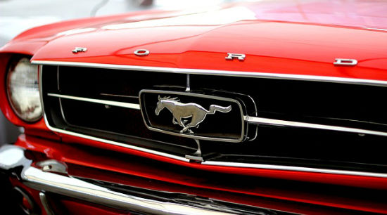 Photo by Mahal on Pixabay
Red design accents are needed on automotive websites, that’s true. Cars are powerful, they are rapid, they are impressive - color red is all the same. Hundreds of business websites that appear on the web every day lack style and dynamism, because mainly all of them are decolorized and boring. I don’t say that you should use red as a background for your web design, there are many more applications for this hue:
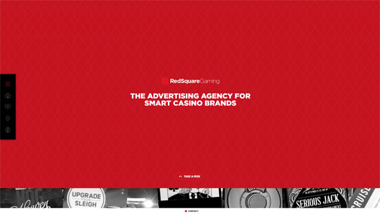 This is a website with full-screen red images and card suits menu tabs.
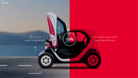 This site demonstrates an original page look – one part of it includes red image, while the other side houses a simple picture.
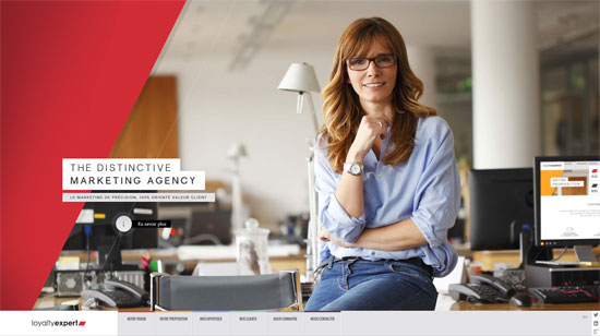 This website successfully uses geometrical shapes in red.
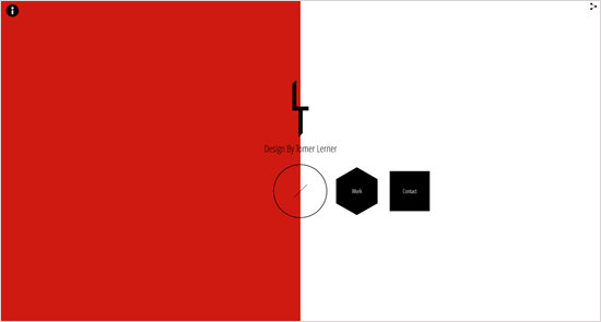 This website has all pages colored differently. While the home page is done in two classic colors – white and black, the Philosophy page adds red section to the layout.
 A website that calls to action can’t be designed without red touch.
 Serious website with red accents – everything is balanced on this design.
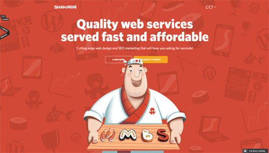 It is an interesting website with scrolling that has a funny red image in the Header.
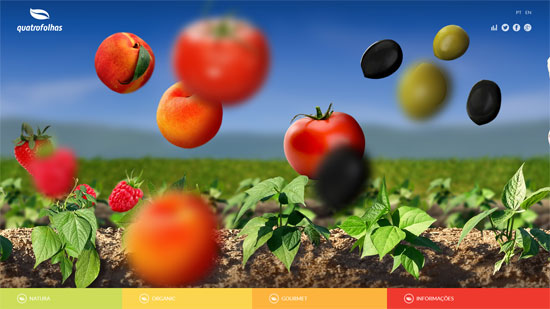 Tasty website with pretty much use of red.
 Isn’t red the color Christmas? This site shows it the best.
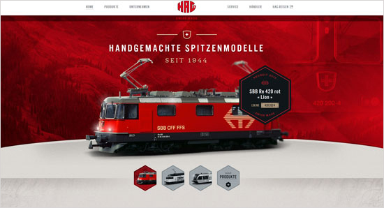 This is a website with red color in logotype, thumbnail images’ design, Header and Footer. It is professional, yet appealing.
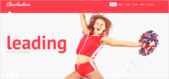 This is a fresh white website design with a red Header.
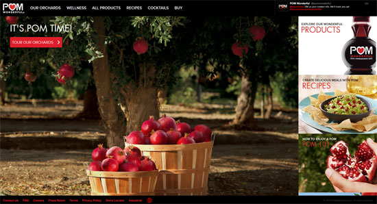 Pomegranate is red, that is why this website uses red so much.
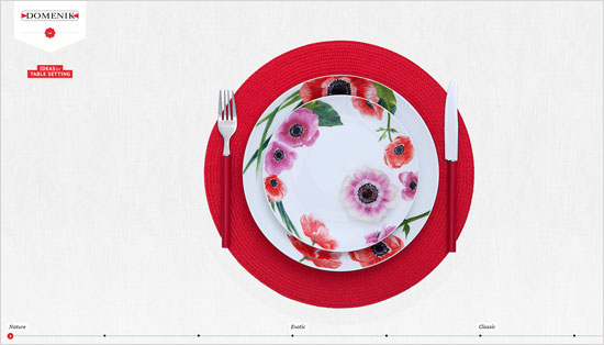 Red tableware is something unusual and very attractive, this proves it well.
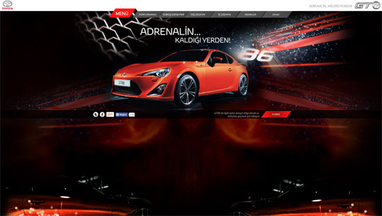 Red is the color of speed and adrenaline. This automotive web design is designed in this color not by accident then.
(dpe)
 Photo by PublicDomainPictures on Pixabay
Meanwhile, I know many website owners who avoid red color in their designs in every way. These people think that red can turn their website into something extravagant and too saucy. Here one phrase comes to my mind and frankly speaking I hate it - ‘like a red rag to a bull’. Why you may ask, and I would answer you - because bulls are colorblind. Have I just discovered America for you? Bulls react to red rug not because it is red, but because a toreador moves it fast. Even if you replace a red rug with a green or white, the actions will be the same. It is a surprise for me that people still use red colors for their websites with caution. I believe it is one of the most effective hues for attention grabbing, do you have another thought?
Designers, Start Using Red!
The variations of using red in web design are unlimited. Here I will give you some. As we already mentioned red stimulates appetite, so why not to use it for a cafe website or any food related design? I am sure it will work well for the clientele increase. Flower websites, I mean the florists’ portfolios and the decor agencies’ sites, are perfect for demonstrating the bright colors (red particularly). Red flowers are cute, and this color will make a website cute too. Going further, fashion brands’ websites can be designed in red, why not? Shopaholics will be pleased with such alluring design. Photo by Mahal on Pixabay
Red design accents are needed on automotive websites, that’s true. Cars are powerful, they are rapid, they are impressive - color red is all the same. Hundreds of business websites that appear on the web every day lack style and dynamism, because mainly all of them are decolorized and boring. I don’t say that you should use red as a background for your web design, there are many more applications for this hue:
- red logotype at the top of the home page is rather inviting;
- navigation menu bar colored red is catchy;
- typography accents in red make the text prominent (it is better to highlight headlines in red, because the entire text in red will be too much to bear).
Red Square Gaming Advertising Agency Website
 This is a website with full-screen red images and card suits menu tabs.
Mobee Car-sharing Service Red Web Design
 This site demonstrates an original page look – one part of it includes red image, while the other side houses a simple picture.
Loyalty Expert Marketing Agency Website
 This website successfully uses geometrical shapes in red.
Tomer Lerner Design Portfolio Website
 This website has all pages colored differently. While the home page is done in two classic colors – white and black, the Philosophy page adds red section to the layout.
First Aid Training Website
 A website that calls to action can’t be designed without red touch.
Marine Construction Website
 Serious website with red accents – everything is balanced on this design.
Shokunin Web Design Site
 It is an interesting website with scrolling that has a funny red image in the Header.
Quatrofolhas Food Brand Website
 Tasty website with pretty much use of red.
Christmas Love Website
 Isn’t red the color Christmas? This site shows it the best.
HAG Railroads Website
 This is a website with red color in logotype, thumbnail images’ design, Header and Footer. It is professional, yet appealing.
Cheerleaders Club Joomla Template
 This is a fresh white website design with a red Header.
POM Wonderful Food Related Website
 Pomegranate is red, that is why this website uses red so much.
Domenik Tableware Website
 Red tableware is something unusual and very attractive, this proves it well.
Toyota GT86 Promotional Website
 Red is the color of speed and adrenaline. This automotive web design is designed in this color not by accident then.
(dpe)
red is a great color for web design, than for sharing.