Put Straight! 7 Amazing Sites Created With: Webydo, a Code-free Platform for Professional Designers
Tools are what drives the web design industry. I do know a handful of people who honestly tell me they design each and every site using just their vi: or Notepad Plus. But I know hundreds of people who embrace modern tools to get their work done without sacrificing quality. In a new series here at Noupe we'll be taking a look at the various solutions available for those designers who don't hide behind ideological walls and are open to evolve. These solutions have come along a way from the Geocities of the Nineties to the online design platforms some of them are today. They are no longer an overly simplistic way of getting sites online without even the slightest knowledge. Instead they have become elaborate, feature-rich design tools in their own right. Our little series will focus on sites created with the online branch of web design software. We will takle a look at how they look and how functional and modern and state of the art they are. We start with Webydo, the code-free online web design platform for professional designers.

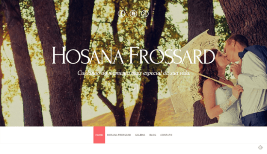 Hosana Frossard is a Brazilian company addicted to bride and event fashion. They sell, they rent and they tailor clothes for you. Their single most important event is the wedding. Wedding is the central topic of their website and anyone who has ever seen a Hollywood movie (or has married) knows which out of this earth expectations this event arouses. It is an emotional milestone in anyone's life.
And that's what a website has to properly convey. Hosana Frossard's site lives up these expectations. The whole design matches the importance of the Day of Your Life perfectly. Besides relying on professional photography in headers, galleries, sliders and hero imagery, the website sports decent coloring and a lot of white space. Sliders are done in a way that they don't change the whole image within the viewport but only individual elements which makes for an even more dynamic, but at the same time calm and elegant look.
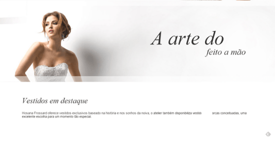 What I like best though, is the use of the fairly new Code-free Parallax Scrollling Animator which we introduced you to a few months back. Just like it should be done, Hosana Frossard doesn't overdo the parallax effect but only sets a few accents at the top of the home page and while scrolling downwards to the footer.
Social Media integration is done thoroughly and as such part of the strategy. Instagram is the central hub for fresh images, while the galleries on the website also show off more than enough bridal fashion. Unmarried women will love the site.
Judging from a design and marketing perspective there's not a lot to criticize. The comapny even operates a blog and this blog even offers valuable articles to those who are the target audience for it. Hosana Frossard ist not identifiable as having been created using an online design platform. So much for the prejudice...
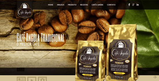 Café Angola from Brasil offers premium, traditionally manufactured coffee. There's absolutely no doubt that. Visit the site and you'll be very clear about that. The first and foremost goal of any given website has been achieved, I'd say. Professional photography and image editing skills create a vintage look that emphasizes the traditional aspect of the coffee business in the best way thinkable. Macro photos of roasted and unroasted beans fill backgrounds discreetly and don't get in the way of the providently set information snippets.
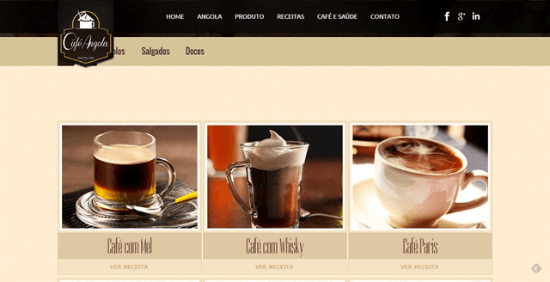 Café Angola integrates Social Media prominently. Instead of a news or blog section, the website offers fancy recipes with coffee involved. You'll find the popular and obvious ones such as Café Cremoso there but also some more unusual stuff like several gravies based on coffee.
The presentation of the recipes fits the overall design guidelines. Not too many letters, solid typography and large imagery is combined with a color scheme coffee lovers would almost naturally associate with the topic.
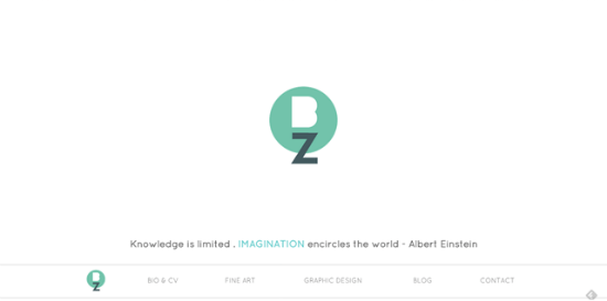 Betty Zhang is a graphic designer with roots in Asia while nowadays calling three continents her home. Betty is the archetype of the designer Webydo had in mind while creating their service. Betty stands on solid ground when it comes to "analog" design. Her excursions to the digital world are not really that excessive at the time being.
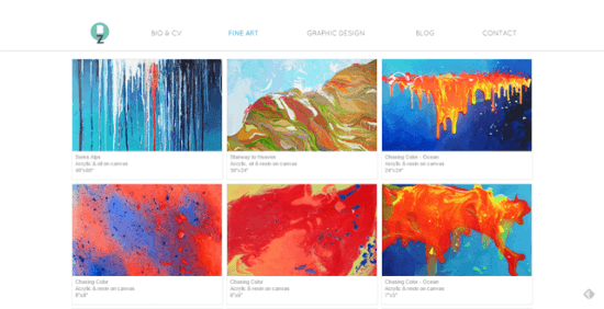 Betty's website sports a minimalistic look with a whole lot of white space. A handful of galleries give an impression of her works; a blog exists, but isn't done with Webydo. Should you like this version of a personal portfolio? Judge for yourself.
What we are seeing here from a neutral point of view is a modern and clean portfolio presentation.
 Stones Throw is a restaurant located in San Francisco. Their motto is "Back to the Basics". They don't want to come over superhip or trendy. Instead they rely on honest hospitality and great food. From that point of view they couldn't have given their website any other look than the vintage one they chose.
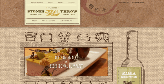
A background showing a linen table cloth and a place mat with red wine stains gets combined with a Wild West typography. Simple sketches lead the visitor through the site. Personally I would have given a little more attention to the details of these sketches and I would have added a whole lot of pictures, for as much as I can see (from their Instagram), Stones Throw is a nice speck of land.
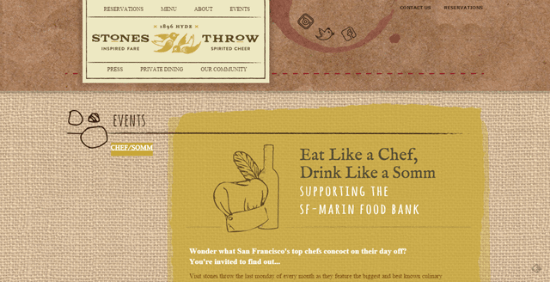 Stones Throw's website can be improved with relatively minor efforts. They are on a good track, not a lot of criticism is due. Next time I visit San Francisco I will definitely make sure to give Stones Throw a reality check.
Stones Throw integrates Social Media prominently and relies fully on Facebook, Instagram and Twitter.
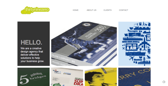 ThirtyNineZero|Citrus is one of these classical design agencies fully fitting into Webydos's core target definition. The group of designers from the UK are undoubtedly creative as one can see from the extensive portfolio they call their website.
ThirtyNineZero|Citrus designs analog products. You'll find books, brochures, posters, stationery and a lot more. The FC Chelsea is one of their customers.
The agency's website is designed following the Masonry style. The portfolio takes most of the space. Each reference is presented with a short description and an image. As you can read under "About Us" ThirtyNineZero|Citrus define themselves as a print agency.
I would bet that they will be doing more web works in the future. Their website is proof that they are able to. The most important thing is not the skill set. Using a tool is something anyone can learn. The most important thing is having the creative idea. Without this idea not even the most skilled designer is able to create anything. And ideas are not in short supply over there at ThirtyNineZero|Citrus. All they need is a professional tool. Obviously they found it in Webydo.
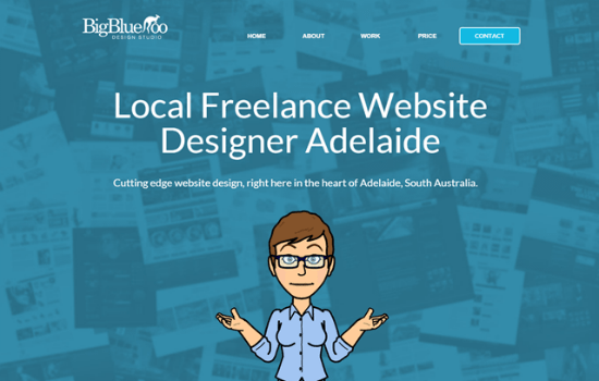 Jody Faux, founder of the freelance design studio Big Blue Roo from Adelaide in Australia, is another example for Webydo's target group definition gone right. Jody is a designer with 16 aears of expoerience in the field as a whole, yet with only five years of web design experience. She decided to go freelance almost a year ago and offers her services to local businesses around her office location.
Relying on Webydo Jody is now head over heels into web design. Her work portfolio is impressive, already. If you live in the area and are looking for a web designer there is no reason not to contact Jody.
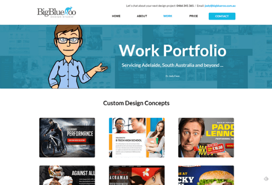 Jody likes comics and likes to draw them. Vintage design is another of her core themes. We could review all the examples Jody has already created to populate another post on the flexibility of the Webydo design software. But don't worry, we won't...
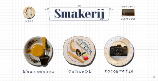 The Smakerij from the Netherlands is a design agency focussing on food and all the topics related to it. They design individual products as well as recipes, they offer food photography and food webdesign. Basically the two founders Larisse Blok and Berber Galema don't back away easily.
Their website is an extraordinary example of a website you don't see too often. The overall impression conveys the message that the Smakerij is your go-to spot for anything food-related which of course is a good thing. The presentation is as unusual as it can get with drawing paper as a background and diversely decorated hand-drawn plates. The message the Smakerij sends to its target audience is clear. We are not your usual design agency. Expect the unexpected. And if this is what you want to present, the strategy is completely valid.
The Smakerij is a most untypical example of what you would expect when someone tells you he would show you a website created with an online design tool. This definitely proves how flexible these solutions have become.

Webydo is More Than an Online Web Design Software and Incomparable to Any Website Builder
Noupe readers already know what all Webydo has to offer. I featured them several times: here, here and here. The core of the system is an online design software along the lines of the SaaS concepts. The people behind Webydo are eager to put emphasis on the fact that Webydo's target group is not the average Joe but the professional designer. To be more specific, they target the professional designer who is not able or willing to code. All that Webydo is able to help you achieve is done completely code-free (Accessing the code is possible for those who insist to do it, however). Besides providing you with a pixel-perfect design interface, Webydo comes equipped with a full-blown business administration that even lets you invoice your clients directly from within Webydo. If you let it, it can be the center of your web design business. Now this shall suffice. If you want to know more read the above mentioned articles or build your first free site over at Webydo directly.... One important information before you read on and probably read wrong: All of the following sites have not been made by the end customer. Instead all of the websites have been designed by professional designers for the respective website owners. What all the end customers do, however, is the maintenance of their site regarding the content, which is easy, because of the almost intuitive CMS Webydo entails. This is one of the easiest to learn CMS I have ever come across. Any customer will be able to learn it in under 30 minutes. Yes, even the most intellectually reluctant...01 Hosana Frossard (Brasil)
 Hosana Frossard is a Brazilian company addicted to bride and event fashion. They sell, they rent and they tailor clothes for you. Their single most important event is the wedding. Wedding is the central topic of their website and anyone who has ever seen a Hollywood movie (or has married) knows which out of this earth expectations this event arouses. It is an emotional milestone in anyone's life.
And that's what a website has to properly convey. Hosana Frossard's site lives up these expectations. The whole design matches the importance of the Day of Your Life perfectly. Besides relying on professional photography in headers, galleries, sliders and hero imagery, the website sports decent coloring and a lot of white space. Sliders are done in a way that they don't change the whole image within the viewport but only individual elements which makes for an even more dynamic, but at the same time calm and elegant look.
 What I like best though, is the use of the fairly new Code-free Parallax Scrollling Animator which we introduced you to a few months back. Just like it should be done, Hosana Frossard doesn't overdo the parallax effect but only sets a few accents at the top of the home page and while scrolling downwards to the footer.
Social Media integration is done thoroughly and as such part of the strategy. Instagram is the central hub for fresh images, while the galleries on the website also show off more than enough bridal fashion. Unmarried women will love the site.
Judging from a design and marketing perspective there's not a lot to criticize. The comapny even operates a blog and this blog even offers valuable articles to those who are the target audience for it. Hosana Frossard ist not identifiable as having been created using an online design platform. So much for the prejudice...
02 Café Angola (Brasil)
 Café Angola from Brasil offers premium, traditionally manufactured coffee. There's absolutely no doubt that. Visit the site and you'll be very clear about that. The first and foremost goal of any given website has been achieved, I'd say. Professional photography and image editing skills create a vintage look that emphasizes the traditional aspect of the coffee business in the best way thinkable. Macro photos of roasted and unroasted beans fill backgrounds discreetly and don't get in the way of the providently set information snippets.
 Café Angola integrates Social Media prominently. Instead of a news or blog section, the website offers fancy recipes with coffee involved. You'll find the popular and obvious ones such as Café Cremoso there but also some more unusual stuff like several gravies based on coffee.
The presentation of the recipes fits the overall design guidelines. Not too many letters, solid typography and large imagery is combined with a color scheme coffee lovers would almost naturally associate with the topic.
03 Betty Zhang Art
 Betty Zhang is a graphic designer with roots in Asia while nowadays calling three continents her home. Betty is the archetype of the designer Webydo had in mind while creating their service. Betty stands on solid ground when it comes to "analog" design. Her excursions to the digital world are not really that excessive at the time being.
 Betty's website sports a minimalistic look with a whole lot of white space. A handful of galleries give an impression of her works; a blog exists, but isn't done with Webydo. Should you like this version of a personal portfolio? Judge for yourself.
What we are seeing here from a neutral point of view is a modern and clean portfolio presentation.
04 Stones Throw (USA)
 Stones Throw is a restaurant located in San Francisco. Their motto is "Back to the Basics". They don't want to come over superhip or trendy. Instead they rely on honest hospitality and great food. From that point of view they couldn't have given their website any other look than the vintage one they chose.
A background showing a linen table cloth and a place mat with red wine stains gets combined with a Wild West typography. Simple sketches lead the visitor through the site. Personally I would have given a little more attention to the details of these sketches and I would have added a whole lot of pictures, for as much as I can see (from their Instagram), Stones Throw is a nice speck of land.
 Stones Throw's website can be improved with relatively minor efforts. They are on a good track, not a lot of criticism is due. Next time I visit San Francisco I will definitely make sure to give Stones Throw a reality check.
Stones Throw integrates Social Media prominently and relies fully on Facebook, Instagram and Twitter.
05 ThirtyNineZero|Citrus (UK)
 ThirtyNineZero|Citrus is one of these classical design agencies fully fitting into Webydos's core target definition. The group of designers from the UK are undoubtedly creative as one can see from the extensive portfolio they call their website.
ThirtyNineZero|Citrus designs analog products. You'll find books, brochures, posters, stationery and a lot more. The FC Chelsea is one of their customers.
The agency's website is designed following the Masonry style. The portfolio takes most of the space. Each reference is presented with a short description and an image. As you can read under "About Us" ThirtyNineZero|Citrus define themselves as a print agency.
I would bet that they will be doing more web works in the future. Their website is proof that they are able to. The most important thing is not the skill set. Using a tool is something anyone can learn. The most important thing is having the creative idea. Without this idea not even the most skilled designer is able to create anything. And ideas are not in short supply over there at ThirtyNineZero|Citrus. All they need is a professional tool. Obviously they found it in Webydo.
06 Big Blue Roo Design Studio (Australia)
 Jody Faux, founder of the freelance design studio Big Blue Roo from Adelaide in Australia, is another example for Webydo's target group definition gone right. Jody is a designer with 16 aears of expoerience in the field as a whole, yet with only five years of web design experience. She decided to go freelance almost a year ago and offers her services to local businesses around her office location.
Relying on Webydo Jody is now head over heels into web design. Her work portfolio is impressive, already. If you live in the area and are looking for a web designer there is no reason not to contact Jody.
 Jody likes comics and likes to draw them. Vintage design is another of her core themes. We could review all the examples Jody has already created to populate another post on the flexibility of the Webydo design software. But don't worry, we won't...
07 Smakerij (Netherlands)
 The Smakerij from the Netherlands is a design agency focussing on food and all the topics related to it. They design individual products as well as recipes, they offer food photography and food webdesign. Basically the two founders Larisse Blok and Berber Galema don't back away easily.
Their website is an extraordinary example of a website you don't see too often. The overall impression conveys the message that the Smakerij is your go-to spot for anything food-related which of course is a good thing. The presentation is as unusual as it can get with drawing paper as a background and diversely decorated hand-drawn plates. The message the Smakerij sends to its target audience is clear. We are not your usual design agency. Expect the unexpected. And if this is what you want to present, the strategy is completely valid.
The Smakerij is a most untypical example of what you would expect when someone tells you he would show you a website created with an online design tool. This definitely proves how flexible these solutions have become.

I will agree that these sites all look well designed, but as a front-end developer the standard of the HTML is pretty bad. Inline styles, a multitude of unnecessary divs is just a start, it just seems so very bulky?
I’m sure as time goes on this will improve, but for now I still stand firmly on the “humans are better at coding” side of things.
I came to know about Webydo from this post itself,and I decided to give it a go. And I must agree with Damian, humans are better at coding at least as of now. Nevertheless I found the Webydo services can be used by amatuers as well. I think the professionals will stick to coding.
Very informative post. All the sites you have shared here are new to me. Thanks for the awesome share.
A decent new web builder for those who lack development skills.
Hi
I’ve been using Webydo for a year now, and they still haven’t got responsive design down right. The article/blogg item isn’t responsive and cannot be resized.
Also their system of having to resize and move items around to fit mobile page sizes is crazy. You have to re-style 3 more versions (manually) for EVERY page on the site. So a 30 page website needs another 90 versions if you want ipad ad mobile versions. Totally impractical, who has that amount of time.
I’m looking for another website builder.
I’ve been trying Webydo for some months now, beside the responsive design “serious” problems, 100% right Laurence, I’m finding the overal layout and bugs of the software pretty terrible.
Some things don’t work as good as it should be on my Apple.
The slogan, “created by designers”, but probably not Apple users?
For me its a wast of money.