Printed Web: Print Design Inspired Websites
It seems things are changing for website design. The minimalist style adopted by many websites is slowly being evolved into something a little more engaging. One of the main sources of inspiration for this change in the way website content is displayed has been print design, particularly newspapers and magazines. Here are some fine examples of print design inspired websites.
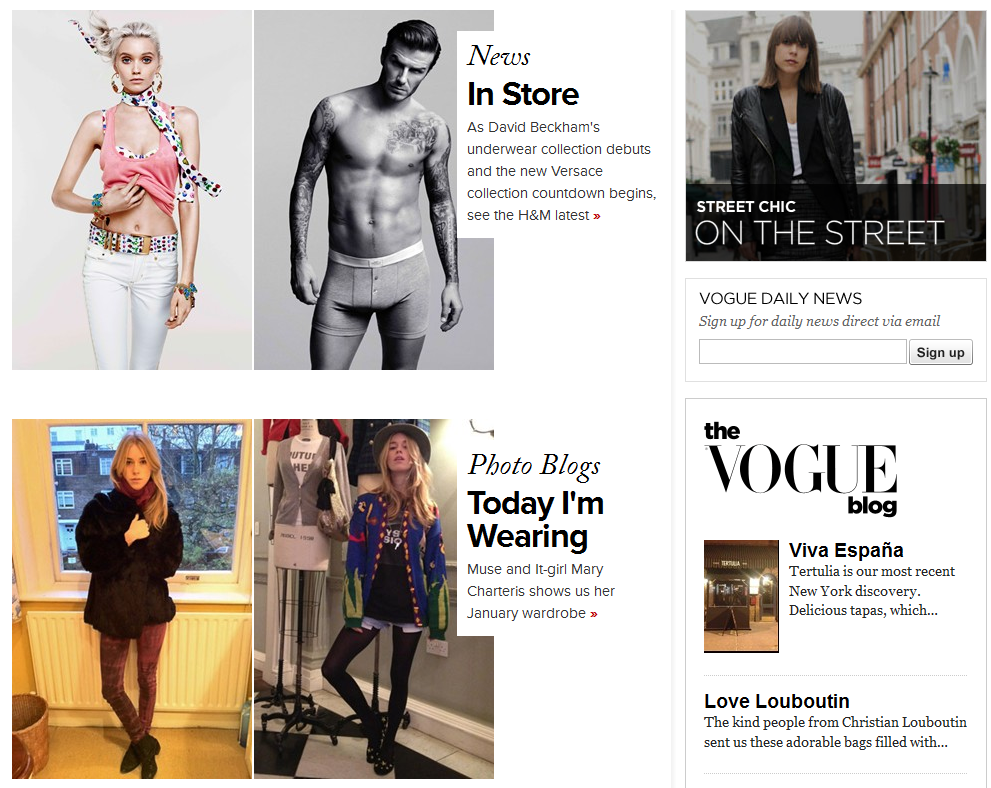 Placing an emphasis on striking photography and keeping text to a minimum, the Vogue website perfectly recreates the basic layout of its magazine, showcasing the latest fashion trends.
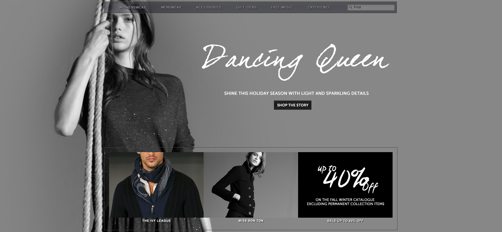 A stunningly beautiful website as sharp as the fashion wear, Armani’s site's look pulled straight from a fashion photographer’s portfolio. A little text and huge exquisite images seize and hold the visitor’s attention.
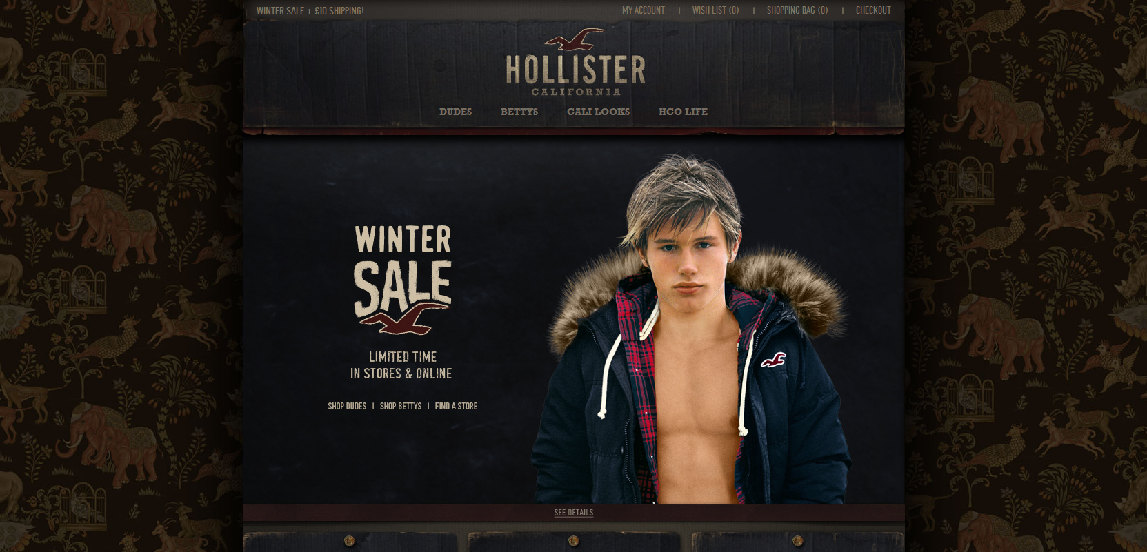 Before you even delve into the content of the Hollister’s website you have to admire their ingenious use of the dead space on either side, which looks like a sort of beautiful vintage Indian-style wallpaper. The rest of the site incorporates a wonderful use of shading and delicate colour textures.
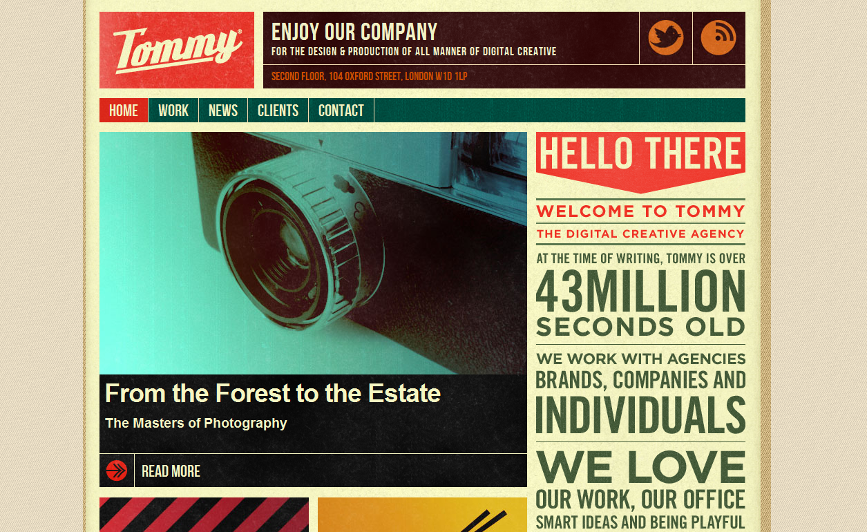 Digital creative agency Tommy has a fantastic website layout which mimics advertising boards of the past to great effect. Mixing bold headlines and strong colours, on close inspection the site almost has a ‘weathered’ or ‘worn’ look to it: retro brilliance.
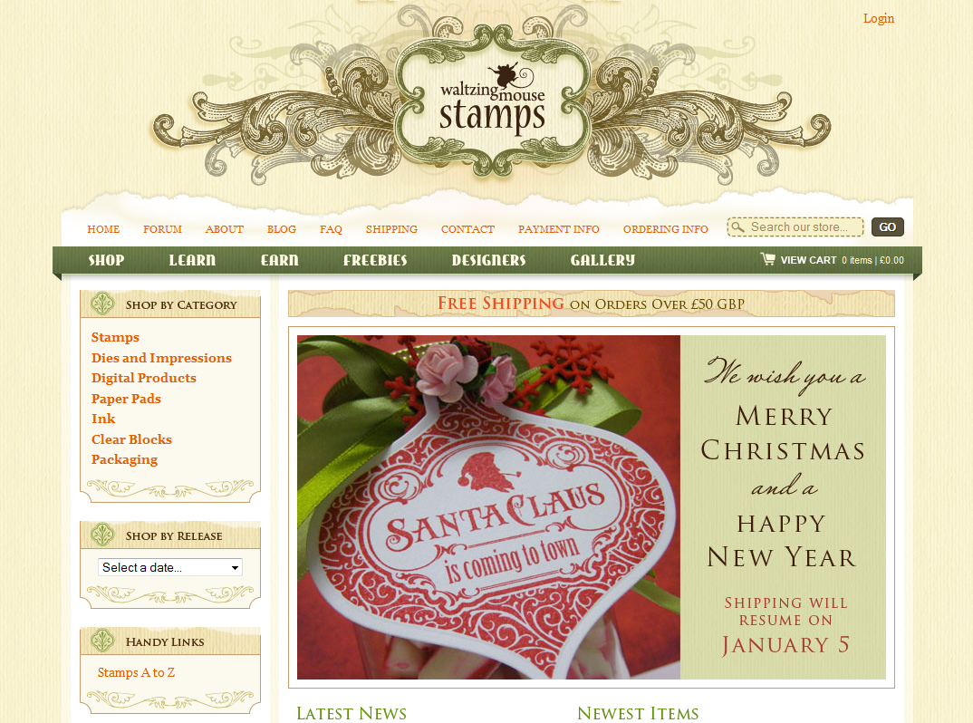 The modest vintage design on the site cleverly represents the nature of their business and the products they sell. The slightly worn and torn Victorian-era wallpaper effect that is subtly added to the banners is one of the most eye-catching features.
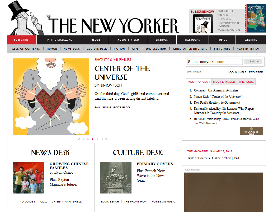 The New Yorker is an excellent example of a publication whose website retains the trademark aesthetic, most notably the famous typography, of its print magazine, from the features to the cartoons.
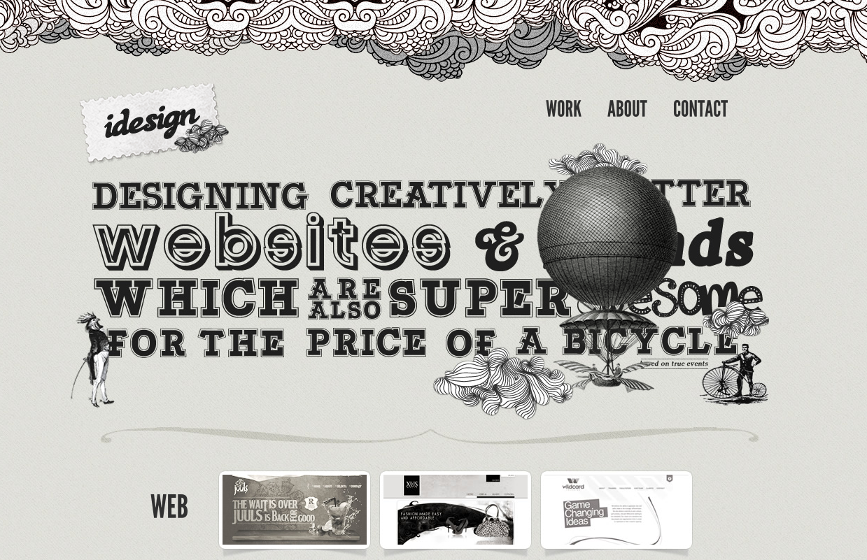 We should expect a firm specialising in designing websites and corporate branding to have a stirring website and idesign’s magnificent eye catching art nouveau aesthetic lives up to expectations and more.
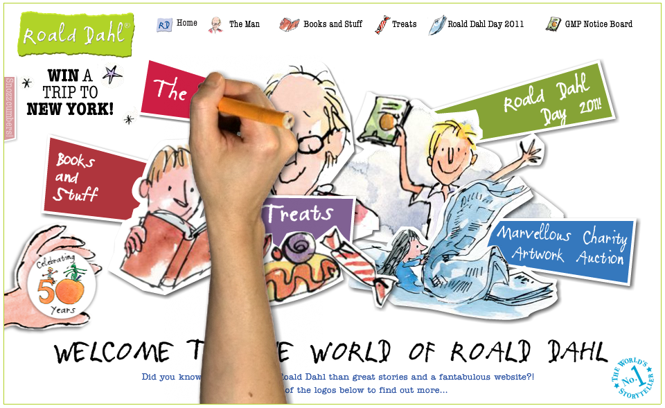 The website for the legendary children’s storyteller beautifully replicates the aesthetic of Dahl’s famous fun-filled children’s books, with the marvellous artwork drawn by long time collaborator Quentin Blake.
 Wonderfully recreating the print design of a high quality fashion catalogue, the Protest Boardwear website features large colourful photography showcasing the brand’s head turning slope fashion wear.
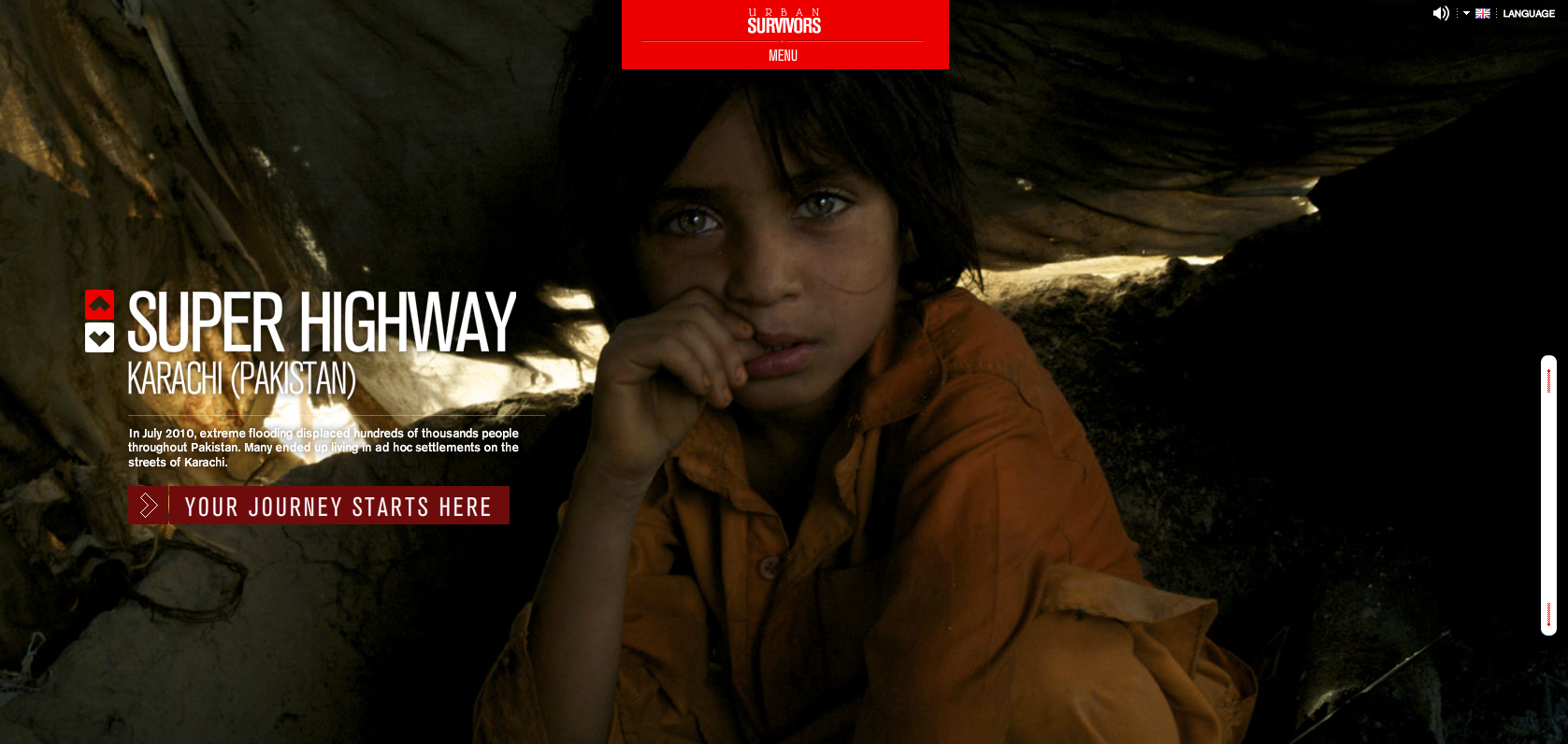 Using huge and beautifully composed photography, the charity’s website captures the feel of a photojournal or a series of striking billboards, displaying the plight of unfortunate people in third world countries.
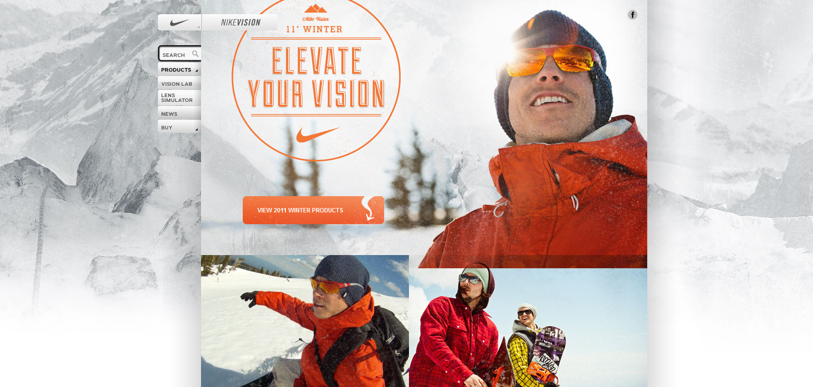 Nike is famous for pushing the envelope in terms of style, and their Nikevision website uses large sliding images to display their stylish range of eyewear, replicating a high quality catalogue you might pick up in an opticians.
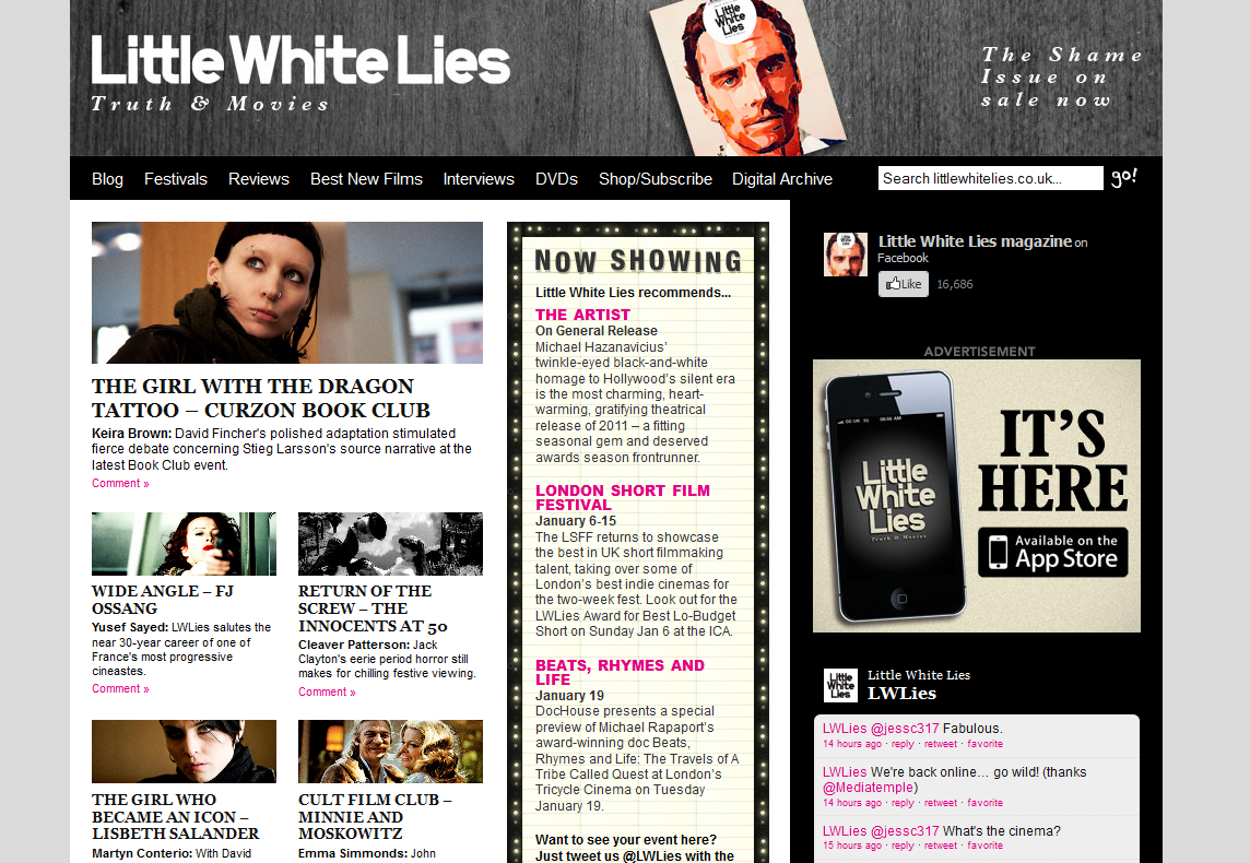 Little White Lies is a bi-monthly film magazine that shapes and themes its publication around a specific film. The website showcases their stirring graphic design and has digital editions of the magazine to browse.
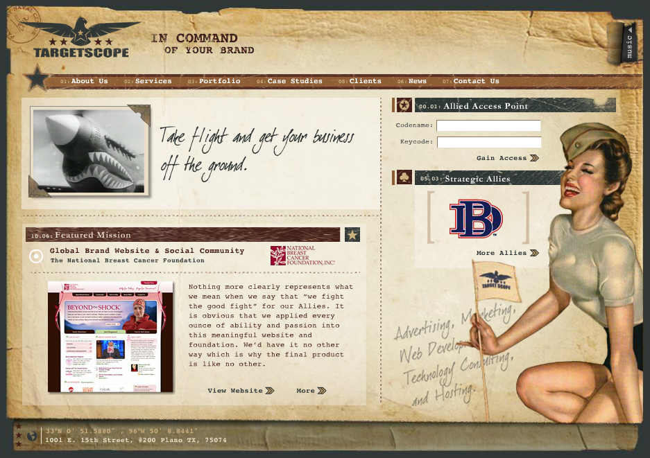 Texas based marketing firm Targetscope really hit the mark with their website design, which is modelled on American World War II propaganda artwork, delivering the message that their creative team is ready to take command of a client’s brand and steer it to victory.
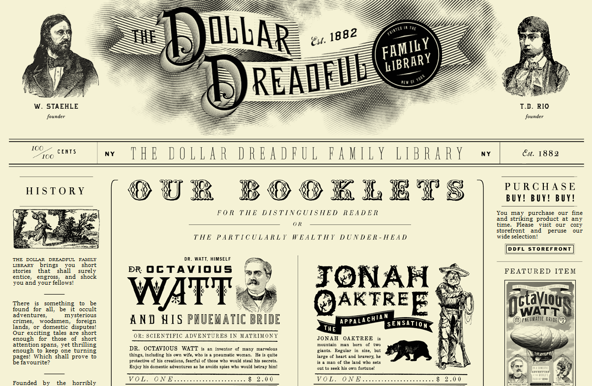 Beautiful to look at, the Dollar Dreadful publication has been running since 1882 and displays its stories using the same layout and typography used in the original late nineteenth century mini magazines on the site.
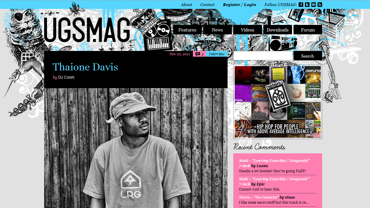 This independent hip hop magazine celebrates rap music using a clear and colourful magazine layout that balances graphics, photography and text to stunning effect, creating a cool and vibrant web experience.
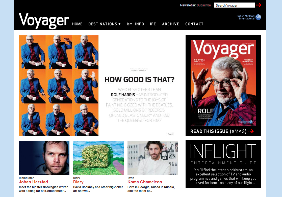 The minimalist aesthetic and clear layout of BMI’s Voyager website perfectly replicates the in flight magazine. Uncluttered and nicely balanced, the information and features are easy to access and read.
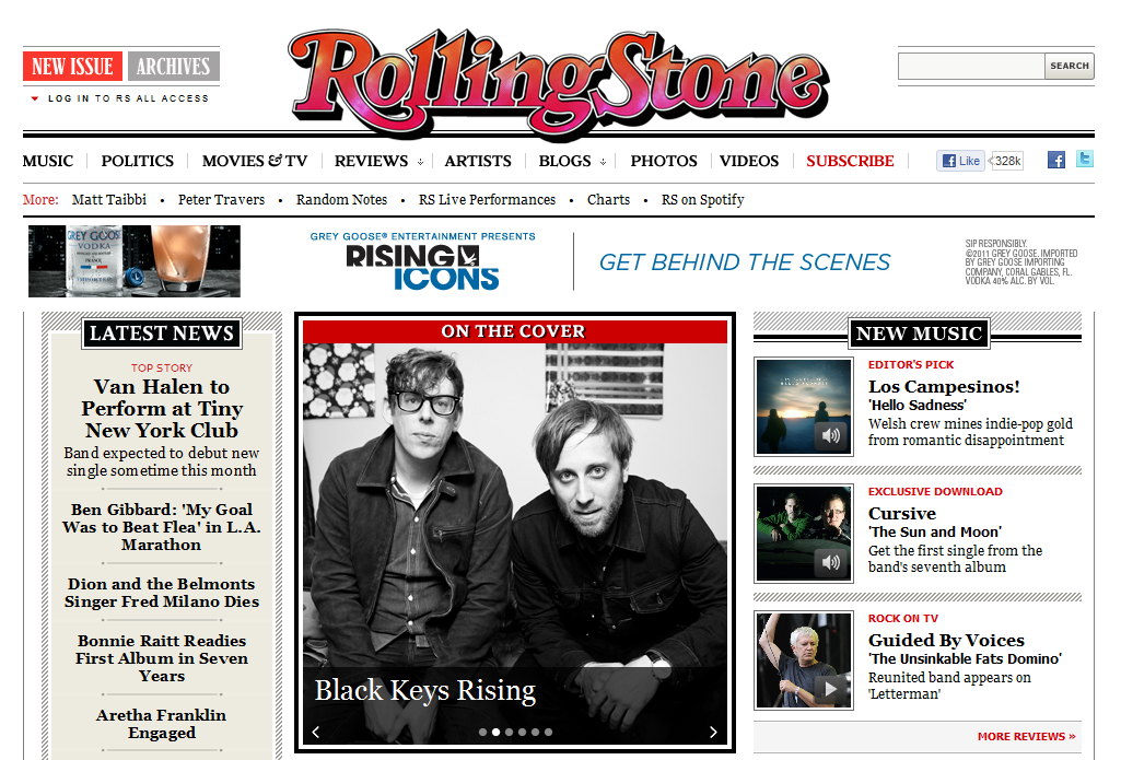 The famous showbiz magazine is another example of a website that accurately replicates their print publication. Showcasing the latest news in music, film and politics, the site is simple to navigate and has a clear layout balancing image and text.
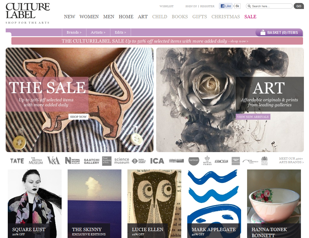 CultureLabel is a different kind of gift site that sells products solely from museums and art galleries. The design of the website mirrors the art focused aesthetic by letting the imagery do the talking. This is also accompanied by lush, matted typography scattered throughout the site.
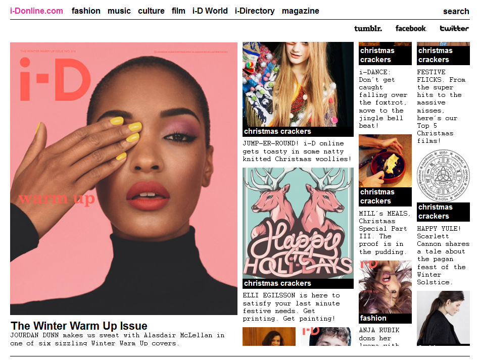 Extremely simple and effective, the online version of i-d magazine has a clear scrolling blog design that enables visitors to scan the news stories displayed with an equally sized photograph and introductory text.
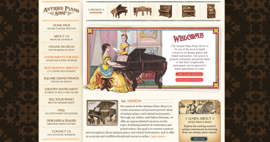 The Antique Piano Shop is dedicated to raising awareness of the need to preserve pianos from the last two centuries as valuable historical artifacts. Their website’s layout, typography and artwork beautifully capture the look of piano and organ catalogues and brochures from the past.
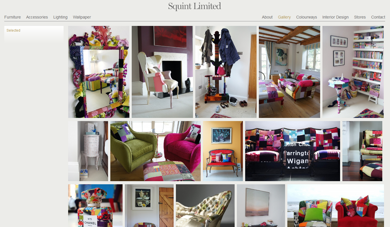 Squint Limited is a fine epitome of Shoreditch and the website does further justice to the products with its portfolio of images that do all the talking. The grey-on-grey text, coupled with the use of gradient in the menu and product boxes adds to the stunning minimalist feel throughout.
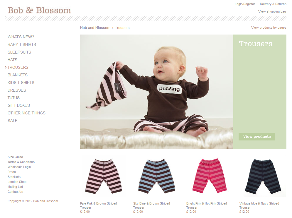 Intricate spacing and light pastel colours complements the array of baby clothing strewn over the site.
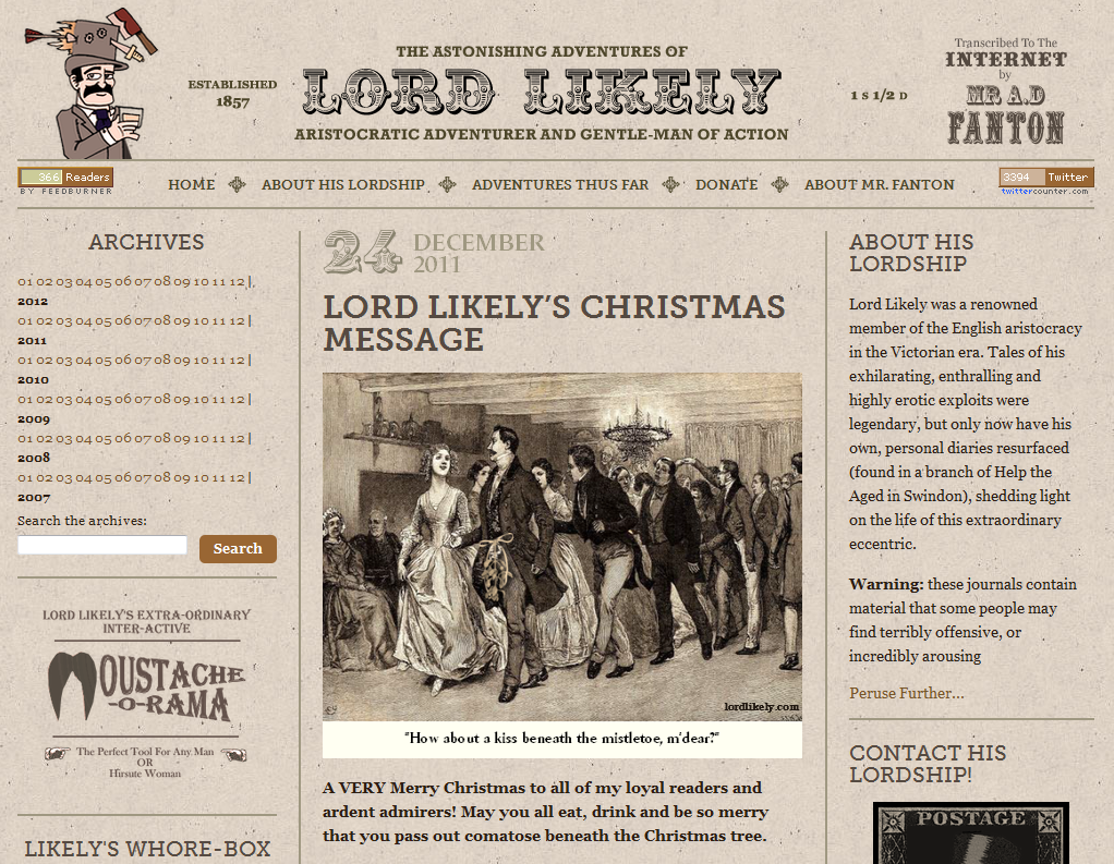 Resembling a Victorian Viz magazine, The Astonishing Adventures of Lord Likely is a lewd tongue-firmly-in-cheek collection of a rather randy Victorian aristocratic gentleman’s adventures. The typography, layout and writing style of the fake diaries brilliantly mimic a Victorian very-broad sheet.
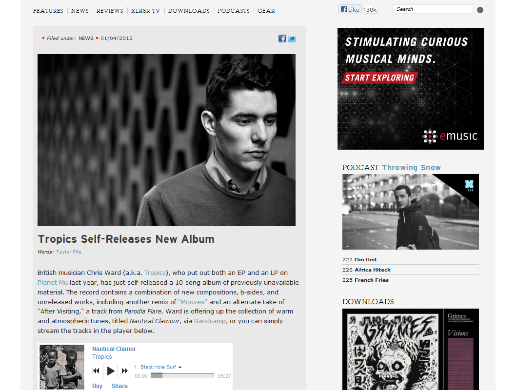 While styled like a blog, the website for alternative music and culture mag, XLR8R makes intricate use of its layering with subtle grey tones and compliments it further with awesome documentary style photography of featured artists.
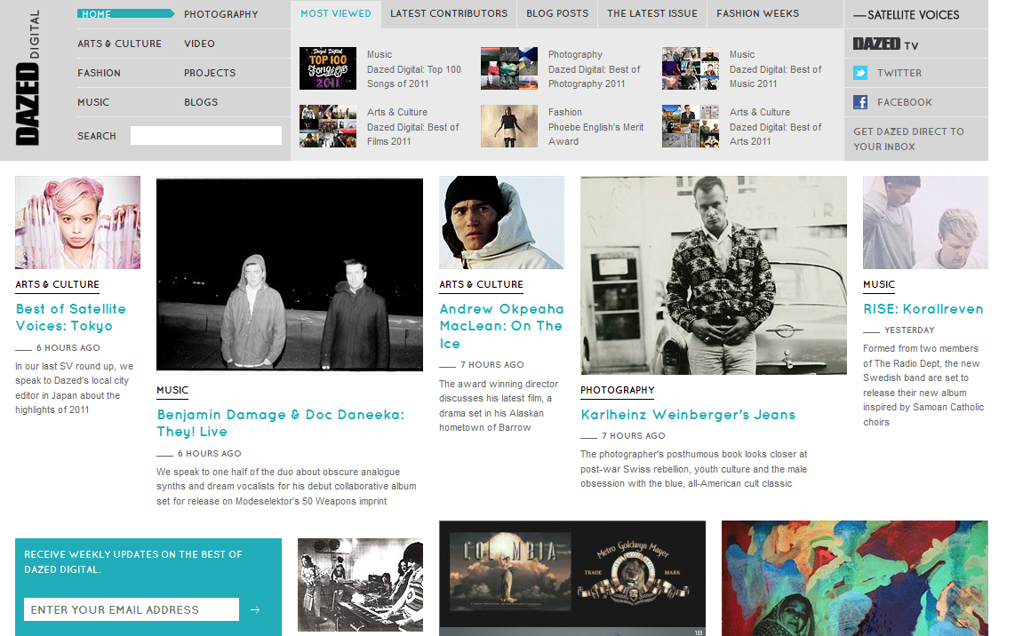 The stunning looking website for Dazed magazine has a less formal magazine layout, abandoning columns in favour of a cloud of images and text on a scrolling page that resembles the continuously flowing manuscript of a Jack Kerouac novel.
(rb)
The Websites
Vogue
 Placing an emphasis on striking photography and keeping text to a minimum, the Vogue website perfectly recreates the basic layout of its magazine, showcasing the latest fashion trends.
Armani
 A stunningly beautiful website as sharp as the fashion wear, Armani’s site's look pulled straight from a fashion photographer’s portfolio. A little text and huge exquisite images seize and hold the visitor’s attention.
Hollister
 Before you even delve into the content of the Hollister’s website you have to admire their ingenious use of the dead space on either side, which looks like a sort of beautiful vintage Indian-style wallpaper. The rest of the site incorporates a wonderful use of shading and delicate colour textures.
Tommy
 Digital creative agency Tommy has a fantastic website layout which mimics advertising boards of the past to great effect. Mixing bold headlines and strong colours, on close inspection the site almost has a ‘weathered’ or ‘worn’ look to it: retro brilliance.
Waltzing Mouse Stamps
 The modest vintage design on the site cleverly represents the nature of their business and the products they sell. The slightly worn and torn Victorian-era wallpaper effect that is subtly added to the banners is one of the most eye-catching features.
The New Yorker
 The New Yorker is an excellent example of a publication whose website retains the trademark aesthetic, most notably the famous typography, of its print magazine, from the features to the cartoons.
IDesign
 We should expect a firm specialising in designing websites and corporate branding to have a stirring website and idesign’s magnificent eye catching art nouveau aesthetic lives up to expectations and more.
Roald Dahl
 The website for the legendary children’s storyteller beautifully replicates the aesthetic of Dahl’s famous fun-filled children’s books, with the marvellous artwork drawn by long time collaborator Quentin Blake.
Protest Boardwear
 Wonderfully recreating the print design of a high quality fashion catalogue, the Protest Boardwear website features large colourful photography showcasing the brand’s head turning slope fashion wear.
Urban Survivors
 Using huge and beautifully composed photography, the charity’s website captures the feel of a photojournal or a series of striking billboards, displaying the plight of unfortunate people in third world countries.
Nike Vision
 Nike is famous for pushing the envelope in terms of style, and their Nikevision website uses large sliding images to display their stylish range of eyewear, replicating a high quality catalogue you might pick up in an opticians.
Little White Lies
 Little White Lies is a bi-monthly film magazine that shapes and themes its publication around a specific film. The website showcases their stirring graphic design and has digital editions of the magazine to browse.
Targetscope
 Texas based marketing firm Targetscope really hit the mark with their website design, which is modelled on American World War II propaganda artwork, delivering the message that their creative team is ready to take command of a client’s brand and steer it to victory.
The Dollar Dreadful
 Beautiful to look at, the Dollar Dreadful publication has been running since 1882 and displays its stories using the same layout and typography used in the original late nineteenth century mini magazines on the site.
UGS Mag
 This independent hip hop magazine celebrates rap music using a clear and colourful magazine layout that balances graphics, photography and text to stunning effect, creating a cool and vibrant web experience.
Voyager
 The minimalist aesthetic and clear layout of BMI’s Voyager website perfectly replicates the in flight magazine. Uncluttered and nicely balanced, the information and features are easy to access and read.
Rolling Stone
 The famous showbiz magazine is another example of a website that accurately replicates their print publication. Showcasing the latest news in music, film and politics, the site is simple to navigate and has a clear layout balancing image and text.
CultureLabel
 CultureLabel is a different kind of gift site that sells products solely from museums and art galleries. The design of the website mirrors the art focused aesthetic by letting the imagery do the talking. This is also accompanied by lush, matted typography scattered throughout the site.
I-D Mag
 Extremely simple and effective, the online version of i-d magazine has a clear scrolling blog design that enables visitors to scan the news stories displayed with an equally sized photograph and introductory text.
Antique Piano Shop
 The Antique Piano Shop is dedicated to raising awareness of the need to preserve pianos from the last two centuries as valuable historical artifacts. Their website’s layout, typography and artwork beautifully capture the look of piano and organ catalogues and brochures from the past.
Squint Limited
 Squint Limited is a fine epitome of Shoreditch and the website does further justice to the products with its portfolio of images that do all the talking. The grey-on-grey text, coupled with the use of gradient in the menu and product boxes adds to the stunning minimalist feel throughout.
Bob & Blossom
 Intricate spacing and light pastel colours complements the array of baby clothing strewn over the site.
The Astonishing Adventures of Lord Likely
 Resembling a Victorian Viz magazine, The Astonishing Adventures of Lord Likely is a lewd tongue-firmly-in-cheek collection of a rather randy Victorian aristocratic gentleman’s adventures. The typography, layout and writing style of the fake diaries brilliantly mimic a Victorian very-broad sheet.
XLR8R
 While styled like a blog, the website for alternative music and culture mag, XLR8R makes intricate use of its layering with subtle grey tones and compliments it further with awesome documentary style photography of featured artists.
Dazed Digital
 The stunning looking website for Dazed magazine has a less formal magazine layout, abandoning columns in favour of a cloud of images and text on a scrolling page that resembles the continuously flowing manuscript of a Jack Kerouac novel.
(rb)
Very nice examples. I’m not sure if every design was inpspired by print design, most of them are based on a grid system like 960 grids. But those grid systems have their origin in the print design. Those techniques, grids and inspirations help in any case pushing websites on a higher level.
How telling of what to anticipate for design in 2012. Our collective nostalgia for the “authentic” feel of print media surely motivates these companies to provide a familiar experience for their users. Publications like The New Yorker and Rolling Stone have created inspiring new modes of delivery ( check out The New Yorker for iPad), and I can’t wait to see what rolls out next.
Cheers,
Sarah Bauer
Navigator Multimedia
Hmm, this page alone has 22.3 MB. Who wants an arrow to their knee?
Thanks for the info, I’ve been interested in this for quite some time, great to get some inspiration from you guys.
this is a very unique kind of showcase but few sites look straightforward not like inspired by print design..
Wow, I Googled “inspirational sites” to try to get inspired on my clients next web project, and these sites came up. Some really get stuff in there. “The Dollar Dreadful” is my favorite. I’ll be back here in the near future I’m sure!
I love the print design websites. Very cool looking!!! My favorite is the Rolling Stone design but that might be my personal bias. Keep up the great work :)
I always wanted to come up a design like these, waiting for the right client