Pretty Colorful: Webdesign for High-Context Cultures
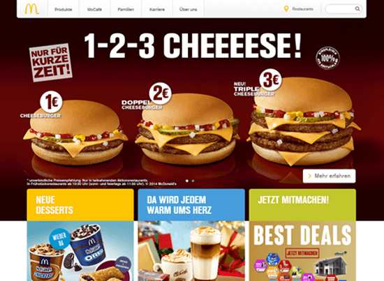
Occasionally, Asian and Western webdesign are poles apart. If you want a proof, check out the German and Chinese websites of a famous fast-food chain, or the Chinese news portal Tom.com. With its animated sequence of images, it may put some Western viewers on edge.
[caption id="attachment_87251" align="alignnone" width="550"] Asia – always visually powerful[/caption]
Image by sjswarts from Pixabay
Websites are also part of the culture in which most viewers move. If you want to design a website for a Chinese, Korean, Japanese or other Asian audience, you will need to deal with the culture and its differences to Western conventions. Doing so, you will come across the terms low-context and high-context cultures. In this article we want to explain the difference between both and how they influence webdesign.
 McDonald's China[/caption]
[caption id="attachment_87253" align="alignnone" width="550"]
 McDonald's Germany[/caption]
 Asia – always visually powerful[/caption]
Image by sjswarts from Pixabay
Websites are also part of the culture in which most viewers move. If you want to design a website for a Chinese, Korean, Japanese or other Asian audience, you will need to deal with the culture and its differences to Western conventions. Doing so, you will come across the terms low-context and high-context cultures. In this article we want to explain the difference between both and how they influence webdesign.
The Ambiguity of Messages
“I like you.” Is this a declaration of love, an expression of friendship, or just an ironic way of telling somebody that you can’t stand him or her? The right answer is: It depends. The actual message is the result of:- the situation in which the sentence is said,
- the relationship between the interlocutors,
- the mimic that accompanies the spoken word,
- and unspoken conventions on how to interpret nonverbal communication.
A Few Words on High- and Low-Context Cultures
The terms high-context and low-context cultures were introduced in the 1976 book “Beyond Culture” by the anthropologist Edward T. Hall. Communication in a high-context culture, to put it roughly, assumes much more unspoken similarities than in a low-context culture. For example, people in low-context cultures are more explicit with visual or spoken messages, whereas in high-context cultures the meaning of a message derives from the interaction of the message itself and unspoken conventions of interpretation. People who are not familiar with these conventions will have a harder time here than in low-context cultures. High-context cultures include China, Japan, Korea, Latin American and Arabian states, as well as Italy and France. Low-context cultures are, for example, Germany, Scandinavia, Australia and some parts of the USA. There is also a difference in the importance of the individual and individuality in general. The relationship between people is generally more important in high-context cultures, because this is the only way to define the necessary unspoken conventions. Conversely, the more society values individuality, the better people understand messages with less common conventions of interpretation. [caption id="attachment_87252" align="alignnone" width="550"] McDonald's China[/caption]
[caption id="attachment_87253" align="alignnone" width="550"]
 McDonald's Germany[/caption]

Great article….
Love the article, something I never considered before!
You bring up some really good points here, one especially awesome one. Web Designers never stop learning! Great examples as well.