Preparing Photoshop Files for Web Developers
By Brian Rhinehart
Whether you’re a freelance web designer or part of a team at an agency, handing off Photoshop files to a client, developer, development team or even another designer is part of the process of building websites.
Whereas the development process is generally more structured, by contrast, the design process is quite often spontaneous and full of experimentation. This can lead to a host of unused and unnamed layers that don’t end up as part of the final approved design. For developers, sifting through a quagmire of unnamed layers (Layer 1, Layer 1 copy, etc.) can be confusing and time consuming.

Designers can help their counterparts or clients before the design hand-off by taking 10 to 15 minutes to prepare files in a consistent and organized manner that can potentially save developers hours of production time. As an added bonus, an organized Photoshop file will save designers time by minimizing development questions after the file has been handed off for coding.
1. Prepping the File
First and foremost, make a copy of the Photoshop file that contains the approved design and add the suffix -prod to the file name. This way you can recognize a production file immediately and know that this file type is for development use only and not for further design refinements.
Guides and layout
Properly align and remove any unnecessary guides in the document. Keep guides to a minimum and only section off the major regions of the layout by outlining blocks of page content such as the masthead, content area, sidebar and footer so that the developer understands what basic structure the page should follow. Keeping the number of guides to a minimum also allows the developer to then add guides where needed to aid them in visually mapping out layout details in the code such as nested divs and navigation menus.
Include a color palette
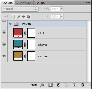
Create a layer group with its visibility turned off at the top of the Layers panel named “Palette.” Populate this group with layers using Layer > New Fill Layer > Solid Color... which are named to correspond to elements that will be colored using CSS. This allows developers to simply Double+click the layer thumbnail to get the color values they need from the Color Picker while coding.

The added “Palette” Layer Group.
2. Navigation and Button States
During the design process, it’s easy to overlook that navigation graphics should have at least three states of user interaction that will need to be defined in a stylesheet. Place each state on its own layer and name that layer to correspond to its function. As an example, using the following for the layer names of a top navigation element (topnav, topnav:hover, topnav:active) will help to establish a common naming convention and language that both the designer and developer mutually understand and recognize.
Create sprite groups of navigation or button layers or layer groups to ensure that what you envisioned as a designer will get executed in the code. Position the default state as the topmost layer within the group with the hover and active states below.
When creating sprite groups, it is also recommended that a consistent height be used for all of the states so that it is easier for the developer to calculate the background-position of the elements while coding the CSS.
![]()
Sprite groups showing the different navigation states.
3. Flattening Artwork
The purpose of flattening artwork is to preserve the approved design and to combine multiple layered elements into single layers that are more readily digested. Examples of this would be a base layer which is being used as a clipping mask and the secondary layers that are being clipped by that base layer, photomontages or a group of layers that comprise the background of a site.
Merging layers
Merge (Command+E) layers and layer groups that won’t require further editing by the developer. This not only reduces the visual impact of the Layers panel, providing a clearer road map for the developer, but also removes the chance of design elements getting accidentally altered during image slicing.
Fonts
Web safe fonts that are used for headings and copy should be left as editable text. This allows developers to easily check the Character panel to see what values need to be applied to font properties in the stylesheet.
In cases where image substitution is to be used for items such as navigation or stylized text treatments, flatten the type layers just in case the developer doesn't have a specific font available to them. Another method of preserving the appearance of a font would be to use Layer > Type > Convert to Shape in cases where the developer may need to resize a type treatment.
Smart objects
Smart objects are invaluable during the design process. They allow for resizing and styling with Smart Filters while remaining completely editable. However, once a design is approved these layer types should be rasterized or merged with other layers to reduce the overall file size as smart objects can often contain photos or other artwork that have a higher resolution (e.g. 300dpi) than is required for the final output of 72dpi. Another reason to flatten smart objects is to prevent a “File Not Found” error message should the developer Double+click the smart object layer thumbnail.
4. Organizing the Layers Panel
First things first, clean house. This means deleting any layers that are empty or are not going to be used in the final design, especially all the duplicated layers that were used to test ideas during the creative process. By doing a little housekeeping you have already made the file easier to read.
Name all layers
Once you have flattened and merged all the layers that will not require editing, go through and name all of the layers and layer groups. Use a naming convention that is not only well recognized, but also common to your work environment. One example would be to assign layers names that correspond to the CSS that would be used for that layer such as “button:hover.” The point is to establish and maintain the nonverbal communication between the designer and developer through common practices and language.
Use layer groups
Group like elements into consistent layer groups. For example, when designing a Wordpress theme, it would be logical to have layer groups with the names “Header,” “Content,” “Sidebar” and “Footer.” It’s also good practice to group like items that constitute a navigational element or other design elements that have multiple states such as icons, buttons and menus.
Mirror the layout
Start from the top of the page layout and work your way to the bottom, arranging the layers and layer groups in descending order to correspond with their position in the design. In this manner a developer can quickly scan through the layer names to identify where a particular design element is located within the Layers panel based on its visual location in the design. This is especially helpful should they need to isolate it for editing or slicing.
Use nested layer groups that reflect the hierarchical structure of the layout. A layer group called “Sidebar” might contain layer groups “search” and “advertising.” Nested layer groups can also illustrate to the developer how elements are arranged structurally within the HTML.

An example of a hierarchically structured Layers panel.
5. Handing off the PSD
When the file has been prepared, don’t just send the file in an e-mail or upload it to the development server. Schedule a hand-off meeting and take the time to go over the file(s) with the developer to ensure that they have a firm understanding of how the end product is supposed to not only look, but behave in terms of user interaction. In the end, both designers and developers will save valuable time.
About the author
Brian Rhinehart is a freelance designer, illustrator who has been working in the media and design industry for the past sixteen years. When he’s not working for clients, he spends his time illustrating or maintaining Illustration Toolbox, an inspiration gallery and blog dedicated to all forms of illustration.

Thanks, this is very helpful as a designer. I’m curious whether developers accept fireworks files in place of photoshop? Is photoshop better?