Practical Typography: The Only Book You’ll Need to Turn Pro
Matthew Butterick is a writer, typographer and lawyer from Los Angeles. As a lawyer he is aqcuainted to reading professionally produced material, as a writer he wants to stick to the same standards, and as a typographer he creates the fonts needed to achieve that. Besides outstanding fonts Butterick also created the web-based book "Practical Typography" which I stumbled upon just recently. "Practical Typography" wants to equip the average designer, writer, anyone with typographical basic knowledge. Butterick promises to elevate your skills to reach a level that is higher than that of 99 percent of your fellow designers/writers.

Practical Typography: Not for Free
"Practical Typography" is still more or less unknown. Matthew started it already more than a year ago, yet didn't promote it in any way besides word of mouth. Still 650,000 readers took notice of the book in its first year. I'd call this a major success as far as awareness is concerned, so does Matthew.
Although the book is web-based doesn't mean it's free. It does not require you to pay upfront, though. You are free to read it and then financially support it in a variety of possible ways. In its first year the over-all success of this voluntary payment model has to be called pretty mediocre. Only one of 650 readers supported the project. Still, with more than 650,000 readers the absolute amount grew high enough to call the project successful - at least compared to a traditionally published book with 1,000 to 3,000 sales.
Practical Typography: For the Likes of You and Me
Matthew's book is easy to read. He does not only write about typography, he brings typography to life to transport his message. To achieve this, Matthew created his own content management system named Pollen, which he is now offering to other authors.
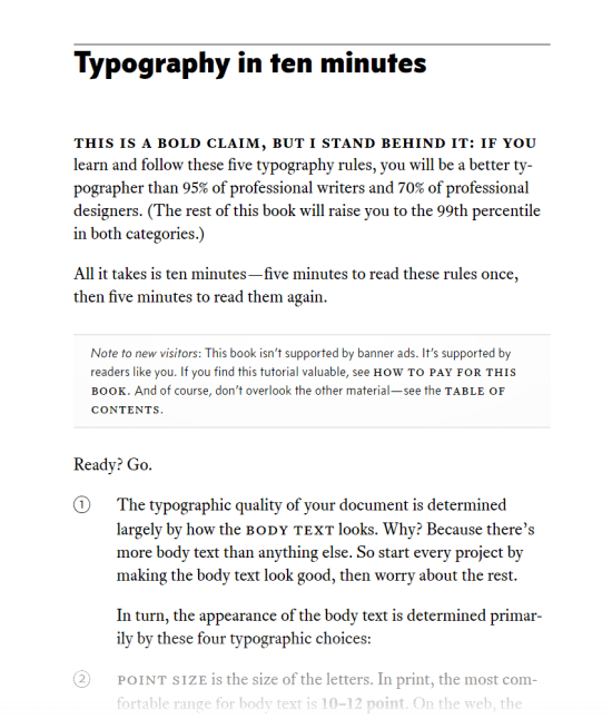
"Practical Typography" is not overly theoretical. You don't need a university degree to understand it. Instead Matthew makes his points clear in simple words. To lower the threshold even further the book starts with an executive summary that promises to make you a better typographer in ten minutes. Five simple rules read twice are enough to sharpen your mind and set you apart from most of your colleagues.

"Practical Typography" as a best practice example of typography in itself is not available in any other format. You can't buy it as an e-book. This is part of the experiment. Matthew wants to see where pure web publishing leads to economically. Additionally, he didn't want to sacrifice typography for a format such as epub or a paper look-alike PDF document.
Practical Typography: From Characters to Documents
If you are looking for a thorough introduction to typography, "Practical Typography" is definitely for you. Matthew starts with simple rules to keep the threshold low and readers' interest high, then turns to explanations of individual characters and their correct typographical uses. From there he moves to formatting and font choice and then advances to sample documents, with the latter most likely being the most interesting part for most.
If you were just about to write that résumé, make sure to read Matthew's tips on that. Typography is for the reader, not for the writer. And as far as résumés are concerned, the reader might sort you out and not invite you to that interview, just because your paper lacks elemental typography. At that point I guess you're hooked.
Head on over and make sure to pay what you like if you like what you read...

Wow this is great; however, I skimmed through it and found a paragraph (On the line numbers chapter, paragraph 1) with the word “Documented” hyphenated, which I though was frowned upon but could be wrong, maybe I’ll read this to find out! Thanks for the link, very nicely done.