Photoshop Etiquette: Basic Knowhow for Designing The Web Using Photoshop
Adobe's Photoshop still is the market's most common and most popular choice for professional designers. Besides photography and print design, which Photoshop once got invented for, it is widely used in the designing of websites, too. The last ten years saw the product grow in functionality especially in terms of web design features. A large part of the world's most successful websites started as a draft in Adobe's market leader. Photoshop Etiquette is a new and free service, aiming at beginners in web design with Photoshop. It offers the absolute basics and makes for a very good starting point.
 Photoshop Etiquette
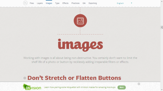
 Photoshop Etiquette: Working with Images
Apart from that, Photoshop Etiquette has practical tips on design in general. You'll probably know that skewing or otherwise deforming texts and images is not a thing to do, but did you know, that you should refrain from scaling text using free transform, instead sticking to whole pixel values? Or did you know, that in the early project stages, where you are still drafting out what might or might not become the client's new web-home, you should refrain from using destructive effects and filters, thus preferably using smart objects instead?
 Photoshop Etiquette
Photoshop Etiquette: Eight Chapters To School You
As Photoshop Etiquette delivers the most basic information and support, its audience recruits itself from beginners and not that advanced users. Eight Chapters cover the handling of files, layers, images, typography, effects and practices as well as techniques for quality control and exporting the results. Besides the more technical aspects, the site details how you should organize and administer a web project from within Photoshop. This includes appropriate naming conventions, grouping of files and elements, anything needed to keep your stuff together and still be able to understand one year in advance what you did today and why you did it. From my own experience, this really is an essential part in the process of building up a website, that should not be missed upon. Photoshop Etiquette: Working with Images
Apart from that, Photoshop Etiquette has practical tips on design in general. You'll probably know that skewing or otherwise deforming texts and images is not a thing to do, but did you know, that you should refrain from scaling text using free transform, instead sticking to whole pixel values? Or did you know, that in the early project stages, where you are still drafting out what might or might not become the client's new web-home, you should refrain from using destructive effects and filters, thus preferably using smart objects instead?

Not sure if this was in there or not, but in Photoshop I like to arrange my layers (as much as possible) from left to right, top to bottom. It is how our brains work, and it makes it a hell of a lot easier to find elements in my PSD.
Which font did you use for Etiquette?