Newsletter Design: How to Create Effective Modern Emails
Designing an email newsletter is a task that has to be approached with multiple aspects in mind. Aesthetics are one, while marketing goals are another. We'll show you how to cover all aspects at once.
Of course, an email newsletter has to look nice. Why? Because people prefer using pretty things. And if users with an inbox filled to the brim have the choice between opening a message with a good looking preview and one that looks as dry as the information it most likely contains, which one will they choose?
By the way, we have recently looked into the question if the email newsletter is dying, or even dead already. I'm sure you can get some additional information from this article.
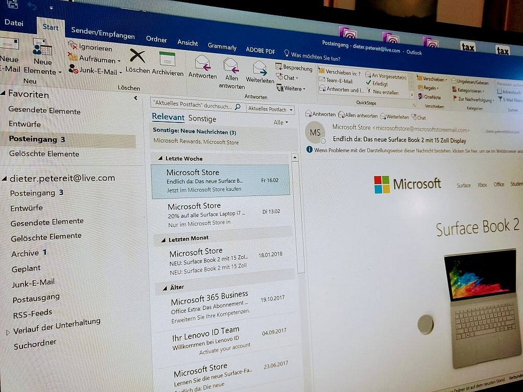 Outlook, the dread of all email designers. (Photo: D. Petereit)[/caption]
Go for strong images, as text deserts are not attractive. Don't use just about any image, though, but go for those that support the text and the general goal of the newsletter.
However, you need to consider those users that have deactivated the display of images on purpose or automatically. The amount of these users is said to be 43 percent of all users of Gmail. Here, you should fall back to techniques such as formatted ALT attributes, that let you create the impression that it was supposed to look like this, rather than displaying empty boxes. The structured use of background colors also alleviates the effect of missing images by a lot.
What you should definitely avoid is sending out emails that only consist of images. The trend of creating email newsletters via Photoshop and then slicing them is not that long ago but has luckily gone by now.
The visual connection to your brand should be clear at all times. Even if your logo is not visible anymore, while scrolling down, the general design, including colors, division, typography, should be recognizable as the design of your brand.
Speaking of typography: in emails, we use fonts that are likely to exist on the readers' systems and forgo those that we have to supply in some way or another. Fonts like Arial, Verdana, Helvetica, Georgia, Tahoma, Lucida, Trebuchet, and Times are considered approved. 14 px for longer and 16 px for short text passages have been proven to be the optimal text size.
The concept of above the fold still applies in newsletter design. The most important information should be displayed in the window of the email client, without the user having to scroll down. In web design, over the past years, we notice that the concept is losing importance. Once you arrive at a site, you seem to be ready for scrolling. In the email client, that will be the case, too. However, you will scroll through the list of entries instead.
[caption id="attachment_104160" align="aligncenter" width="1000"]
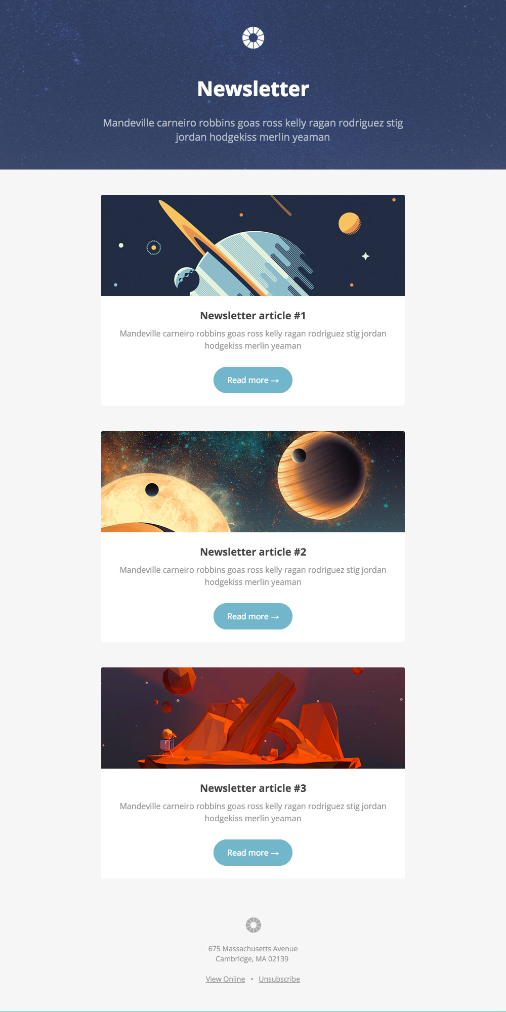 Free modern email newsletter template. (Source: litmus)[/caption]
The effects of the attention economy also support the significance hierarchy. What you definitely want to communicate always goes at the beginning. Journalists train to exhaustion to write texts that can be shortened from the bottom on up, without damaging their central message.
Optimally, when placing links, they should only be links to your own website. SEO aspects can just be ignored here. If you have space, you should set plenty of links.
To make the newsletter perceptible as a personal message, you should not go for multi-column layouts. Naturally, an email is successful in story mode. The message is mediated from top to bottom, only interrupted by one or a few calls to action.
Further Reading
Common Problems in Email Newsletter Design
Usually, email newsletters are used to turn prospects into customers. In this function, the newsletter serves as some shop window of a store in the pedestrian area. If it looks dull, the pedestrians walk past it. With your newsletter, you have the significant advantage that potential customers have already actively decided to receive your virtual shop window in their inbox. However, you have to convince them every time. After all, the "unsubscribe" link is mandatory in some countries. One thing that makes your life as a newsletter supplier hard are the many different email clients that your potential customers use to open their emails. Even Gmail has only recently integrated a somewhat usable HTML rendering engine. Outlook is still dreaded. What makes this even harder is the fact that more than half of all emails are opened on a mobile device first. Thus, you can't avoid responsiveness as a design essential. The mentioned restrictions are the reason why creativity is less critical than the technology itself when it comes to newsletter design.Newsletter Design From a Marketing Perspective
Let's start with the marketing aspects. Here, it is essential to identify the goal of your newsletter. Do you want to generate traffic to your website by sending out article teasers, or do you want to sell products from within your newsletter? Are you merely looking for a more personal way of communication? A mix would be connecting seemingly personal messages with selling products recommended in said messages. Service freelancers send out information that is potentially relevant to the target group, with the goal that the recipients of the email remember the sender as a competent expert, or even ask for more in-depth information and services, based on the brief information in the newsletter. Not all of the mentioned email newsletters can and should be created in the same way. The goal of the newsletter and the target group's expectations should be kept in mind. Reminder: Before you get to the design of your newsletter, you need to be as aware of its goal and the target group as possible. Based on your goal and target group, approach the further deliberations. There are very general rules that apply here. If you can only remember two rules, or just want to use two, you should go with these:- Keep it as short as possible
- Place one (or few) obvious calls to action
Email Newsletter Design From a Design Perspective
The design aspects are subordinated to the marketing goals as well. Thus, these are not recommendations that can be made independently, regardless of the marketing aspects. Instead, many parts of the design are a result of the restrictions. Not all email clients provide a preview of the received email from within the inbox. Often, your potential readers also have the previews turned off. In these cases, your email subject is the only element you have to convince your recipient to read the newsletter. In any case, you need a stable subject to prevent your newsletter from drowning in the stream of mail. This is where you'll face the question "clickbait or not." Of course, I never recommend subjects that announce something that the newsletter does not even provide. Nonetheless, a bold wording approach should help you get your content out there. [caption id="attachment_104159" align="aligncenter" width="1024"] Outlook, the dread of all email designers. (Photo: D. Petereit)[/caption]
Go for strong images, as text deserts are not attractive. Don't use just about any image, though, but go for those that support the text and the general goal of the newsletter.
However, you need to consider those users that have deactivated the display of images on purpose or automatically. The amount of these users is said to be 43 percent of all users of Gmail. Here, you should fall back to techniques such as formatted ALT attributes, that let you create the impression that it was supposed to look like this, rather than displaying empty boxes. The structured use of background colors also alleviates the effect of missing images by a lot.
What you should definitely avoid is sending out emails that only consist of images. The trend of creating email newsletters via Photoshop and then slicing them is not that long ago but has luckily gone by now.
The visual connection to your brand should be clear at all times. Even if your logo is not visible anymore, while scrolling down, the general design, including colors, division, typography, should be recognizable as the design of your brand.
Speaking of typography: in emails, we use fonts that are likely to exist on the readers' systems and forgo those that we have to supply in some way or another. Fonts like Arial, Verdana, Helvetica, Georgia, Tahoma, Lucida, Trebuchet, and Times are considered approved. 14 px for longer and 16 px for short text passages have been proven to be the optimal text size.
The concept of above the fold still applies in newsletter design. The most important information should be displayed in the window of the email client, without the user having to scroll down. In web design, over the past years, we notice that the concept is losing importance. Once you arrive at a site, you seem to be ready for scrolling. In the email client, that will be the case, too. However, you will scroll through the list of entries instead.
[caption id="attachment_104160" align="aligncenter" width="1000"]
 Free modern email newsletter template. (Source: litmus)[/caption]
The effects of the attention economy also support the significance hierarchy. What you definitely want to communicate always goes at the beginning. Journalists train to exhaustion to write texts that can be shortened from the bottom on up, without damaging their central message.
Optimally, when placing links, they should only be links to your own website. SEO aspects can just be ignored here. If you have space, you should set plenty of links.
To make the newsletter perceptible as a personal message, you should not go for multi-column layouts. Naturally, an email is successful in story mode. The message is mediated from top to bottom, only interrupted by one or a few calls to action.
Further Reading
- Is the Email Newsletter Dead? | Dieter Petereit, Noupe
- 10 Rules to Make Your Email Newsletter Design Beautiful yet Effective | Karolina Jasvinaite Petraskiene, Omnisend
- Email Newsletter Design Best Practices | Bogdan Sandu, Design your Way
- Beautiful Email Newsletters | Showcase with a ton of pretty newsletter designs
- The Ultimate Guide to Email Image Blocking | Lauren Smith, Litmus
- Online Marketing Basics #6: Introduction to Email Marketing | Manuel Diwosch, Noupe
