New Simbla 2016: Responsive Websites for Everyone

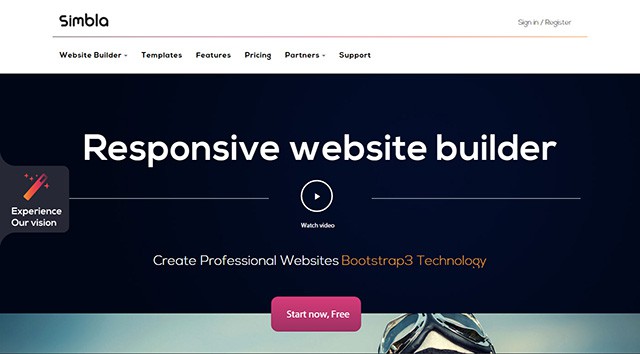
Thanks to plenty of building kits and website builders, it's possible to create a website easily and without any knowledge of HTML, CSS or JavaScript. However, these websites often lack quality regarding design and technology. Simbla is a website builder directed to both, professionals that speak HTML fluently and laymen that simply want to create a website via drag and drop. Websites created using Simbla are responsive and thus suitable for the display on mobile devices such as tablets and smartphones.
 Gallery With Templates
If you prefer working without templates, you can as well start off with an empty website and build it up from scratch.
What further sets Simbla apart from the competition is the new Theme Maker. This tool allows you to take a theme as a template and derive your own theme from it. All the template's areas are customizable within the visual interface of Theme Maker.
 Setting Up a Master Page With Fixed Elements
Of course, you can also set up multiple pages within a website project. You can add these to a navigation in the header or footer area. All pages are individually customized and filled with content. There is also the option to set up so-called master pages. Here, fixed areas, which will be the same on all pages, can be defined. Master pages assure that all pages keep these fixed areas. It's also possible to create multiple master pages for one website.
 Defining an Element's Appearance
Every master page has a „Dynamic Content“ area. This serves as a placeholder to place the individual content of the single pages on later.
 Intro Element
As the importance of videos is constantly growing, Simbla provides unique content elements for them as well. You can integrate both YouTube videos and HTML5 videos from any desired source. Simbla also supports the popular trend of incorporating videos as a background. To do that, a library with plenty of videos to choose from is provided. You can also set whether to play the video in a loop or just once.
There's a new carousel element for the presentation of images which allows you to display images as image sliders. Simply choose images and decide on a slide or fade effect to be displayed when switching between images. You can customize the time until the automatic image change. Also, choose the design of the pagination and the navigation arrows.
There are special intro elements for the design of your landing page. You can attract attention with impressive large format images and incisive headlines. You can easily place videos, links and sliders in an intro as well.
 Adjustable Size for Containers
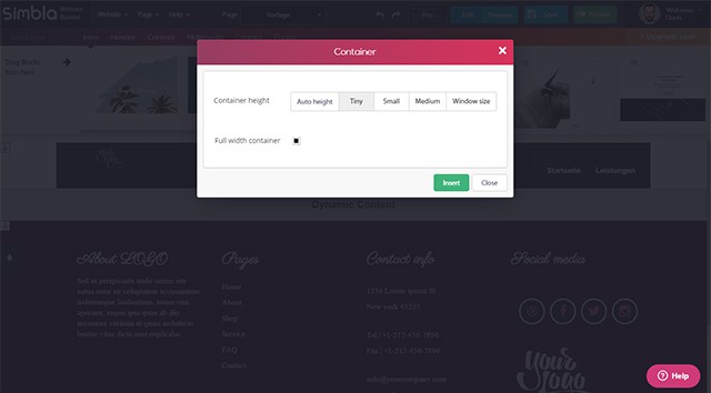
If you prefer a classic presentation with borders on the sides, you simply do that. You can also adjust the height of the containers. A container adapts to an automatic height or the full window height. Sizes in between, ranging from tiny to small to large are also possible.
Thanks to the setting options for container sizes, you are very flexible when it comes to displaying and designing your website.
 Integrated Image Editor
Once your website is set up, the diligence work begins. Texts and images need to be implemented. This is done fast and uncomplicated, thanks to integrated text and image editing.
 Integrated Text Processing
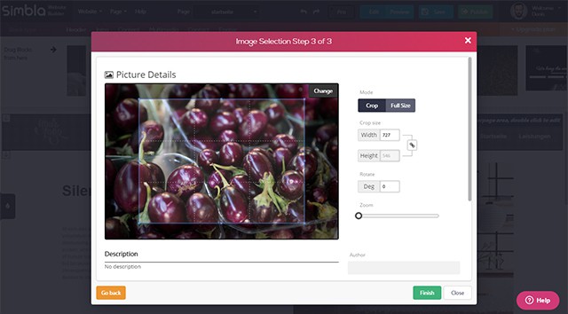
Images are cropped and enhanced or scaled down with the integrated image editor. You can rotate the image and define a section. Image material is available in a media gallery with plenty of categorized photos. Of course, it is also possible to upload your own images or use images from external sources.
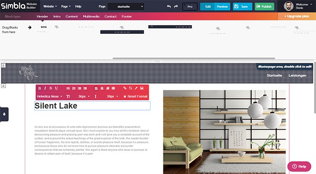
You can directly enter text int the website builder. Due to the integrated text editor, all standard format options are available. Font type, size and color definable, as well as the text orientation. Enumerations, indentations, and text links are also possible.
 Display in Pro Mode
Additionally, there is a particular HTML element only available in Pro mode. It allows you to implement HTML source code into the website. Everything that Simbla does not offer already can be added this way.
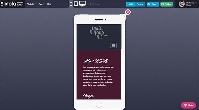 Preview for Different Devices
When setting up and designing a website with Simbla, you don't need to worry about the display on mobile devices. Especially laymen and semi-professional web designers should benefit from this.

Starting With a Template or an Empty Page
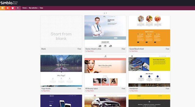
Once you have registered for the Simbla Website Maker for free, you can instantly set up your first website. Those that don't want to design their websites from scratch can choose one of many free templates. The templates are filled with example content and come with a live demo that delivers a solid impression of the template's appearance and functionality. The templates are categorized to make sure you find the right one for your project quickly. There are branch categories for gastronomy, technology and property, for example. This allows you to find a matching template for your business or other use cases that you can customize later on. Gallery With Templates
If you prefer working without templates, you can as well start off with an empty website and build it up from scratch.
What further sets Simbla apart from the competition is the new Theme Maker. This tool allows you to take a theme as a template and derive your own theme from it. All the template's areas are customizable within the visual interface of Theme Maker.
Defining Master Pages and Setting Up Websites
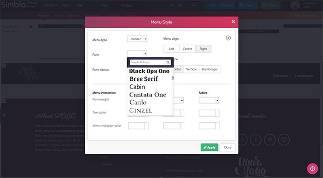
It doesn't matter whether you start with a template or with an empty page: All contents of the website are designed modularly. There are header and footer elements to contain e.g. the logo, navigation as well as social media links. All elements are already designed. Colors and fonts are deposited in a theme. You can choose one out of different themes from a palette. Of course, you can also adjust the appearance of all elements as you wish to. Colors, fonts, sizes, and positions are all to be defined freely. Every element placed on the website has two menu options: „Edit“ and „Design“, which can be used to adjust functionality and appearance. For the header, there is the option to choose whether the header should be fixed while scrolling or if it should fade out and slide in. Depending on the element, different menu options are available. For the navigation, you define the appearance of the single menu options. These are displayed as simple text, framed text or as text in a rounded rectangle. Font and colors are also editable. When choosing a font, the system fonts, as well as plenty of web fonts, are available. Setting Up a Master Page With Fixed Elements
Of course, you can also set up multiple pages within a website project. You can add these to a navigation in the header or footer area. All pages are individually customized and filled with content. There is also the option to set up so-called master pages. Here, fixed areas, which will be the same on all pages, can be defined. Master pages assure that all pages keep these fixed areas. It's also possible to create multiple master pages for one website.
 Defining an Element's Appearance
Every master page has a „Dynamic Content“ area. This serves as a placeholder to place the individual content of the single pages on later.
Content Variety: Text, Images, Videos, and Intros
There is a bunch of elements that allow you to integrate text and images in different ways. There are classic templates to combine texts and images. There are also templates for team presentations, on which you can add captions to the pictures. Intro Element
As the importance of videos is constantly growing, Simbla provides unique content elements for them as well. You can integrate both YouTube videos and HTML5 videos from any desired source. Simbla also supports the popular trend of incorporating videos as a background. To do that, a library with plenty of videos to choose from is provided. You can also set whether to play the video in a loop or just once.
There's a new carousel element for the presentation of images which allows you to display images as image sliders. Simply choose images and decide on a slide or fade effect to be displayed when switching between images. You can customize the time until the automatic image change. Also, choose the design of the pagination and the navigation arrows.
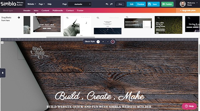
There are special intro elements for the design of your landing page. You can attract attention with impressive large format images and incisive headlines. You can easily place videos, links and sliders in an intro as well.
Full Width for Content
By default, all content that you add is displayed over the full width of the browser window, as you know it from many contemporary websites. However, you can also edit the width and height of your content containers. Adjustable Size for Containers
If you prefer a classic presentation with borders on the sides, you simply do that. You can also adjust the height of the containers. A container adapts to an automatic height or the full window height. Sizes in between, ranging from tiny to small to large are also possible.
Thanks to the setting options for container sizes, you are very flexible when it comes to displaying and designing your website.
Adding Content Via Text and Image Editing
 Integrated Image Editor
Once your website is set up, the diligence work begins. Texts and images need to be implemented. This is done fast and uncomplicated, thanks to integrated text and image editing.
 Integrated Text Processing
Images are cropped and enhanced or scaled down with the integrated image editor. You can rotate the image and define a section. Image material is available in a media gallery with plenty of categorized photos. Of course, it is also possible to upload your own images or use images from external sources.
You can directly enter text int the website builder. Due to the integrated text editor, all standard format options are available. Font type, size and color definable, as well as the text orientation. Enumerations, indentations, and text links are also possible.
Pro Mode for More Options
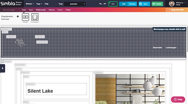
By default, Simbla is operating in a mode that allows visual and content editing using a graphical user interface. In the so-called Pro mode, further options for a more in-depth editing are available. For example, the single elements of an area, like containers, rows, and lines, can be edited individually. The Pro mode is switched on and off using a simple button. It should only be used by experienced users, as the sophisticated editing options come at the cost of clarity. However, Pro mode gives you full control over all of the content. Display in Pro Mode
Additionally, there is a particular HTML element only available in Pro mode. It allows you to implement HTML source code into the website. Everything that Simbla does not offer already can be added this way.
Individual CSS, JavaScript and Media Queries
If the variety of options to provide and alter content is not enough, you can individually add CSS and JavaScript using an editor. Especially the option to deposit your own JavaScript opens up many doors. You can even edit select device and browser sizes with the media queries editor. By default, pixel information for tablets and smartphones is deposited. But it is also possible to enter a custom resolution.Responsive Preview
The unique thing about Simbla is, as mentioned before, the responsive design of all websites. There is a preview page that displays the site as a desktop, tablet or smartphone version. Images are displayed either enhanced or scaled down to a responsive layout. The menu is displayed via the famous burger icon and content aligned in columns is displayed underneath each other. Preview for Different Devices
When setting up and designing a website with Simbla, you don't need to worry about the display on mobile devices. Especially laymen and semi-professional web designers should benefit from this.

This seems like a pretty nifty tool for putting together a website. The trouble comes when businesses don’t have the time or resources to put together the website themselves. In those moments it might be worth exploring the option of professionals.
I just tried Simbla out. It’s very intuitive and produced a nice design. Nice option if you want to use a drag and drop builder.
Hmm,very interesting.. the responsive preview looks very promising and looks just perfect for my next project.
Gotta say it is quite nice.