Mobile Navigation Via Taps and Gestures Instead of the Mouse

Mobile web has strongly influenced our habits of when, how, and where we use the world wide web. The way of how we navigate through websites has changed the most. A few years ago, the mouse had the main responsibility for the navigation, and now, tablets and smartphones are controlled via simple taps and gestures. Thus, contemporary websites should definitely consider taps and gestures when it comes to user interfaces and mobile navigation.
 Navigation Via Hover Effect on Fotolia
Of course, web developers can generally forgo hover effects to guarantee a homogeneous user interface on desktop and mobile devices. Or you could choose to take a different approach for desktop and mobile devices. If the hover effect is only used as ornamental art, you should just leave it out on mobile devices.
When information, like texts, is displayed using a hover effect, you should find a way to display them without the hover effect for mobile devices.
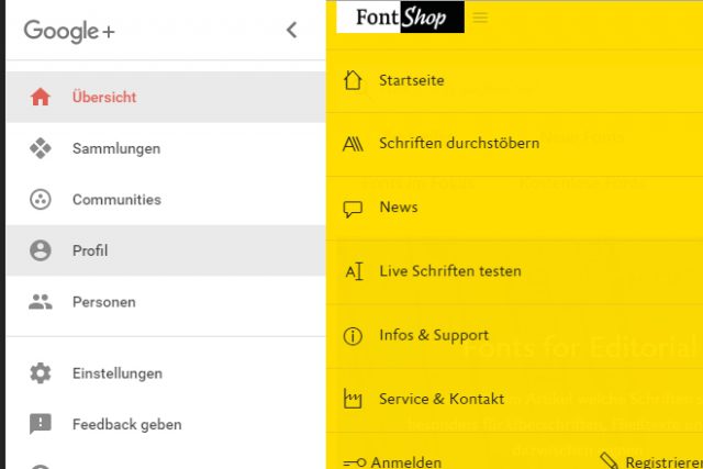
 Example for Menus With Sufficient Size: Google+ and FontShop
While the mouse allows you to click small links and buttons very precisely, the finger tap is not as accurate. Thus, you should make sure that your elements are large enough on mobile views. It is also important to leave enough space between the individual elements. All of this prevents the visitor from accidentally choosing a wrong link or button.
If you want to distinguish between desktop and mobile view, you could, once again, use the "pointer" designation to design different menus and forms.
Making the design of these elements dependant on a device's display width, like it's common in responsive weblayouts, doesn't make much sense. After all, tablets are also operated via taps and gestures, and usually, they display the desktop view.
 Gestures Supported by Hammer-JS/
This way, you react to swipe gestures as well as rotation and zoom gestures. As JavaScript doesn't know any gestures, you need to create the using touch events, or by using according frameworks like Hammer.JS, which knows common gestures, allowing it to react to them with unique actions or functions.
The Hover Problem
Navigation on a smartphone or tablet works fine without paying close attention to taps and gestures. Links are opened via tap instead of a click, and scrolling is done by swiping. However, when it comes to hover effects, which are quite popular in web design, mobile devices will already give you trouble. That's because a hover effect, using the CSS pseudo class ": hover", for example, just doesn't exist on mobile devises, and thus, it won't be triggered when calling up links via tap. So, when equipping links with hover effects, the link target and the hover effect are processed at the same time on mobile devices. At best, the visitor will see the hover effect for a short period of time, until the page referenced in the link is accessed. Navigation Via Hover Effect on Fotolia
Of course, web developers can generally forgo hover effects to guarantee a homogeneous user interface on desktop and mobile devices. Or you could choose to take a different approach for desktop and mobile devices. If the hover effect is only used as ornamental art, you should just leave it out on mobile devices.
When information, like texts, is displayed using a hover effect, you should find a way to display them without the hover effect for mobile devices.
Media Query and "pointer"
CSS might not give you an explicit way to choose between controls via mouse, and touch displays. However, the "pointer" designation allows you to distinguish between high and limited pointer accuracy. On touch devices, "pointer" hands out the value "coarse", which is equivalent to a limited accuracy. For other devices, the value "fine" is used for a high precision.@media (pointer: fine) {
a:hover p {
display: block;
}
}
In the example, a paragraph within a link is only displayed via hover when using a device with a high pointer accuracy, as that means that it's controlled with a mouse. This way, you are able to operate your website depending on the control concept - mouse or touch -, without using JavaScript.
Links and Buttons Require Space
Aside from hover effects, there's another aspect that you should consider when designing mobile user interfaces: the size of and the distances between links and buttons. Example for Menus With Sufficient Size: Google+ and FontShop
While the mouse allows you to click small links and buttons very precisely, the finger tap is not as accurate. Thus, you should make sure that your elements are large enough on mobile views. It is also important to leave enough space between the individual elements. All of this prevents the visitor from accidentally choosing a wrong link or button.
If you want to distinguish between desktop and mobile view, you could, once again, use the "pointer" designation to design different menus and forms.
Making the design of these elements dependant on a device's display width, like it's common in responsive weblayouts, doesn't make much sense. After all, tablets are also operated via taps and gestures, and usually, they display the desktop view.
Reacting to Gestures Via JavaScript
By default, links and buttons are triggered with a simple tap on mobile. However, you can also react to gestures by using touch events. These are similar to the well-known mouse events. As such, there are events that are triggered at the start and end of a touch, as well as during the motion on the display.document.getElementsByTagName("body")[0].addEventListener("touchmove", function(e) {
console.log(e.touches[0].pageX);
console.log(e.touches[0].pageY);
}, false);
In the example seen above, the event "touchmove" activates a funtion that writes down the position of the touch inside the browser window ("pageX" and "pageY") into the console. All taps are captured as arrays using "touches[]", by the way. Thus, if there are two fingers on the display at the same time, both moves and their positions are available to you via "touches[0]" "touches[1]".
 Gestures Supported by Hammer-JS/
This way, you react to swipe gestures as well as rotation and zoom gestures. As JavaScript doesn't know any gestures, you need to create the using touch events, or by using according frameworks like Hammer.JS, which knows common gestures, allowing it to react to them with unique actions or functions.
