The Most Beautiful Layer Fonts and How to Use Them in Web Design
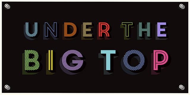
Multi-colored text is no invention of digital typography. In the 19th century already, there were some fonts that were divided into two or more cuts so that they can be printed above each other in different colors. The OpenType Format provides these so-called layer fonts for digital use as well. Especially for 3D and shadow effects, plenty of fonts that allow for multi-colored display are available. Thanks to these web fonts, you can even use the multi-colored texts in web design.
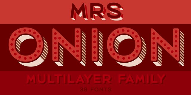
 "Mrs. Onion", which is structured similarly to "Core Circus", offers a couple more cuts - 38 in total. Here, however, you have the option to display the individual sides of the three-dimensional font in different colors. There are separate cuts for the lower and the right sides. Additionally, shaded and dotted cuts are available for the front side.
You can combine up to six cuts without any problems, and thus, you receive very detailed multi-colored texts which are a perfect fit for spacious headings.
 "Epilepsja" comes with a slightly different 3D look. The font plays with the illusion of three-dimensionality. This creates the impression of a 3D effect here and there. At some point, however, the font appears to be two-dimensional again.
There are three cuts which display contour, filling, and background. The "Epilepsja" is flashy in any way and is certain to create some confusion here and there.

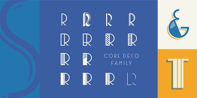
 The "Core Deco" resembles the fonts of Art Déco. The font has the large curves and strict geometric alignment, which were typical for this style of typography. Hatching, shadows, and 3D effects are all available as own cuts so that they can be displayed in separate colors.
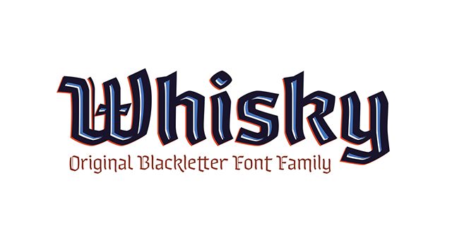
 "Whisky" goes to prove that even fractured fonts can be interpreted in a contemporary way. There are different types of bold surface cuts that you combine with various strengths of contour cuts. This creates unusual effects which you can use to play around with the classic perception of fractured fonts.
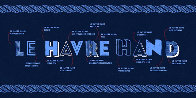
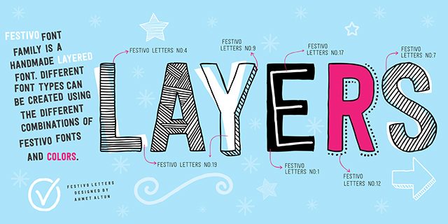 "Le Havre Hand" also simulates a hand-drawn font. Here, even a 3D look is available. Shading of different strengths is combined with contour drawings and creates massive letters which still have a playful look.
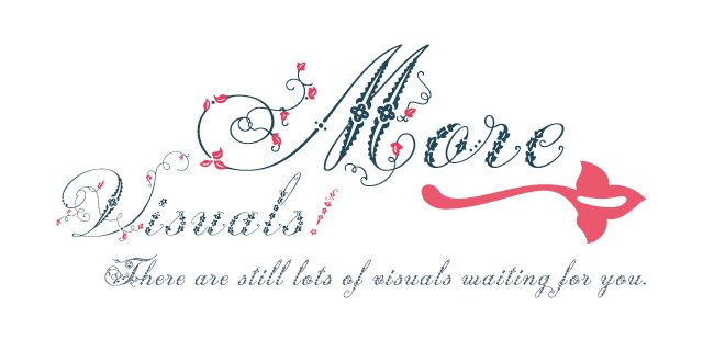
 If you prefer a more filigree look, you might like the "Weingut." The elegant font is decorated with floral elements and appears quite noble yet playful. For an individual look, there is a decorative cut which you can use to add floral elements in a different color.

What Exactly Are Layer Fonts?
Layer fonts are special types of fonts for which the cuts are designed in a way that they can be overlapped. Often, decorative elements like shadows, contours or three-dimensional pages can be combined this way. When you assign a color to each of the font layers, this creates flashy headings and striking texts. Drawing and desktop publishing programs like Illustrator and InDesign offer simple ways of using layer fonts. Later, I'll explain how to use layer fonts in web design using CSS3. First, I'll present some of the most beautiful and exciting multi-colored fonts that are available as web fonts.Three Dimensional Fonts
Multi-colored display is especially useful for fonts with a three-dimensional appearance. The "Core Circus" is certainly one of the most interesting layer fonts for that reason. There are 20 different cuts that can be combined in a variety of ways. There are some that simulate three-dimensionality. These can be combined with one of the plethoras of flat cuts which can be used as the front of the 3D font, for example. Apart from lines and hatching, there are dotted cuts as well. Last but not least, there are several shadows you can add. "Mrs. Onion", which is structured similarly to "Core Circus", offers a couple more cuts - 38 in total. Here, however, you have the option to display the individual sides of the three-dimensional font in different colors. There are separate cuts for the lower and the right sides. Additionally, shaded and dotted cuts are available for the front side.
You can combine up to six cuts without any problems, and thus, you receive very detailed multi-colored texts which are a perfect fit for spacious headings.
 "Epilepsja" comes with a slightly different 3D look. The font plays with the illusion of three-dimensionality. This creates the impression of a 3D effect here and there. At some point, however, the font appears to be two-dimensional again.
There are three cuts which display contour, filling, and background. The "Epilepsja" is flashy in any way and is certain to create some confusion here and there.

Historical Fonts
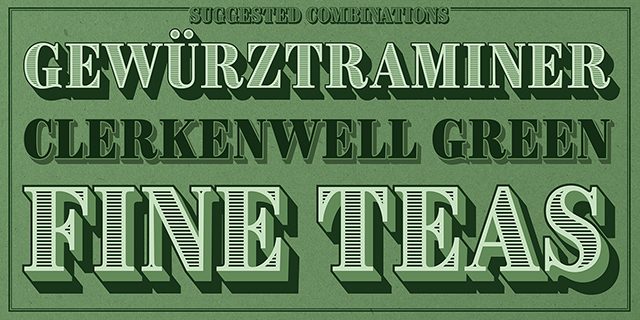
Alongside interesting 3D effects, layer fonts are always fitting to rehash historical fonts. Especially in times before digital typography, many typographic effects were created with large amounts of manual effort. Thanks to layer fonts, these effects can now be created in no time. "Brim Narrow," for example, is a font that orientates itself towards classic fonts of the 18th century. It reminds the user of detailed and delicately drawn fonts that you know from money bills and other valuable documents. The "Core Deco" resembles the fonts of Art Déco. The font has the large curves and strict geometric alignment, which were typical for this style of typography. Hatching, shadows, and 3D effects are all available as own cuts so that they can be displayed in separate colors.
 "Whisky" goes to prove that even fractured fonts can be interpreted in a contemporary way. There are different types of bold surface cuts that you combine with various strengths of contour cuts. This creates unusual effects which you can use to play around with the classic perception of fractured fonts.

Handwriting
Handwritten or drawn texts are always very popular, both playful and with an elegant typography. Here, I'll show you some layer fonts that shine with special effects. "Festivo Letters" simulates a pen-drawn font. Letters are partially shaded, partially outlined by dots, and hand-colored. The combination of different cuts allows you to integrate colors. This supports the playful character of the font. "Le Havre Hand" also simulates a hand-drawn font. Here, even a 3D look is available. Shading of different strengths is combined with contour drawings and creates massive letters which still have a playful look.
 If you prefer a more filigree look, you might like the "Weingut." The elegant font is decorated with floral elements and appears quite noble yet playful. For an individual look, there is a decorative cut which you can use to add floral elements in a different color.

Using Layer Fonts in Webdesign
If you want to use layer fonts on your website, the respective cuts of the font are needed as a web font first. Now, of course you have the option to draw and overlay multiple elements with the same text. However, this variant is not recommendable as the same text would be present multiple times. Thus, the combination of the pseudo elements "::before" and "::after" with a data attribute are preferrable. For that, the text set in the layer font is marked with just one element. This element receives an HTML5 data attribute which contains another copy of the text.<p data-text="Noupe Magazine">Noupe Magazine</p>
Semantically, the value of the attribute "data-text" is irrelevant. It's only required as you need to have access to the attribute's content via CSS. Now, everything else is also done via CSS. Assign the cut that you want to display in the background to the "<p>" element using CSS.
p {
  font-family: "LayerFont 1";
  color: blue;
}
Then, make sure that the pseudo element "::after" gives out the content of the data attribute. The placement is absolute, so that it lies above the actual "<p>" element. Additionally, assign the font for the background and a different color to "::after".
p::after {
  font-family: "LayerFont 2";
  color: red;
  content: attr(data-text);
  position: absolute;
  top: 0;
  left: 0;
}
If you want to add a third cut, additionally integrate "::before" and proceed according to how you did for "::after". Then, your impressive web font is ready for prime time!
(dpe) 
I didn’t know about Layer fonts before now. I am definitely going to use these in my next design endeavors. Thanks for sharing
Same as Raja here! It could be nice a little example, just to select the text!
Thanks for the little insight on the implementation, also I had forgotten that you can reference your data-* in the content propery.
Cheers!
Love the acknowledgment of layer fonts. Great article. Thanks you.