JotForm Cards: The Friendly Way of Asking Your Visitors
Getting your visitors to engage with a form is not an easy undertaking. Yet, forms are vital for your business. Consider using JotForm Cards. Let’s go ahead and take a look at this friendly way of asking together.
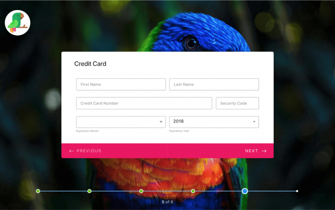
 JotForm Cards work on any device. (Illustration: JotForm)[/caption]
With JotForm 4 there is nothing left to be desired. You’ll find the most flexible form designer on the market. Did you know that you can even build forms from your mobile device? This is only one of the groundbreaking features of JotForm 4. If you want to learn about all the tiny details that make the service great turn to the mentioned article.
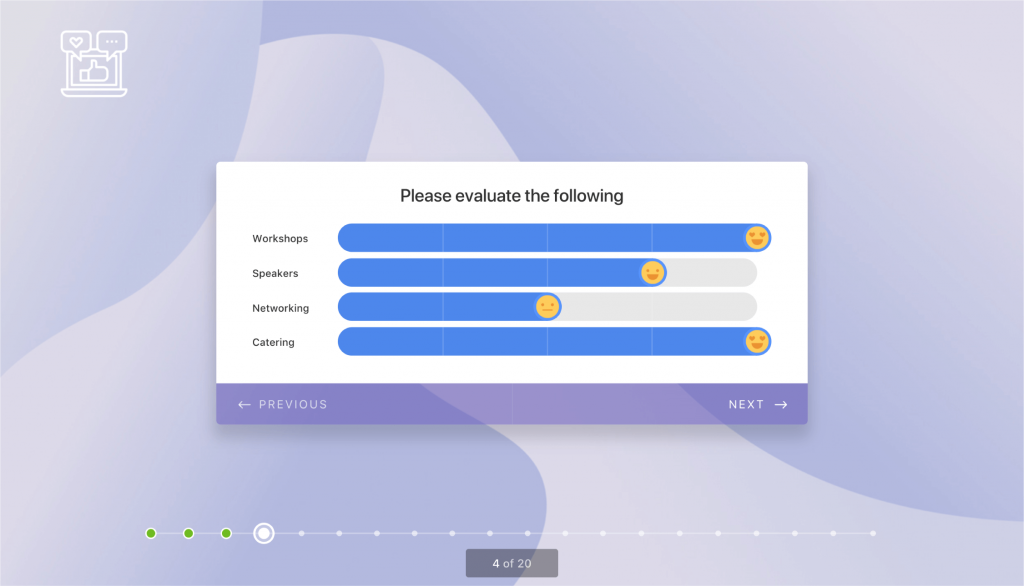 Unprecedented fun in filling out a form. (Illustration: JotForm)[/caption]
Cards in JotForm follow a way more simple concept. The content of a card is self-contained. One piece of content equals one card. That has been the reason for the introduction of cards on social media, to separate one information from the next.
Regarding usability and UX, separating information through card-based design concepts is perfectly smart. Cards are easy to handle and easy to digest. This creates a feeling of comfort and safety. The user will always know where he stands and what he is supposed to do there. A card is a great road sign.
Forms, on the other hand, are a thing that people love to avoid. Too cluttered, too long, too many questions, too sensitive questions, and poor guidance. That’s what still today characterizes most of the forms out there in the wild. Discomfort and unsafety are what gets easily associated with forms.
Now bring this together with the card-based concept of JotForm Cards and the equation works out. Sounds ingenious? It probably is…
Ask Your Questions, But One Piece at a Time
The idea behind JotForm Cards is so simple; you might wonder why no one else has had the idea already. JotForm Cards conceptually is a full-page questionnaire where you answer one question per screen, then get directed to the next.
[caption id="attachment_104053" align="aligncenter" width="1024"]
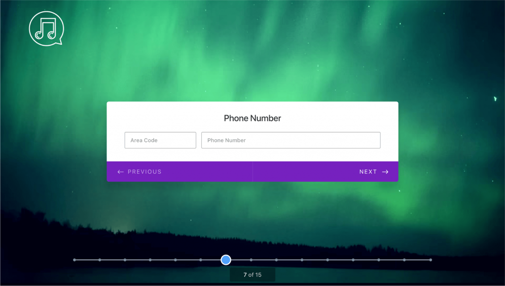 Ultimate focus on a single question at a time. (Screenshot: JotForm)[/caption]
Putting forms this way has a variety of benefits:
JotForm: The Executive Summary
I should assume that you as a frequent Noupe reader already know JotForm from the inside out. The service is one of our favorite cloud services out there, and we have continuously covered JotForm’s evolution over the years. JotForm is a dinosaur in terms of the web. It’s been ten years since they started out on their mission to provide the world with the best form builder available. Today JotForm is proud to have more than 2.5 million users working with their product. I found JotForm in 2014. This was the year where JotForm introduced their revamped form designer. They really got me excited that day. I wrote this article. Then, in 2016, I gathered the top six reasons why designers should use JotForm and found a service that kept getting better and better still. But all of this got topped when they released the version 4 of their service in early 2017. Since then I am in love, which led me to write this article. [caption id="attachment_104054" align="aligncenter" width="1024"] JotForm Cards work on any device. (Illustration: JotForm)[/caption]
With JotForm 4 there is nothing left to be desired. You’ll find the most flexible form designer on the market. Did you know that you can even build forms from your mobile device? This is only one of the groundbreaking features of JotForm 4. If you want to learn about all the tiny details that make the service great turn to the mentioned article.
JotForm Cards: Mr. Nice Guy Data Collector
So what could the good people at JotForm now make even better? I would have said, nothing. But then, this is what I said before JotForm 4 got introduced. It seems that they tend to be highly innovative. JotForm Cards proves just that. Should you be in a hurry, at least watch this small video to get an idea of what I’ll be talking about later on in this article: https://www.youtube.com/watch?v=tdZU7lVo3TE& Cards Are a Designer’s Darling, And for a Reason Cards are the new black. Any designer knows that. Card-based design has been the craze for a few years now, and it is still going strong. First introduced by social networks such as Twitter and Facebook, cards are also the native design pattern in Android’s Material Design. And they make perfect sense no matter how you look at them. The design aspect of cards is not the most important in the context of JotForm’s latest feature. They don’t go forward stacking form cards responsively upon each other or look for the perfect grid layout. [caption id="attachment_104051" align="aligncenter" width="1024"] Unprecedented fun in filling out a form. (Illustration: JotForm)[/caption]
Cards in JotForm follow a way more simple concept. The content of a card is self-contained. One piece of content equals one card. That has been the reason for the introduction of cards on social media, to separate one information from the next.
Regarding usability and UX, separating information through card-based design concepts is perfectly smart. Cards are easy to handle and easy to digest. This creates a feeling of comfort and safety. The user will always know where he stands and what he is supposed to do there. A card is a great road sign.
Forms, on the other hand, are a thing that people love to avoid. Too cluttered, too long, too many questions, too sensitive questions, and poor guidance. That’s what still today characterizes most of the forms out there in the wild. Discomfort and unsafety are what gets easily associated with forms.
Now bring this together with the card-based concept of JotForm Cards and the equation works out. Sounds ingenious? It probably is…
Ask Your Questions, But One Piece at a Time
The idea behind JotForm Cards is so simple; you might wonder why no one else has had the idea already. JotForm Cards conceptually is a full-page questionnaire where you answer one question per screen, then get directed to the next.
[caption id="attachment_104053" align="aligncenter" width="1024"]
 Ultimate focus on a single question at a time. (Screenshot: JotForm)[/caption]
Putting forms this way has a variety of benefits:
- Cards are a familiar content unit. Users see them all day everywhere.
- Cards allow you to build a design that eliminates distractions. Present your form front and center and do away with all the rest of the content that’s unneeded at the time.
- The design of the form can totally be accustomed to the goal of your JotForm Card.
- Available micro interactions allow for a form design that’s both clear and fun. Don’t forget the motivational effect of small UX goodies.
- Showing users where they are on their form mission through your card set keeps them on track.
- Unintrusive card designs are a friendly way of asking. Users are less likely to feel annoyed.
- As the process is one step at a time users’ focus is not tested but supported.
- With a wide array of customization options, JotForm Cards can be truly beautiful.
- Especially on mobile will this way of form filling feel more natural than anything else.
- Forms filled out with fun will result in a high response rate.

I believe chatbots will replace forms soon. Tested out a simple free version of Landbot, and it offers outstanding UX and a really simple way to build and maintain them. I think JotForm should look into it too…