In From The Cold: Find A Slot For Every Content With Off-Canvas Layouts
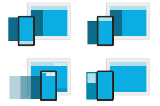
As a web designer you face challenges constantly. But the evolution of mobile devices multiplies the challenges you have to cope with. Placing texts, images, navigation, sidebars, headers and what not on a desktop-sized browser-window is hard enough in terms of creativity and information architecture. Doing the same on a mobile device is close to impossible. There just isn't enough screen real estate. A new approach that addresses this problem works with the use of so-called off-canvas layouts. In this type of layout content is placed where you cannot see it, outside the screen, well, outside its visible area to be more precise.
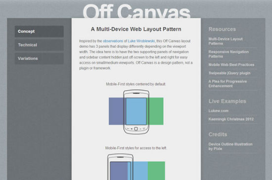
The idea is simple. Instead of completely omitting certain content from the mobile design, you can just put it aside and only show it on demand or while break points allow. A click of a button, a tap or a swipe are enough to bring the content back to screen. CSS3 is capable of letting you create beautiful animated effects for the slide-in, out or round about. All you need for an off-canvas-layout is CSS and JavaScript. But wait, why work hard? We have access to several frameworks, that can do the job and probably do it better. The approaches vary though.
 Off-Canvas Layouts With Foundation
That way we can have a horizontal navigation turn into a vertical one, shown at the top or the bottom of the browser-window while in mobile view. Alternatively you can have the navigation vanish altogether with only a menu-button remaining, that brings the navigation back on click or tap. Google+ and Facebook use this concept in their mobile apps. One of the other layouts puts contents in tabs for easier access during mobile view.
All the layouts are relatively simple. It should not be a problem to modify them to your needs. The only thing you cannot avoid is the use of the Foundation framework as all the samples rely on it.
 Off-Canvas-Layouts By Jason Weaver
A three-column layout gets gradually scaled down. The first step reduces it to a two-column design, degrading to one column on even smaller devices.
Conclusion: Thanks to off-canvas layouts we can find slots for all of our intended content even on the smallest of devices. We are no longer in the dilemma of having to choose between overly reduced content and overladen sites.
(dpe)
Off-Canvas Layouts With Foundation
The creators of the famous framework focussing on responsive web design, Foundation, developed four different variants of off-canvas-layouts and are kind enough to offer them as a free download. There are layouts aiming to hide or show the navigational elements in mobile view and others made to scale content to different target sizes. Off-Canvas Layouts With Foundation
That way we can have a horizontal navigation turn into a vertical one, shown at the top or the bottom of the browser-window while in mobile view. Alternatively you can have the navigation vanish altogether with only a menu-button remaining, that brings the navigation back on click or tap. Google+ and Facebook use this concept in their mobile apps. One of the other layouts puts contents in tabs for easier access during mobile view.
All the layouts are relatively simple. It should not be a problem to modify them to your needs. The only thing you cannot avoid is the use of the Foundation framework as all the samples rely on it.
A Showcase Of Interesting Off-Canvas Layouts
Web designer Jason Weaver established a demo that incorporates some really nice ideas as of how to hide or show navigation and content by the use of off-canvas-layouts. JavaScript, media queries and CSS3 transitions work together to make for amazing effects. Off-Canvas-Layouts By Jason Weaver
A three-column layout gets gradually scaled down. The first step reduces it to a two-column design, degrading to one column on even smaller devices.
Conclusion: Thanks to off-canvas layouts we can find slots for all of our intended content even on the smallest of devices. We are no longer in the dilemma of having to choose between overly reduced content and overladen sites.
(dpe)
Great examples of off canvas layouts Denis thanks, I’ll be sure to take some inspiration from these. There are some great examples beginning to crawl onto the web now and to be honest I think they have been largely inspired by iOS. I’ll need to look into doing this for http://www.reynoldsdigital.com because I think this is just how people want to browse on the mobile.
Nice tutorial, I’m good with html5 but find canvas confusing.
Great tutorial. I have to check out Foundation Framework, it looks nice.