How to Make a Well-Designed Education Website: 4 Quick Tips

In this day and age, nearly every school has its own website to connect with their communities and keep students, teachers, and parents up-to-date. However, many of these education sites are poorly designed and lack some important elements for ensuring high-level engagement.
Here at Morweb, we know that as schools begin to reopen and continue to adjust to the unprecedented circumstances, having a quality school website is more important than ever. That’s why we’ve created this brief guide to help teachers and administrators build the best education website possible. A degree in computer science is a plus but by following tips and marketing tools, a working and efficient website is definitely possible.
By following our carefully curated best practices for school website development, you’ll set your own school up for great success. We’ll walk through these tried-and-true school website-building tips:
- Use an education-specific website builder
- Prominently display your donation page
- Ensure branding is consistent
- Look at successful designs for inspiration
Your school website is your most important marketing tool—it’s crucial for communicating with students and families, promoting upcoming events, and maintaining overall high levels of engagement throughout your community.
Are you ready to learn more about building and maintaining a top-notch education website for your school? Let’s dive in.

1. Use an education-specific website builder
First and foremost, it’s a good idea to craft your school website with an education-specific content management system (CMS). There are many website builders to choose from (for example, WordPress is a popular choice for all sorts of businesses and organizations), but a CMS made specifically for schools provides sector-specific tools that generic website builders don’t.

According to this Morweb guide to school website builders, the best platforms incorporate the following features:
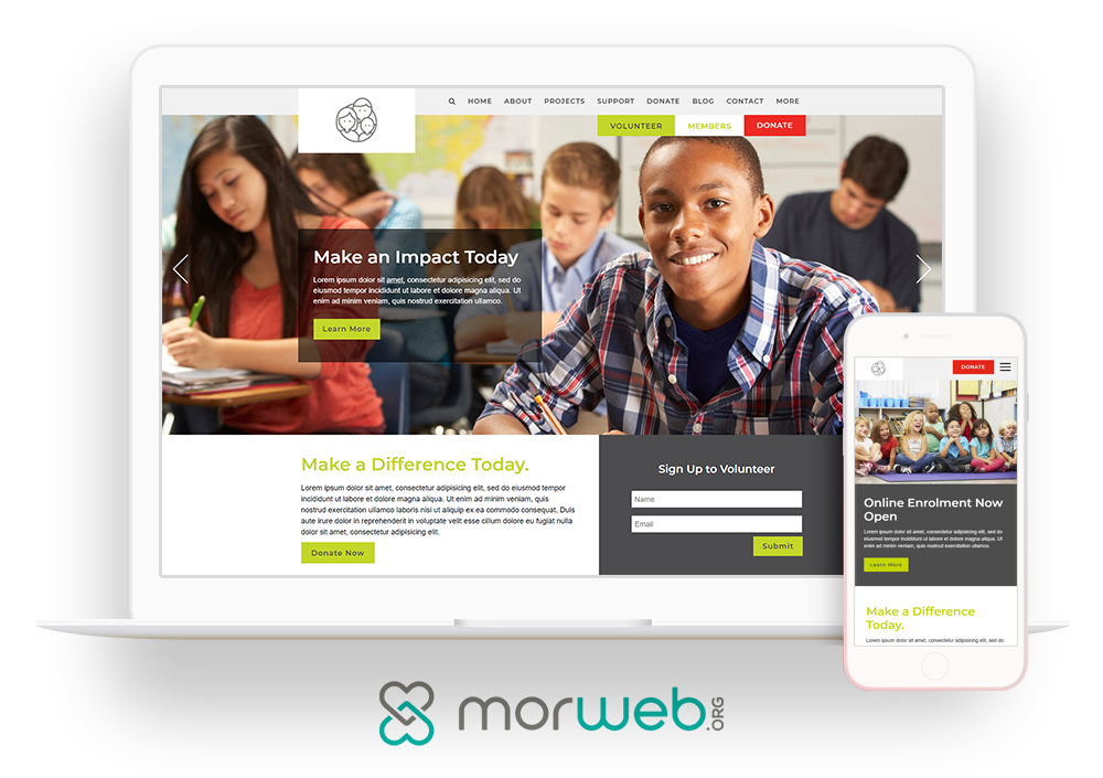
- Customizable layouts: Pre-built layouts, themes, and templates are one of the most convenient features of a content management system. You can save time by building off an existing layout, while still being able to brand it to your liking (which we’ll discuss in further detail below).
- Front-end editing: With intuitive school website builders, you can create a beautiful and easy-to-use site with little-to-no coding experience. With front-end editing tools, you can drag-and-drop items in place, edit text directly on the site, and upload images with ease. That makes it accessible for teachers and/or administrators to use and update, without the support of a web developer.
- Mobile-optimization: With more than 4.18 billion users accessing the internet from their mobile devices worldwide, you’d be remiss if your school website is inaccessible to mobile users. A mobile-friendly website means that students, parents, and teachers can find the information they need while on-the-go, from the convenience of wherever they are, and whenever they want.
With the right school website builder, you’ll also be able to easily add educational content to your school website such as online courses, quality videos, and digital quizzes. Working with a school-specific platform will provide a seamless experience for your site visitors and make the web development process a breeze.

2. Prominently display your donation page
All sorts of schools depend on charitable donations to sustain operations, including public and private K-12 institutions and universities. This is why school fundraising is a big deal for many of these schools, and having the right fundraising technology in your toolkit can make a big difference!

That being said, it's important to develop a well-designed donation page that effectively conveys your school's need for funds. You can link to this form across your fundraising efforts and outreach to parents, alumni, and other members of your community. However, keep in mind that a donation page that's difficult to navigate or hard to fill out will turn prospects away.
When designing your school's giving form, keep these donation page design tips in mind to guide visitors through the process:
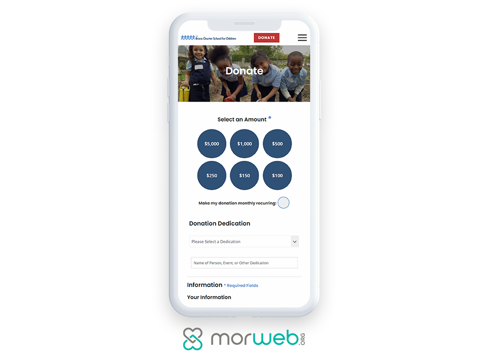
- Ensure your donation page is mobile-friendly. We already touched on the importance of mobile-optimization for your education website design as a whole. This remains true for your donation page. If your donation form is not accessible on a mobile device, you run the risk of losing potential contributions and turning away eager donors. Ensuring a mobile-friendly donation page design is crucial for maximizing donations and creating a positive user experience.
- Stick with a minimalist design. A donation page with too many elements can distract the user and detract from the overall purpose of the page: to collect donations. Instead, limit the number of required fields by only requesting essential information, such as the name and contact details. The faster a donor is able to complete the process, the more gifts are likely to be submitted. A lengthy or otherwise complicated giving process can often lead to increased donation form abandonment.
- Incorporate multiple giving options. Be sure to provide flexible giving options to ensure you receive as many donations as possible. For example, it’s a good idea to accept multiple payment methods (such as debit/credit cards and ACH payments), encourage recurring donations, and include suggested donation amounts to raise more.
Qgiv’s fundraising software for education guide puts it this way: “Fundraising software for schools makes online fundraising easier so you can spend more time making connections with the people that are more likely to donate to your cause.”
In this case, it means having an easy-to-use donation form embedded in your school website so that alumni and other charitable individuals can contribute to your school whenever they’re motivated to do so. This way, they don’t have to deal with cutting and mailing a check or dropping off a cash donation to the school.

3. Ensure branding is consistent
Effective branding is important for any organization, but for a school website, it’s an even bigger deal. Not only does your digital branding remind visitors that they’re on the right site and help form mental connections to your school, but it can also foster a sense of school spirit among visitors!

Here are three key elements to consider for all school marketing materials, especially your education website:
- Color scheme: Choosing the right colors for your school website is essential. Make sure to build your website with your school’s spirit colors in mind!
- School logo: Including your school logo, along with other branded imagery, is a great way to establish credibility and build school spirit.
- Font selection: Not only should your font choices be legible, but they should also remain consistent throughout your website and other school-related materials.
Whether your website visitor is a current student exploring details on upcoming events or a prospective parent learning about what your school has to offer, a consistently branded website can go a long way toward ensuring a positive experience for users.

4. Look at successful designs for inspiration
Whether you’re building a school website from scratch or looking to update your current website to meet today’s competitive standards, sometimes the hardest part is knowing where to start. And to that, we suggest researching some of the most successful designs and going from there.
As you explore other school websites, be sure to look out for these top characteristics:
- Positive user experience: Is the website simple to use for the average internet user? Is it easy to know where to find the information you need? If your school website is too complicated to explore, students, parents, and teachers will miss out on valuable information.
- Visually appealing design: Does the website have an overall appealing design? Is there enough blank space to balance out a busy design? Nobody wants to spend a lot of time on a poorly designed website, whether that’s due to clashing colors or indecipherable fonts.
- Informative resources: Is there valuable information available on the school website? Are you able to find out about upcoming events, class times, and extracurricular activities? Make sure you include information that’s relevant to any potential user, including students, parents, teachers, administrators, alumni, and prospects.
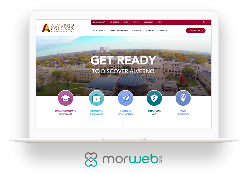
- Simple navigation: Is there an easy-to-follow navigation menu at the top of the website? Can you find the pages you’re looking for? It should be easy to locate your most popular pages, but including every page on your menu can make it hard to find what you’re looking for. Feature your high-value pages, and add a search tool to help users find any other information they need.
To get started, we suggest checking out this list of top school website designs to garner inspiration and see some of these best practices in action. Note what works well for each site, and specifically look for elements that you’d like to emulate on your own school website.
The Gist
Especially in a difficult and uncertain time like this, having a strategic online presence is more important than ever before to remain connected with your school’s community. With these suggested tools and our tried-and-true best practices, you’ll be equipped to build an education website for your school that will make a big impact.
In turn, your students, parents, teachers, and faculty members will appreciate the effort you made to develop an easy-to-use school website with highly-relevant content that caters to their needs. Good luck!
Image by vectorjuice on Freepik
