How Poorly Hamburger Menus and Hidden Navigation Work

Small display, little room - on smartphones, it's always a challenge to fit in all the content and the navigation of a website. That's why hiding the navigation and only placing a hamburger menu which displays the navigation after a tap has established itself. For a long time already, there have been discussions whether you should hide something as important as the navigation. In a study, the Nielsen Norman Group, which researches user behavior, found out that said behavior differs between visible and hidden navigations.

 Combined Navigation at BBC[/caption]
The websites were the ones of 7digital, BBC, Bloomberg Business, Business Insider UK, Supermarkt HQ, and Slate. Each website has a differently designed navigation. The study distinguished between a visible navigation, with all menu items listed up in the header or sidebar of the site, and a hidden navigation, where the menu items could only be reached via a hamburger menu or a button labeled "Menu". Aside from that, there was a combination of both versions, where some items were visible, while the rest was displayed via "more" button as a drop-down list.
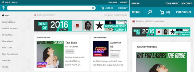
This way, the navigation of 7digital is always visible on desktop devices and is unfolded via "menu" icon on smartphones. The BBC website uses a combined version on the desktop. With only the most important menu items visible, others are displayed via drop-down menu.
[caption id="attachment_77305" align="alignnone" width="640"]
 Navigation Only Accessible Via Hamburger Menu[/caption]
In contrast to that, the website of Business Insider uses a hamburger menu to grant access to the navigation on both desktop and mobile view. By the way, there was no website that had a visible navigation on both desktop and mobile devices. The main reason for that is probably because a permanently visible navigation is a rather unusual choice for mobile devices.
 Visible and Hidden Navigation at 7digital[/caption]
Hidden navigation was also down regarding how much time it took to navigate. Participants on desktop devices took 31 seconds to navigate with a hidden navigation, but it only took 26 seconds on websites with visible navigation. Interestingly, the combined navigation did the best with only 23 seconds.
The difference between hidden (26 seconds) and combined navigation (24 seconds) was not as large. The reason for that may be that mobile device users are already used to reaching the navigation via hamburger menu, while they are not as common on desktop devices.
 Hidden Navigation at Bloomberg[/caption]
The combined navigation did the best, achieving 80 percent on the desktop, and 85 percent on mobile. Even the fully visible navigation was three percent behind, with only 77 percent of the content being found.
If possible, you should forgo a hidden navigation. Ideally, you always display necessary menu items, and hide minor ones behind a "more" icon, that shows all remaining items as a drop-down list, for instance.
You can find all the study results with plenty of diagrams and detailed explanations on the Nielsen Norman Group's website.
(dpe)

Photo by amirali mirhashemian on Unsplash
179 Participants, Six Websites
The aim of the study was to find out how often the navigation was found and used on a website. For that, 179 participants had to visit six different websites on different devices. About half of all participants called up the six websites on a desktop device only, while the other half accessed them on smartphones. [caption id="attachment_77303" align="alignnone" width="640"] Combined Navigation at BBC[/caption]
The websites were the ones of 7digital, BBC, Bloomberg Business, Business Insider UK, Supermarkt HQ, and Slate. Each website has a differently designed navigation. The study distinguished between a visible navigation, with all menu items listed up in the header or sidebar of the site, and a hidden navigation, where the menu items could only be reached via a hamburger menu or a button labeled "Menu". Aside from that, there was a combination of both versions, where some items were visible, while the rest was displayed via "more" button as a drop-down list.
This way, the navigation of 7digital is always visible on desktop devices and is unfolded via "menu" icon on smartphones. The BBC website uses a combined version on the desktop. With only the most important menu items visible, others are displayed via drop-down menu.
[caption id="attachment_77305" align="alignnone" width="640"]
 Navigation Only Accessible Via Hamburger Menu[/caption]
In contrast to that, the website of Business Insider uses a hamburger menu to grant access to the navigation on both desktop and mobile view. By the way, there was no website that had a visible navigation on both desktop and mobile devices. The main reason for that is probably because a permanently visible navigation is a rather unusual choice for mobile devices.
Visible or Partially Visible Navigation was More Commonly Used
Only 27 percent of the participants that visited the desktop devices used the hidden navigation, while the visible or combined navigation was used by 48, or 50 percent, respectively. On mobile, only 57 percent utilized the hidden, and 86 percent went for the combined navigation. [caption id="attachment_77306" align="alignnone" width="640"] Visible and Hidden Navigation at 7digital[/caption]
Hidden navigation was also down regarding how much time it took to navigate. Participants on desktop devices took 31 seconds to navigate with a hidden navigation, but it only took 26 seconds on websites with visible navigation. Interestingly, the combined navigation did the best with only 23 seconds.
The difference between hidden (26 seconds) and combined navigation (24 seconds) was not as large. The reason for that may be that mobile device users are already used to reaching the navigation via hamburger menu, while they are not as common on desktop devices.
Conclusion
In the result, one can say that the hidden navigation was used much less, took longer, and a much lower amount of content was actually found using it. On the desktop, only 54 percent of the content that the users were supposed to call up was actually found, and on mobile, it was only 64 percent. [caption id="attachment_77304" align="alignnone" width="640"] Hidden Navigation at Bloomberg[/caption]
The combined navigation did the best, achieving 80 percent on the desktop, and 85 percent on mobile. Even the fully visible navigation was three percent behind, with only 77 percent of the content being found.
If possible, you should forgo a hidden navigation. Ideally, you always display necessary menu items, and hide minor ones behind a "more" icon, that shows all remaining items as a drop-down list, for instance.
You can find all the study results with plenty of diagrams and detailed explanations on the Nielsen Norman Group's website.
(dpe)