From Head to Foot: Showcase of Beautiful Header and Footer Designs
Studies show that the website header is one of the first things a visitor sees on your website. That is mainly due to the way we are used to browser information on the computer presented from top to bottom, and due to the way HTML is built with the header being the first thing it's loading on the page. Thus the importance of the header.
A beautifully designed one can help make a difference when attracting visitors to your website and getting them to stay awhile. Of course, content is still the most important website element, demonstrated by the latest Google algorithm updates, Panda and Penguin. But no matter how good your content is, if the visitor decides not to stick around long enough to see it, then your website suffers.
A visually appealing header design can assist in this department. To further add to its importance, a header often contains the website's navigation and logo. Having solid, user-friendly navigation facilitates the browsing of your content and keeps users on your site for longer.
A website footer is like a book's foot note. When you need more information, usually you find it there. In the case of a website, a footer usually features copyright information, a second navigation and in some cases contact details. But the footer has a more important role than that. If a visitor has made it to the bottom of the page, that tends to mean they are hooked. They have gone through your offerings, and are now looking for more. So it is important to keep that in mind as you build yours.
Below are a few examples of beautiful header and footer designs that stand as effective testaments to the roles these web design elements play.
 Corvus Art uses a beautiful canvas effect with awesome illustrations and a functional menu to achieve the desired visual impact.
 Merchand de Trucs is like a story of its own. The overall feeling of the header is simply "Welcome! What would you be interested in?"
 Viget Inspire has a simple yet powerful header. The menu is basic and very functional.
 Glamping's vivid illustrations give an overall feel of delight. It bids you to stay longer and see what it's about.
 Ten 24 Media's header invites you to "Enter the Show", and join the game if you will. Hurry if you don't want to be left out.
 Komodo Media's header is a preview for the wild and beautiful design resources available there. Brilliant use of illustrations.
 Octwelve is another great example of the use of an illustrated header. The author uses the header to introduce himself and his skills.
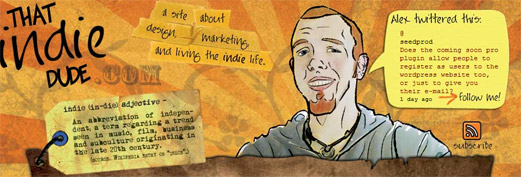
 That Indie Dude features one of the best uses of Twitter integration in the header around the web.
 Ozon 3, the header makes you think of ecology and the concept of "eco-design", as one of the categories of the blog also suggests.
 Pixel Resort has a beautiful animated header. The overall feeling is, as the title suggests, one of relaxation and joy.
 Helmy Bern features one of the most innovative headers and menus on the web. The stitched cardboard design does the job well, and raises the eyebrow of the visitor; making them want to see more.
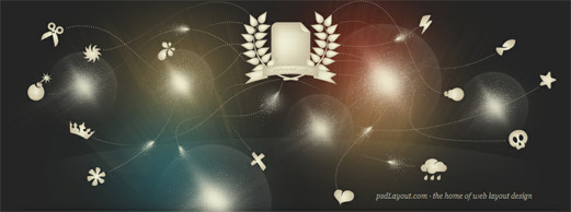
 PSD Layout's header suggests many things coming together in harmony and creating the web layout. The message is clear and the design is great.
 Koko Digital has another header that makes excellent use of illustration and really stands out on the web.
 Larissa Meek uses a very simple, personal, and efficient header. Need we say more?
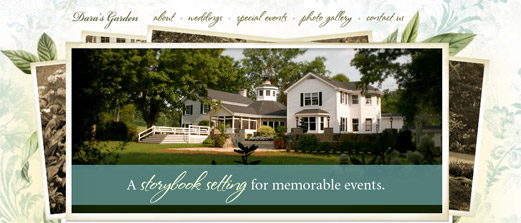
 Dana's Garden...as the subtitle says: "A storybook setting for memorable events".
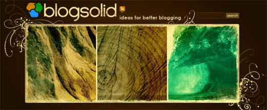
 Blog Solid makes excellent use of Photoshop brushes and effects.
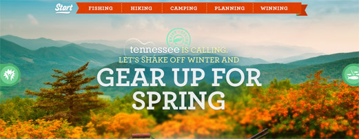
 Sprintime Tennessee, "Tennessee is calling"...the beautiful landscaped header almost single-handedly makes you want to be there.
 Bits and Pixels has a simple, yet effective design. This header features a beautiful logo and diagonal menu.
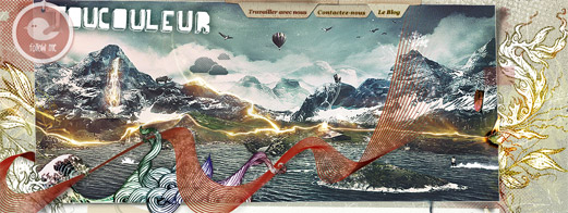
 Toucoleur's header is an amazing blend photo-manipulation and illustration.
 Veerle's Blog is probably known by nearly every designer. Not just the website, but also the talented designer behind it. Nothing more to say than an amazing website overall with a beautiful illustrated header.
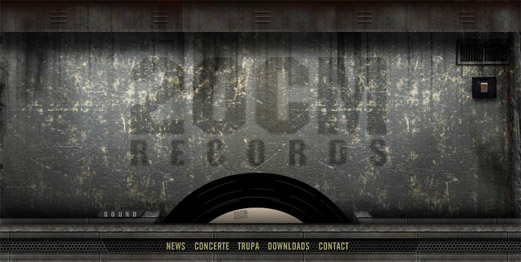
 20CM Records' header is for a Romanian hip-hop band, and the functionality is quite stunning. On the push of the button the light is turned on or off and the disk is rotating and playing one of their beats. Truly beautiful.
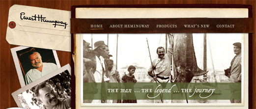
 Ernest Hemingway Collection has an amazing storybook-like header featuring the journey through the life of one of this highly regarded American author.
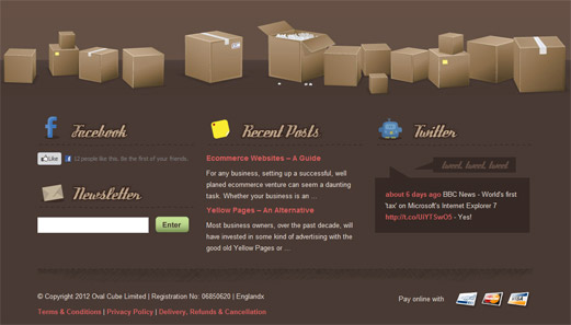
 Ready made Designs features another great integration of Twitter in the footer, this time with Facebook also. The middle of the footer is used for the most recent blog posts.
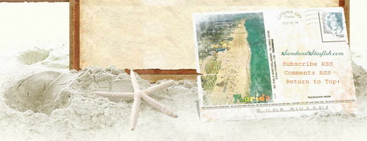
 Sand and Starfish has a beautifully illustrated postcard blog footer, inviting users to subscribe to the posts RSS and comments RSS.
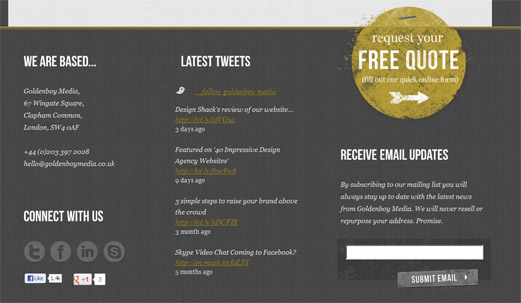
 Golden Boy Media's organized footer with a good Twitter and newsletter subscription integration shines. The left column is used for information where you can reach the company both online and offline.
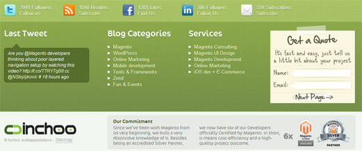
 Inchoo has a beautiful multiple row, multi-column footer featuring a contact form, Twitter integration, social media reach and services offered.
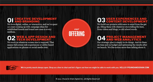
 Pound and Grain uses the footer to summarize the services they offer to effectively drive the point home.
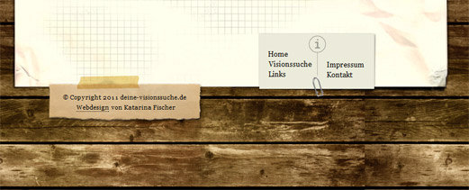
 Visionssuche is an example of a simple, yet beautiful, use of the footer to display the copyright information and website sections.
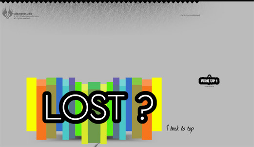
 V Dezign Studio's footer features a beautiful and creative "Back to top" section.
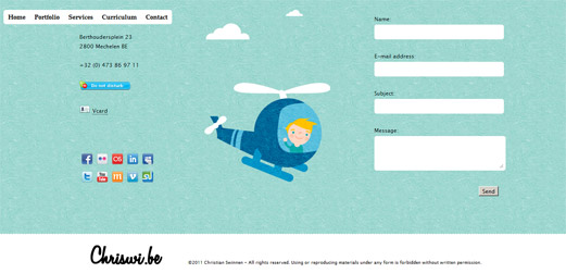
 Chriswi has an amazing illustrated footer which includes a contact form and social media information.
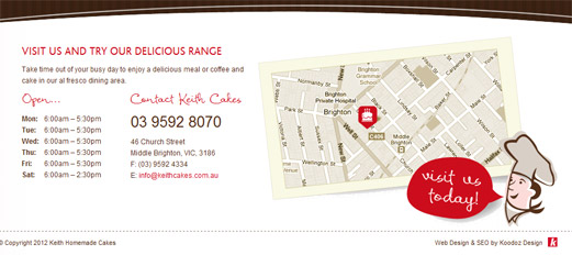
 Keith Cakes uses the footer in a very efficient way, displaying the running schedule, address, map and telephone information for the business.
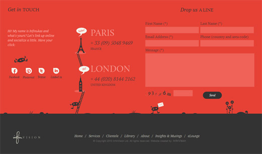
 InfinVision uses a creative footer featuring social media info and contact information.
 Gauvain Bricoult's footer doesn't do much in terms of functionality, but it sure says something in terms of beauty. Amazing design with a "Back to top" button for user's convenience.
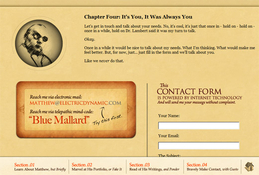
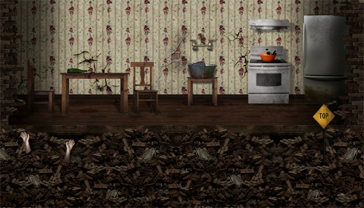 Matthew D. Jordan has a clever and impressive footer. First of all the message "It's You, It Was Always You" brilliantly fits the site, and the contact box...well, we'll let you discover that on your own.
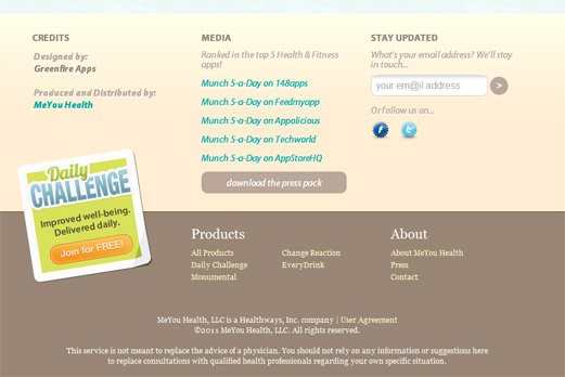
 Munch 5-A-Day employs a beautiful, organized footer featuring a newsletter subscription module, social media links and copyright information.
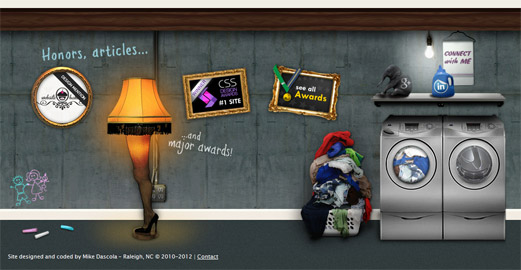
 Mike Dascola has an amazingly creative footer displaying the different awards won by the website as well as social media info.
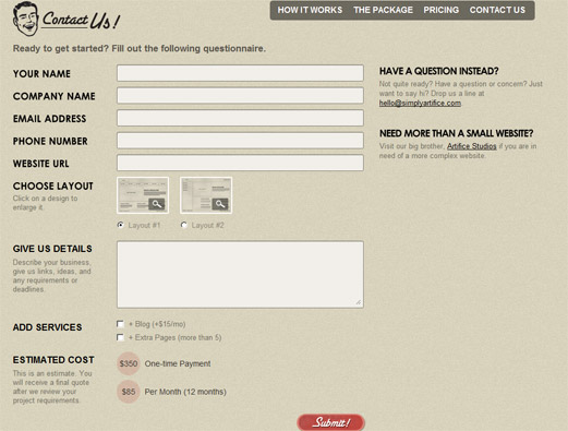
 Simply Artifice's extensive footer features a beautifully designed contact form.
 Jay Hafling is another extensive footer example with 2 sections. A section presenting the services the website offers and another with the most recent blog posts organized in columns.
Header Designs
Cult-Foo has probably one of the most well known header designs around the design community. The use of colors and pixelation effects is stunning. Corvus Art uses a beautiful canvas effect with awesome illustrations and a functional menu to achieve the desired visual impact.
 Merchand de Trucs is like a story of its own. The overall feeling of the header is simply "Welcome! What would you be interested in?"
 Viget Inspire has a simple yet powerful header. The menu is basic and very functional.
 Glamping's vivid illustrations give an overall feel of delight. It bids you to stay longer and see what it's about.
 Ten 24 Media's header invites you to "Enter the Show", and join the game if you will. Hurry if you don't want to be left out.
 Komodo Media's header is a preview for the wild and beautiful design resources available there. Brilliant use of illustrations.
 Octwelve is another great example of the use of an illustrated header. The author uses the header to introduce himself and his skills.
 That Indie Dude features one of the best uses of Twitter integration in the header around the web.
 Ozon 3, the header makes you think of ecology and the concept of "eco-design", as one of the categories of the blog also suggests.
 Pixel Resort has a beautiful animated header. The overall feeling is, as the title suggests, one of relaxation and joy.
 PSD Layout's header suggests many things coming together in harmony and creating the web layout. The message is clear and the design is great.
 Koko Digital has another header that makes excellent use of illustration and really stands out on the web.
 Larissa Meek uses a very simple, personal, and efficient header. Need we say more?
 Dana's Garden...as the subtitle says: "A storybook setting for memorable events".
 Blog Solid makes excellent use of Photoshop brushes and effects.
 Sprintime Tennessee, "Tennessee is calling"...the beautiful landscaped header almost single-handedly makes you want to be there.
 Bits and Pixels has a simple, yet effective design. This header features a beautiful logo and diagonal menu.
 Toucoleur's header is an amazing blend photo-manipulation and illustration.
 Veerle's Blog is probably known by nearly every designer. Not just the website, but also the talented designer behind it. Nothing more to say than an amazing website overall with a beautiful illustrated header.
 20CM Records' header is for a Romanian hip-hop band, and the functionality is quite stunning. On the push of the button the light is turned on or off and the disk is rotating and playing one of their beats. Truly beautiful.
 Ernest Hemingway Collection has an amazing storybook-like header featuring the journey through the life of one of this highly regarded American author.

Footer Designs
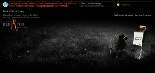
Black Sheep Brewery's beautiful use of footer space features the mascot of the brewery reading a sign saying "To the Baa..r". Excellent integration of Twitter here also. Ready made Designs features another great integration of Twitter in the footer, this time with Facebook also. The middle of the footer is used for the most recent blog posts.
 Sand and Starfish has a beautifully illustrated postcard blog footer, inviting users to subscribe to the posts RSS and comments RSS.
 Golden Boy Media's organized footer with a good Twitter and newsletter subscription integration shines. The left column is used for information where you can reach the company both online and offline.
 Inchoo has a beautiful multiple row, multi-column footer featuring a contact form, Twitter integration, social media reach and services offered.
 Pound and Grain uses the footer to summarize the services they offer to effectively drive the point home.
 Visionssuche is an example of a simple, yet beautiful, use of the footer to display the copyright information and website sections.
 V Dezign Studio's footer features a beautiful and creative "Back to top" section.
 Chriswi has an amazing illustrated footer which includes a contact form and social media information.
 Keith Cakes uses the footer in a very efficient way, displaying the running schedule, address, map and telephone information for the business.
 InfinVision uses a creative footer featuring social media info and contact information.
 Gauvain Bricoult's footer doesn't do much in terms of functionality, but it sure says something in terms of beauty. Amazing design with a "Back to top" button for user's convenience.
 Matthew D. Jordan has a clever and impressive footer. First of all the message "It's You, It Was Always You" brilliantly fits the site, and the contact box...well, we'll let you discover that on your own.
 Munch 5-A-Day employs a beautiful, organized footer featuring a newsletter subscription module, social media links and copyright information.
 Mike Dascola has an amazingly creative footer displaying the different awards won by the website as well as social media info.
 Simply Artifice's extensive footer features a beautifully designed contact form.
 Jay Hafling is another extensive footer example with 2 sections. A section presenting the services the website offers and another with the most recent blog posts organized in columns.


Cheers for this really interesting and useful blog post on beautifully designed headers and footers. I personally like Mike Dascola footer, the design compliments the website brilliantly and whilst being extravagant doesn’t take to much away from the design itself. I also like Visionssuche, although this is a extremely simple footer, it is designed brilliantly and really adds depth to the website design.
This was really a very fantastic list. I got much inspiration from it.
I love seeing all of the headers lined up; Larissa Meeks’ elegant simplicity is my favourite!
Koko in my opinion had the coolest one. It is well organized so that it looks clean and at the same time looks fun due to the cartoon graphics
Thanks so much for including our site in this great compilation!
Great collection of website header and footer, I like them. Good work.
Free Mobile Websites is new theme.. its good idea, I am very much inspiration in theme. So, Thank you blog member.