Fontjoy Combines Fonts Via Deep Learning
Correctly combining fonts is a complex task, which is mostly taken care of in an overly subjective fashion. The free web app Fontjoy objectifies the selection with "Deep Learning" methods.
The suitable combination of different fonts hides plenty of pitfalls that can only be avoided with a significant typography knowledge. In practice, this results in most people avoiding the combination of multiple fonts for the safety reasons alone.
You might dare to do it for headings and paragraphs, but you'll rarely use more than two fonts, of which one is only meant for accentuation. This is how I handled it until now. And then I found Fontjoy. The intuitive user interface simplifies the process so much that it's almost fun.
[caption id="attachment_103326" align="aligncenter" width="1024"]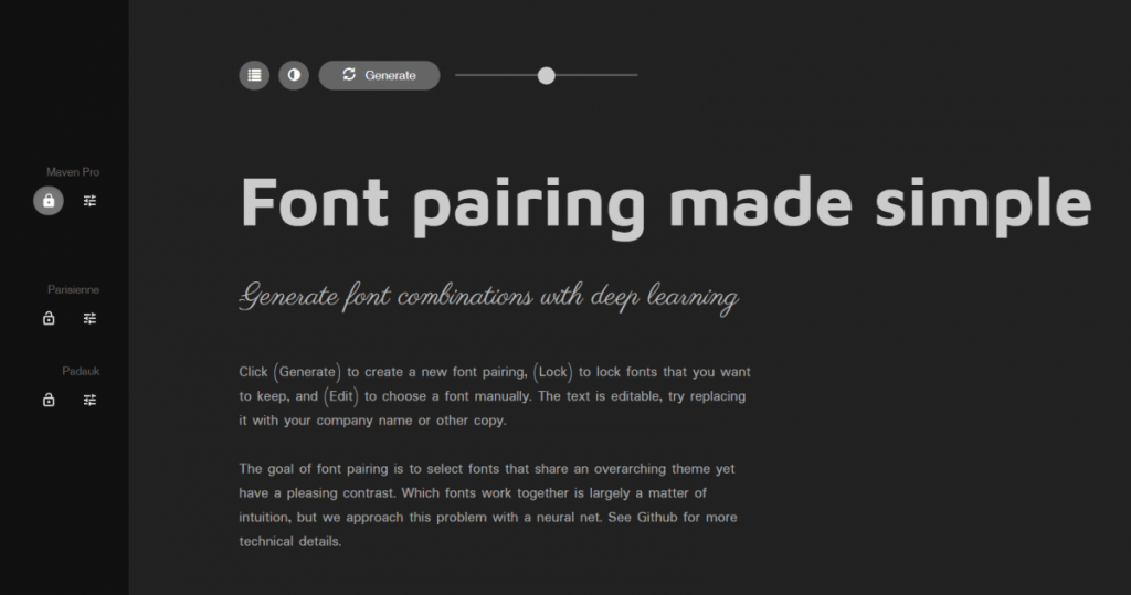 Fontjoy: Landing Page (Screenshot: Noupe)[/caption]
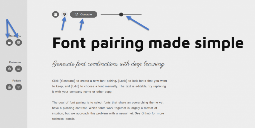 Fontjoy: The "Controls" (Screenshot: Noupe)[/caption]
On the right of the lock symbol, you'll find an icon that usually represents settings, but here is used to manually search a font from the index. Normally, we're looking for fonts that complement a given font as it is.
You can edit the text examples as well. This allows you to evaluate the suggested combination as close to your actual application case as possible, for instance, by using the actual content of your future landing page.
On the right and the left of the generate button, you invert the display to black on white. The slider also lets you manipulate the AI. By default, Fontjoy is looking for fonts with a balance between similarity and contrast. By moving the slider, you can change that manually. Of course, this only makes sense in cases where you want to work with visual disharmonies on purpose.
Fontjoy is one of those services that belongs into every bookmark list; especially if typography is not your specialty.
Featured image by Brett Jordan on Unsplash
 Fontjoy: Landing Page (Screenshot: Noupe)[/caption]
Deep Learning: Artificial Intelligence Combines Fonts
Jack Qiao, the mastermind behind Fontjoy, relies on mathematical methods, including "deep learning," to enable automatic font combination. Simply put, the app determines the similarities and differences of a font pile computationally. This way, it produces patterns that show significant differences, or major similarities, or a mix between the two. "Deep Learning" as a method of machine learning is based on working with artificial neuronal webs. Using neuronal webs, the machine allows itself to recognize structures, evaluate the detection, and continuously improve itself in multiple forward, and backward iterations. For that purpose, the neuronal webs are divided into multiple layers. You can think of them as a filter that refines the raw base, increasing the chances of it recognizing and distributing a correct result. The human brain works similarly. Today, when talking about artificial intelligence, deep learning with neuronal webs is meant most of the time. In the project's Github repository, Jack even explains the approach with mathematical formulas. In case you want to check his calculations...Combining Fonts With Few Clicks, But Lots of Maths
The web app is easy to control. To get a feel for what the app can do, you could click on the button "generate" at the top of the page. This way, a new set of fonts to combine is suggested, and displayed right below the button. The origin of the fonts is the ever-growing portfolio of Google Fonts. Google Fonts itself also shows you popular combinations of different fonts. However, the difference is very easy to spot. Fontjoy's mathematics rarely ever adds a font included in Google's suggestion list. If the generated combination includes one or more fonts that you want to use, but not in the given combination, a simple click on the lock symbol will lock these fonts in position. During the next "generate" process, these fonts will not be replaced. [caption id="attachment_103327" align="aligncenter" width="1024"] Fontjoy: The "Controls" (Screenshot: Noupe)[/caption]
On the right of the lock symbol, you'll find an icon that usually represents settings, but here is used to manually search a font from the index. Normally, we're looking for fonts that complement a given font as it is.
You can edit the text examples as well. This allows you to evaluate the suggested combination as close to your actual application case as possible, for instance, by using the actual content of your future landing page.
On the right and the left of the generate button, you invert the display to black on white. The slider also lets you manipulate the AI. By default, Fontjoy is looking for fonts with a balance between similarity and contrast. By moving the slider, you can change that manually. Of course, this only makes sense in cases where you want to work with visual disharmonies on purpose.
Fontjoy is one of those services that belongs into every bookmark list; especially if typography is not your specialty.
Featured image by Brett Jordan on Unsplash