Flexbox Patterns: Ready-To-Use Building Blocks for Your Design

If you ever delved into Flexbox as an alternative to the classic CSS box model, you probably don't want to go back. The hitch is, that you need to deal with it in-depth, and who has enough time for that these days. Thus, we're often stuck with old methods of getting things done, just because we know how to reach the goal using them. Let's change that. Today, I'll show you the project Flexbox Patterns as a quick introduction to Flexbox.

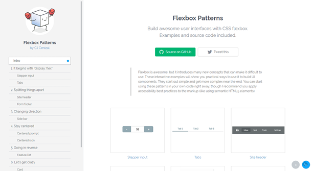
 Flexbox Patterns: Landing Page
We've already talked about Flexbox at Noupe here. In the article, we covered the topic of creating a responsive comment section with Flexbox.
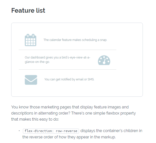
 Example: Alternating Rows Via Flexbox
Cenizal gives a detailed and understandable explanation of what he did, the way he did it, and why he did it for each module. The respective code snippets are also included, as well as the working examples of the elements. Generally, all UI elements are usable via copy and paste, but Cenizal recommends using them in the context of a semantically correct concept, such as HTML5 elements, for example.
Flexbox Patterns has gotten a lot of hype ever since it made its way onto the landing page of Product Hunt. At least that shows that there is a significant demand for a service like that.
(dpe)

Flexbox: Diving Deeper
If you have the time, make sure to watch the free video tutorial on which I reported for the colleagues at t3n here. You'll receive 160 minutes of essential knowledge. Flexbox Patterns: Landing Page
We've already talked about Flexbox at Noupe here. In the article, we covered the topic of creating a responsive comment section with Flexbox.
Flexbox Patterns
Thankfully, the interface designer CJ Cenizal has also looked into Flexbox and started a collection of ready-to-use best practices on the website Flexbox Patterns. At the moment, there are only about a dozen of finished modules available. However, the project has just started out, and the available modules already cover the most important application cases. Example: Alternating Rows Via Flexbox
Cenizal gives a detailed and understandable explanation of what he did, the way he did it, and why he did it for each module. The respective code snippets are also included, as well as the working examples of the elements. Generally, all UI elements are usable via copy and paste, but Cenizal recommends using them in the context of a semantically correct concept, such as HTML5 elements, for example.
Flexbox Patterns has gotten a lot of hype ever since it made its way onto the landing page of Product Hunt. At least that shows that there is a significant demand for a service like that.
(dpe)