Empty States: How to Design Pages With Nothing to Show

Good design is already difficult enough when it has to be done on a page with something to display. However, things get even harder when you have to create pages with nothing to see on them. Like an empty inbox (hehe, good one), or a download window without downloads, for example. Empty States collects this type of pages to help you get going.
 No Way! (Screenshot: Noupe)[/caption]
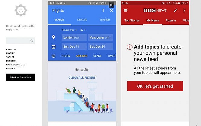
Empty Stat.es divides the gallery into categories that match the respective target resolutions. This makes it easy to sort by examples for smartphones, tablets, or desktops. While the additional category "Games Console" exists, there's only one screenshot in there as of right now. Maybe you'd like to help fill it.
Anyone can help building the empty page gallery, as these can easily be submitted via the contact form with a screenshot upload. If you mention your Twitter handle, it will also be published as a link.
Users can either explore the gallery by browsing the categories, or by using the free text search function. "Random" presents a random empty page. Tumblr provides the platform's technology.
Empty Stat.es Collects Empty Pages as Best Practices
Empty Stat.es is an entirely unobtrusive collection of all different types of blank pages. Error messages, a particular kind of blank page, have an entire category dedicated to them. That's good because error pages need a special, target-oriented design, but of course, as a Noupe reader, you already knew that. If not, just read this article with plenty of examples. Of course, websites that serve the purpose of presenting a brand, or your freelancer portfolio, only have one error page at most, with no other empty pages. But as soon as you go ahead and create a native, or web app that has the slightest amount of data to process, you'll face the problem. On Empty Stat.es, you can see how your colleagues have solved their respective problems.Let the Empty Page be Noble, Helpful and Good (Goethe)
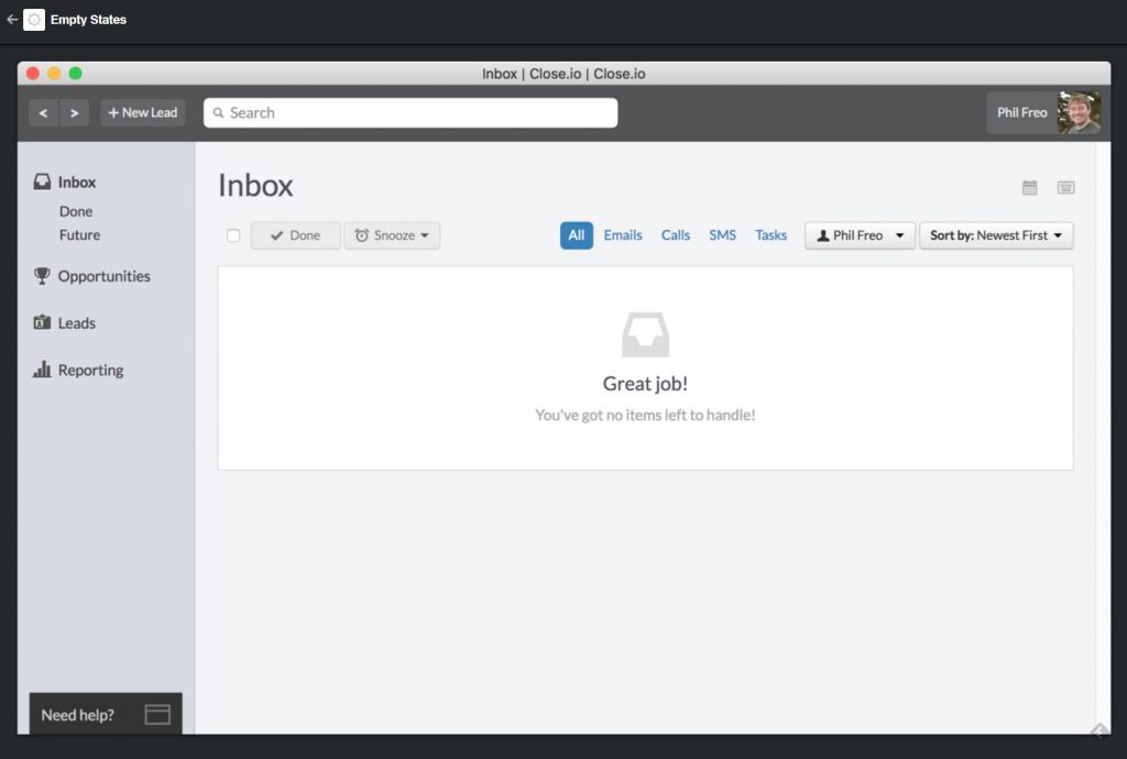
Aside from obvious, rather profane solutions, you'll also find some helpful, as well as funny approaches. As you scroll through the examples, you'll notice that there's a pattern. Of course, the design is always different, but one thing stays the same in all of them. The user is always taken by the hand, making sure that the page doesn't have to be empty during the next visit. Whether it's the tour planning app that suggests planning the first trip right away or the sleep tracker that asks you to track the first snooze. The empty page leads the user to the core of the app using a call to action. It's understandable that you as the developer of a mail app don't expect your users to ever reach the status "inbox zero." But don't forgo the design for this unlikely contingency ;-) [caption id="attachment_101473" align="alignnone" width="1024"] No Way! (Screenshot: Noupe)[/caption]
Empty Stat.es divides the gallery into categories that match the respective target resolutions. This makes it easy to sort by examples for smartphones, tablets, or desktops. While the additional category "Games Console" exists, there's only one screenshot in there as of right now. Maybe you'd like to help fill it.
Anyone can help building the empty page gallery, as these can easily be submitted via the contact form with a screenshot upload. If you mention your Twitter handle, it will also be published as a link.
Users can either explore the gallery by browsing the categories, or by using the free text search function. "Random" presents a random empty page. Tumblr provides the platform's technology.