Check That Out: Mockplus Makes Prototyping Easy
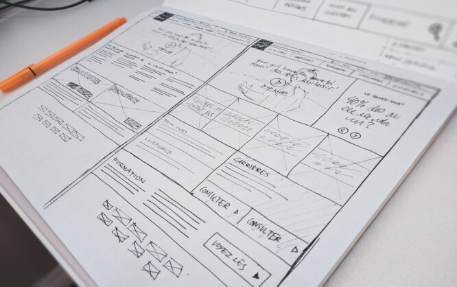
The Asian prototyping software Mockplus is gaining popularity in Europe and other western countries. It allows for an almost intuitive creation of mockups. We took a look at the tool for you.
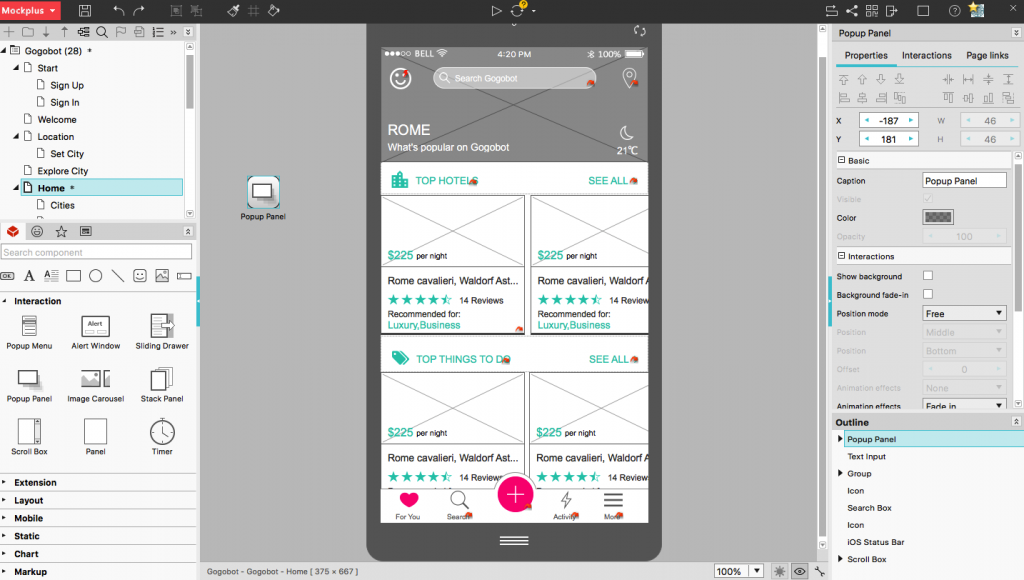 Mockplus: Demo Project in the Mac Version. (Screenshot: Noupe)[/caption]
I'm convinced by this prototyping approach and consider it a necessity. I think it's just as necessary that the solution used for the prototyping sticks to the approach, and refrains from adding any unnecessary complexity.
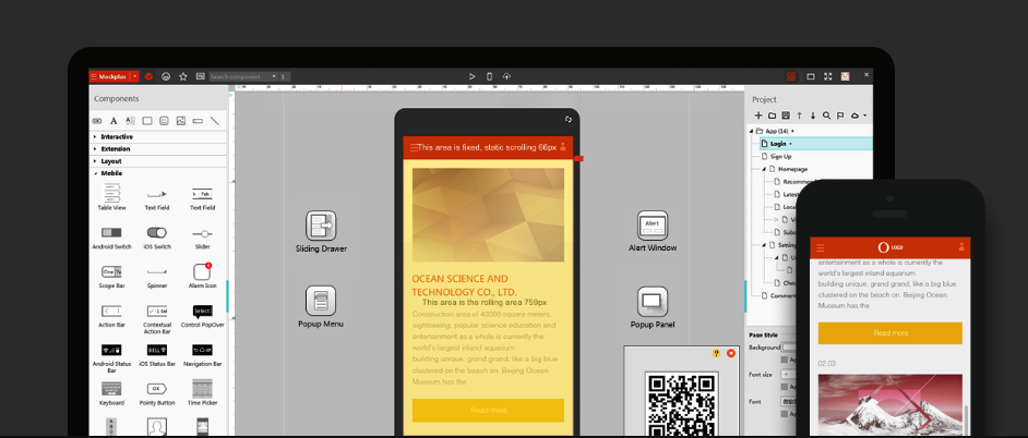 Mockplus Also Supports the Creation of Mobile Prototypes. (Screenshot: Mockplus)[/caption]
A free version of Mockplus is available for download. After the installation, and an uncomplicated registration, the feature set of the free version is yours to keep. This version might be entirely sufficient for lone freelancers.
In its current version 3.x, the creators of Mockplus significantly built upon the team features. Now, it is possible to define projects as team projects right away, resulting in multiple people having simultaneous access to the prototypes. This way, it is also possible to discuss design changes and other questions directly on the given mockup, allowing for project-related communication to take place right at the project. Where it belongs...
[caption id="attachment_103720" align="aligncenter" width="905"]
 Mockplus Accelerates Teamwork But Also Works for Soloists.[/caption]
Working on the prototype is not so uncoordinated that every member can work on the same page of the mockup at once. Instead, pages that are being worked on are blocked for other users. Chaos is not the goal, after all.
Regardless of this functional expansion, Mockplus has not lost the focus on simplicity of usage. The software offers about 200 interactive components, that can be integrated into your prototypes via drag and drop. On top of that, there are 3,000 icons, which enable you to quickly create common user interfaces without having to draw new symbols every time.
[caption id="attachment_103721" align="aligncenter" width="812"]
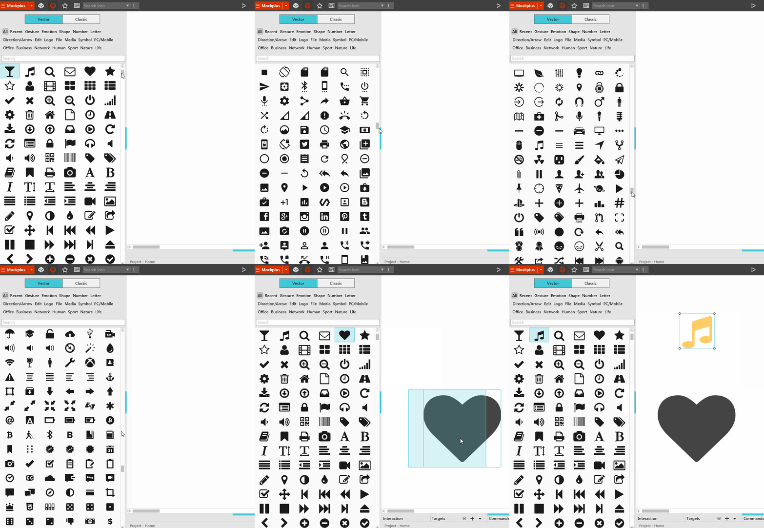 3,000 Icons Can Easily be Integrated Into the Mockups.[/caption]
What I really like is the fact that all interface elements are available in a style that looks like they were hand-drawn. This doesn't have a real user value, but it keeps the digital prototype close to the sketched mockup. This way, everyone can tell that this is a transitional stage. Who doesn't know the type of client that wants to discuss the very first design element, and if this and that button shouldn't be smaller, bigger, rounder, or redder?
[caption id="attachment_103722" align="aligncenter" width="802"]
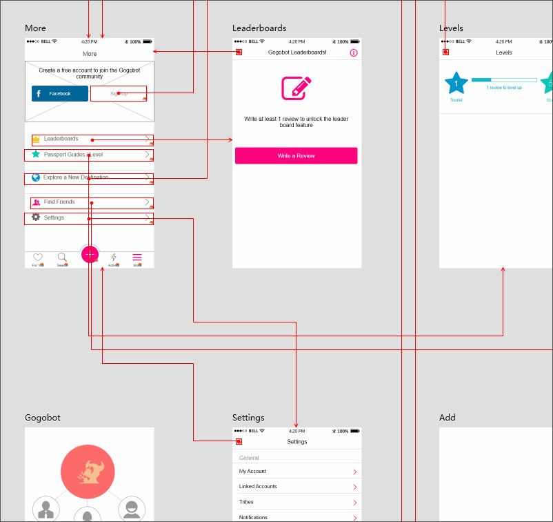 UI Flow: Dependencies as a Desk Overview.[/caption]
Due to the many pre-defined elements and interactive components, Mockplus prototypes represent some kind of interim state, between the pure draft and the finished product. This makes it easier to imagine what the mockup is going to turn out like, without needing the individual design, in the sense of customer looks. At least for me, it is very advantageous that there are pictograms, as I am not that great at drawing tiny elements by hand. There, I said it...
Just like the competition, Mockplus is a WYSIWYG tool. Your prototypes are basically created via drag and drop, but you don't get to edit code blocks. Developers might miss this, although I don't think there's a place for program-logical processes in a mockup anyway. Thus, I'll word it positively, and say that you don't need any code skills to use Mockplus. Overall, the learning curve is pleasantly plane. The learning process is almost entirely intuitive. I have yet to need a tutorial. Though, I have to say that there are a lot of them. If you want to dig deep into the matter, Mockplus does its best to support you in both textual, and audiovisual ways.
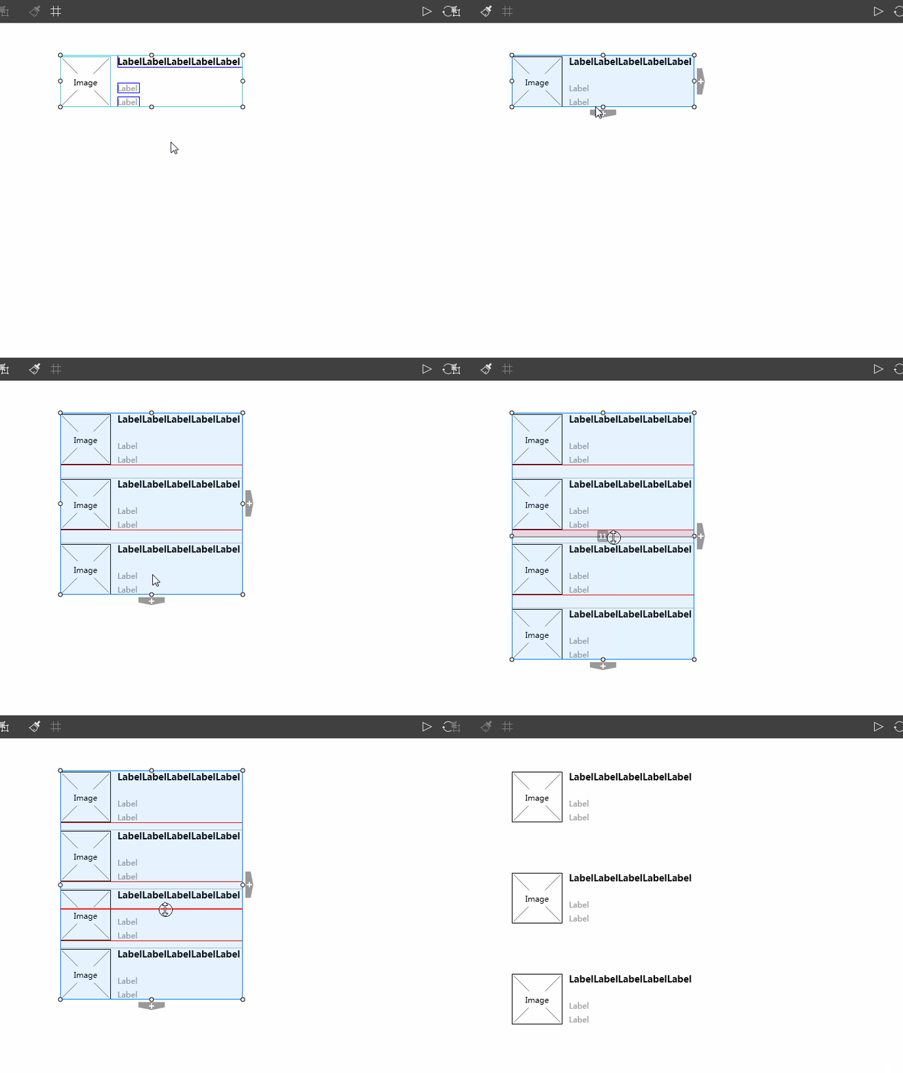 Mockplus Simplifies Setting up Repeating Content.[/caption]
While these are significant restrictions, they are not enough to call the free version a demo in disguise. All other functions are available to free users. This also includes all interactive elements, as well as the beneficial features of the tool's newest version.
The latter turn Mockplus into a valid alternative to Adobe XD, which requires a paid subscription to the Creative Cloud. Modern apps are often characterized by the display of information in a structured list. Here, Mockplus provides a so-called Repeater that is used to design a list entry once, and copy and paste it along.
The Auto Data Fill is used to automatically implement sample data into the created lists if needed. Another indispensable feature is the view UI Flow, which shows you which page and function are entry and exit points to which other page and function on something that reminds me of a setter table. The predefined templates selectable in the application can also be very useful. The new version of Mockplus also makes it possible to import from Sketch. This lets you breathe life into your drafts in no time, while still continuing to work with your allegedly favorite software.
[caption id="attachment_103719" align="aligncenter" width="905"]
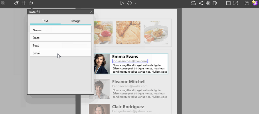 Auto Data Fill Fills Lists With Live Data.[/caption]
There are two price models. Aside from the free version, you can only choose the pro version. Per year and team member, this costs 199 USD or a one-time payment of 399 USD per team member. In European countries, the sales tax is added on top of these prices, unless you have an EU VAT Code.
Without Mockups, Complex Designs are Too Prone to Errors
As soon as a design is supposed to expand over more than a few pages, it makes sense to think about the structure in advance and put these thoughts into a raw prototype. Its primary task is giving you, the rest of the design team, and the potential client a clear look at the information architecture. This is not about creating production ready assets like Sketch allows you to, but rather about producing a usable click skeleton that shows which information is accessed which way, excluding any visual considerations. [caption id="attachment_103726" align="aligncenter" width="1024"] Mockplus: Demo Project in the Mac Version. (Screenshot: Noupe)[/caption]
I'm convinced by this prototyping approach and consider it a necessity. I think it's just as necessary that the solution used for the prototyping sticks to the approach, and refrains from adding any unnecessary complexity.
The Creation of Mockups Has to be Fast and Simple
For trained designers, creating a suitable prototype, depending on the project's complexity, and given the availability of all information, shouldn't take longer than an hour. I'm assuming that the training period for the respective tool should be included within that timespan. Looking at it under these preconditions, many potential mockup solutions fall off the grid right away. We used to create mockups with pen and paper, and many of us still do this today, to sketch something in a meeting with the client, which makes sense. As long as the client's decider responsible for the project is also sitting at the table. Back at the office, I don't want to have to morph the sketch into a complex software product. Instead, I'd rather have a slim solution that allows for the fast digitalization of my draft.The Good Old Days?
A bit over ten years ago, I still used Powerpoint for my prototypes, which apparently was not a good solution. However, I was able to simply scan and integrate my drafts as separate slides, and simulate the interaction with a few hotspots. As Powerpoint was able to save auto-playing presentations, I was able to send the prototype to my clients via email, allowing him to view it without having to install Powerpoint to do so. This has always been sufficient for getting client approval. Today, there are more elegant solutions.Mockplus, Prototyping Giant From Asia
Today, I want to steer your attention to a product that is already super popular in Asia and is now preparing to gain a foothold in Europe and other Western markets with its impressive feature set. I'm talking about Mockplus. Mockplus started out as a web app with a remarkably reduced, almost fragmentary scope of functions. However, the product is way past these days. Instead of a web app, Mockplus is available as a desktop app for Windows and macOS, as well as a native mobile app for Android and iOS. The mobile versions are mainly suitable for the presentation of mobile prototypes on the mobile target device. This is better than any desktop screen smartphone simulation. [caption id="attachment_103724" align="aligncenter" width="942"] Mockplus Also Supports the Creation of Mobile Prototypes. (Screenshot: Mockplus)[/caption]
A free version of Mockplus is available for download. After the installation, and an uncomplicated registration, the feature set of the free version is yours to keep. This version might be entirely sufficient for lone freelancers.
In its current version 3.x, the creators of Mockplus significantly built upon the team features. Now, it is possible to define projects as team projects right away, resulting in multiple people having simultaneous access to the prototypes. This way, it is also possible to discuss design changes and other questions directly on the given mockup, allowing for project-related communication to take place right at the project. Where it belongs...
[caption id="attachment_103720" align="aligncenter" width="905"]
 Mockplus Accelerates Teamwork But Also Works for Soloists.[/caption]
Working on the prototype is not so uncoordinated that every member can work on the same page of the mockup at once. Instead, pages that are being worked on are blocked for other users. Chaos is not the goal, after all.
Regardless of this functional expansion, Mockplus has not lost the focus on simplicity of usage. The software offers about 200 interactive components, that can be integrated into your prototypes via drag and drop. On top of that, there are 3,000 icons, which enable you to quickly create common user interfaces without having to draw new symbols every time.
[caption id="attachment_103721" align="aligncenter" width="812"]
 UI Flow: Dependencies as a Desk Overview.[/caption]
Due to the many pre-defined elements and interactive components, Mockplus prototypes represent some kind of interim state, between the pure draft and the finished product. This makes it easier to imagine what the mockup is going to turn out like, without needing the individual design, in the sense of customer looks. At least for me, it is very advantageous that there are pictograms, as I am not that great at drawing tiny elements by hand. There, I said it...
Just like the competition, Mockplus is a WYSIWYG tool. Your prototypes are basically created via drag and drop, but you don't get to edit code blocks. Developers might miss this, although I don't think there's a place for program-logical processes in a mockup anyway. Thus, I'll word it positively, and say that you don't need any code skills to use Mockplus. Overall, the learning curve is pleasantly plane. The learning process is almost entirely intuitive. I have yet to need a tutorial. Though, I have to say that there are a lot of them. If you want to dig deep into the matter, Mockplus does its best to support you in both textual, and audiovisual ways.
Differences Between the Versions Free and Pro
Naturally, in the free version, there are many features you won't have access to. This starts with the giant icon collection of 3,000 pictograms, only available to users of the pro version. Above all else, almost all export functions are exclusive to pro users. For instance, pro users get to synch projects directly into the cloud, export them as HTML or image files, or print the Mockups in a proper format, as well as display them on mobile devices. It is also possible to distribute prototypes as .exe for Windows, and as .app for macOS. Furthermore, the entire section of Team collaboration is exclusive to the pro users. [caption id="attachment_103723" align="aligncenter" width="688"] Mockplus Simplifies Setting up Repeating Content.[/caption]
While these are significant restrictions, they are not enough to call the free version a demo in disguise. All other functions are available to free users. This also includes all interactive elements, as well as the beneficial features of the tool's newest version.
The latter turn Mockplus into a valid alternative to Adobe XD, which requires a paid subscription to the Creative Cloud. Modern apps are often characterized by the display of information in a structured list. Here, Mockplus provides a so-called Repeater that is used to design a list entry once, and copy and paste it along.
The Auto Data Fill is used to automatically implement sample data into the created lists if needed. Another indispensable feature is the view UI Flow, which shows you which page and function are entry and exit points to which other page and function on something that reminds me of a setter table. The predefined templates selectable in the application can also be very useful. The new version of Mockplus also makes it possible to import from Sketch. This lets you breathe life into your drafts in no time, while still continuing to work with your allegedly favorite software.
[caption id="attachment_103719" align="aligncenter" width="905"]
 Auto Data Fill Fills Lists With Live Data.[/caption]
There are two price models. Aside from the free version, you can only choose the pro version. Per year and team member, this costs 199 USD or a one-time payment of 399 USD per team member. In European countries, the sales tax is added on top of these prices, unless you have an EU VAT Code.
