Design: These Prototyping Tips Prevent You From Losing Your Customers and Your Mind
It doesn't matter whether you call it prototyping, design draft, mockup, or proposal. It's the same topic. The customer wants to see what his digital product will look and work like as soon as possible. You're no wizard, though. What now?
 It's his fault! No, he's to blame! (Photo: Pixabay)[/caption]
However, those that enter the ring with their existing or potential clients will start a hopeless fight. Even if the client ends up relenting, he won't be satisfied. He'll feel run over and definitely won't build a lasting client relationship.
 Mockup, Prototype, Wireframe - don't put too much detail to it. (Illustration: Pixabay)[/caption]
Because of that, a prototype is never a waste of effort. However, there is nothing bad about keeping that part of the creative process as short as possible. Standardize your prototyping workflow. Get a building block system that lets you move the default elements of each project to quickly form a mockup.
Even if you don't want to admit it. The basic components are almost always the same - after all, we're not artists, but rather craftsmen that create more or less standardized solutions with given materials.
In the past, I created mockups in my Moleskine notebook - totally hipster. At one point, I stopped, since I wasn't able to tell the drafts apart anymore. Since then, I've been using Sketch on the basis of three templates, which I have created for prototyping in my clients' main branches.
That Sketch ends up in InVision, where the individual screens are extracted automatically, so this doesn't result in any additional effort for me. Now, I quickly implement the interactions via hotspots - done.
This minimizes the work I need to put into the mockup creation while contributing to the communication and planning with the customer.
 Rapid Prototyping in Adobe Xd. (Screenshot: Adobe)[/caption]
Of course, creating an interaction-free prototype is still the easiest way, but with the prototyping tools available today, this would be near careless. In the noughties, I used Powerpoint for that purpose. Today, there are a bunch of better tools, and even standard web technologies allow for the fast creation of prototypes.
If you want to work contemporarily and provide an interactive prototype, that should be more than just a slideshow. Build a prototype with hotspots in the right places, which lead to the appropriate screens when clicking them. If you don't do that, you're already setting yourself up for the next pitfall.
Aside from the previously mentioned Sketch, I also like to use Adobe XD a lot. I explained why and how I'm doing that in this article.
Adobe XD lets you present your prototype via Creative Cloud using your smartphone. This is really impressive, as I was able to see from the dropped jaws of some customers. Definitely, try that.
Design Prototypes Always Require a Compromise. But Your Customer Doesn't Know That…
Us designers like to consider ourselves experts - especially when we're able to look back at a bunch of successful projects of the past. In comparison to our typical client, we really are experts. Under this basic assumption, it seems unnecessary to make a prototype for easy projects. The customer wouldn't agree with that. He wants to see results as fast as possible. This early on in the project, the most we can show is a mockup, a prototype, a wireframe model. Of course, we know that the mockup won't be able to satisfy the clients' needs. They don't want what we consider a prototype - no, they want to see a complete and fully functional website or app. At the same time, they expect all changes to be made immediately, and at any time, no matter how massive they may be. This is cause for conflict. Even if we don't want to cause an argument, we still know that, with the client's idea in mind, a prototype always has to be a compromise. This may strengthen the urge to forgo the wireframe entirely, or at least to devote as little time as possible. With the prototyping tools and UI kits available today, creating a draft doesn't have to take long. With some experience and the mentioned means, you should be able to get a rough draft complete with interactions in about two hours. With a calm and professional approach, you can prevent losing both your customer and your mind. This is a win-win situation in many regards. Thus, take a clinical look at the following tips, and decide what's more important to you. Being right, or keeping the customer.Tip 1: Don't Lose Your Understanding of the Customer
I have experienced this more often than I'd like to: the designer builds himself up in front of the client, and may even be angry about the client sticking to his own idea of a prototype, even after multiple attempts to convince him. After all, the designer has the expert knowledge on his side - maybe he even studied design, which would make him a certified expert. His customer is a complete idiot! [caption id="attachment_104189" align="aligncenter" width="1024"] It's his fault! No, he's to blame! (Photo: Pixabay)[/caption]
However, those that enter the ring with their existing or potential clients will start a hopeless fight. Even if the client ends up relenting, he won't be satisfied. He'll feel run over and definitely won't build a lasting client relationship.
Remember: You will never win a fight with your customer.Thus, always approach the design process with an open mind and a lot of appreciation for the customer. He's the one that pays for the music - so he is allowed to decide what you play. If he expects Serenade No. 13, but you only know how to play the electric guitar, you might not fit together. But even that can be dealt with intelligently.
Tip 2: Don't Think of Prototyping as Unnecessary Effort
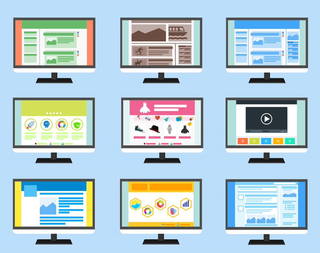
First of all, making a prototype means effort. However, it's also about quickly defining the direction of a project, and communicating basic components of the commission with the client. [caption id="attachment_104194" align="aligncenter" width="1024"] Mockup, Prototype, Wireframe - don't put too much detail to it. (Illustration: Pixabay)[/caption]
Because of that, a prototype is never a waste of effort. However, there is nothing bad about keeping that part of the creative process as short as possible. Standardize your prototyping workflow. Get a building block system that lets you move the default elements of each project to quickly form a mockup.
Even if you don't want to admit it. The basic components are almost always the same - after all, we're not artists, but rather craftsmen that create more or less standardized solutions with given materials.
In the past, I created mockups in my Moleskine notebook - totally hipster. At one point, I stopped, since I wasn't able to tell the drafts apart anymore. Since then, I've been using Sketch on the basis of three templates, which I have created for prototyping in my clients' main branches.
That Sketch ends up in InVision, where the individual screens are extracted automatically, so this doesn't result in any additional effort for me. Now, I quickly implement the interactions via hotspots - done.
This minimizes the work I need to put into the mockup creation while contributing to the communication and planning with the customer.
Tip 3: Build Interactive Prototypes
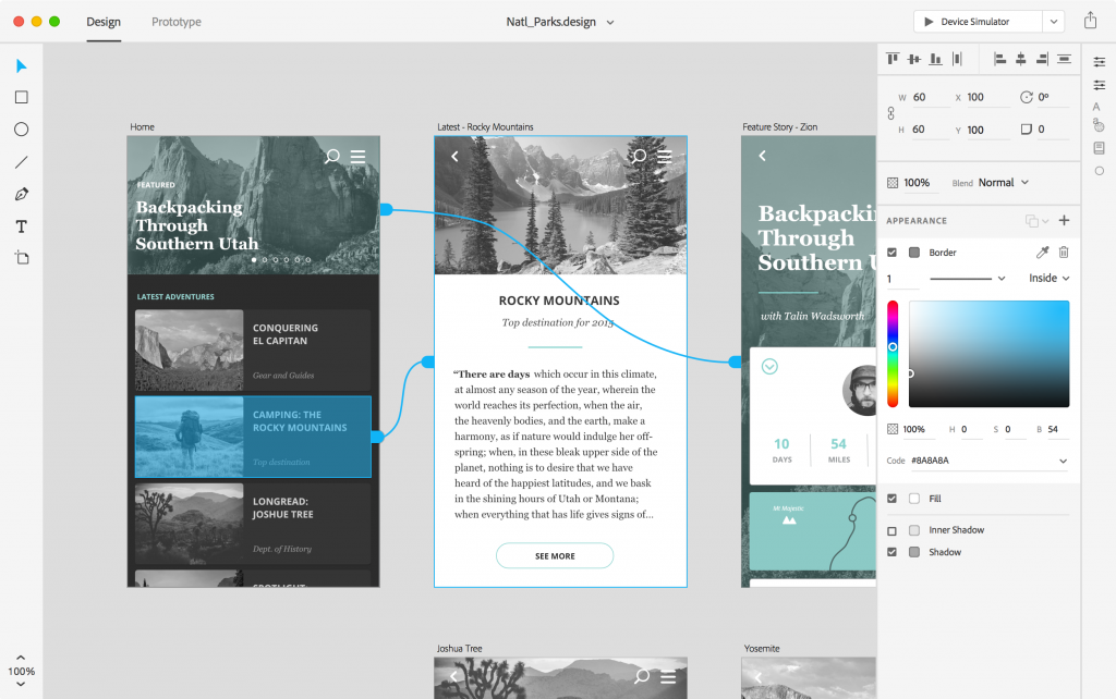
It used to be conventional to create and print out a pure design draft. That print was often glued to a large piece of colorful cardboard to make an impression. The client got to see at least five versions - one of which was awful on purpose, to guide the client into a particular direction from the beginning, stimulating his decision-making. [caption id="attachment_104187" align="aligncenter" width="1024"] Rapid Prototyping in Adobe Xd. (Screenshot: Adobe)[/caption]
Of course, creating an interaction-free prototype is still the easiest way, but with the prototyping tools available today, this would be near careless. In the noughties, I used Powerpoint for that purpose. Today, there are a bunch of better tools, and even standard web technologies allow for the fast creation of prototypes.
If you want to work contemporarily and provide an interactive prototype, that should be more than just a slideshow. Build a prototype with hotspots in the right places, which lead to the appropriate screens when clicking them. If you don't do that, you're already setting yourself up for the next pitfall.
Aside from the previously mentioned Sketch, I also like to use Adobe XD a lot. I explained why and how I'm doing that in this article.
Adobe XD lets you present your prototype via Creative Cloud using your smartphone. This is really impressive, as I was able to see from the dropped jaws of some customers. Definitely, try that.
