CSS Instead of SVG: Creating, Animating, and Morphing Shapes

When it comes to complex shapes and animations, SVG is often the format of choice, and there's a reason for that. However, thanks to new CSS3 attributes, you get to create and even animate shapes aside from rectangle and circle, without any SVG being required at all.

 For that, define a pseudo-class using ": is difficult to define thehover" and enter the polygon's end stage. Here, it is important that the amount of coordinates in the source and final shape are identical.
 While the CSS function "polygon()" separates the coordinate pairs via comma, and the pair's individual values via space, it is the exact opposite for the SVG format. Thus, you need to swap comma and space, and assign a percentage symbol to the values.

Complex Shapes Via "clip-path."
The CSS3 attribute "clip-path" allows you to crop elements to (almost) any shape you want to. For that, the basic geometrical shapes "inset()" for a rectangle, "ellipse()" and "circle()" for ellipse and circle, as well as "polygon()" for polygonal shapes are available. When it comes to displaying a simple rectangular or circular part of an image or an HTML element, "inset()", "ellipse()", and "circle()" are good options. The "polygon()" function is the most interesting one, as it is used to create polygonal shapes.div {
clip-path: polygon(50% 0%, 65.5% 32.9%, 100% 38.2%, 75% 63.8%, 80.9% 100%, 50% 82.9%, 19.1% 100%, 25% 63.8%, 0% 38.2%, 34.5% 32.9%);
width: 300px;
height: 300px;
}
When using "polygon()", as many coordinate pairs as you want to are defined and divided via comma. Not only absolute but also percentual values can be entered. This comes with the advantage that you get to set width and height using the CSS attributes "width" and "height".
The shape defined in the example is a star. As the coordinates are defined relatively, it is easy to alter the form's width and height.
Animating a Form Via "transition."
The "transition" attribute or the "animation" attribute when combined with the "@keyframes" rule gives you the option to create an animated transition between two forms defined with "clip-path". For that, define a pseudo-class using ": is difficult to define thehover" and enter the polygon's end stage. Here, it is important that the amount of coordinates in the source and final shape are identical.
div:hover {
  clip-path: polygon(50% 0%, 80.9% 7.2%, 97.5% 33.7%, 100% 64.6%, 79.4% 88.1%, 50% 100%, 20.6% 88.1%, 0% 64.6%, 2.5% 33.7%, 19.1% 7.2%);
}
As soon as there is too much or too little of a coordinate pair, the animated transition doesn't work anymore. Instead, the two shapes switch without an animation.
Creating Shapes in Illustrator
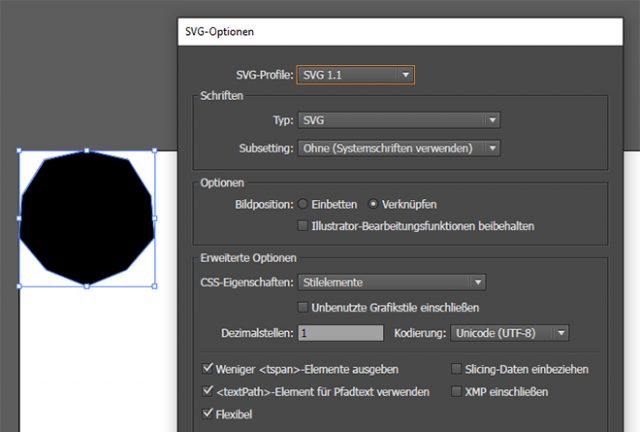
It's hard to define the coordinates yourself. Thus, it is easier and more useful to just draw the shape in Illustrator or another drawing program that knows the SVG export. If you want to enter the shape's data as relative percent values in the "polygon()" function, the form should have a width or height of 100 pixels. Subsequently, export the drawing as SVG and exctract the coordinates. Make sure that you actually set up a polygon. The form mustn't contain bezier curves. A "<polygon>" element should be placed in the SVG source code. While the CSS function "polygon()" separates the coordinate pairs via comma, and the pair's individual values via space, it is the exact opposite for the SVG format. Thus, you need to swap comma and space, and assign a percentage symbol to the values.
<polygon points="50,0 65.5,32.9 100,38.2 75,63.8 80.9,100 50,82.9 19.1,100 25,63.8 0,38.2 34.5,32.9 "/>
The example shows how the coordinates in the SVG source are displayed.

The biggest disadvantage of this solution is a browser support, acoording to #caniuse there is no support for IE or Edge, even most popular browsers needs prfixes. Clip path will be a great tools for developers but for now it’s only a great feature not for productions. (I’m not writing about polyfill becouse… it’s a polyfill)