Create The Future: Common Techniques in Responsive Web Design
In this article, I’ll dive into some of the most common practices for building responsive site layouts and experiences. I’ll describe the emerging and available techniques for site layouts that flexibly resize based on screen real estate (referred to as “fluid grids”) so as to ensure that users get complete experiences across whatever screen size they are using. Additionally, I’ll show how to present rich media, especially images, and how developers can ensure that visitors on small-screen devices do not incur additional bandwidth costs for high-quality media.
 In previous articles, I talked about why the Web is ready for responsive design and how a site owner can use the context of a user’s device and screen real estate to provide a contextually relevant experience to users across screens of various sizes, including PCs, phones and consoles.
As you play with some of the techniques I describe, here are a few ways to test what your site looks like on different devices resolutions:
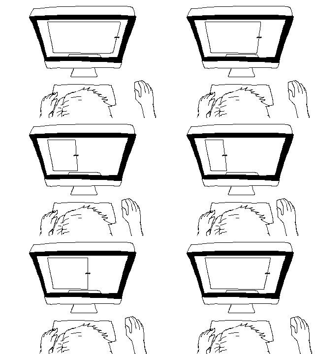 Figure 1. Basic Testing for Responsive Web Design
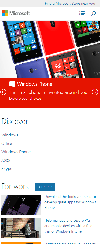 Figure 2. Microsoft.com as Designed for Mobile Phones
Once the width of the viewport exceeds 540 px (at which point we can assume that the user is no longer viewing the site on a phone but on a tablet or a low-resolution PC), you notice the first layout change (Figure 3). The search box is now visible by default, as is the top-level navigation, which was previously hidden under the list icon. The products in the Discover section are now presented in a single line, since they fit in the available width. Most importantly, notice that in this transition the hero image always occupies the available width of the screen.
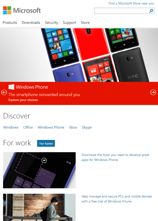 Figure 3. Microsoft.com After Exceeding 540 px
The next layout change, shown in Figure 4, occurs at a width of 640 px or higher. As always, the hero image takes up all available screen width. The individual items within the For Work section are laid out side-by-side. The additional real estate also allows the caption for the hero image to be presented in line with the image and with motion, which is very eye-catching.
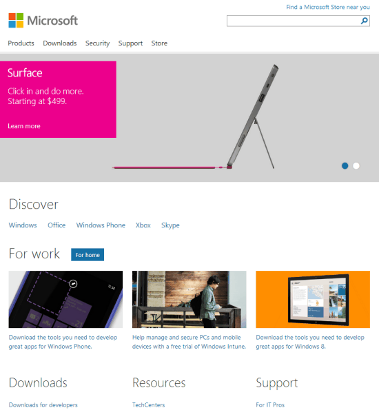 Figure 4. Layout Change at 640 px or Higher
The last layout change occurs at screen widths of 900 px and higher (Figure 5). The Discover menu floats to the left to take advantage of available horizontal space, which reduces the need for vertical scrolling.
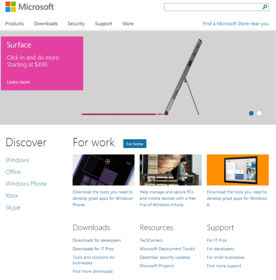 Figure 5. Layout at Screen Widths of 900 px and Higher
Finally, and most importantly, the page layout—especially the hero image—continues to scale and fill the available horizontal real estate (until 1600 px) so as to maximize the impact of the visual eye-candy (Figure 6). In fact, this is the case for all screen widths between 200 px and 1600 px—there is never any wasted whitespace on the sides of the hero image. (Similarly, the relative layouts of the Discover and For Work sections don’t change, but the images scale proportionally as well.)
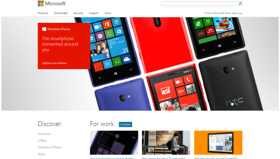 Figure 6. Maximizing Impact at Higher Resolutions
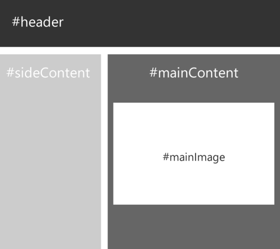 Figure 7. Set Up for a Fluid Grid
The markup for this page would look like the following:
 Main Content
A similar technique is employed by Wikipedia for its pages. You’ll notice that the content of an article seems to always fit the available screen width. Most interestingly, the sidebars (the left navigation bar as well as the right column with the HTML5 emblem) have a fixed pixel width and seem to “stick” to their respective sides of the screen. The central area with the textual content grows and shrinks in response to the screen size. Figure 8 and Figure 9 show examples. Notice the sidebars remain at a fixed width, and the available width for the remaining text content in the center gets proportionally scaled.
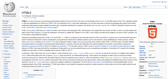 Figure 8. Wikipedia on a 1920-px wide monitor
<
 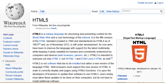 Figure 9. Wikipedia on a 800-px wide monitor
Such an effect for a site with a fixed navigation menu on the left can easily be achieved with the following code:
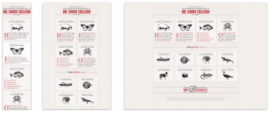 Figure 10. Simon Collision at Different Screen Sizes
We can achieve a similar experience using CSS3 media queries. Let’s examine the simple example illustrated in Figure 11, where I have four divs: #red, #green, #yellow and #blue.
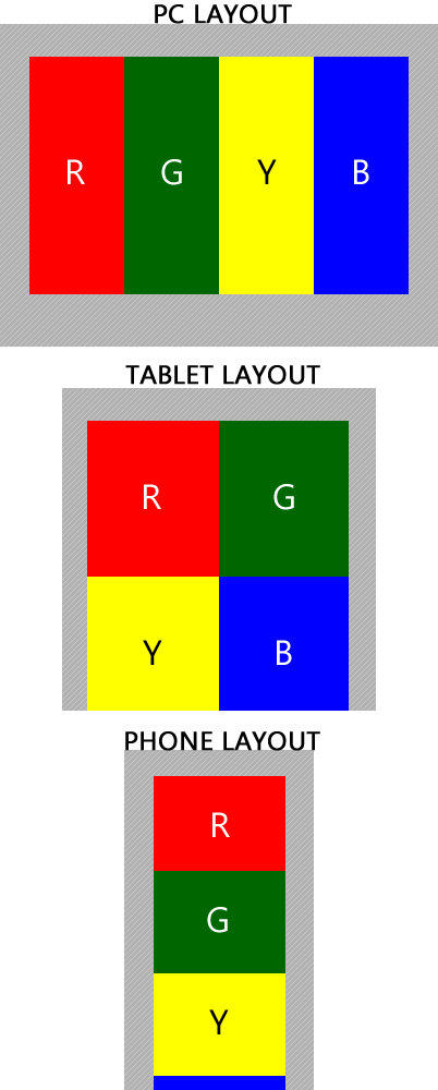 Figure 11. Example for CSS Media Queries
Here’s the sample code:
Often though, you don’t need to write such stylesheets from scratch. After all, what’s Web development without taking advantage of the abundance of open-source frameworks out there and available, right? Existing grid-layout frameworks, such as Gumby Framework (which is built on top of Nathan Smith’s tried-and-true 960gs) and the Skeleton Framework, already provide out-of-box support for reordering the number of grid columns based on available screen width. Another great starting point, especially for a Wikipedia-esque layout, is the simply named CSS Grid. This provides users with the standard fixed-width left navigation bar, which disappears when the screen resolution shifts to that of tablets and smartphones, giving you a single-column layout.
 In previous articles, I talked about why the Web is ready for responsive design and how a site owner can use the context of a user’s device and screen real estate to provide a contextually relevant experience to users across screens of various sizes, including PCs, phones and consoles.
As you play with some of the techniques I describe, here are a few ways to test what your site looks like on different devices resolutions:
- Benjamin Keen has a responsive Web design bookmarklet that you can add to your Favorites bar (or Bookmarks bar) on your browser of choice. You can click on this bookmarklet to test your site layout in different resolutions.
- If you’re using Windows 8, you can always test your page layout on Internet Explorer 10 by employing the Windows 8 snap modes. In Windows 8, you can use Internet Explorer 10 on your full screen (full mode), or you can multitask by docking the browser to snap mode, where it emulates the layout characteristics of a smart phone browser. Additionally, you can dock the browser into fill mode, where it occupies 1024 x 768 pixels (px) on a default Windows 8 screen size of 1366 x 768 px. This is a great proxy for how your site will look on iPad screens as well as traditional 4:3 screens.
- Lastly, you'll probably do a lot of what you see in Figure 1 (image courtesy Reddit.com).
 Figure 1. Basic Testing for Responsive Web Design
Media Queries
Traditionally, developers have relied on sniffing out the browser’s user-agent string to identify whether a user is visiting a site from a PC or a mobile device. Often, after doing so, they redirect users to different subsites that serve up virtually the same content but with different layout and information design. For example, in the past, users who visited MSN.com could see the traditional PC experience or get hardware-specific mobile experiences by being redirected to http://m.msn.com. But redirections require two separate engineering efforts. Also, this approach was optimized for two screen layouts (mobile with 320-px width and desktop with 1024-px width). It did not intelligently provide a great experience for users visiting from intermediate device sizes (such as tablets) as well as users with significantly larger screens. CSS3 looks to help Web developers separate content creation (their page markup and functionality in HTML and JavaScript) from the presentation of that content and handle layout for different dimensions entirely within CSS via the introduction of media queries. A media query is a way for a developer to write a CSS3 stylesheet and declare styles for all UI elements that are conditional to the screen size, media type and other physical aspects of the screen. With media queries, you can declare different styles for the same markup by asking the browser about relevant factors, such as device width, device pixel density and device orientation. But even with CSS3, it’s very easy to fall into the trap of building three different fixed-width layouts for the same Web page markup to target common screen dimensions today (desktop, tablet and phone). However, this is not truly responsive Web design and doesn't provide an optimal experience for all devices. Media queries are one part of the solution to providing truly responsive Web layout; the other is content that scales proportionally to fill the available screen. I'll address this later.What Does “Pixel” Mean Anymore?
The pixel has been used for Web design and layout for some time now and has traditionally referred to a single point on the user’s screen capable of displaying a red-blue-green dot. Pixel-based Web design has been the de facto way of doing Web layout, for declaring the dimensions of individual elements of a Web page as well as for typography. This is primarily because most sites employ images in their headers, navigation and other page UI elements and pick a site layout with a fixed pixel width in which their images look great. However, the recent emergence of high-pixel-density screens and retina displays has added another layer of meaning to this term. In contemporary Web design, a pixel (that is, the hardware pixel we just discussed) is no longer the single smallest point that can be rendered by a screen. Visit a Web site on your iPhone4, and its 640 x 960 px hardware screen will tell your browser that it has 320 x 480 px. This is probably for the best, since you don’t want a 640-px wide column of text fitted into a screen merely 2 inches wide. But what the iPhone screen and other high-density devices highlight is that we’re not developing for the hardware pixel anymore. The W3C defines a reference pixel as the visual angle of 1 px on a device with 96 ppi density at an arm’s length distance from the reader. Complicated definitions aside, all this means is that when you design for modern-day, high-quality screens, your media queries will respond to reference pixels, also referred to as CSS pixels. The number of CSS pixels is often going to be less than the number of hardware pixels, which is a good thing! (Beware: hardware pixels are what most device-manufacturers use to advertise their high-quality phones, slates and retina displays—they’ll lead your CSS astray.) This ratio of hardware pixels to CSS pixels is called device pixel ratio. A higher device pixel ratio just means that each CSS pixel is being rendered by more hardware pixels, which makes your text and layout look sharper. Wikipedia has a great list of recent displays by pixel density, which includes device pixel ratio. You can always use CSS3 media queries to identify the device pixel ratio if you must, as so:/*Note that the below property device pixel ratio might need to be vendor-prefixed
for some browsers*/
@media screen and (device-pixel-ratio: 1.5)
{
/*adjust your layout for 1.5 hardware pixels to each reference pixel*/
}
@media screen and (device-pixel-ratio: 2)
{
/*adjust your layout, font-sizes etc. for 2 hardware pixels to each reference pixel*/
}
There are also some open source libraries that let developers calculate device pixel ratio using JavaScript across browsers, such as GetDevicePixelRatio by Tyson Matanich. Note that this result is available only in JavaScript, but it can be used to optimize image downloads so that high-quality images (with larger file sizes) are not downloaded on nonretina displays.
However, it is not recommended that you use device pixel ratio to define your page and content layout. While the reference pixel vs. hardware pixel disparity can be confusing, it’s easy to understand why this is crucial in offering users a better experience. An iPhone 3GS and iPhone 4 have approximately the same physical screen size and have identical use patterns, so it stands to reason that a block of text should have approximately the same physical size.
Similarly, just because you have an HDTV with a 1920 x 1080 p screen, this doesn’t mean sites should render content at this native resolution. Users sit several feet away from their TV and also use imprecise input mechanisms (such as joysticks) to interact with it, which is why it’s preferred that TV browsers pack multiple hardware pixels into a reference pixel. As long as you’ve designed your site with a 960-px wide layout for desktop browsers, the site will look comparable and be usable, regardless of whether your TV is 1080 p or an older model with 720 p.
As a general rule of thumb, your text content will look better on these devices. However, your image content may look pixelated and blurry. Thus, from a practical perspective, device pixel ratio matters most when you’re trying to serve high-quality photography/image data to your users on high-pixel-density screens. Moreover, you want to make sure that your brand logo looks sharp on your users’ fancy new phones. Later in this article, I'll talk about techniques for implementing responsive images and point to some existing JavaScript libraries that can address this.
As we continue, I’ll use the term pixel to mean reference pixel and explicitly call out hardware pixel as needed.
Scaling Your Site Layout Responsively
Grid-based layout is a key component of Web site design. Most sites you visit can easily be visualized as a series of rectangles for page components such as headers, site navigation, content, sidebars, footers and so on. Ideally, when we design responsive sites, we want to make the grid layout agnostic of the user’s screen size. This means we want our layout and content to scale to as much screen real estate as is available (within reason), instead of providing two or three fixed-width layouts.Mobile-First Design
As I pointed out in the first article of this series, more than 12 percent of the world’s Web traffic comes from mobile devices. This fraction is significantly higher in nations with higher smartphone penetration and is expected to increase notably in the next few years as adoption picks up in Asia, Latin America and Africa. Additionally, taking a mobile-first approach to site design is a good exercise in information design. Basically, it helps you prioritize the content and functionality that you want to make available on the mobile version of a site and then progressively enhance the site layout for larger devices. This way you ensure that your users have a valuable experience on their mobile devices—not just an afterthought to their desktop experience—and you can take advantage of additional real estate when available to provide a more visually engaging experience as well as navigation to additional “tier-two” content.Case Study: The Redesigned Microsoft.com
When you visit microsoft.com on a mobile phone or narrow your PC browser width (with screen width under 540 px), you see a single hero image as part of a touch-friendly, visually rich slide show advertising one product at a time. (See Figure 2.) The top products are highlighted in the Discover section. Additional navigation is below the fold or in an accordion-style menu that is collapsed by default and is exposed when the user taps the list icon. Similarly, the search box is hidden by default to conserve screen real estate—the user needs to tap the search icon. This way, the mobile layout shows top products and links one below the other and only requires vertical panning. Content and product links below the fold are prioritized from top to bottom. Figure 2. Microsoft.com as Designed for Mobile Phones
Once the width of the viewport exceeds 540 px (at which point we can assume that the user is no longer viewing the site on a phone but on a tablet or a low-resolution PC), you notice the first layout change (Figure 3). The search box is now visible by default, as is the top-level navigation, which was previously hidden under the list icon. The products in the Discover section are now presented in a single line, since they fit in the available width. Most importantly, notice that in this transition the hero image always occupies the available width of the screen.
 Figure 3. Microsoft.com After Exceeding 540 px
The next layout change, shown in Figure 4, occurs at a width of 640 px or higher. As always, the hero image takes up all available screen width. The individual items within the For Work section are laid out side-by-side. The additional real estate also allows the caption for the hero image to be presented in line with the image and with motion, which is very eye-catching.
 Figure 4. Layout Change at 640 px or Higher
The last layout change occurs at screen widths of 900 px and higher (Figure 5). The Discover menu floats to the left to take advantage of available horizontal space, which reduces the need for vertical scrolling.
 Figure 5. Layout at Screen Widths of 900 px and Higher
Finally, and most importantly, the page layout—especially the hero image—continues to scale and fill the available horizontal real estate (until 1600 px) so as to maximize the impact of the visual eye-candy (Figure 6). In fact, this is the case for all screen widths between 200 px and 1600 px—there is never any wasted whitespace on the sides of the hero image. (Similarly, the relative layouts of the Discover and For Work sections don’t change, but the images scale proportionally as well.)
 Figure 6. Maximizing Impact at Higher Resolutions
Techniques for Responsive Layout
Great, so how do we implement this kind of experience? Generally, the adaptive layout for Web sites boils down to two techniques:- Identify break points where your layout needs to change.
- In between break points, scale content proportionally.
Scaling Content Proportionally Between Break Points
As pointed out in the evaluation of microsoft.com, the relative layout of the header, hero image, navigation area and content area on the home page do not change for a screen width of 900 px or higher. This is valuable because when users visit the site on a 1280 x 720 monitor, they are not seeing a 900-px wide Web site with more than 25 percent of the screen going to whitespace in the right and left margins. Similarly, two users might visit the site, one with an iPhone 4 with 480 x 320 px resolution (in CSS pixels) and another using a Samsung Galaxy S3 with 640 x 360 px resolution. For any layout with a width less than 512 px, microsoft.com scales down the layout proportionally so that for both users the entire mobile browser is devoted to Web content and not whitespace, regardless of whether they are viewing the site in portrait or landscape mode. There are a couple of ways to implement this, including the CSS3 proposal of fluid grids. However, this is not supported across major browsers yet. In the meantime, we’re going to use the tried-and-tested methods of percentage-based widths to achieve a fluid grid layout. Consider the simplistic example illustrated in Figure 7, which has the following design requirements:- A #header that spans across the width of the screen.
- A #mainContent div that spans 60 percent of the width of the screen.
- A #sideContent div that spans 40 percent of the screen width.
- 20-px fixed spacing between #mainContent and #sideContent.
- A #mainImage img element that occupies all the available width inside #mainContent, excluding a fixed 10-px gutter around it.
 Figure 7. Set Up for a Fluid Grid
The markup for this page would look like the following:
< !doctype html>
Header

Side Content
 Figure 8. Wikipedia on a 1920-px wide monitor
<
  Figure 9. Wikipedia on a 800-px wide monitor
Such an effect for a site with a fixed navigation menu on the left can easily be achieved with the following code:
< !DOCTYPE html>
SomeContent
Changing the Page Layout Based on Breakpoints
Proportional scaling is only part of the solution—because we don’t want to scale down all content equally for phones and other small-screen devices. This is where we can use CSS3 media queries to progressively enhance our site experience and add additional columns as screen size grows larger. Similarly, for small screen widths, we might use media queries to hide entire blocks of low-priority content. MediaQueri.es is a great resource to browse to see what kinds of layout changes sites undergo at their breakpoints. Consider the example of Simon Collision shown in Figure 10. Figure 10. Simon Collision at Different Screen Sizes
We can achieve a similar experience using CSS3 media queries. Let’s examine the simple example illustrated in Figure 11, where I have four divs: #red, #green, #yellow and #blue.
 Figure 11. Example for CSS Media Queries
Here’s the sample code:
< !doctype html>
More Media Queries
Depending on the needs of your site design, you might require other pieces of data about the device/viewport before making your CSS decisions. Media queries let you poll the browser for other attributes as well, such as:- Device width and height. This is a useful set of properties to get not just the width available to the browser but the overall width of the device, which can give you insight into the device form factor.
- Device width and orientation (portrait vs. landscape).
- Browser aspect ratio and device aspect ratio.
Images and Photos
Images are used on the Web for photo content as well as for styling (for background textures, custom borders and shadows and icons). Images make the Web beautiful, and we certainly want our sites to look rich and inviting to all users. However, the biggest concerns around images relate arguably to the most important part of the user experience—namely, performance and page load time.Bandwidth Impact of Images
Our Web sites get served up in text—HTML, CSS and JavaScript. Often, these files don’t take more than 50 kilobytes or so to download. Images and other media are usually the most bandwidth-hungry parts of our pages. All the images on the homepage of a news site can add up to a couple of megabytes of content, which the browser must download as it renders the page. Additionally, if all the image content comes from separate files, each individual image file request causes additional network overhead. This is not a great experience for someone accessing your site on a 3G network, especially if you’re looking to serve up a gorgeous 8-megapixel panoramic landscape background. Besides, your user’s 320 x 480 px phone will not do justice to this high-quality image content. So, how do you ensure that users get a quick, responsive experience on their phones, which can then scale up to a richer media experience on larger devices? Consider the following techniques, which you can combine to save users image downloads on the order of several hundred kilobytes, if not more, and provide a better performing experience.Can You Replace Your Images with CSS?
CSS3 can help Web developers avoid using images altogether for a lot of common scenarios. In the past, developers have used images to achieve simple effects like text with custom fonts, drop-shadows, rounded corners, gradient backgrounds and so on. Most modern browsers (Internet Explorer 10, Google Chrome, Mozilla Firefox and Safari) support the following CSS3 features, which developers can use to reduce the number of image downloads a user needs while accessing a site. Also, for older browsers, a number of these techniques degrade naturally (for example, the rounded border just gives way to a square border on Internet Explorer 8 and earlier), and this way your sites are still functional and usable on older browsers.- Custom font support using @font-face. With CSS3, you can upload custom fonts to your site (as long as you own the license to do so) and just point to them in your stylesheet. You don’t need to create images to capture your page titles and headers or embed custom fonts for impactful titles and headers
- Background-gradients. Go to a lot of top sites, and you’ll notice that the background of the site is usually a gradient color, which helps the page look less “flat.” This can easily be achieved with CSS3, as seen here.
- Rounded corners. CSS3 allows you to declaratively specify a border-radius for each of the four corners of an HTML element and avoid having to rely on those pesky 20 x 20 px images of circles to create a rounded box on your site design.
- 2-D transforms. CSS3 allows you to declare 2-D transforms such as translate(), rotate(), skew() and others to change the appearance of your markup. IETestDrive has a great working example here. Common transforms such as rotation might cut back on the number of image downloads.
- Box-shadow and text-shadow. Modern browsers support box-shadow and text-shadow, which allow site developers to make their content look more three dimensional and add prominence to important pieces of content (such as header text, images, floating menus and the like)
Use JavaScript to Download the Right Image Size for the Right Context
If your site experience inherently relies on pictures, you need a solution that scales across the spectrum of devices and network conditions to offer users a compelling experience in the context of the device they use. This means that on high-quality cinema displays you want to wow your audience with high-quality (that is, large file size) images. At the same time, you don’t want to surface your 1600 x 1200 px photographs to users on a 4-inch cellphone screen with a metered 3G data connection. While the W3C is working on proposals for how to declare different image sources for a given picture, a few emerging JavaScript technologies can help you get started right now.Media Query Listeners
Media Query Listeners are supported in modern browsers. They let developers use JavaScript to verify whether certain media query conditions have been met, and accordingly decide what resources to download. For example, say your Web page has a photograph that someone posted. As a developer, you need to do two things:- Decide the thresholds (or break points) for showing a high-quality (large-screen experience) or a small-screen experience, and based on that decision, download a high-quality set of resources or the low-bandwidth set of resources. Include the following script at load time to ensure that your page downloads the appropriate set of assets and provides users with the right experience:
var mediaQueryList = window.matchMedia("(min-width:480px)");
//NOTE: for IE10 you will have to use .msMatchMedia, the vendor-prefixed implementation
 //instead
isRegularScreen = mediaQueryList.matches;
//this returns a Boolean which you can use to evaluate whether to use high-quality assets or
//low-bandwidth assets

if (isRegularScreen)
{
  //run script to download the high-quality images
}

else
{
  //the condition has failed, and user is on smartphone or snap-mode
  //run script to download low-bandwidth images
}
- Optionally, add an event listener to watch for changes to the media size so that as a user resizes her browser window, you can run different sets of scripts to acquire high-quality resources as needed. For example, a user might first visit your site on Windows 8 in snap mode with a 320-px width. Later, the user might find your content interesting and open the browser in full-mode (and even share what she is seeing on her HDTV.) At this point, you might want to provide a better experience for your media:
mediaQueryList.addListener(mediaSizeChange);
function mediaSizeChange(mediaQueryList)
{
  //Executed whenever the media query changes from true to false or vice versa
  if(mediaQueryList.matches)
  {
    //run script to acquire high-quality assets;
  }

else{
  //in this case the user has gone from a large screen to small screen
  //by resizing their browser down
  //if the high-quality images are already downloaded
  //we could treat this as a no-op and just use the existing high-quality assets
  //alternatively, if the smaller image shows a clipped version of the high-quality image
  //trigger the download of low-bandwidth images
  }
}
Custom JS Libraries
Of course, there are also custom libraries to help you with this. These libraries work in a similar way by identifying the size and resolution of the user’s device and then delivering, on-the-fly, a scaled-down version of your source image over the network. Here are some examples:- The Filament Group, which redesigned the Boston Globe site to be responsive, has a technique available, which requires you to add some JavaScript files to your site and alter your site’s .htaccess file. Then, for each of your <img> tags, you provide a regular-size version as well as a hi-res version, and their plug-in takes care of the rest.

- A similar technique is available at AdaptiveImages.com. The benefit of this technique is that it does not require developers to hand-code their markup to point to low-resolution and high-resolution images, nor does it require developers to manually upload two different versions of the same image.
- Allow developers to specify which images should load before the DOM is ready (must-have images for page content).
- Allow developers to specify which images to load only after the rest of the page is ready (for example, images in a slide show that will only toggle 10 seconds later).
- Allow developers to decide whether new images should be downloaded and swapped in at the time a browser is resized.
Text
Sites use text to communicate organization and content to their users in two predominant ways, namely body text and header text. It’s definitely valuable to think through how your site is going to scale these across different contexts. Body text is particularly interesting if your site features articles, blog posts and tons of written content that users consume. Your mobile users want to read the same 500-word article on their desktop, TV and 320-px width screens and, as the site developer, you want to balance readability with convenience (that is, not having to scroll too much). The width of the article’s body can be scaled up to match the screen size, but more than that, you can offer larger type and improved line spacing to further improve readability for users with bigger screens. Blocks of text are usually most readable when they hold approximately 66 characters per line, so if your site really depends on readability of long articles, optimizing type responsively for users can really improve their overall experience. The following example uses the CSS3 media query max-width to progressively increase the readability of paragraph text:/* pack content more tightly on mobile screens to reduce scrolling in really long articles */
p {
font-size:0.6em;
line-height: 1em;
letter-spacing: -0.05em;
}
@media screen and (max-width:800px) and (min-width:400px)
{
/* intermediate text density on tablet devices */
p
{
font-size:0.8em;
line-height: 1.2em;
letter-spacing: 0;
}
}
@media screen and (min-width:800px)
{
/* text can be spaced out a little better on a larger screen */
p
{
font:1em 'Verdana', 'Arial', sans-serif;
line-height: 1.5em;
letter-spacing:0.05em;
}
}
AListApart.com has a great example of an article with responsively scaled type.
Additionally, your site probably uses headlines to break up content—to make it easier for a user who is scanning through your site’s pages to quickly identify how information and functionality are structured. Sites often use headlines with large impactful type and add margins and padding.
Headers in HTML (specifically <h1>, <h2>, and similar tags) usually are automatically styled not just to use a large font-size attribute but also spacious margins and padding to ensure that they stand out and break the flow of content.
With a similar technique, you can consider scaling down the text size, margins, padding and other spacing attributes you use for your headlines as a function of the available device real-estate. You can also use available open-source solutions, such as FitText, to achieve this.
Optimizing Form Fields
If your site requires users to fill in forms, you might want to ensure that you can minimize interactions for touch users. This is especially relevant if you have a lot of text inputs. HTML5 extends the type attribute for the <input> tag to let developers add semantic meaning to a textbox. For example, if a user is filling out a contact form, the phone number input can be marked up as <input type= "tel" /> and the email address field can be marked up as <input type= "email" />. Modern browsers, especially those on touch devices, will parse this attribute and optimize the layout of the touch-screen keyboard accordingly. For example, when a user taps on a phone number field, the browser’s touch keyboard will prominently display a numpad, and when the user taps on the email address field, the touch keyboard will surface the @ key, as well as a .com key to minimize typing. This is a minor tweak that can really improve the overall form-filling experience on your site for users visiting via touchscreen phones and tablets.Wrapping Up
In this article, I’ve covered the strategies for dealing with the most common scenarios of responsive design, such as handling grid-layout, bandwidth-sensitive image scaling and optimization of text and form fields. It’s important to note that the Web development community is still evaluating techniques to solve newly arising challenges in the responsive design space. For example, the HTML working group of the W3C is evaluating competing proposals (namely the srcset attribute proposal and the picture element proposal) to handle image selection and download for high-quality displays (for example, retina-display laptops that show the same reference pixel size as their predecessors but use a higher hardware pixel count). Still, the techniques described here should work on all modern browsers and allow you to ensure that users visiting your site have a great experience regardless of what device they’re coming from. Consumers today have a variety of purchase options for smart phones, tablets, PCs and consoles, and the hardware landscape is constantly changing and evolving. You want to be sure that your site is ready to handle traffic from the hot new device in 2013 and beyond.About the Author
(dpe)Rahul Lalmalani is a former Microsoft engineer who currently freelances in app and Web development. You can follow him online at RahulJL.com and reach him @quasirahul.

Thanks for this article, especially about the images