Atomic Design: How to Design a Modular Website

Often, technical terms in web design aren't more than empty words. The term "Atomic Design" is one of them. All it does is allow its inventor to spread his philosophy with a memorable name. Nonetheless, it is worth looking into the content.
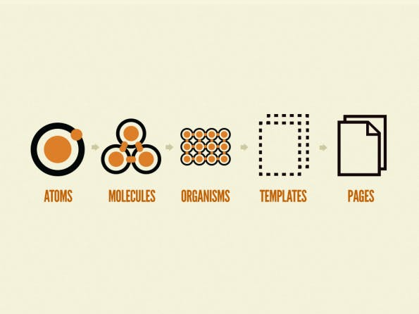
 The five components of atomic design. (Illustration: Brad Frost)[/caption]
"Atomic Design" is meant in a literal way. It starts at the atom as the smallest component of a design. An atom, for example, is an HTML tag, a font, or another unit of the design system that can not be reduced any further. A molecule is a conglomerate of multiple atoms that solve a task together. This could be an HTML form, for instance. The next unit is called organism. Here, multiple molecules assume a specific role. An organism would be a complete header, footer, or the area with recent news. I think you can imagine what I mean.
This where Frost leaves the chemistry analogy. The organism is followed by the template, a pre-stage of the actual page. The latter is the page available to the user, with all active contents, while the templates are where these contents are meant to be placed in.
And that's pretty much it.
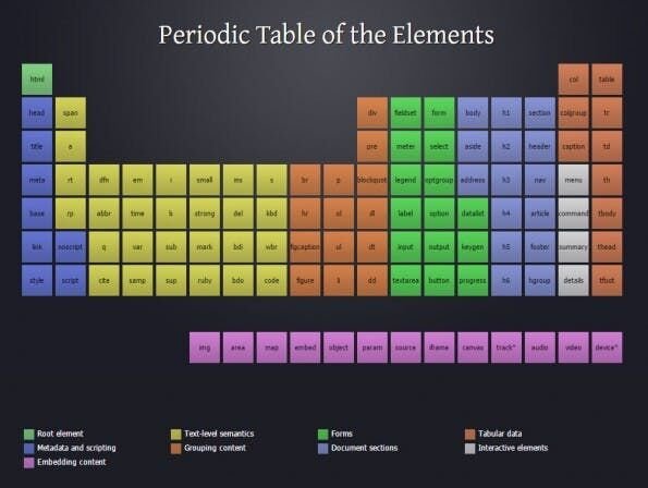
 The periodic table of HTML elements. (Illustration: Josh Duck)[/caption]
Thus, saying that atomic design is just old wine in new tubes is justified. Which also answers the question of whether atomic design is a success or not: it is successful, but not under this name tag. **
I can see one advantage of using these terms, even if it's more of a psychological one. By speaking of atomic design, we create a mindset that points us in the right direction. This results in us focusing on the details of the design approach, rather than randomly designing the right way.
It should be undisputed that a design approach should always start at the smallest, and end with the largest component. Responsive design is one of, but not the only factor forcing this approach on us. Whether we're doing it voluntarily or not, there are valid reasons for the method.
Atomic Design: This is What's Behind the Word
The term "Atomic Design" has been haunting the web for nearly half a decade. Invented by Brad Frost and supported by an entire e-book, it is still waiting for its triumph. Or is it? This depends on how you look at the phenomenon. If you haven't heard of "Atomic Design" yet, you've come to the right place. I'll briefly explain the theoretical approach, so we're all on the same page. If you end up developing a more profound interest in the concept, use the links to Brad's websites, and his e-book, above. [caption id="attachment_104642" align="aligncenter" width="595"] The five components of atomic design. (Illustration: Brad Frost)[/caption]
"Atomic Design" is meant in a literal way. It starts at the atom as the smallest component of a design. An atom, for example, is an HTML tag, a font, or another unit of the design system that can not be reduced any further. A molecule is a conglomerate of multiple atoms that solve a task together. This could be an HTML form, for instance. The next unit is called organism. Here, multiple molecules assume a specific role. An organism would be a complete header, footer, or the area with recent news. I think you can imagine what I mean.
This where Frost leaves the chemistry analogy. The organism is followed by the template, a pre-stage of the actual page. The latter is the page available to the user, with all active contents, while the templates are where these contents are meant to be placed in.
And that's pretty much it.
Atomic Design: The Only Thing That's New is the Term
Huh, some web designers will realize that they've never done this in a different way. However, they would've never thought about using these terms to describe it. If you're in the same boat, I welcome you. This is my understanding of the situation as well. Of course, it sounds excellent and pseudo-scientific if we talk about atoms, molecules, and whatnot. This doesn't provide any value, though. It only makes sense to build pages on a foundation of templates that we've filled with different functions and layout blocks. It doesn't matter if I call it atoms, molecules, or something entirely different. [caption id="attachment_104646" align="aligncenter" width="595"] The periodic table of HTML elements. (Illustration: Josh Duck)[/caption]
Thus, saying that atomic design is just old wine in new tubes is justified. Which also answers the question of whether atomic design is a success or not: it is successful, but not under this name tag. **
I can see one advantage of using these terms, even if it's more of a psychological one. By speaking of atomic design, we create a mindset that points us in the right direction. This results in us focusing on the details of the design approach, rather than randomly designing the right way.
It should be undisputed that a design approach should always start at the smallest, and end with the largest component. Responsive design is one of, but not the only factor forcing this approach on us. Whether we're doing it voluntarily or not, there are valid reasons for the method.

Thanks for this informative brief discussion about atomic design. It was very useful and knowledgeable.
Thanks for sharing very nice blog post amazing for articles
It’s a great article, surely it will help our students to learn more about modular websites. Thanks for sharing so informative post. Keep sharing good work.
I recommend my colleagues and team members to have a look at your blog to know how exactly website building should be done. Great Article!
Hi,
Thanks for Sharing this very helpful blog.
Keep it up Sharing.
These days, designing a professional website for your business is not a difficult task to handle. There are a lot of free sites builder available on the internet which provides excellent solutions to create a website within a few minutes. Those people who are searching for how to design a modular website in 2019, this post is very useful for them. Thumbs up for your efforts, keep up the great work.