Annoying or Inspiring? Sound in Modern Webdesign (Best Practice)

You could think that background music in web design was totally out. We, the web designers and developers thought we had left behind this anachronistic way of attracting attention since the early stages of web design. But we were wrong. Sound, in the shape of effects or background music for particular areas of a website, is slowly gaining popularity again. Enough reason for us to grill this trend.

Sound Effects in Modern Webdesign - Simply Annoying?
Who doesn't know this? You visit a website unsuspectingly, and suddenly it makes itself noticeable with a loud background noise. In many cases, there is also no button that allows you to quickly turn of off the sound. The reaction of most visitors is obvious: closing the browser tab with a quick click. The users simply forgo the visit to a website that might contain the exact information they're searching for. All because the concept of the site didn't fit.
Maybe the web developer has let the client influence him too much and wasn't able to come out on top. Either way, the result remains the same. Potential visitors or even customers leave the website because they are annoyed by the background music. In many situtations, you can gain the impression that the music is not supposed to be supportive, but is rather implemented by technology loving nerds for the sole purpose of implementing it. Of course, no visitor will reward that. That brings up the question if it could work in a different way.
Multimedia Webdesign - the Challenge of the Future
The trend is definitely going towards multimedia web design. Everything started with the so-called hero images which completely take up the visible parts of the browser. However, this was too static and old school for many developers, as people have been working with full screen background images for a rather long time already. The only difference to hero images was that the entire screen was taken up, instead of only the visible area (Viewport).
Thus, the newest trend leans towards using background videos instead of hero images. Well-designed websites with background videos require significantly less text to convey their message. It's only logical that there are not only services for free to use photos, but also for background videos.
Sound Effects and Background Music as Perfect Support for Multimedia Webdesign
Careful use of sound effects and even music could be a perfect support for modern web design. Working with supportive background videos would only be the first step. More and more developers will want to integrate multimedia elements into their websites.
The Integration of Sound Effects - a Logical Evolution
Interesting and carefully placed sound effects fit perfectly here. The website can inform the user that the interaction with the website worked by returning a sound effect. Clicking a call-to-action button or sending a form can be confirmed acoustically.
Of course, this acoustic support is nothing new. Computers' operating systems and video games have been using these effects for a while now and with great success. How would it feel to empty the recycle bin on Windows and OS X without the famous, decent sound? How would it feel to play games like the famous Pac-Man without sound effects? Developers can learn a lot from the creators of operating systems and video games. It's something to orientate oneself by and build on. The websites you design can only benefit from that.
Don't Overdo. A Sound Effect is not an End in Itself
Especially websites that have to earn money, like online shops, for instance, can profit. But also business websites with call-to-action buttons would be a good place to integrate sound effects. With all the coolness of new features, you still have to make sure that you apply them carefully.
A Perfect Example of Interesting Sound Effects. Victoria Nine Webdesign and Development.

Sound in Webdesign Can Also be Very Inspiring
Using background music is easier said than done. Of course, implementing it can be done rather fast and simple. However, the music just won't always fit. That's why you should think about on which websites, or what type of websites, background music can be beneficial. There are many good examples where it would be entirely fitting. The website of New York City, for instance, could play Frank Sinatra's "New York, New York", even though this depends on personal taste and would require dealing with the licenses.
This way, you can find many websites where background music would be a beneficial addition.
Music Needs to Convey a Message and it Should be Easy to Turn Off
Background music should always convey a message or at least underline one. Then, it is less likely to be perceived as an annoyance, but rather as beneficial, as then, it serves a purpose. Apparently, not every visitor will recognize the purpose and above all, won't want to hear it. In order to protect yourself from losing visitors, a volume control button that allows the user to mute the sounds should be placed in a prominent and clear area on the website.
The Visible, Well-Integrated Control Sound Element.

Many visitors will prefer or, depending on the user's location, might have to view it muted. However, supporting sound effects when clicking a button or something similar should remain even if muted, as they can contribute to a higher user friendliness.
The following websites are good examples of successful media integration. Enjoy exploring!
14 Examples of Brilliant Websites With Sound
1 - Google Ideas
2 - Amy Movie
3 - John Iacoviello
4 - Fornasetti
5 - Calvin Harris
6 - Hashima Island
7 - The Build Film
8 - Jakob de Boer
9 - Janis Breslin
10 - Brightley Preflight Nerves
11 - Conoce Valencia de una forma diferente
12 - Black Negative by Ralph Lauren
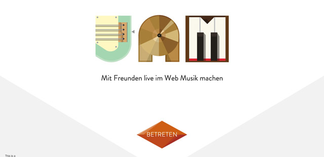
13 - Jam with Chrome
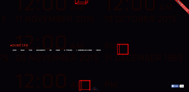
14 - Dubfire
Featured Image by Drew Patrick Miller on Unsplash











Damn nice post.!! Sound on a website is quite annoying sometimes. But these sites are very rare.
Great Post.
Thanks
100% inspiring
No matter how you package it – sound and sound effects are still annoying unless specifically requested.
Sounds don’t have to be annoying if the volume on the waveform is right, and the frequencies aren’t annoying.