Adobe Illustrator Tutorial: Creating a Tattered Parchment
Today, in this all new Adobe Illustrator tutorial, we will be learning how to create a very popular illustration; old tattered parchment. There are many beautiful illustrations that seem to be complicated to create, but they are actually not. This is the main purpose of this tutorial, to show you how easily some of these can be achieved. We will deform some basic shapes and objects, combine them, and perfectly complete the whole illustration with some decorative elements and gradients.
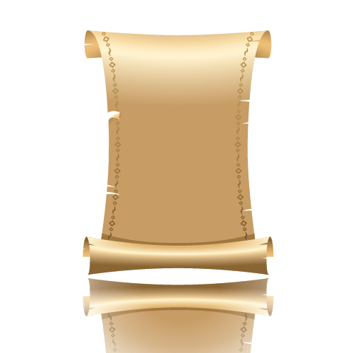
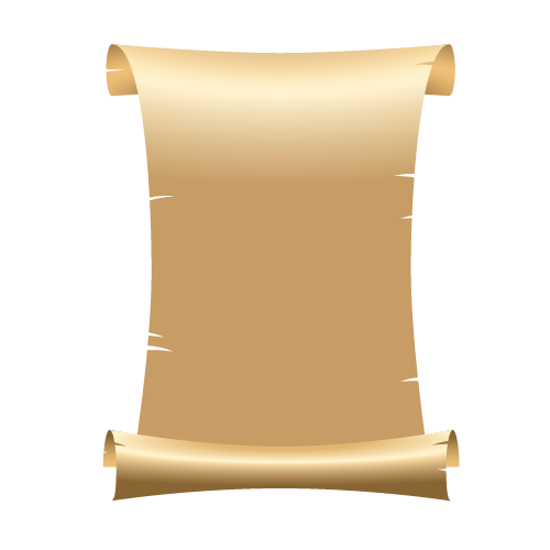
This is what we will be creating.
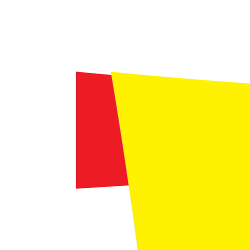
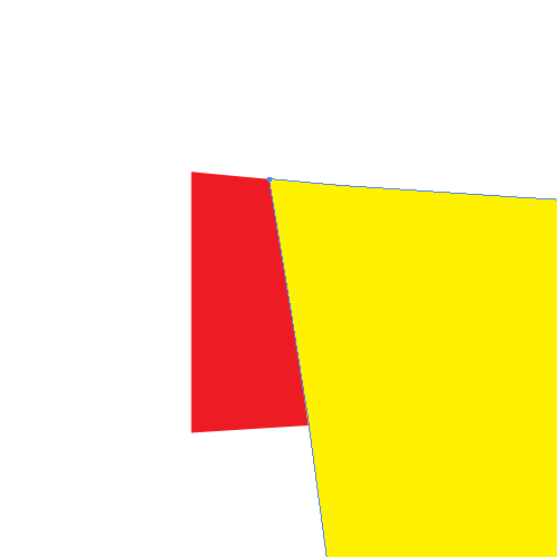
 Now we need to distort the rectangles a little bit. To do that we will need a few extra anchor points. Grab the Add Anchor Point Tool (
 Select the Direct Selection Tool (
 With the Convert Anchor Point Tool (
 You will notice that some parts of the rectangles have changed position. Make sure to correct all the flaws that may cause any problems with the smoothness.
 Grab the Ellipse Tool (
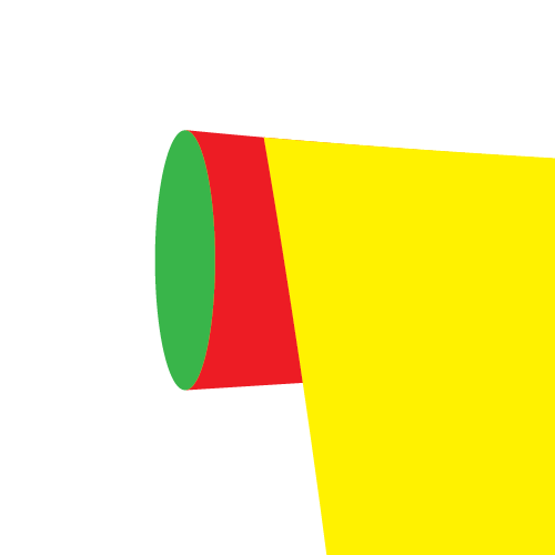
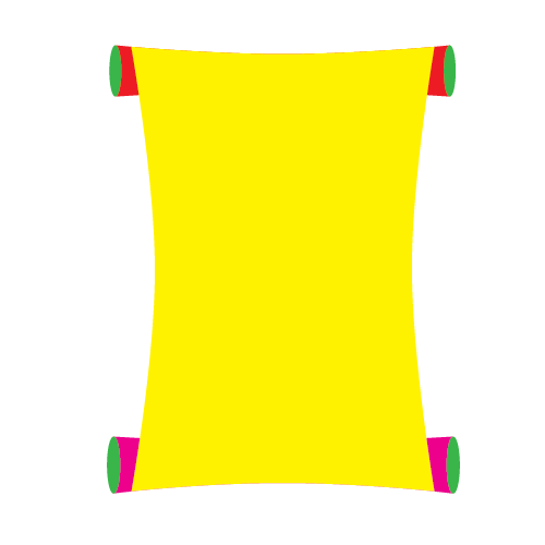 Now we will make some adjustments to the ellipses we have just created. The point is to create the effect of rolled up parchment on the ends.
First select the lower parts of the illustration (the purple shape with two green ellipses) and bring them to the Front (
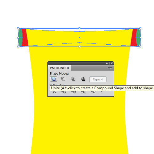
 Lets adjust the upper part of the yellow shape. We have to make both shapes (green and yellow) look connected. To do this we will need the Direct Selection Tool (
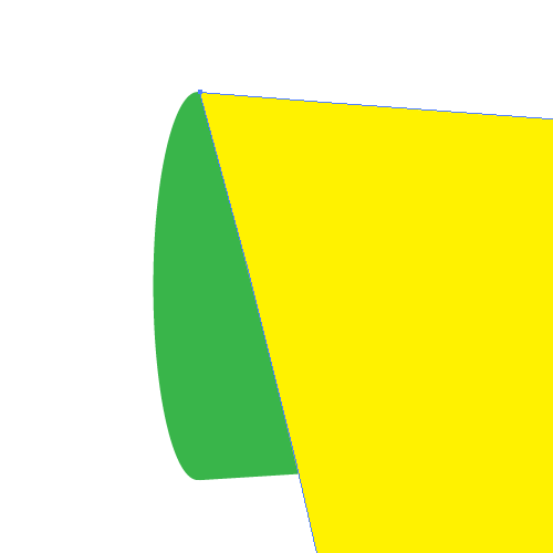 As you can see, we didn't accomplish all we needed with previous step. We will try harder to make it look like rolled up parchment. With the Direct Selection Tool (
 Repeat the previous step for the right side of the illustration as well.
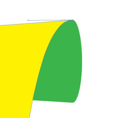 You should end up with something like this.
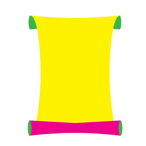 Now it's time to adjust lower part of the illustration.
Duplicate (
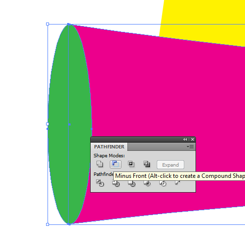 Now we have one green ellipse left on each side. Remove the Fill color and set the Stroke color to any color you wish (color is not important).
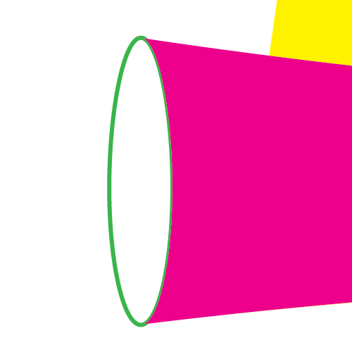 Now we need to remove some anchor points. With the Direct Selection Tool (
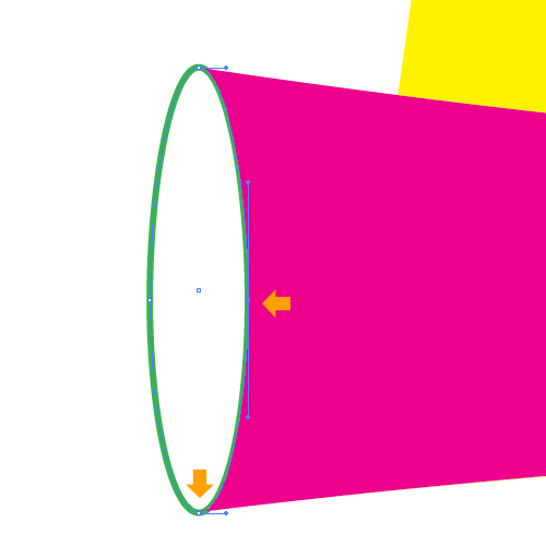 You should end up with something like this.
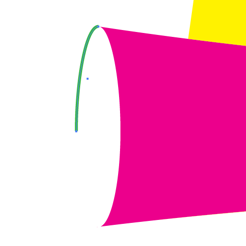 Repeat the previous step for the ellipse on the right side as well.
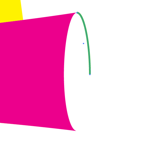 Now we need to connect the paths on both sides and use them to create a new shape. To do that grab the Pen Tool (
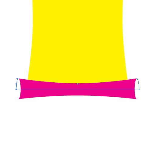
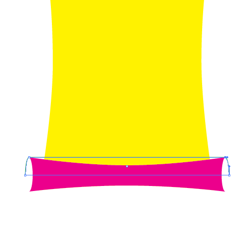 Remove the Stroke color and set the Fill color to any solid color. Grab the Add Anchor Point Tool (
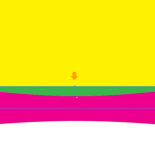 With the Direct Selection Tool (
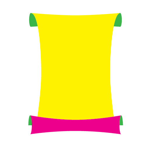 Basically, this is the shape of our parchment. Feel free to play around with position of the anchor points, add new ones or remove some (if needed). You might improve the look.
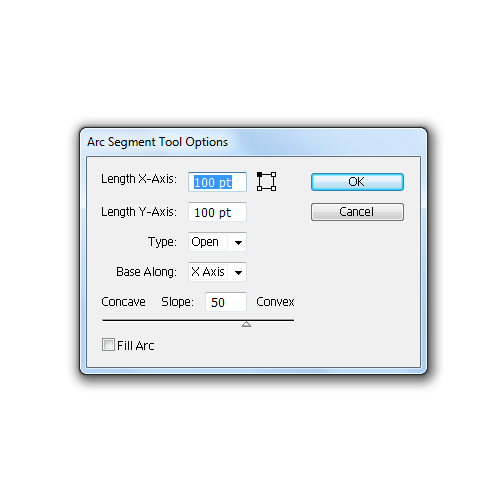 Leave all settings at the default and hit the
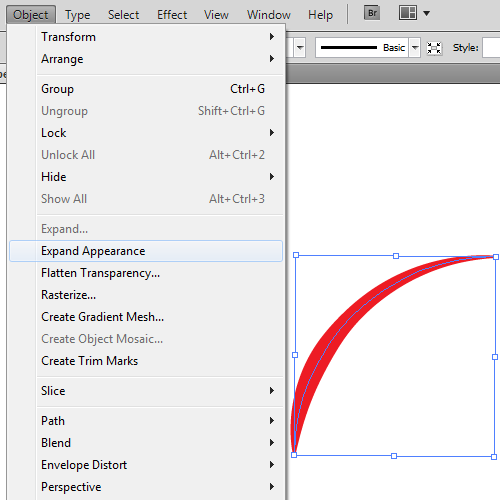
  To be able to create the rips we will need to expand the Stroke we have just created. Select the arc, and under Object select Expand Appearance.
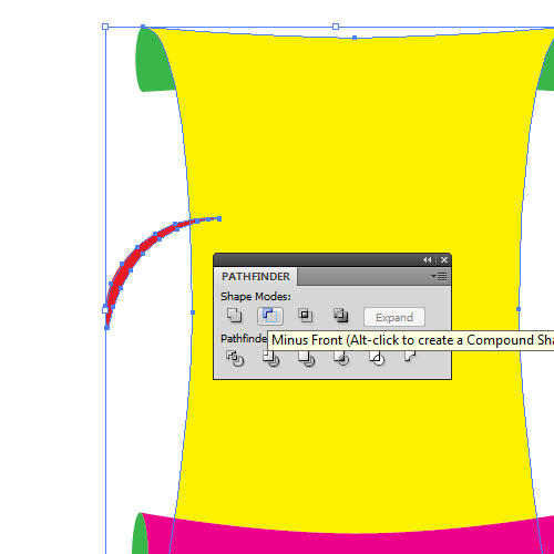
 Place the new shape, we have just created, where the end just partially covers the edge of the parchment. Feel free to rotate it, if needed. Select the new shape and the yellow shape (parchment), and under the Pathfinder Panel hit the Minus Front button. It will create a small rip.
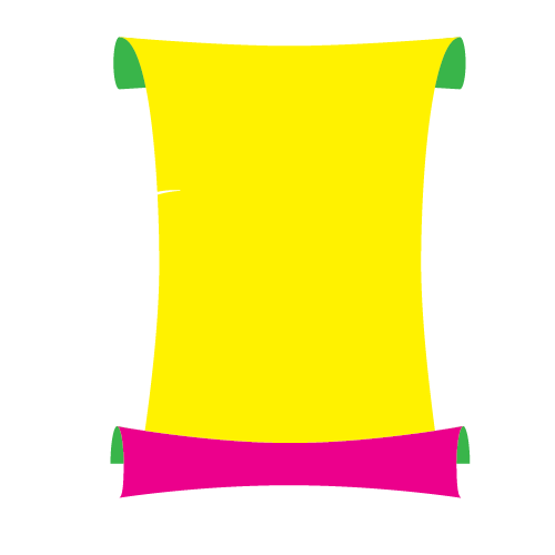
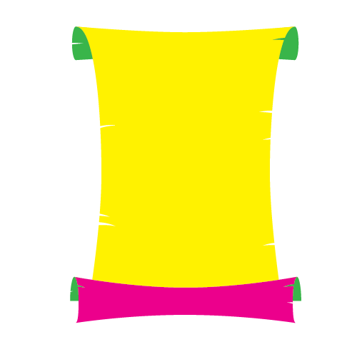
 Repeat this step a few times to create several more rips. Just place them randomly all over the folded parchment. You should end up with something like this.
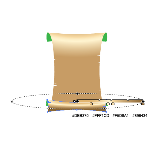
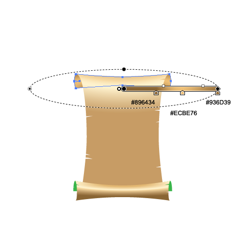
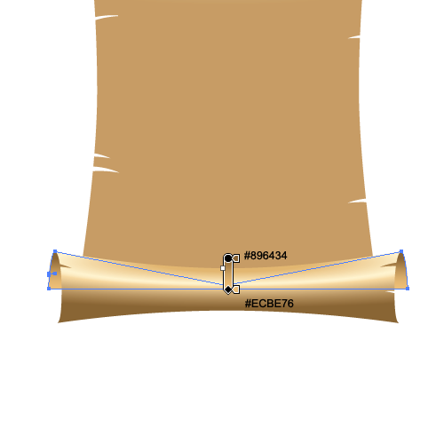
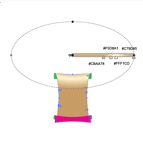 We will use similar gradients for the other parts of the illustration as well.

Setting Up the Elements for the Basic Shape
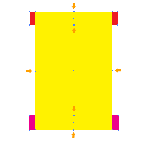
We will start with some simple rectangles. Grab the Rectangle Tool (M) from the Tool Panel and create rectangles as shown in the picture below. Just make sure to create the lower rectangle slightly larger than the upper.
 Now we need to distort the rectangles a little bit. To do that we will need a few extra anchor points. Grab the Add Anchor Point Tool (
+) from the Tool Panel and add anchor points in the middle of each rectangle.
 Select the Direct Selection Tool (
A) from the Tool Panel, select the each individual anchor points (we have just added) and nudge them towards center, as shown below.
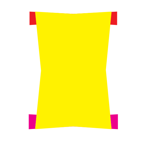
 With the Convert Anchor Point Tool (
Shift + C) try to make new corners less sharp. Just click on the anchor point and drag its handle downwards (or to the right, depending on which anchor point you are editing). You should end up with something like this.
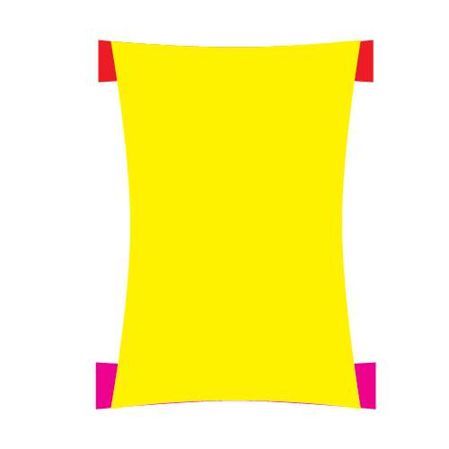
 You will notice that some parts of the rectangles have changed position. Make sure to correct all the flaws that may cause any problems with the smoothness.

 Grab the Ellipse Tool (
L) from the Tool Panel and create ellipses as pictured below. Make sure to match the edges properly.

 Now we will make some adjustments to the ellipses we have just created. The point is to create the effect of rolled up parchment on the ends.
First select the lower parts of the illustration (the purple shape with two green ellipses) and bring them to the Front (
Now we will make some adjustments to the ellipses we have just created. The point is to create the effect of rolled up parchment on the ends.
First select the lower parts of the illustration (the purple shape with two green ellipses) and bring them to the Front (Shift + Ctrl / Cmd + ]). This way it will look like the upper part of the parchment is folded back and the lower part is rolled up the front.
Now select the upper part of the illustration (the red shape and two ellipses) and under the Pathfinder Panel hit the Unite button. It will turn the shapes into one object. Make sure the new object stays behind the yellow shape.

 Lets adjust the upper part of the yellow shape. We have to make both shapes (green and yellow) look connected. To do this we will need the Direct Selection Tool (
A) again. Select it in the Tool Panel and select the left upper anchor point. We will move it to the left (where the green shape starts to curve).
 As you can see, we didn't accomplish all we needed with previous step. We will try harder to make it look like rolled up parchment. With the Direct Selection Tool (
A) select the lower part of the handle and place it as shown in the picture below. This will give the impression of rolled effect we were looking for.
 Repeat the previous step for the right side of the illustration as well.
 You should end up with something like this.
 Now it's time to adjust lower part of the illustration.
Duplicate (
Now it's time to adjust lower part of the illustration.
Duplicate (Ctrl / Cmd + C, Ctrl / Cmd + F) both green ellipses. Select the purple shape and the copy of the green ellipse on the left, then under the Pathfinder Panel hit the Minus Front button.
 Now we have one green ellipse left on each side. Remove the Fill color and set the Stroke color to any color you wish (color is not important).
 Now we need to remove some anchor points. With the Direct Selection Tool (
A) select two anchor points and remove them by hitting the Delete key on your keyboard.
 You should end up with something like this.
 Repeat the previous step for the ellipse on the right side as well.
 Now we need to connect the paths on both sides and use them to create a new shape. To do that grab the Pen Tool (
P) from the Tool Panel and just click on the end points of those paths.

 Remove the Stroke color and set the Fill color to any solid color. Grab the Add Anchor Point Tool (
+) from the Tool Panel and add the anchor point to the new shape as it's shown below.
 With the Direct Selection Tool (
A) grab the new anchor point and move it downwards, in order to hide the unwanted part of the green shape.
 Basically, this is the shape of our parchment. Feel free to play around with position of the anchor points, add new ones or remove some (if needed). You might improve the look.
Creating the Rips
We are moving on on the next step, creating the rips in the sides of the parchment. We will need to create small shapes that we will be using to cut from the parchment in several places. The creation process is quite simple. Grab the Arc Tool from the Tool Panel and click somewhere on the Artboard. The Arc Segment Tool Options window will popup. Leave all settings at the default and hit the
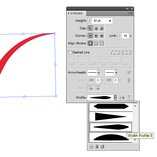
 OK button. This way we have created a curved path. Make sure to set the Stroke color (to any color you like), and the value for stroke to 10 pt. We will also have to change the shape of the stroke. Under the Stroke Panel (if the Stroke Panel isn't visible you will find it under Window > Stroke) set the Profile to Width Profile 5. This way you can create different shapes. Just try to experiment with Stroke settings to get the look you want.
 To be able to create the rips we will need to expand the Stroke we have just created. Select the arc, and under Object select Expand Appearance.
 Place the new shape, we have just created, where the end just partially covers the edge of the parchment. Feel free to rotate it, if needed. Select the new shape and the yellow shape (parchment), and under the Pathfinder Panel hit the Minus Front button. It will create a small rip.
 Repeat this step a few times to create several more rips. Just place them randomly all over the folded parchment. You should end up with something like this.


Applying Gradients
Get ready to apply some nicely colored gradients to our folded parchment. We will combine linear and radial gradients in order to create a nice realistic look. So let’s get started. For the largest part of the parchment we will be using a radial gradient. The radial gradient will help us create a nice color transition, especially in the upper segment. We will be using a large radius on the radial gradient in order to follow the shape of the page. We will use similar gradients for the other parts of the illustration as well.


Nice an easy to do :) Thanks
Great, easy & complete explanations. thanks
Cool tutorial. Very detailed. Created a couple of tattered parchment before and it’s good to see that you’ve come up with a very detailed explanation on how it’s done. And most of all, it’s easy to follow. Thanks.
Very pleased that the tutorial was both easy to follow and appreciated.
Noupe Editorial Team
Nicely described. Look easy to use. Thanks.
good