Adobe Illustrator Tutorial: Create a Simple Drop-Down Menu
In the following Adobe Illustrator tutorial you will learn how to create a detailed web element, a simple drop-down menu. We'll start with a bunch rectangles and simple paths, some basic vector shape building techniques and the Rounded Corners effect. Once we have our starting shapes we'll continue with the colors. We'll use multiple fills and strokes along with the Drop Shadow effect and some simple blending techniques. Finally, we'll add the text. Let's get started.
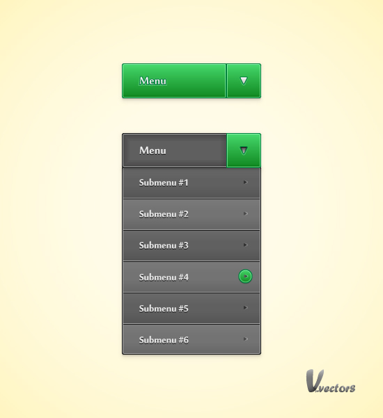
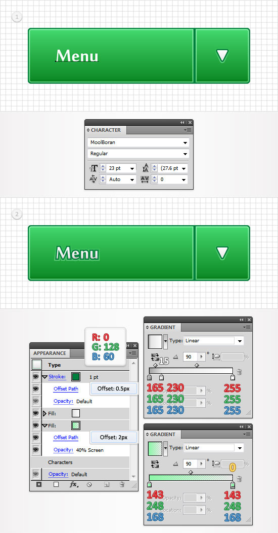
As always, this is the final image that we'll be creating.


Step 1
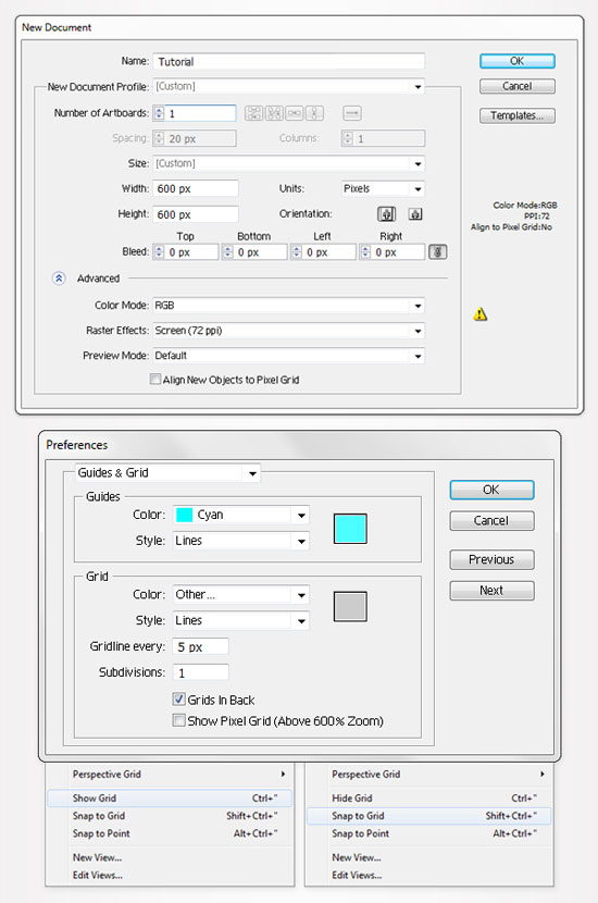
Hit Control + N to create a new document. Enter 600 in the width and height boxes then click on the Advanced button. Select RGB, Screen (72ppi) and make sure that the "Align New Objects to Pixel Grid" box is unchecked before you click OK. Now, turn on the Grid (View > Grid) and the Snap to Grid (View > Snap to Grid). Next, you'll need a grid every 5px. Go to Edit > Preferences > Guides & Grid, enter 5 in the Gridline every box and 1 in the Subdivisions box. You can also open the Info panel (Window > Info) for a live preview with the size and position of your shapes. Do not forget to set the unit of measurement to pixels from Edit > Preferences > Unit > General. All these options will significantly increase your work speed.
Step 2
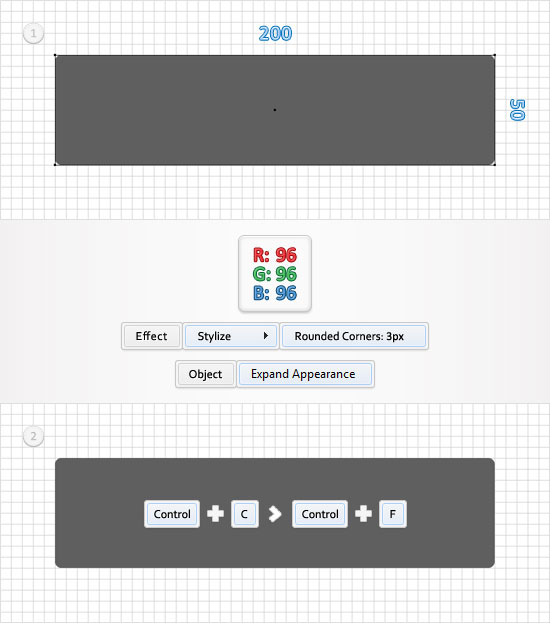
Start with the Rectangle Tool(M), create a 200 by 50px shape, fill it with R=96 G=96 B=96 and go to Effect > Stylize > Rounded Corners. Enter a 3px radius, click OK and go to Object > Expand Appearance. Select the resulting shape and make a copy in front (Control + C > Control + F). You'll need it for the next step.
Step 3
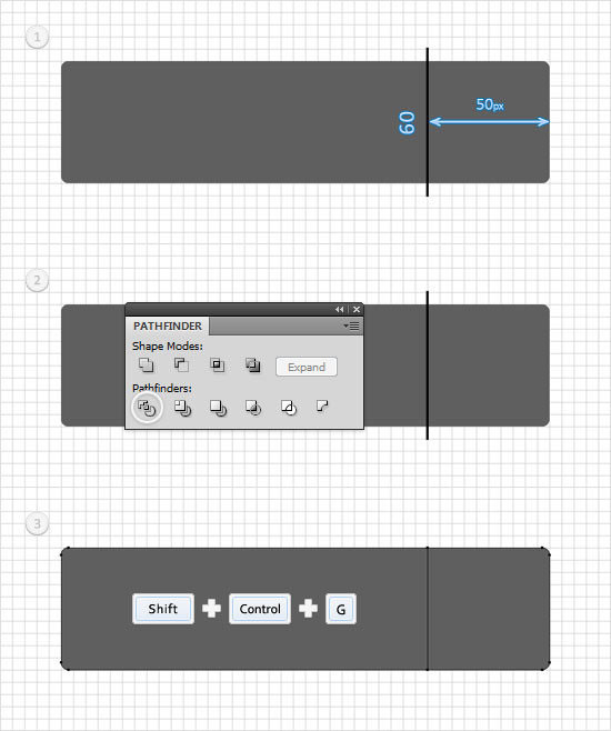
Grab the Pen Tool(P), draw a 60px vertical path and place it as shown in the first image. The Snap to Grid will ease your work. Select it along with the copy of the rounded rectangle created in the previous step, open the Pathfinder panel and click on the Divide button. Move to the Layers panel, select the resulting group of shapes and ungroup it (Shift + Control + G).
Step 4
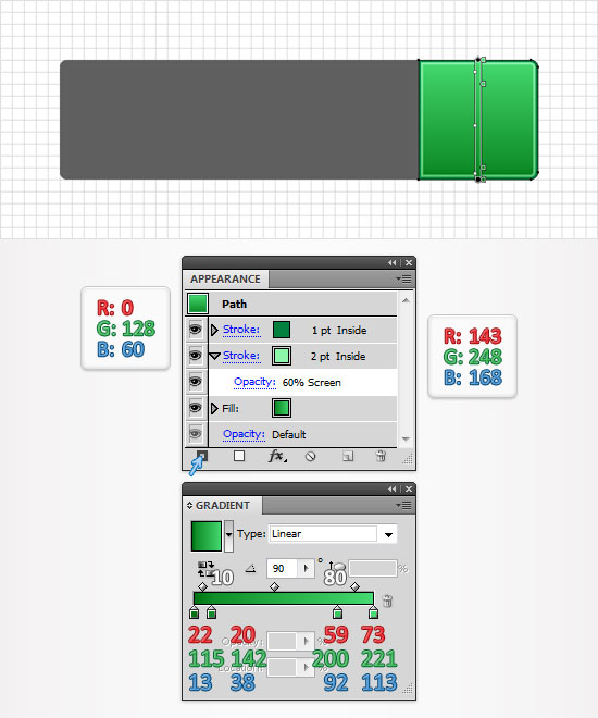
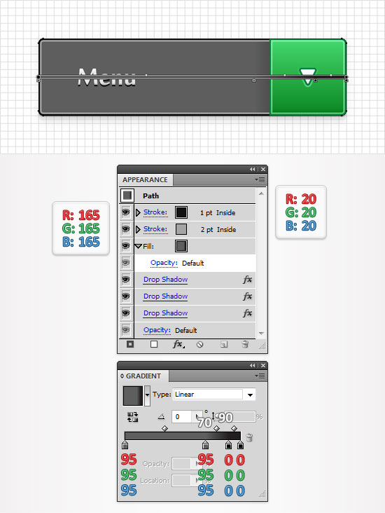
Focus on the right shape created in the previous step. Select it and replace the flat color used for the fill with the linear gradient shown in the following image. Make sure that this shape stays selected, focus on the Appearance panel and add a 2pt stroke. Select it, set its color at R=143 G=248 B=168, align it to inside, lower the opacity to 60% and change the blending mode to Screen. Keep focusing on the Appearance panel and add a second stroke for your shape using the Add New Stroke button. Select this new stroke, make it 1pt wide, set its color at R=0 G=128 B=60 and make sure that it's aligned to the inside.
Step 5
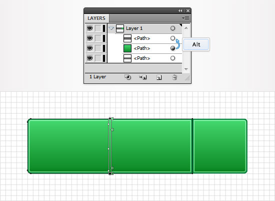
Next, you need to copy the properties used for the shape edited in the previous step and paste them onto the other shape created in the third step. Here is how you can easily do it. Go to the Layers panel, focus on the right side and you'll notice that every shape comes with a little grey circle. It's called a target icon. Hold Alt, click on the target icon that stands for the shape edited in the previous step and drag onto the circle that stands for the second shape created in the third step.
Step 6
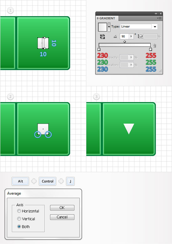
Pick the Rectangle Tool(M), create a 10px square, fill it with the linear gradient shown below and place it as shown in the first image. Focus on this new shape and grab the Direct Selection Tool(A). Select the bottom anchor points and go to Object > Path > Offset Path (Alt + Control + J). Check the Both button and click OK. This should turn your little square into a triangle.
Step 7
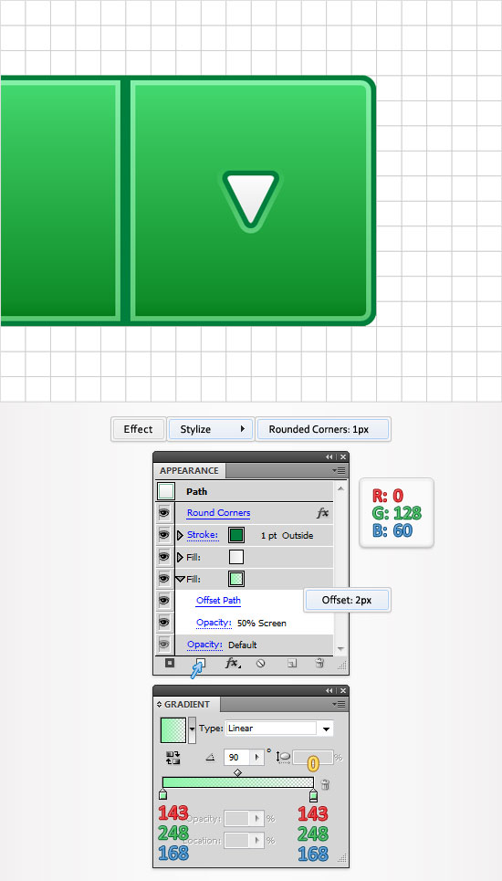
Reselect the triangle created in the previous step and go to Effect > Stylize > Rounded Corners. Enter a 1px radius and click OK. Focus on the Appearance panel and add a 1pt stroke for this shape. Make it 1pt wide, align it to the outside and set its color at R=0 G=128 B=60. Keep focusing on the Appearance panel and add a second fill for this triangle using the Add New Fill button. Select it, drag it below the existing fill, add the linear gradient shown in the following image and go to Effect > Path > Offset Path. Enter a 2px offset and click OK. The yellow zero from the gradient image stands for opacity percentage. Make sure that this new fill is still selected then lower its opacity to 50% and change the blending mode to Screen.
Step 8
Disable the Snap to Grid (View > Snap to Grid). Pick the Type Tool(T) and add your white "Menu" text. Use the MoolBoran font with the size set at 23pt. Select this text, focus on the Appearance panel and add two fills and a stroke using the Add New Fill and Add New Stroke buttons. Select the bottom fill, lower its opacity to 40%, change the blending mode to Screen and add the bottom linear gradient shown in the following image then go to Effect > Path > Offset Path. Enter a 2px Offset and click OK. Return to the Appearance panel, select the second fill and use the top linear gradient shown below. Move up in the Appearance panel, select the stroke, make it 1pt wide, set its color at R=0 G=128 B=60 and go to Effect > Path > Offset Path. Enter a 0.5px Offset and click OK.
Step 9
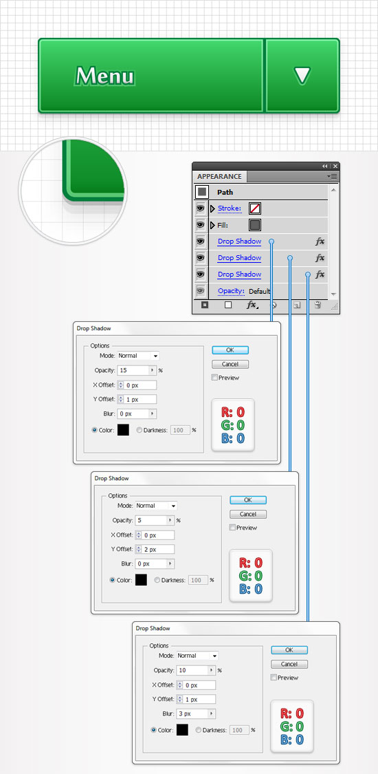
Reselect the grey rounded rectangle created in the second step and go to Effect > Stylize > Drop Shadow. Enter the properties shown in the top window (in the image), click OK and go again to Effect > Stylize > Drop Shadow. Enter the properties shown in the middle window, click OK and go one more time to Effect > Stylize > Drop Shadow. Enter the properties shown in the bottom window and click OK.
Step 10
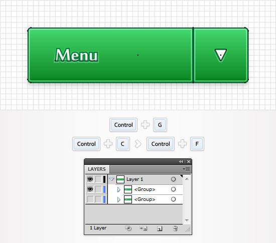
Reselect all the shapes created so far and group them (Control + G). This will be your closed drop-down menu. Make a copy of this group (Control + C > Control + F) then move to the Layers panel and turn off the visibility for the original group by clicking on the little eye icon.
Step 11
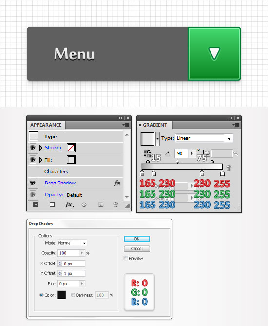
Focus on the remaining, visible group created in the previous step. First, select the left, green shape and delete it. Next, focus on the "Menu" text. Select it and move to the Appearance panel. Remove the bottom fill and the stroke then select the remaining fill and replace the existing linear gradient with the one shown in the following image. Also, with this text still selected go to Effect > Stylize > Drop Shadow. Enter the data shown in the following image and click OK.
Step 12
Reselect the grey rounded rectangle and replace the flat color used for the fill with the linear gradient shown in the following image. Add a 2pt stroke for this shape, set its color at R=165 G=165 B=165 and align it to the inside. Focus on the Appearance panel, add a second stroke for this shape, make it 1pt wide, set its color at R=20 G=20 B=20 and align it to the inside.
Step 13
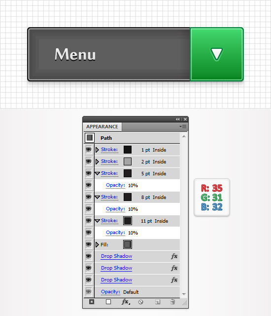
Reselect the shape edited in the previous step and focus on the Appearance panel. Add three new strokes and drag them below the existing ones. Select the bottom one, make it 11pt wide, set its color at R=35 G=31 B=32 and lower its opacity to 10%. Select the middle one, make it 8pt wide, set its color at R=35 G=31 B=32 and lower its opacity to 10%. Select the top one, make it 8pt wide, set its color at R=35 G=31 B=32 and lower its opacity to 10%.
Step 14
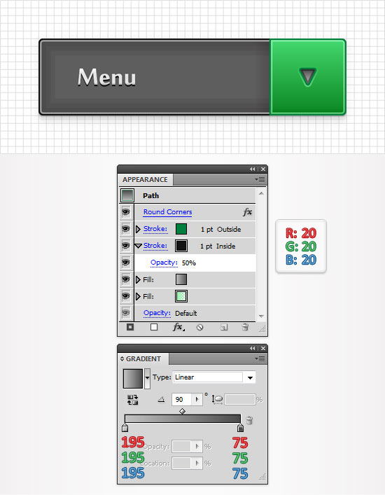
Move to the little arrow shape, select it and focus on the Appearance panel. First, replace the linear gradient used for the top fill with the one shown in the following image. Next, add a new stroke and drag it below the existing one. Select it, make it 1pt wide, align it to inside, set its color at R=20 G=20 B=20 and lower its opacity to 50%.
Step 15
Enable the Snap to Grid (View > Snap to Grid). Grab the Rectangle Tool(M), create a 200 by 270px shape, fill it with R=96 G=96 B=96 and go to Effect > Stylize > Rounded Corners. Enter a 3px radius, click OK and go to Object > Expand Appearance. Select the resulting shape and make a copy in front (Control + C > Control + F).
Step 16
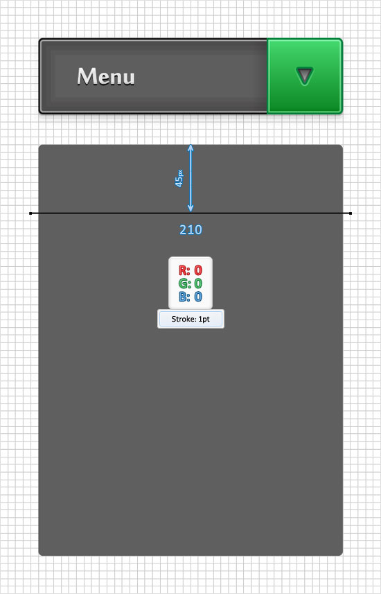
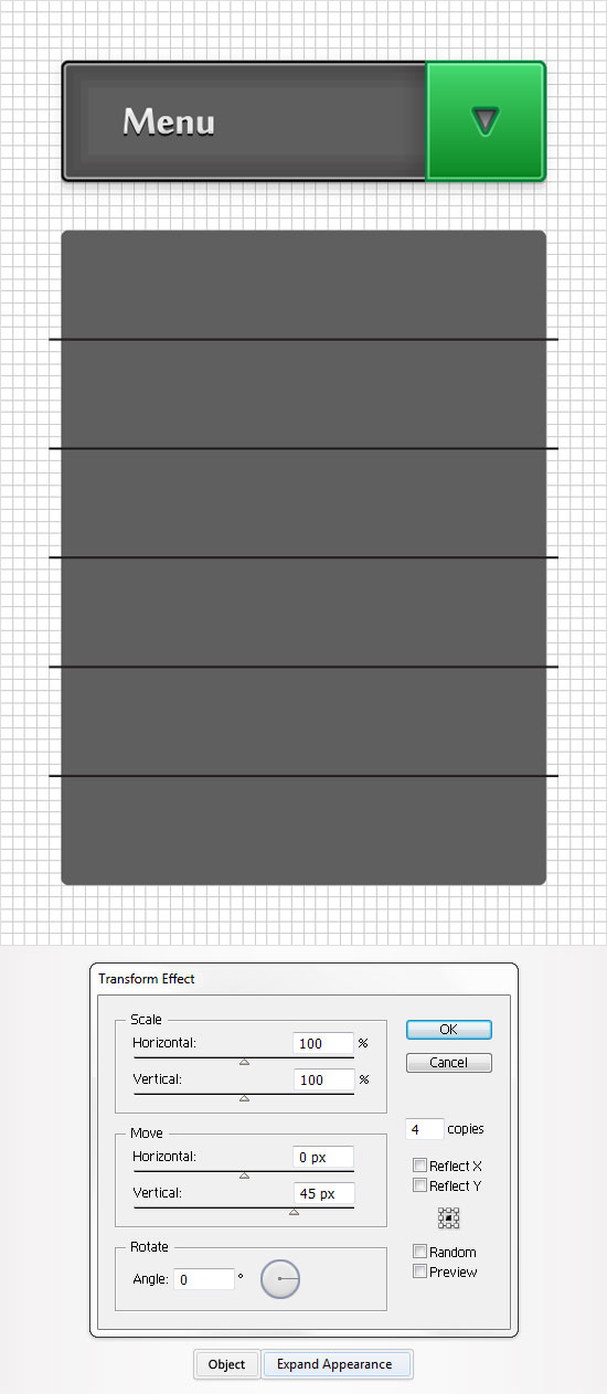
Pick the Pen Tool(P), draw a 210px horizontal path and place it as shown in the following image.
Step 17
Reselect the path created in the previous step and go to Effect > Distort & Transform > Transform. Enter the properties shown in the following image, click OK and go to Object > Expand Appearance.

The information provided by you was very useful and nice. I will use this for my future projects. Thanks for the tutorial.
this is a great tutorial, i’ll try to use it on some web practices… i had a little different result with the strokes on the shapes, because you have two different strokes, but i was able just to apply one, i had the problem with the “offseth path effect”, my illustrator didn’t show me the option when you apply that effect, so it can’t be shown, do you know why that happened? everything else worked fine for me…
Very nice tutorial. I’ll mix this with JQuery to make nice effects. Thanks. Keep writing!
How do I align it inside? New to this, and I can’t find how to align…