Adobe Illustrator Tutorial: Create a Detailed Restaurant Chalkboard
In the following new Adobe Illustrator tutorial you will learn how to create a detailed restaurant specials style chalkboard. We’ll start with the Rectangle Tool and some simple vector shape building techniques. Once you have your starting shapes you can continue and add the colors. We’ll use multiple fills and strokes along with a bunch of new effects and some simple blending techniques. For the finishing touches, we’ll use several built in brushes and patterns along with some simple masking techniques.
This is a pretty challenging tutorial, but with patience and some basic Illustrator knowledge you will make it through, and have a new illustration to play with. We hope that you enjoy the process. Here is a peek at the final image we’ll be creating:
Step 1
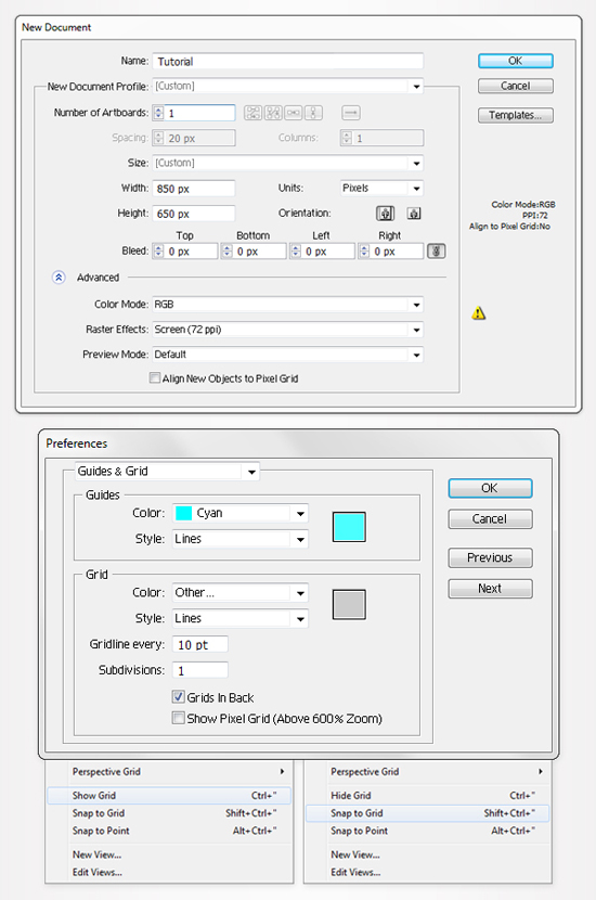
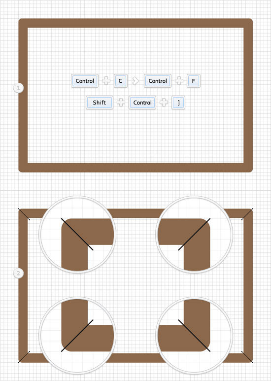
Hit Control + N to create a new document. Enter 850 in the width box and 650 in the height box then click on the Advanced button. Select RGB, Screen (72ppi) and make sure that the "Align New Objects to Pixel Grid" box is unchecked before your click OK. Now, turn on the Grid (View > Grid) and the Snap to Grid (View > Snap to Grid). Next, you’ll need a grid every 10px. Go to Edit > Preferences > Guides & Grid, enter 10 in the Gridline every box and 1 in the Subdivisions box. You can also open the Info panel (Window > Info) for a live preview with the size and position of your shapes. Do not forget to set the unit of measurement to pixels from Edit > Preferences > Unit > General. All these options will significantly increase your work speed.
Step 2
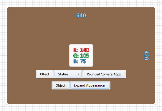
Pick the Rectangle Tool(M) and create a 640 by 420px. Fill it with R=140 G=105 B=75, remove the color from the stroke and go to Effect > Stylize > Rounded Corners. Enter a 10px radius, click OK and go to Object > Expand Appearance.
Step 3
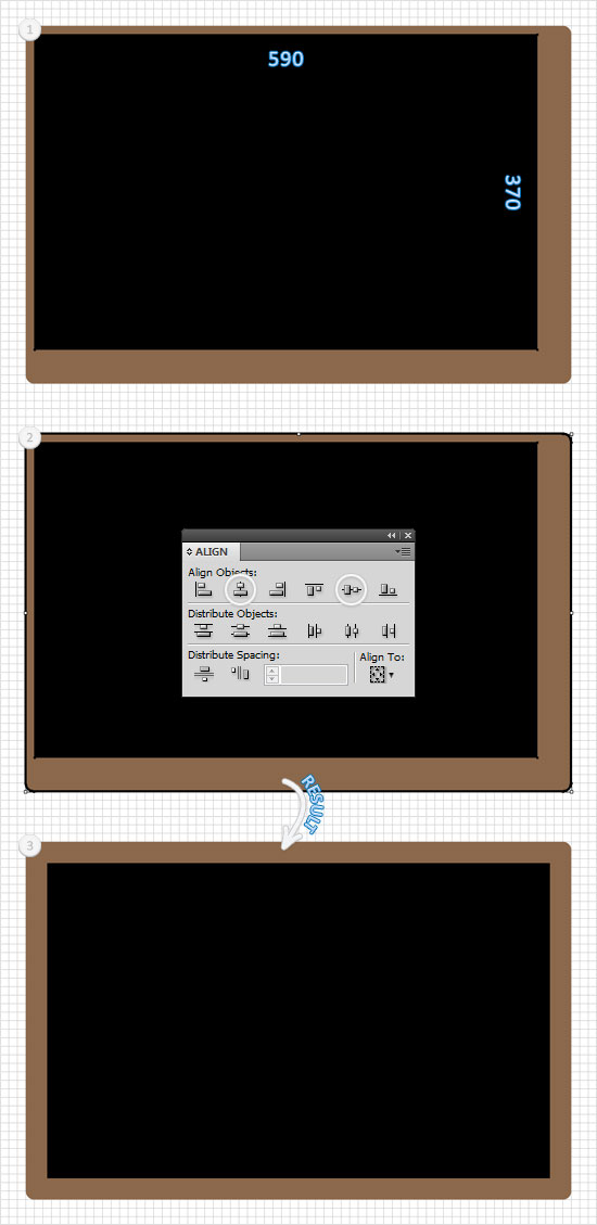
Pick the Rectangle Tool(M), create a 590 by 370px shape, fill it with black and open the Align panel (Window > Align). Pick the Selection Tool(V), select the two shapes created so far and click on the border of the shape created in the previous step (it should get emphasized). With this selection still active, move to the Align panel and simply click on the Vertical Align Center and Horizontal Align Center buttons. In the end your black shape should be centered as shown below.
Step 4
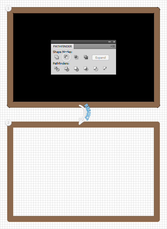
Reselect the two shapes created in the previous steps, open the Pathfinder panel (Window > Pathfinder) and click on the Minus Front button. The resulting shape should look like in the second image. Move to the Layers panel, double click on this fresh compound path and name it "Frame".
Step 5
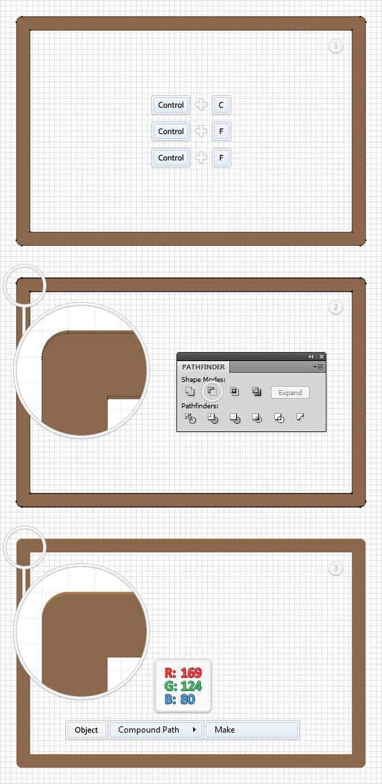
Disable the Snap to Grid (View > Snap to Grid) then go to Edit > Preferences > General and make sure that the Keyboard Increment is set at 1px. Select the "Frame" and make two copies in front (Control + C > Control + F > Control + F). Select the top copy and simply hit the down arrow once. This will move your selected shape down 1px. Reselect both "Frame" copies and click on the Minus Front button from the Pathfinder panel. Move to the Layers panel and you will find a new group with two shapes. Select it, turn it into a compound path (Object > Compound Pat > Make) and fill it with R= 169 G=124 B=80.
Step 6
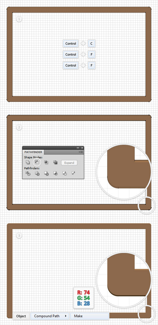
Select the "Frame" and make two new copies in front (Control + C > Control + F > Control + F). Select the top copy and move it 1px up. Reselect both "Frame" copies and click on the Minus Front button from the Pathfinder panel. Turn the resulting group of shapes into a compound path (Object > Compound Pat > Make) and fill it with R=74 G=54 B=28.
Step 7
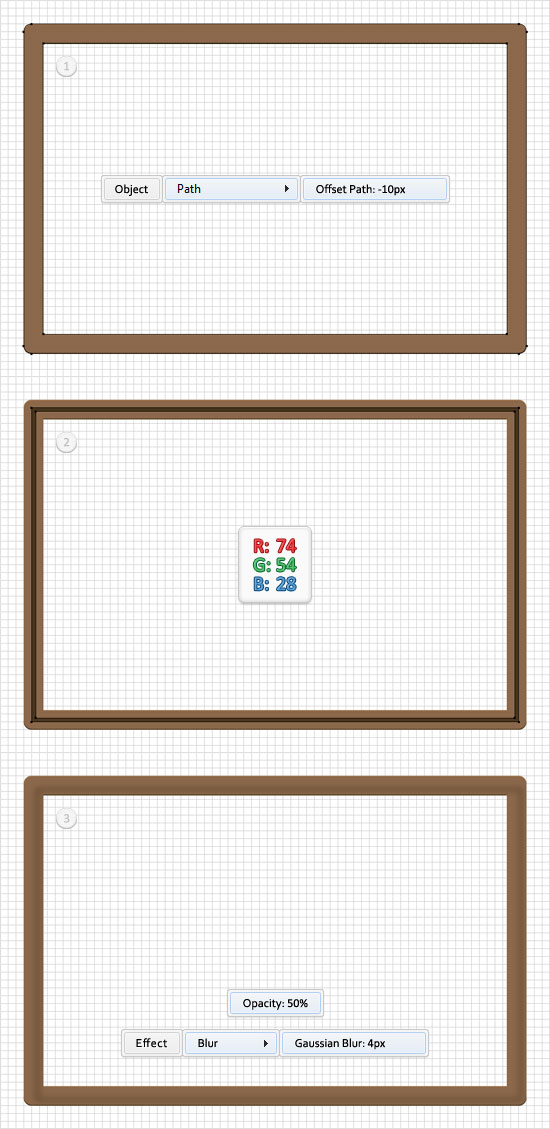
Reselect the "Frame" and go to Object > Path > Offset Path. Enter a -10px offset and click OK. Fill the resulting shape with R=74 G=54 B=28, move it 5px down and to the right, lower its opacity to 50% and go to Effect > Blur > Gaussian Blur. Enter a 4px radius and click OK.
Step 8
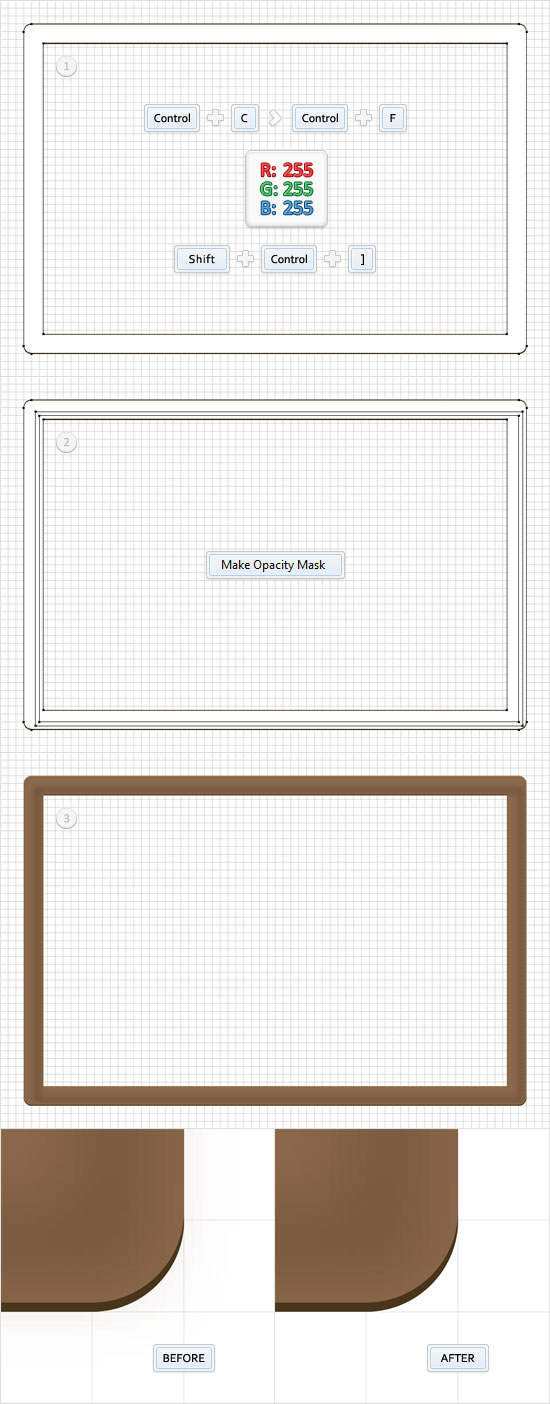
Next, you need to mask the blurred shapes created in the previous step. It’s a small detail but it’s better to take care of it. We’ll use an Opacity Mask, so open the Transparency panel (Window > Transparency). Select the "Frame", make a copy in front (Control + C > Control + F), fill it with white and bring it to front (Shift + Control + ] ). Select this white shape along with the blurred shape from the previous step, open the fly-out menu of the Transparency panel and click on Make Opacity Mask.
Step 9
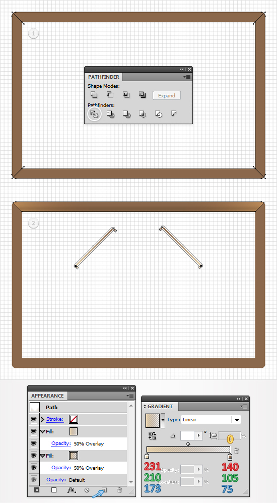
Reselect the "Frame", make a copy in front (Control + C > Control + F) and bring it to front (Shift + Control + ] ). Re-enable the Snap to Grid (View > Snap to Grid), pick the Pen Tool(P) and draw the four oblique paths shown in the second image. The Snap to Grid will make it easier.
Step 10
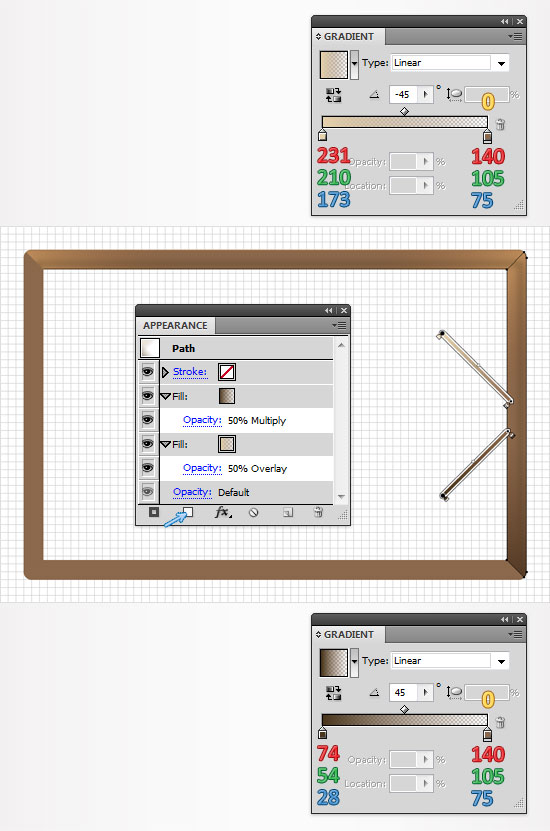
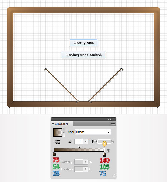
Select the for oblique paths and the "Frame" copy created in the previous step and click on the Divide button from the Pathfinder panel. Move to the Layers panel and you will find a group with five simple shapes. Find the large rectangle shape (the one with no color set for fill or stroke) and delete it. Now focus on the remaining shapes. Start with the top one. Select it, replace the flat color from the fill with the linear gradient shown below and open the Appearance panel (Window > Appearance). Select the fill from the Appearance panel, lower its opacity to 50% and change the blending mode to Overlay. Keep focusing on the Appearance panel, make sure that the fill is still selected and simply click on Duplicate Selected Item. It’s the little file icon from the bottom of the Appearance panel. This adds a copy of the selected fill. Select it and simply change the gradient angle. The yellow zero from the gradient image stands for Opacity percentage.
Step 11
Keep focusing on the group of shapes created in the previous step. Continue with the right shape. Select it and fill it with the top linear gradient shown below. Move to the Appearance panel, select this fill, lower its opacity to 50% and change the blending mode to Overlay. Add a second fill for this shape using the Add New Fill button. It’s the little, white square icon from the bottom of the Appearance panel. Select this new fill, lower its opacity to 50%, change the blending mode to Multiply and use the bottom linear gradient shown below.
Step 12
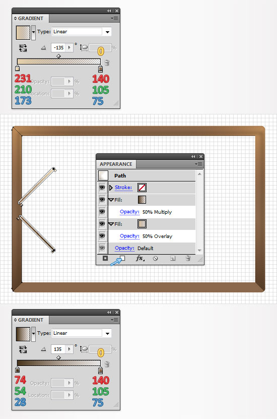
Move to the left shape from the group created in step #10. Select it and fill it with the top linear gradient shown below. Move to the Appearance panel, select this fill, lower its opacity to 50% and change the blending mode to Overlay. Add a second fill for this shape, lower its opacity to 50%, change the blending mode to Multiply and use the bottom, linear gradient shown below.
Step 13
Finally, select the bottom shape from the group created in step #10. Fill with the linear gradient shown below and move to the Appearance panel. Select the fill, lower its opacity to 50% and change the blending mode to Multiply. Make a copy of this fill, select it and edit the gradient angle.
Step 14
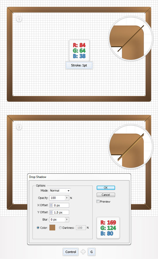
Pick the Pen Tool(P) and re-draw the four oblique paths from the ninth step. Add a 1pt stroke for these paths, set its color at R=84 G=64 B=38 and go to Effect > Stylize > Drop Shadow. Enter the data shown below, click OK, then group them (Control + G).
Step 15
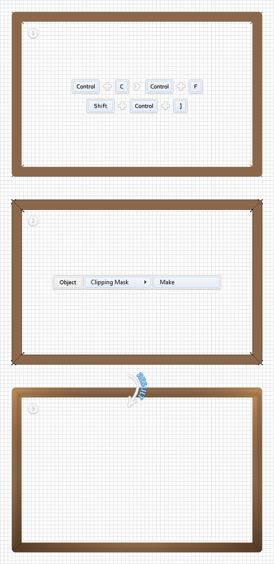
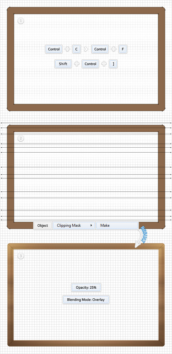
Reselect the "Frame", make a copy (Control + C > Control + F) and bring it to the front (Shift + Control + ] ). Select this copy along with the group created in the previous step and go to Object > Clipping Mask > Make. In the end your group should look as it does in the third image. Move to the Layer panel, select it and drag it below the group of shapes created in step #10.
Step 16
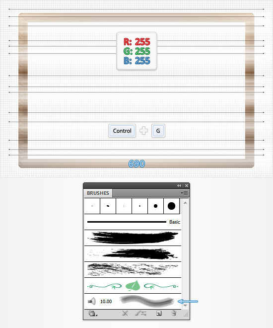
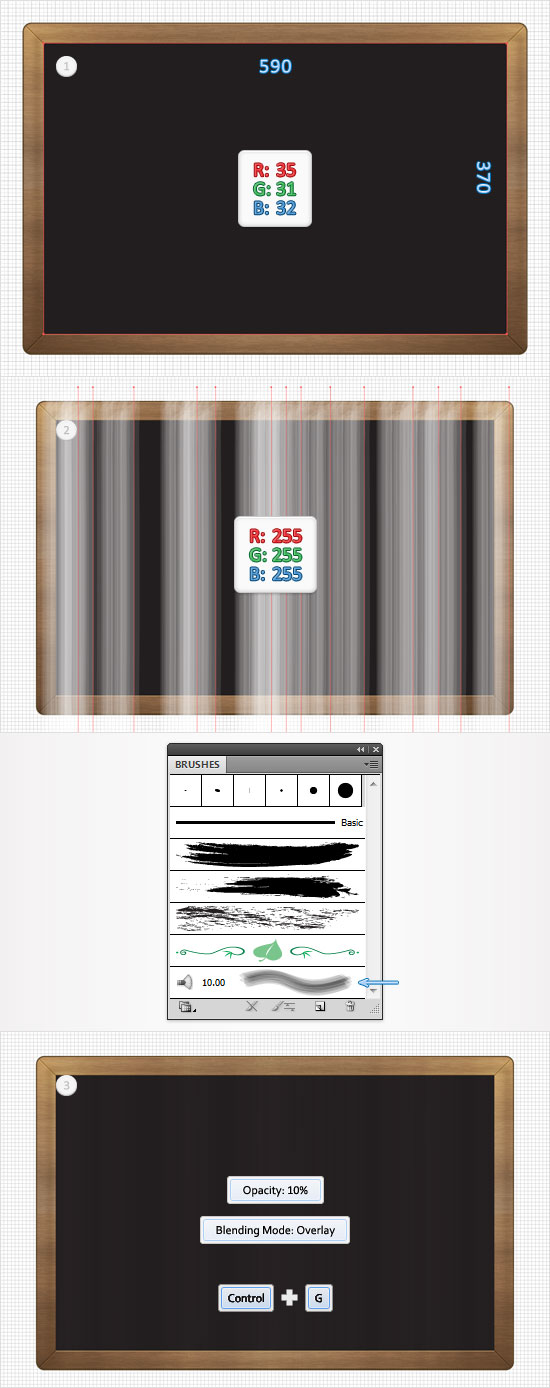
For the following step you will need a built-in bristle brush. Open the Brushes panel (Window > Brushes), open the fly-out menu and go to Open Brush Library > Bristle Brush > Bristle Brush Library. A new window with a nice set of bristle brushes should pop-up. Double click on the Mop brush and increase its size to 10pt. Pick the Pen Tool(P) and draw several horizontal paths (690px long) as shown in the following image. Set the stroke color at white, add the 10pt, bristle brush for these paths, then group them (Control + G).
Step 17
Reselect the "Frame", make a copy (Control + C > Control + F) and bring it to front (Shift + Control + ] ). Select this copy along with the group of paths created in the previous step and go to Object > Clipping Mask > Make. Make sure that this masked group is still selected, lower its opacity to 25% and change its blending mod to Overlay.
Step 18
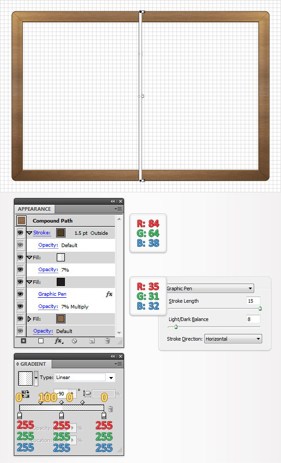
Reselect the "Frame", move to the Appearance panel, add a second fill and select it. Set its color at R=35 G=31 B=32, lower its opacity to 7%, change the blending mode to Multiply and go to Effect > Sketch > Graphic Pen. Enter the data shown below, click OK and return to the Appearance panel. Add a new fill, lower its opacity to 7% and use the linear gradient shown in the following image. Finally, make sure that the "Frame" is still selected and add a stroke. Make it 1.5pt wide, set its color at R=84 G=64 B=38 and align it to outside.
Step 19
For the following step you will need a grid every 5px. So, go to Edit > Preferences > Guides & Grid and enter 5 in the Gridline every box. Pick the Rectangle Tool(M), create a 590 by 370px shape, fill it with R=35 G=31 B=32 and place it as shown in the first image below. Move to the Layers panel, find this new shape and name it "Board". Switch to the Pen Tool(P) and draw several vertical paths as shown in the second image. Select them, set the stroke color at white and add the 10pt, bristle brush. Lower their opacity to 10%, change the blending mode to Overlay and group them (Control + G).

Superb!!!!!!! LOVE the tutorial!!!! Surely gonna try it out! :D
Wow that is one heck of a tutorial! I am looking forward to making this one!
Wow, great work in all the details. Nice piece.
Awesome, i love this tutor, i’m gonna give it a try!
I lost track when you got to the different gradients. It would have been nice if you had been more specific as to which gradient fills require which angles. In one window I see you have -45, in another window you have another angle, but it’s completely unclear to which fills these angles correspond to.