Top 6 Reasons Designers Should Use JotForm
JotForm's Form Designer is a tool Noupe readers already know quite well. Throughout the years we have covered all of JotForm extensively because we are entirely convinced of its value. Today we present you the six most important reasons why you as a designer should be using JotForm.
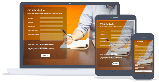 JotForm-designed Forms on Multiple Devices
 Setting up Conditional Logic in JotForm
If your forms are to be of the most sophisticated kind, you will like the collaboration features JotForm offers. With sub-users, you can build a team of designers working together in-house or in a spread environment that might even involve the client.
JotForm is available in 18 languages and provides full reports on all activity around your forms.
Learn more about JotForm features
Reason 01: The Point-and-Click CSS Form Theme Designer
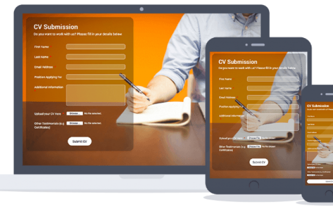
Form Designer is the most advanced form designing tool available and is the fastest way to customize a form’s look and feel. We have reviewed this part of the service in-depth in this article. With JotForm designers find the best form creator available. This alone is enough reason to use the service. If you don’t know about JotForm’s Form Designer, let me just throw the best features at you. Form creation with Form Designer is far faster than traditional CSS, yet also allows you to add custom CSS. The forms are mobile-ready by default. Form Designer is seamlessly linked to Google Fonts which gives you the freedom to choose from hundreds of fonts to create an outstanding typographic experience. You can even monetize your designs by offering them through the JotForm Theme Store. Noupe has covered the Theme Store in more detail in this post. JotForm-designed Forms on Multiple Devices
Reason 02: Outstanding Features
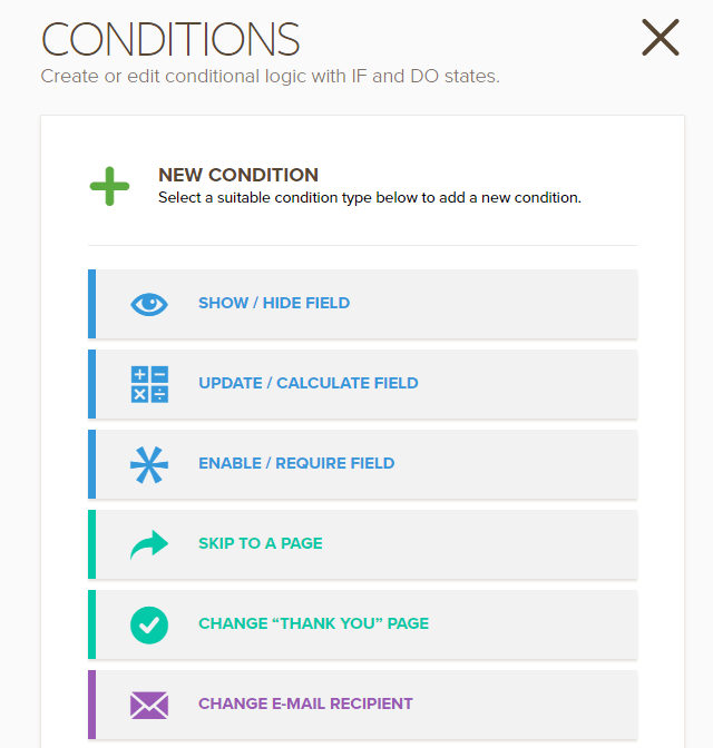
Web forms don’t need to be boring. With JotForm’s Form Designer even less so. However, a nicely designed web form might still not cut it. What if we could add almost any element to our web forms quickly? Think of image sliders, YouTube videos, SoundCloud files and more. JotForm works hard on providing you with the best widget experience any web form can offer. Besides the few that I named there are almost 400 widgets available altogether spreading over 18 categories of use cases. Chances are, the widget you need already exists. Sometimes filling out a form is not a simple linear process. Instead, you might want to react differently to form actions the visitor takes. With JotForm you can create conditional logic using simple commands in a point-and-click manner. The most simple example could be serving a custom "Thank you" page to different visitors with different form information. Besides that, you can always serve custom "Thank you" pages after the form is sent. You might want to open a page with the latest offerings or a special promotion or just a downloadable present as a reward. Whatever you want, do it with JotForm. Setting up Conditional Logic in JotForm
If your forms are to be of the most sophisticated kind, you will like the collaboration features JotForm offers. With sub-users, you can build a team of designers working together in-house or in a spread environment that might even involve the client.
JotForm is available in 18 languages and provides full reports on all activity around your forms.
Learn more about JotForm features
Reason 03: Integrations Galore
JotForm has over 100 Form Apps, which give users the ability to send form response information to dozens of other helpful tools. This includes:- CRMs like Salesforce, Highrise, Zoho, and Insightly;
- Email marketing software like Constant Contact, MailChimp, VerticalResponse, and GetResponse;
- File storage providers like Box, Dropbox, and Google Drive.
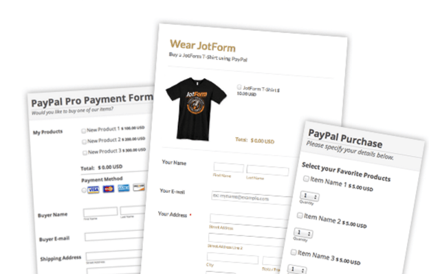 Examples of PayPal Payment Forms

The Jotform theme designer is way too confusing to use. I never understand where I am or what I’m doing. I frequently discard changes without even knowing, and I’m always struggling to get it do what I want.
That’s what i feel too !
i found that creating a form from scratch is much better and faster, and usable also !
Today most of the companies must be getting huge amount of traffic from mobile & tablets too, maintaining consistency across all the platform is very important. Nicely crafted article Dieter!