6 Best Practices for Designing Landing Pages
Online ads are a great way to get the word out about your online marketing campaign. However, an ad can't simply lead to the home page of the website or visitors will be unsure as to what to do next. And an unsure customer usually ends up becoming a lost sale. This is why knowing some best practices for designing landing pages is so important.
 The landing page guides a customer from the ad to that next step, the call to action. But not all landing pages are created equally. As a designer, it's your job to make sure the landing page smoothly takes visitors through the necessary steps from that first ad click to the next step, which could be anything from filling out an email form to creating a new account to shopping the site for a discounted purchase.
Whatever the call to action of the landing page, you must create a design that makes the offer, benefits, and call to action clear. The design should also build trust and make it easy for a visitor to complete that next step.
If you are new to landing page design or feel like your landing pages don't give your client a high conversion rate, then read through the following. The 6 best practices and landing page inspiration below will help you know where your designs could use some improving.
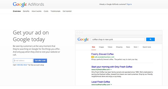 Google's landing page for their ad for Adwords is simple and clearly guides the visitor to that next step - entering an email address to receive an offer code. Plus, the ad itself included the same words as the title on the landing page.
Clarity is critical in any landing page design. But, there are times when long-form landing pages will convert better.
Ultimately, you need to test different landing page variations against each other to know what works best for your target audience. Fortunately, most landing page builders have A/B split-testing included.
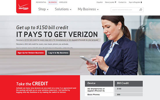 Just as with the Google ad, the Verizon ad that led to this landing page included the same words as in this heading: "$150 bill credit". Notice in this landing page, too, how it then gives Verizon's tagline, immediately followed by a brief explanation of how the offer works. There are two call to action buttons, which is sometimes necessary as in this example, but each call to action is tailored to the two types of visitors that would click on the ad.
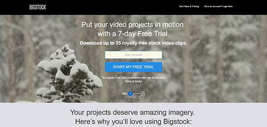 Again, the ad that led to this BigStock landing page mentioned video projects, so when visitors land on this page, they don't feel lost at all. The content is clear, short, and to the point. Even better, there's a progress bar along the bottom so that visitors know how many steps they need to take and where they are along each step of the process.
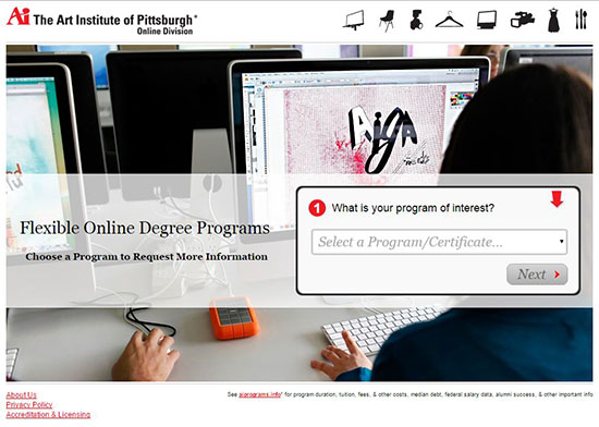 This landing page for the Art Institute of Pittsburg has a very focused message that requires very little explanation. Plus, the page makes the call to action quite clear with a bouncing red arrow that points to the first step.
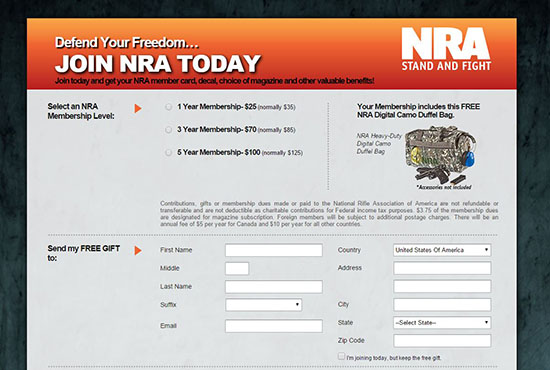 Both the ad that led to this landing page as well as the page itself have a single focus: join NRA to receive a digital camo duffel bag. Very wisely, the landing page includes the entire form so that visitors can quickly see all steps and how quick the process is.
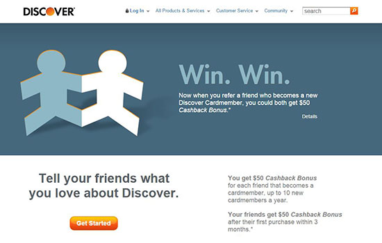 You may have noticed by now that some landing pages are actual pages on a website. Some argue that this can cause confusion for visitors who may start clicking on the navigation menu at the top and get distracted. But done right, like Discover did here, and readers are drawn to the call to action right away with every image and text on the page leading the reader to the all-important and very noticeable call to action button.
 Again, this landing page is an actual page on the website. But the single, full width photo draws the eye immediately. Very cleverly, the designer placed the question in a large font right on the image along with the first question of the form and instructions that tell visitors how easy it is to find out the answer.
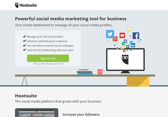 This landing page for Hootsuite is extremely streamlined. It starts with the header, subheader, bullet points to cleanly explain benefits, and finally a large bold button for the call to action. Notice, too, the wording on the button: "sign up free". Adding another benefit right on the button saves room and further seals the deal in the visitor's mind.
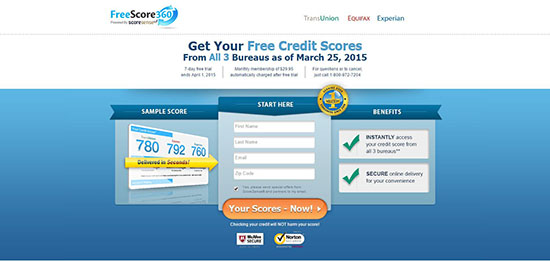 On this landing page design, the business seals are directly below the call to action button to ensure that visitors won't hesitate. But this design also includes the company's seal right at the top of the form boasting how many customers the FreeScore360 has served since 2006.
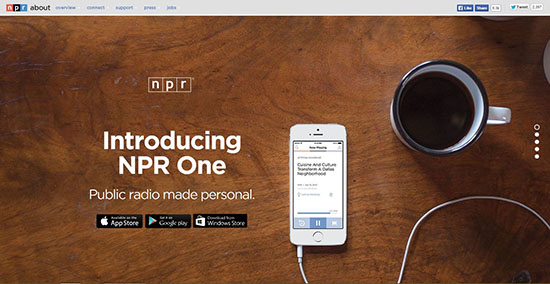 NPR doesn't necessarily need authenticity cues, simply because interested parties already trust this news source. However, they still include their logo and social media button in the header. Another excellent design practice that must be mentioned is how all of the elements work together so well. The full screen image demonstrates just how "personal" the public radio app is. The call to action buttons stand out quite noticeably from the image and allow visitors to choose the download appropriate for their phone.
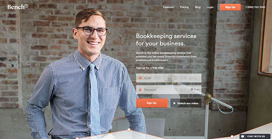 A full screen image adds life to a landing page, and this one gives Bench a personal, human feel by using a photo of one of the bookkeepers. The bright orange stands out well from the background photograph and points visitors to the first step they need to take.
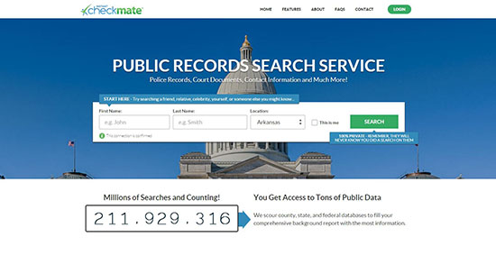 Forms stand out well from background images when placed in a box, such as on this landing page. While the "Search" button stands out due to its differentiated color, the blue instruction boxes are a bit hidden against the blue sky in the photo. Probably a better color choice would have been to either change the background image or make the instruction boxes green and the call to action button a bright orange.
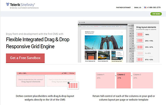 This landing page contains lots of images to demonstrate how the drag and drop front end development tool works. While it seems a lot to take in, the design wisely places the title and call to action on the left side of the main image. Just below are the extra benefits laid out in a clean grid layout.
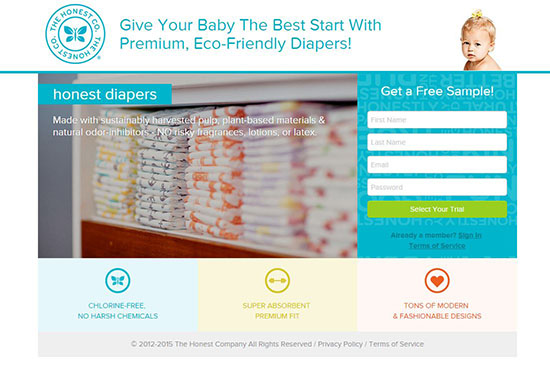 This is a stellar landing page design that is very well laid out. The logo and header are at the top. The form stands out very noticeably next to the related photo. While the words on the image are a bit hard to read, the benefits are reiterated below using cute icons and text in a neat grid.
Have you created a landing page that brought your client high conversion rates? If so, please share your experience and tips on designing stellar landing pages in the comments below!
(dpe)
 The landing page guides a customer from the ad to that next step, the call to action. But not all landing pages are created equally. As a designer, it's your job to make sure the landing page smoothly takes visitors through the necessary steps from that first ad click to the next step, which could be anything from filling out an email form to creating a new account to shopping the site for a discounted purchase.
Whatever the call to action of the landing page, you must create a design that makes the offer, benefits, and call to action clear. The design should also build trust and make it easy for a visitor to complete that next step.
If you are new to landing page design or feel like your landing pages don't give your client a high conversion rate, then read through the following. The 6 best practices and landing page inspiration below will help you know where your designs could use some improving.
Short and Clear
As mentioned above, the point of a landing page is to promote a specific campaign and guide visitors to the actions you want them to take. Therefore, make sure that the landing page uses the same words in the ad that visitors click. This way, they know that they are at the right place. But visitors also don't want to read novel to get to the next step, so keep it short and to the point. Your title should be the place that you include the same words that led them to the landing page. Also address the value of your offer and how it benefits them. And most of all, include a big, bold call to action that clearly tells the visitor what you want them to do next. Avoid long blocks of text and instead use subheadings, bullet points, and design techniques such as bold or noticeable colors to draw the eye to important sections. Google's landing page for their ad for Adwords is simple and clearly guides the visitor to that next step - entering an email address to receive an offer code. Plus, the ad itself included the same words as the title on the landing page.
Clarity is critical in any landing page design. But, there are times when long-form landing pages will convert better.
Ultimately, you need to test different landing page variations against each other to know what works best for your target audience. Fortunately, most landing page builders have A/B split-testing included.
 Just as with the Google ad, the Verizon ad that led to this landing page included the same words as in this heading: "$150 bill credit". Notice in this landing page, too, how it then gives Verizon's tagline, immediately followed by a brief explanation of how the offer works. There are two call to action buttons, which is sometimes necessary as in this example, but each call to action is tailored to the two types of visitors that would click on the ad.
 Again, the ad that led to this BigStock landing page mentioned video projects, so when visitors land on this page, they don't feel lost at all. The content is clear, short, and to the point. Even better, there's a progress bar along the bottom so that visitors know how many steps they need to take and where they are along each step of the process.
Focus Your Message
Just as your landing page design matches the ad that visitors clicked, so should the rest of the content be consistent with this single message. This means that every aspect of the design leads the visitor directly to that next step: the call to action. Without congruency, your visitors could lose interest or get distracted along the way, which then affects the conversation rate considerably. Keep all of the content focused on this single message to keep prospects moving through your steps with ease. This landing page for the Art Institute of Pittsburg has a very focused message that requires very little explanation. Plus, the page makes the call to action quite clear with a bouncing red arrow that points to the first step.
 Both the ad that led to this landing page as well as the page itself have a single focus: join NRA to receive a digital camo duffel bag. Very wisely, the landing page includes the entire form so that visitors can quickly see all steps and how quick the process is.
 You may have noticed by now that some landing pages are actual pages on a website. Some argue that this can cause confusion for visitors who may start clicking on the navigation menu at the top and get distracted. But done right, like Discover did here, and readers are drawn to the call to action right away with every image and text on the page leading the reader to the all-important and very noticeable call to action button.
Clean Design
A clean design means that every aspect helps support the message of your landing page. If your information is short and sweet, as encouraged above, then it's easy to create a clean design. Include plenty of white space since too much clutter will hide rather than enhance the message. Don't forget also that too many graphics can slow down load time as well as make the landing page design overwhelming. So limit visuals and be sure to only include those that demonstrate your message. Remember, you want every aspect of the design to guide the visitor to that next step. Again, this landing page is an actual page on the website. But the single, full width photo draws the eye immediately. Very cleverly, the designer placed the question in a large font right on the image along with the first question of the form and instructions that tell visitors how easy it is to find out the answer.
 This landing page for Hootsuite is extremely streamlined. It starts with the header, subheader, bullet points to cleanly explain benefits, and finally a large bold button for the call to action. Notice, too, the wording on the button: "sign up free". Adding another benefit right on the button saves room and further seals the deal in the visitor's mind.
Authenticity Cues
Small and large businesses alike need to use cues that build a visitor's trust. All landing pages should include the brand or company logo. Large businesses that are well-known may not need more than a logo and possibly a guarantee of the specific offer being made. Small businesses will definitely need more than a few cues to prove their legitimacy. Their logo is a must and any guarantee offered, plus social media buttons and testimonials. Some landing pages even include safe business seals, such as BBB, TRUSTe, and NortonSecured. On this landing page design, the business seals are directly below the call to action button to ensure that visitors won't hesitate. But this design also includes the company's seal right at the top of the form boasting how many customers the FreeScore360 has served since 2006.
 NPR doesn't necessarily need authenticity cues, simply because interested parties already trust this news source. However, they still include their logo and social media button in the header. Another excellent design practice that must be mentioned is how all of the elements work together so well. The full screen image demonstrates just how "personal" the public radio app is. The call to action buttons stand out quite noticeably from the image and allow visitors to choose the download appropriate for their phone.
Use the Right Color Scheme
As with any design project, using a color scheme that flows with the message is a must. Like any other web design, landing pages should include colors that lead the eye from the least important elements to the most important elements on the page. Strong contrast in your color scheme really helps important information stand out. For instance, even if the rest of your color scheme includes pastel colors, consider making the call to action button a bold color. A full screen image adds life to a landing page, and this one gives Bench a personal, human feel by using a photo of one of the bookkeepers. The bright orange stands out well from the background photograph and points visitors to the first step they need to take.
 Forms stand out well from background images when placed in a box, such as on this landing page. While the "Search" button stands out due to its differentiated color, the blue instruction boxes are a bit hidden against the blue sky in the photo. Probably a better color choice would have been to either change the background image or make the instruction boxes green and the call to action button a bright orange.
Perfect the Layout
Make sure to organize the information in such a way to keep a reader's eye flowing along from least important to more important to least important. For instance, place the header, any forms, call to action button, and even the text that explains the value of the offer at the top. Along the bottom or in a very small section in an upper corner, place the authenticity cues, such as social media and seals of trust. Not all landing page designs need to read from top to bottom either. Yours may look cleaner by placing the form and call to action button in the left column and the header and offer in the right column, or vice versa. User testing your design first before making it public will help you know exactly where the best placement for each item really is. This landing page contains lots of images to demonstrate how the drag and drop front end development tool works. While it seems a lot to take in, the design wisely places the title and call to action on the left side of the main image. Just below are the extra benefits laid out in a clean grid layout.
 This is a stellar landing page design that is very well laid out. The logo and header are at the top. The form stands out very noticeably next to the related photo. While the words on the image are a bit hard to read, the benefits are reiterated below using cute icons and text in a neat grid.
Have you created a landing page that brought your client high conversion rates? If so, please share your experience and tips on designing stellar landing pages in the comments below!
(dpe)
Nice article Tara about how to design a call to action website that convert. I will try to make our website design and following these tips. Thank you very much
Nice article Tara. Yes sure, landing pages design is very important for customers. If it’s simple and attractive then its very useful for you.
Also Call to Action are very important as they grab the attention of the user. Call to action play a vital role in conversions. Web developers should always remember this point too.
This is really great, I just took a course at Hubspot about how to create the most useful landing pages, now bringing some design in it. I am confident I can build a really strong & sucessful landing page.
GREAT landing page design full of inpiration