5 Web Design Trends to Follow this Spring
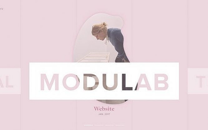
Trends in web design sphere are similar to trends in fashion. There are trends that are available only for people with a generous budget (aka those that buy items only from the first line); and there are trends that are available for the majority (like items from the second line). Today we are going to take a look at 5 trends from the second category: those that are widely adopted by web designers and developers these days.
Illustrations
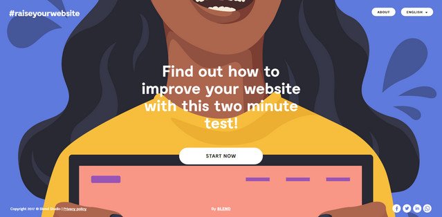
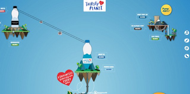
Artistic approach never gets old, even in the era when abstract animations with a high-tech vibe like in Digital Design Days, dominate the Web. Illustrations of various sorts mark both web and app interfaces. Although the artificial solutions have their perks and awe effects, but we as human beings are craving for the personal touch of artistry that can be easily found in artworks. It can be a part of a splash screen like in Raiseyourwebsite that establishes the general mood and immediately draws everyone in; or it can be a primary medium for building an overall environment like in Thirsty Planet where fully illustrated surrounding that is set in motion creates the whole buzz.
Image source - Raiseyourwebsite

Image source - Thirsty Planet
Pink
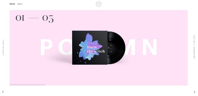
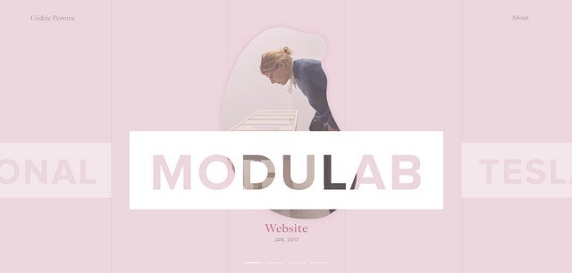
Although Pantone has chosen green, aka Greenery, as a color of 2017, it seems that the pastel pink, the tone that hit all the runways and won over Gucci and Oscar de la Renta takes over this spring. Beautiful, gentle and utterly charming, it goes perfectly well with different shades. Both Victoire Douy’s and Cedric Pereira’s personal websites open with this tone. It makes the first impression incredibly voguish.
Image source - Victoire Douy

Image source - Cedric Pereira
Geometry + Asymmetry
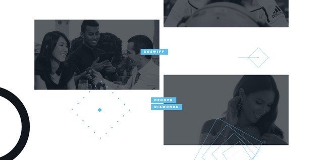
Both geometry and asymmetry are two main trends that rule the roost nowadays. These two directions open tremendous opportunities to the creative folks despite being straightforward and rather primitive. How can a bunch of basic triangle shapes or uneven layout of content blocks force the design to stand out, to say nothing about attracting visitors? Take a look at two examples that are featured below, and you will see. This pair can do wonders. In tandem, they form a close and fruitful partnership resulting in an inspiring and harmonious environment. Make feels fresh, crisp, robust and techy: modest coloring, spacious layout, and boxy vibe nicely interact with each other.
Image source - Make
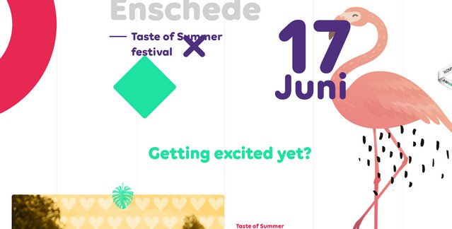
Unlike the previous example, Taste of Summer takes another approach. It is here where the lavish and savory artistry meets the pragmatic and relatively insipid branch of mathematics.
Image source - Taste of Summer
Small subtle effects
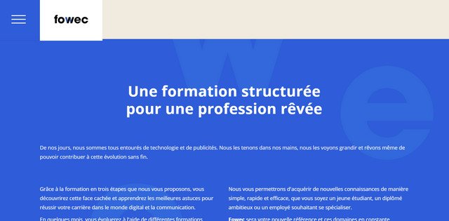
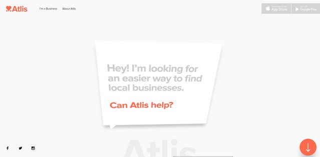
It is hard to find a website without any dynamic effects today. Static interfaces are no longer in fashion. Everyone wants to astound users with interactive, meaningful and in some way playful experience. While WebGL, Three.js and some other powerful high-end experimental libraries can be beyond your means (since they are items from the first line), little subtle effects are within any budget. As a result, bouncing, shaking, swinging, fading, sliding, zooming and of course, parallax enliven pages and please visitor’s eyes. Both Fowec and Atlis go for a businesslike vibe; nevertheless, tiny subtle effects make these interfaces less formal and more engaging.
Image source - Fowec

Image source - Atlis
Edges
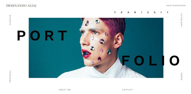
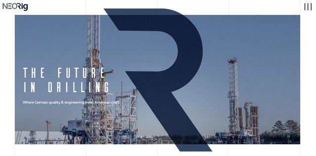
The trend started in 2016, and it is still relevant. The technique is simple: just provide tangible indentations along the perimeter of a page. In this way, your users will naturally focus their attention on the important content like portfolio pieces, slogan, etc. Portfolio of Erminando Aliaj adopts this approach in a creative manner whereas NEORig strongly relies on a clean and solid structure. Both interfaces benefit from the wide white edges that place the content into the limelight and at the same time strike an organizational balance.
Image source - Erminando Aliaj

Image source - NEORig
Which trends are you into? Do you prefer more creative solutions or vice versa stick to the pragmatic and robust ones?
Thanks for the sharing spring trends. When I came on the geometrical structure that is being sometime complex and some easy, but I enjoyed with the opportunities that helpful me to increase the knowledge power.
Edges and Pink, although probably not combined, are great observations. I will be sure to use these in my work, very good presentation of these trends!