5 Web Design Elements That Improve User Experience

As you begin to build or revamp your organization’s website, your users’ experience should be at the forefront of your web design strategy.
Successful web design means your site visitors have a positive experience and can easily navigate your pages, immediately finding the information they seek.
If you have a conversion goal for your visitors, whether that’s securing a donation for your nonprofit or getting a sale in your eCommerce store, enhancing your user experience can help you achieve this. As you begin to explore ways your website design can help reinvent your user experience, first look at the CMS you’re using.
What is a CMS?
CMS stands for the content management system, which manages the creation and modification of content on a website. Choosing the right CMS, whether you’re a nonprofit, business, or other types of organization, is essential so you can take advantage of the features you need.
In this article, we’ll outline some key web design elements that can help improve your website’s user experience. These include features that may already be part of your CMS, but if they’re not, you may benefit from exploring other platform options to achieve your goals.
Web design elements that can help you improve user experience include:
- Mobile Optimization
- White Space
- Beautiful Imagery
- Fast Page Speed
- Intuitive Interface
When your web design strategy incorporates each of these elements, you'll ensure that your web visitors can navigate your website without issue. Let’s take a closer look.

1. Mobile Optimization
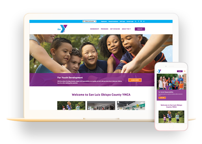
These days, you can’t walk down a street without seeing someone on their phone. We have constant access to information. Because of this, an important part of the web development process involves making sure your web design is mobile responsive, which means the content adapts to the user’s device. Your website should look equally as great on a desktop, laptop, tablet, or mobile phone.
Be sure to work with a CMS that offers automatic mobile responsiveness so you don’t have to worry about developing multiple versions of your website for mobile and tablet devices. By doing this, you can avoid negative user experiences such as:
- Zooming in and out to view content
- Rotating their mobile devices multiple times
- Abandoning the page due to frustration with viewing the content
You risk a much higher bounce rate (the rate at which users navigate away from a website after viewing only one page) if your website is not mobile responsive. This is one of the biggest web design mistakes you can make, but it’s easily avoidable.
When your images, forms, buttons, and other elements adapt to any size screen, you’ll set up your users for a good experience and they will be more likely to continue browsing your site.

2. White Space
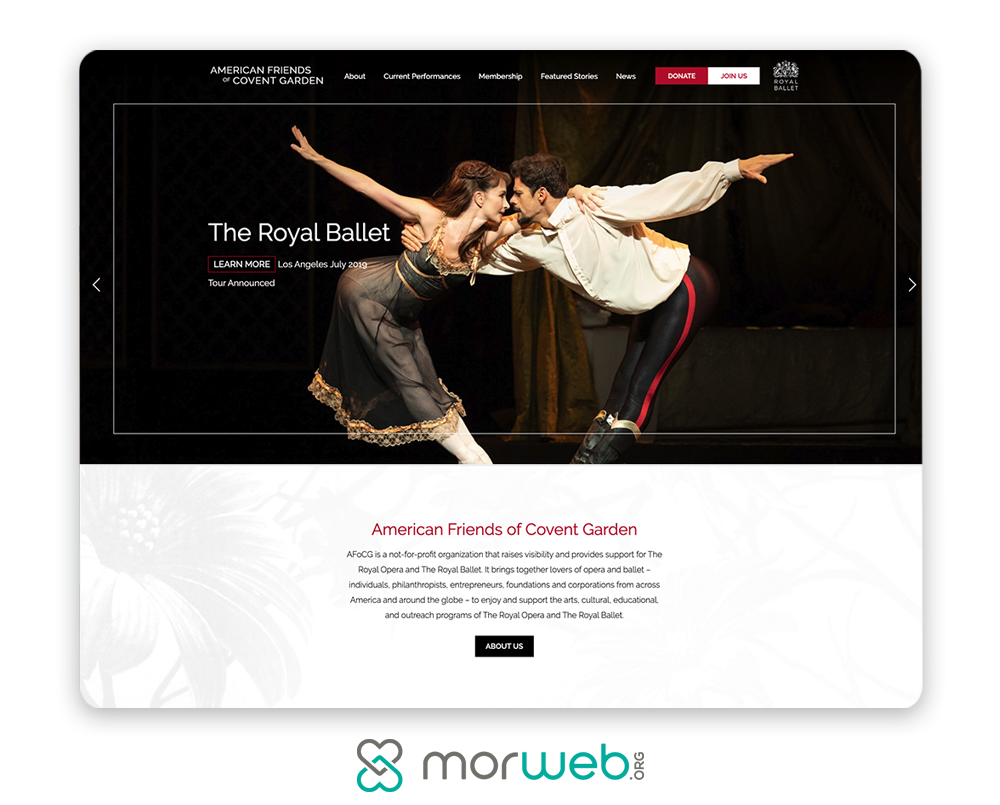
While white space may seem like a “waste of space,” it’s actually an important element of good web design. White space makes your content more readable and allows users to focus on elements around the text, a quick change that improves your user experience.
Users have shorter attention spans as they browse websites, so this is especially important. The more spaced out your content is, the easier it will be for users to digest it and avoid distractions.
The benefits of white space include:
- Increasing user attention
- Making your website feel fresh and less cluttered
- Helping users better digest your information
While white space does have its benefits, keep in mind that you still need to find a balance between your white space and content. After all, white space still takes up space. Think about what you want to appear above the fold (the area of your website that’s immediately visible without scrolling) and decide what information you want to be displayed there.

3. Beautiful Imagery
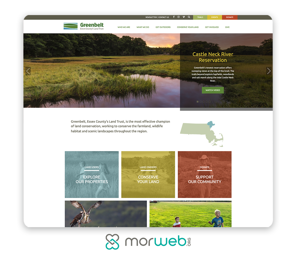
One of the most effective elements that you can (and should) include in your web design is imagery. Images captivate your users from the moment they land on your homepage and keep them engaged as they continue to navigate through your site.
When you incorporate images, however, keep in mind some best practices so that you make the most of them:
- Use your own images. Rather than using a library of generic stock photos that don’t add value to the content, be sure to use images that directly reflect your organization and enhance the site’s purpose. Preferably, you’ll use your own images.
- Convey your brand. Use images that communicate your brand to your visitors, which will instill a sense of trust in them. Make sure images like your logo are consistently placed across your website.
- Don’t overuse them. If your pages are overly cluttered with images, this will serve more as a distraction for your users and make it more difficult for them to understand your messaging. As an alternative, consider using image sliders so that viewers only see one image at a time.
- Be strategic in placement. Strategically place your images throughout your pages to support the content and also break up the text for your readers.
Being strategic with your images will not only improve your user experience, but also encourage your visitors to stay on your site for longer. Improve your bounce rate and successfully convey your brand with the right use of imagery.
The same idea applies to video. Videos can enhance your user experience and help users absorb the content in front of them.
If you’re looking for some specific examples of optimal image use, check out Morweb’s list of the best nonprofit websites.

4. Fast Page Speed
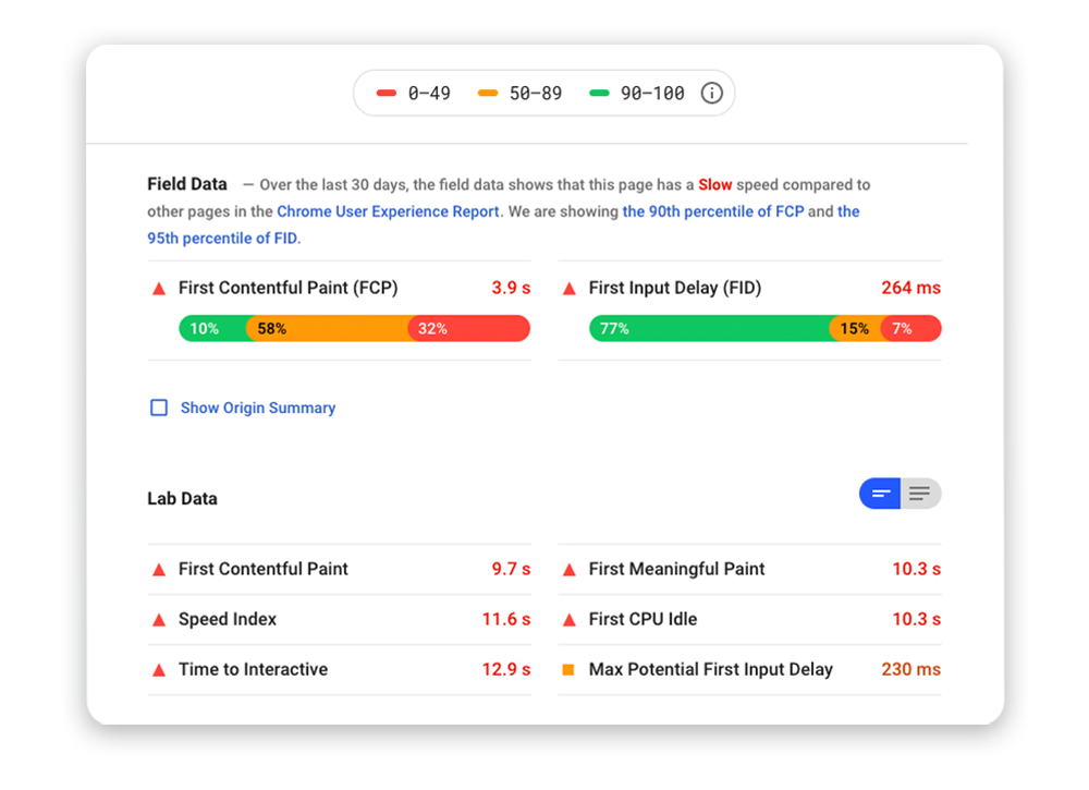
One of the most frustrating experiences a user can have involves waiting too long for a page to load. People are accessing content from all over the world on mobile devices and are increasingly expecting a fast result for the content they’re viewing. If they don’t get it, they’ll abandon that site.
So how can you address this concern? By taking steps to optimize your page speed, you can ensure your website loads within just a few seconds for a majority of your users, improving their experience in the process.
Here are a few things you can do:
- Use Google’s free service that analyzes your page speed and gives you the information you need about improving your load time on mobile and desktop.
- Compress all of your images before loading them into your site. Your images are typically the main cause of slower page load issues. You can easily address this by compressing all of your images before uploading them onto your website.
- Minimize the number of scripts, plugins, and custom fonts you use. Removing these elements will also help you increase your page speed.
- Choose HTML and CSS over Flash Player. Flash Player can slow down your site, as it usually requires a longer load time. Speed up your site by opting for HTML and CSS instead.
For more details on minimizing your page load time, check out Double the Donation’s guide to nonprofit web design.

5. Intuitive Interface
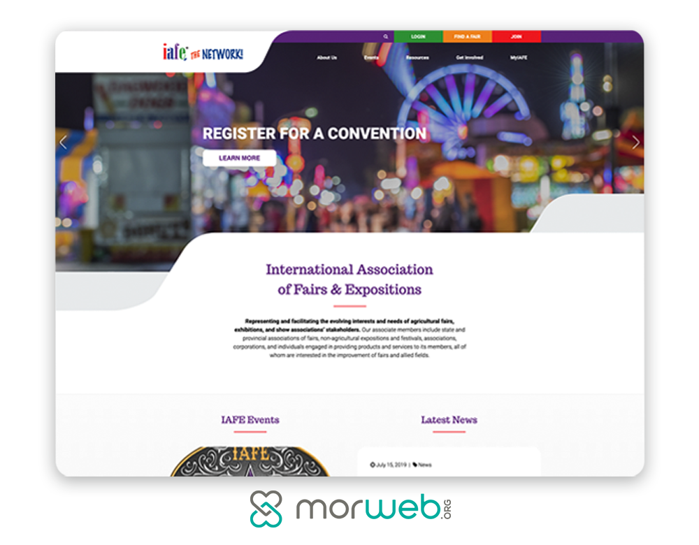
Of course, one of the biggest sources of frustration for users, aside from your page load speed, is the interface itself. When your website is not intuitive to navigate, this can cause users to abandon your site, especially if they can’t find what they’re looking for within just a few seconds. Improve your user experience by making your website easy to use.
For that reason, be sure you take the following into consideration:
- Your navigation. Your navigation should be easy to understand and use on every device. One option is to include a top or left-side navigation bar that’s visible on every page. Keep each navigation title short and avoid language that’s confusing or doesn’t accurately portray the content it’s linking to.
- Your consistency. Everything should coordinate across your site, including heading sizes, fonts, color scheme, button styles, spacing, photo choices, and more. As your users navigate through your website, they should know they’re still on your website. A noticeable design change from one page to another can confuse them and cause them to lose trust in your site.
- Your updates. As your organization grows and changes over time, you’ll need to update content on your website. Using a non-technical CMS can ensure your team will be able to easily update your navigation and other parts of your site without needing a highly technical background. For example, nonprofits could benefit from a nonprofit CMS that offers easy-to-use features and makes updating your site simple.
Streamline your user experience by making your interface as intuitive as possible. When your navigation is easy to understand and your overall website’s appearance is consistent, users will stay on your site longer and have a positive experience as a result. Even more, keep your content updated with a simple-to-use CMS, and you’ll set your website up for success.
As you explore your CMS options, remember that choosing the right solution for your organization means taking a hard look at the features each offers. If your current solution isn’t mobile responsive and makes it difficult to update your content, you might consider shopping around for a new platform. After all, user experience should be at the top of your list, so ensure you’re using the resources available to you to make it a positive one.
If you’re looking for more tips on web design, check out this guide.

Nice post, very much helpful details are provided with informational which make thing to understand quickly! Thanks.
I really looking for these kinds of posts for a long time. Thank you for sharing with us.
Past i use WP Page Builder but i feel my site load slowly then i try to minimize some code and reduce image size but continue it happen. Thanks for add “White Space” in your list, its really increase user attention and i able to add some advanced icon and now my site become fast.
This is extremely useful. A debt of gratitude is in order for sharing this rundown,
Anil. I surmise the most significant thing is to stay away from spam mediators by
putting remark that really MATTER. At any rate, I’ll be utilizing these sites. Much
obliged to you to such an extent!