5 Most Common Mistakes That Ruin The Key Design Elements Of Product Pages
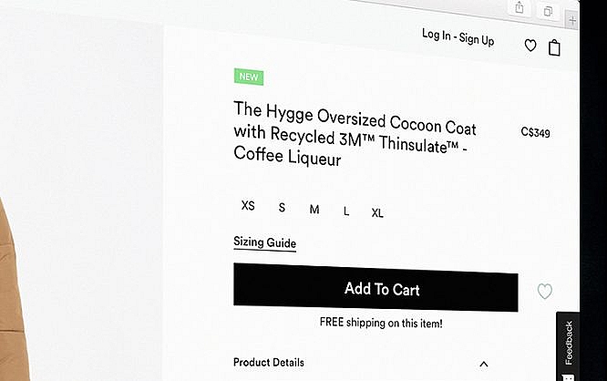
Web Page Designers are the Backbone of the eCommerce Industry.
The development of eCommerce marketing strategies requires not just the development of your product, but also your ability to showcase it through an online space. One of the many advantages that eCommerce has provided for both startups and customers alike is the convenience of shopping wherever they may be. Because of this, retailers need to prioritize their efforts to make their online presence attractive to potential buyers. Combined with people’s dependence on mobile devices, the online market is one that’s full of competition and opportunity.
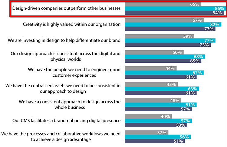
Econsultancy and Adobe’s survey of companies and suppliers show that over 84% believe that design-driven businesses have a better standing compared to their competitors. Now more than ever, industries require the assistance of eCommerce designers to put them ahead of the competition.
Developing an effective product page for your customers is far from being a walk in the park. The development of a full-blown online retailer page takes about two months for conceptualization and execution, with commission rates of eCommerce designers ranging from a measly $500 to over $32,000 depending on what you want to appear on your page. With such a high expense, mistakes are bound to make for a regretful and costly decision especially if you’re unaware of what not to do with your page.
Here are five key mistakes that designers fail to prioritize in developing an effective product page. We’ve also included online store conversion tips that can solve these said mistakes.
Mistake #1. Introducing a Product Instead of a Lifestyle

You can learn a lot by knowing what your customers look for in their user experience (UX). Knowing how to develop a proper UX design can make or break your online retail store’s reach and popularity.
Designing the ideal eCommerce product page requires knowing who your target audience is and what they actively look for. Having just a stream of assorted products isn’t an attractive sell to your clients. To stay ahead of the competition, you need to emphasize through your design elements why you’re the better choice compared to other online retailers by selling not just your products, but also your service.
Solution: Showcase your Flair and your Product at the Same Time
One of the more effective ways to improve your online shop’s personality is by showing your individuality. Hobby and craft stores usually include their stories and background with their products. Homemade fashion brands make their clothing lines more accessible by featuring relatable faces wearing their products instead of models to show who their target audience really is.
Developing a social media strategy that includes the engagement of your customers either by leaving feedback and reviews on your products or having an open line of communication with them for help desk concerns can improve your products’ visibility while promoting good relations with your brand’s credibility.
Mistake #2. Using the Wrong Product Alignment
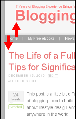
One of the many design elements that’s integral to your pages is how your product is presented. Not knowing how to align your products could lead to losing your potential customers in the process of navigating your pages. Though creatives make use of asymmetry as a stylistic choice, it could work to your disadvantage if it’s not incorporated properly into your design.
Solution: Know the Direction’s Purpose
Surveys conducted on user experience show that vertical alignment is more connected with different categories of products from top to bottom while horizontal alignment is attributed to more similar products from left to right. Know how to utilize your customers’ alignment preferences to work to your advantage in developing an easy-to-use product page.
Mistake #3. Too much Text and Too Little Visuals (and Vice-Versa)

One of the many reasons why eCommerce businesses fail is because they fail to utilize the design elements of their page to their advantage. A poorly-designed user interface (UI) often leads to instances of online shopping cart abandonment. Being bombarded by too much or too little information such as block texts of unnecessary information or visually weak navigation buttons in your pages can lead to your potential customers losing interest with your product.
Solution: Prioritize Faster Loading Times
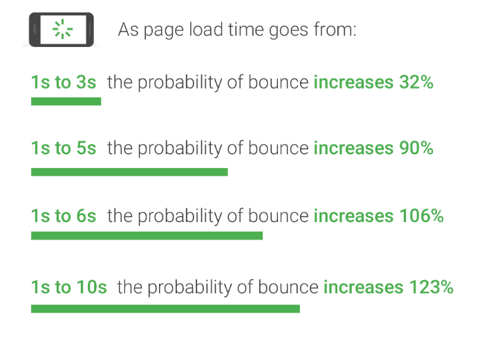
Statistics for eCommerce store performances show that users access a site that takes too long to load are more prone to leaving it then and here, with over 32% of individuals losing interest if pages take longer than 3 seconds to load. Using less bandwidth on your pages can be seen as doing more especially if you know how to manage your empty spaces. Optimize your product pages to be effective not just in desktop but also on mobile devices so that you may test the effectivity of restricting your design elements for faster loading speeds.
Mistake #4. Poor Scan-Ability

Poorly designed product pages often have too little or too much information on your pages. Poor scan-ability is the result of underutilizing white spaces and neglecting to include information that’s important to your customers such as:
- Product name
- Product cost
- Product materials
- Shipping information
- Help desk contact information
Solution: Looking Through your Customer’s Eyes
Assessing your eCommerce store’s poor performance is best done by testing your product pages with your customers. Know how to build trust with your customers by allowing them to give authentic feedback on both your pages and your products. People who aren’t actively looking for known mistakes or bugs can give you a broader insight into what you need to improve on your pages.
Mistake #5. Hard to Navigate Product Pages
The best way to lose your customers is by literally making them unaware of where they are on your pages. The importance of product page navigation design is critical as it will eventually lead to more sales. Your customers need to know how they can efficiently move back and forth from adding products to their cart or changing their payment options.
Solution: Keep your Customers in the Loop
Have micro notifications that allow your users to conveniently move to and from your pages by giving pop-up notifications on what customer inputs they’ve left unfilled or by providing essential information such as shipping costs, similar products, and delivery times.
Bonus Tip: Include a Product Demo

Beyond text and images, you should also utilize videos in your product pages. Product demos make it easier for customers to visualize and understand how to use what you’re selling by seeing it in action instead of using an essay to describe it. Make sure that your videos can be viewed even on mute by integrating subtitles or typography on it to make it more accessible for your customers wherever they may be.
Takeaway
Contrary to popular belief, most of the mistakes that occur on this list aren’t the fault of the product page designers. Unless you’re hiring a relatively new team of creatives to design your page, most of the blame can be pointed at your own requests and decisions. It can be difficult as a brand owner to admit that you’re not as equipped to deal with making creative choices, but being close-minded can lead to disastrous and costly mistakes.
The same can be said in reverse. If you simply keep agreeing with your designer without providing your own input, then the creative direction of your brand might be sidetracked to their preference and not yours. It’s important to keep an open dialogue with regards to the creative choices that are integral to the development of your brand. If you end up only looking for what you want, you might not be open to discovering what your brand needs. Make sure that you can put your full trust on your team, your vision, and your research’s data to develop the best design for your eCommerce website.
What did you think about our list? Did our top five items match with your own pet peeves? Leave a comment in the article below to share your thoughts on your own design tips and concerns.

Thanks for sharing these great ideas. Surely they are a gonna help lot of designers to try it for their work.
thanks for the information.
useful post.thank you so much.
Check your post, then i fix some problem in my website, i found some Common Mistakes in our blog.
Thanks for sharing Such a Nice article. You can also Post You Blog Here. It’s instant Approval and Do follow the link for your best quality blog.
Impressive post. Thank you so much for sharing this post with us. Great Job
Thanks for sharing this valuable information! It is very useful for me as a part of daily off-page seo activities.
Great post
Useful post.Thank you so much for sharing
That’s really good. I will definitely try working on some of these websites. Thanks for sharing this article.