46 of the Web’s Most Creative 404 Error Pages (2015 Edition)
Entering a mistyped URL into your browser or clicking a link to a destination that no longer exists usually leads to a 404 error page. This 404 is generated by your server and if you do nothing about will look like a default server message looks - ugly and boring and unhelpful to the technically non-savvy. This needs not be that way, however. We have curated a collection of 46 creative approaches to offering a 404 that you actually want to see as a visitor. Be it because it is helpful, impressive, entertaining or simply cute. Have fun!



 .. an animated session of ping pong ..
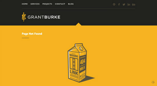
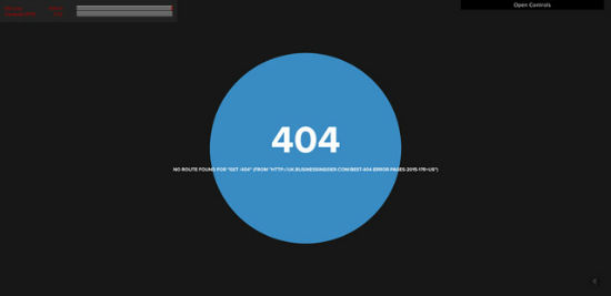 .. very interesting effects. Make sure to visit this page and try clicking around ..
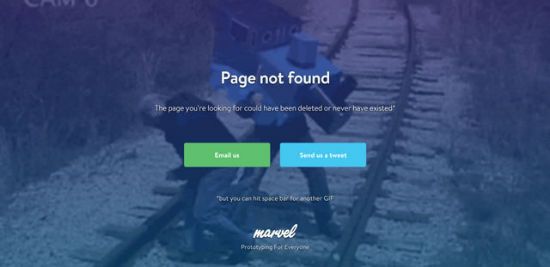 .. clicking the space key changes the animated background image ..
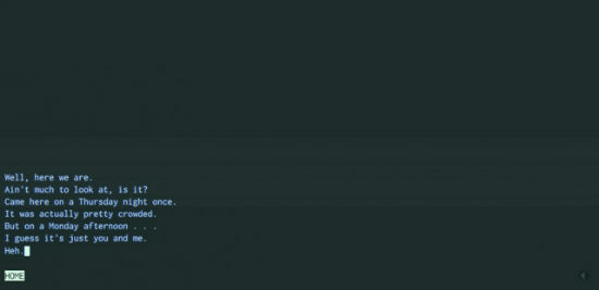 .. the good old terminals are back ..
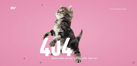 .. we can always haz cats. Noteworthy is the custom URL. Check it out ..
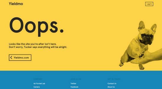
 .. fascinating animations ..
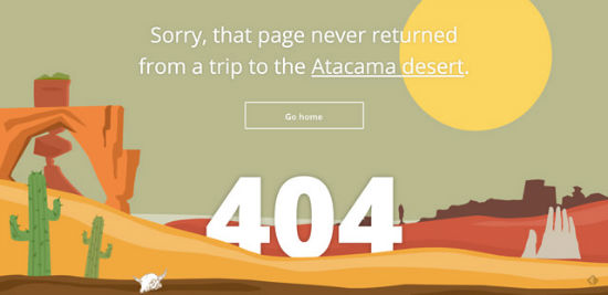 .. hand-drawn with love, then animated the same way ..
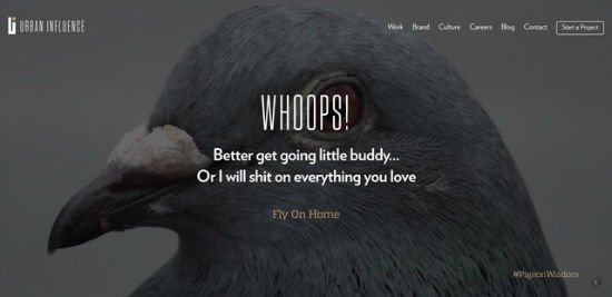 .. video in the background ..
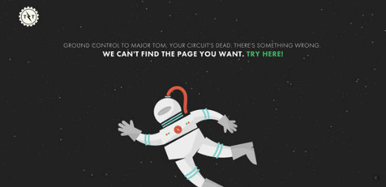 .. an animated blend of a David Bowie tribute and the movie Gravity ..
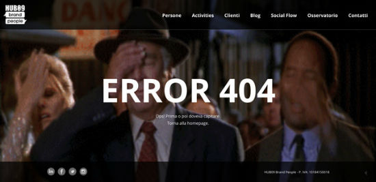 .. full-screen background video ..
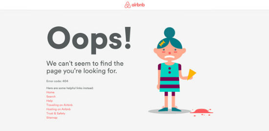 .. designed with love and delibering added value by providing links - also to the sitemap ..
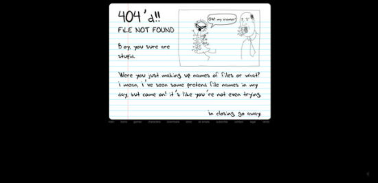
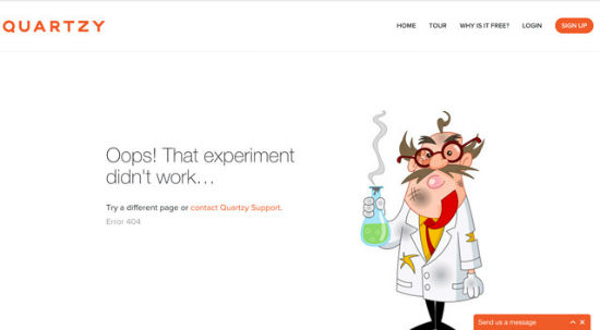
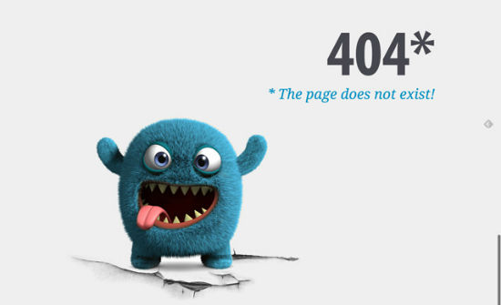
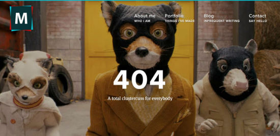 .. imaginative and simply cute ..
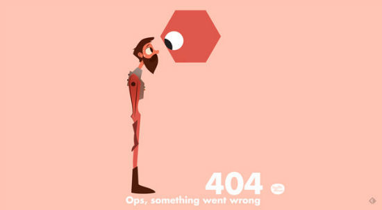

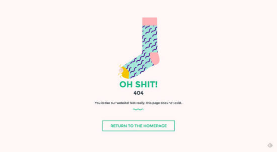
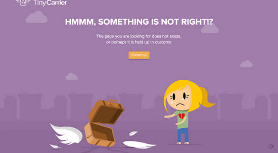
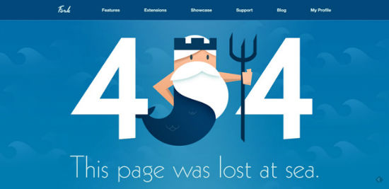
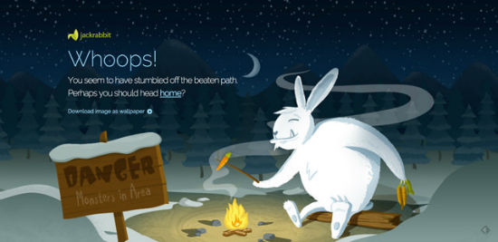
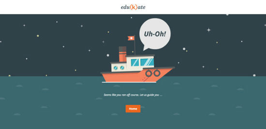 .. beautifully animated parallax background ..


 .. full-screen background video ..
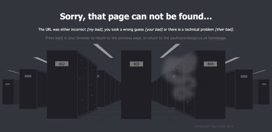 .. blinking lights of a data center ..
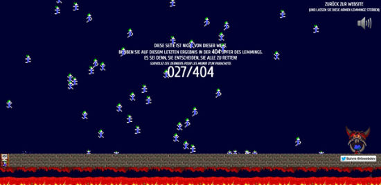 .. back to the Eighties' game consoles. Amazing ..

 . fully animated page featuring a starting rocket held back by an anchor - amusing ..



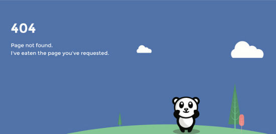

 .. dainty design and animation ..

Larkef - Error

Incore - Error

Krit.it - Error
 .. an animated session of ping pong ..
GrantBurke - Error

Gifmylive.arte.tv - Error
 .. very interesting effects. Make sure to visit this page and try clicking around ..
Marvel App - Error
 .. clicking the space key changes the animated background image ..
Allison House - Error
 .. the good old terminals are back ..
Wild - Error
 .. we can always haz cats. Noteworthy is the custom URL. Check it out ..
Yieldmo - Error

Random Staging - Error
 .. fascinating animations ..
Tripomatic - Error
 .. hand-drawn with love, then animated the same way ..
Urban Influence - Error
 .. video in the background ..
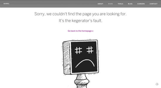
Barrel - Error

This by Them - Error
 .. an animated blend of a David Bowie tribute and the movie Gravity ..
Hub - Error
 .. full-screen background video ..
Airbnb - Error
 .. designed with love and delibering added value by providing links - also to the sitemap ..
Homestarrunner - Error

Quartzy - Error

Martin Wright - Error
 .. imaginative and simply cute ..
Laszlito - Error

TOBI - Error

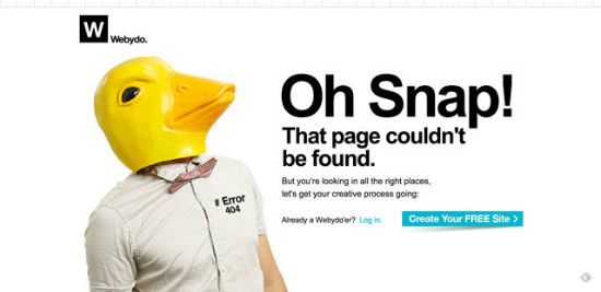
Webydo - Error

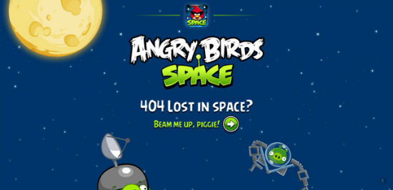
Angry Birds Space - Error

Odd Pears - Error

Tiny Carrier - Error

Edukate Web Client - Error
 .. beautifully animated parallax background ..
Fork CMS - Error

Bellstrike - Error

Jackrabbit Design - Error

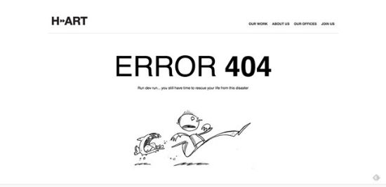
H Art - Error

Signum - Error

Storio Digital - Error

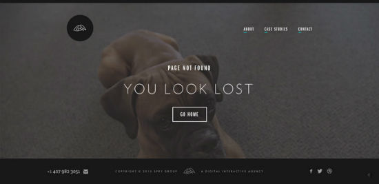
Spry Group - Error
 .. full-screen background video ..
Brand Crowd - Error

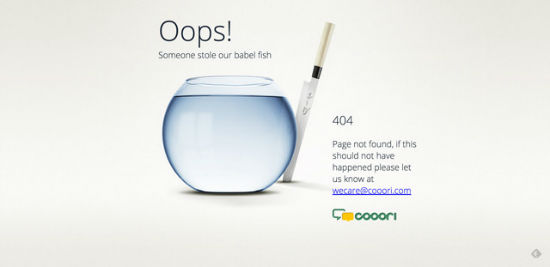
Cooori - Error

Paul Foster Design - Error
 .. blinking lights of a data center ..
Romain Brasier - Error
 .. back to the Eighties' game consoles. Amazing ..
Cool Apps - Error

Code School - Error
 . fully animated page featuring a starting rocket held back by an anchor - amusing ..
Herrlich Media - Error

Back Country - Error

Constellation & Co. - Error

Use Panda - Error

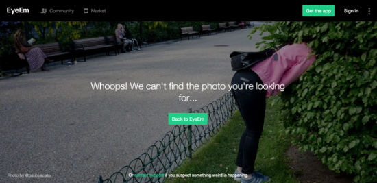
EyeEm - Error

Bob Wassermann - Error

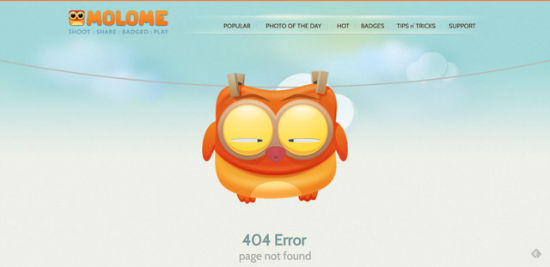
Molome - Error
 .. dainty design and animation ..

Wow, very inspiring sites!
Here’s another one: http://www.werbeagentur-glanzer-und-partner.de/404
I think also the page 404 can convey information to the user.
I thought about putting in 404 page information on missing persons or animals.
Awesome collection. TOBI – Error is my favorite.
Thanks for sharing :)
Hah! great ones – our support department; http://novicell.dk/404 :)
Embarrassing
jajaj look this http://www.web-media.com.ar/404
Uh oh. Takedown notice is to be waited for …
Another one
http://www.nextria.es/error/
creativity at its best for some… nice collection BTW.. thanks for the post.
Here’s a cool UX themed one: http://konigi.com/404
Great collection with a lot of inspiration. Also check out Mashables 404 page.
all of those 404 error pages are so creative :)
honestly i like code school error page design