20 Vital Techniques & Best Practices For Effective Web Design
Creating beautiful, unique websites seems to get harder every day. There are so many amazing website designs out there that coming up with something fresh and different is getting close to impossible. And even if you're not looking for something entirely unique, creating beautiful designs that don't look dated is a constant challenge.
Below are twenty excellent techniques and design elements you can incorporate into your designs to create a beautiful, polished website. Combine them or pick and choose which ones you want to use for each project you do. And we've also included plenty of examples to give you real-world examples of how designers are using them to create gorgeous website designs.
1. Vivid Colors
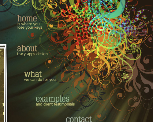
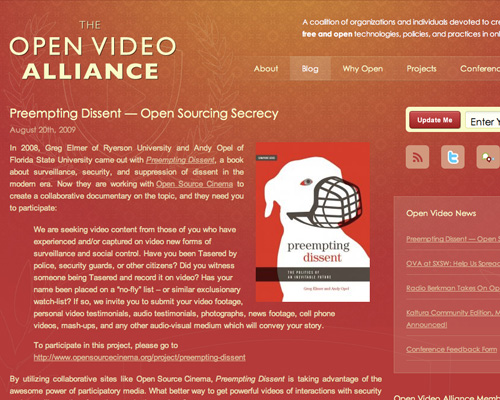
Using bright colors in your website designs can add a lot of visual interest. They're best for sites that want to appeal to younger demographics or for more casual sites. Using colors either in the similar hues or saturation makes for a more cohesive appearance and keeps things from looking too busy.
Make sure when using vivid color schemes that you allow sufficient contrast between elements without using too much (such as red text on a green background). This is especially important with text, as improper contrast can make things very difficult, if not impossible, to read.
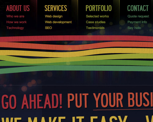
Using colors similar in saturation and intensity keeps a vivid color scheme looking cohesive.
Using shades of a single bright color can work well also.
Even limiting your vivid color usage to just your header and headings can still make a big impact.
Adding lighting effects to a vivid color scheme can make it pop even more.
Mixing vivid colors with more muted ones really makes the vivid colors stand out.
2. Gradients and Lighting Effects.
Gradients and lighting effects can be used for dramatic or subtle effects, or anything in between. Mixed or used separately, they can add a bit of extra polish to your designs. A subtle tone-on-tone gradient can make a great background, while gradients mixed with lighting effects are often used to create awesome header images.
If you're mixing gradients with lighting effects (particularly multiple effects), be careful that your design doesn't end up too busy. Limit either the colors used, the intensity of the lighting effects, or the overall number of effects for the best results.
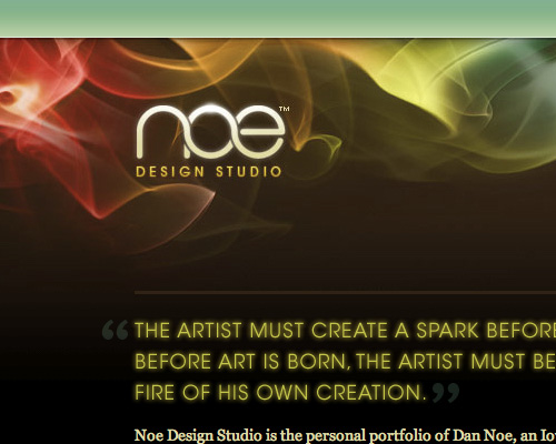
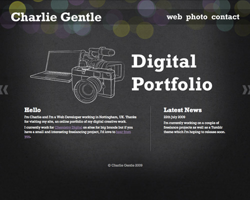
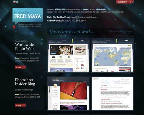
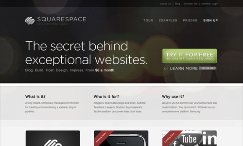
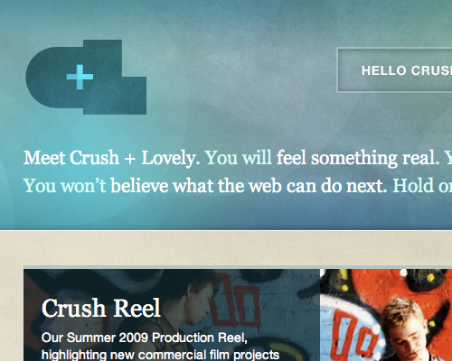
Combining gradients and lighting effects can have a big impact, even when the overall colors are muted.
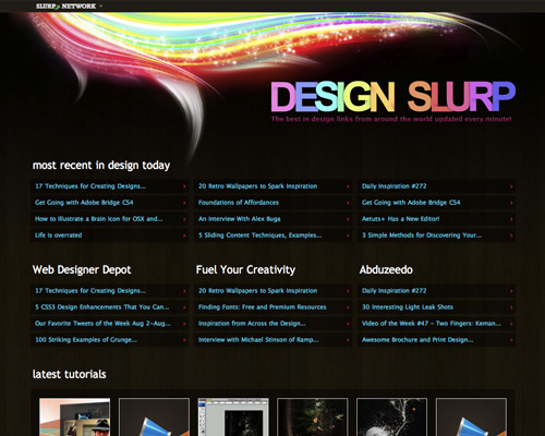
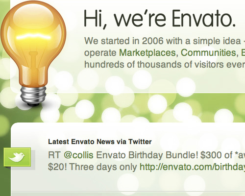
There's a huge variety of possible lighting effects you can use, like this one that combines angled lighting with fairy-dust-like spots.
Another combination of a subtle gradient with light artifacts.
A simple gradient over the background instantly ramps this design up to the next level.
Another site with a subtle lighting effect in the header.
3. Transparency.
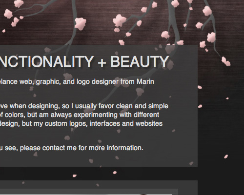
Transparent boxes work especially well over interesting backgrounds that aren't too busy. Whether it's a photo, a sketch, or just geometric and graphic elements, transparent layers can give your background a larger part in your site's design.
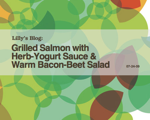
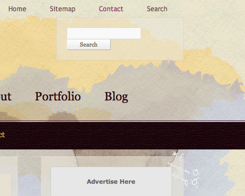
Transparency over a patterned background works very well.
Transparent boxes over a photo background work even better.
Including a 1 pixel opaque border around your transparent boxes adds an extra level of polish.
Transparency can make your text pop more while still allowing your background to take center stage.
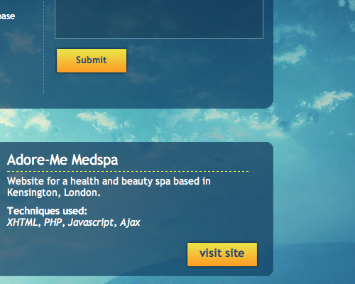
Using transparent boxes in a similar color to the background really makes them stand out.
4. Grunge.
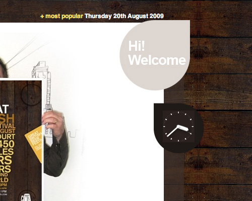
Grunge is a pretty broad category when it comes to website design. Adding in subtle grunge elements to otherwise clean and polished sites can contribute a bit of an edge to the overall design. You can also combine multiple elements of grunge design to create a site that's clearly grungy.
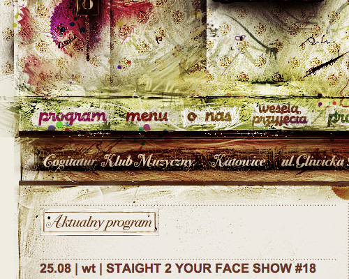
Some of the more common elements of a grunge design are dirty textures; messy borders (often that look like paint brush strokes or decay)' torn paper; staples, paper clips and similar elements; muted colors; water or other liquid stains; grungy fonts; and other decayed and destructed elements. Using any or all of these (carefully) can add a new layer to your design.
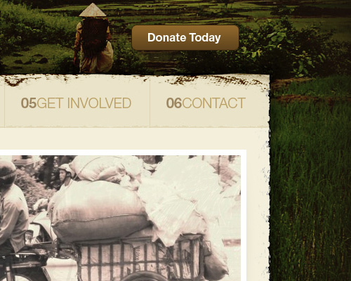
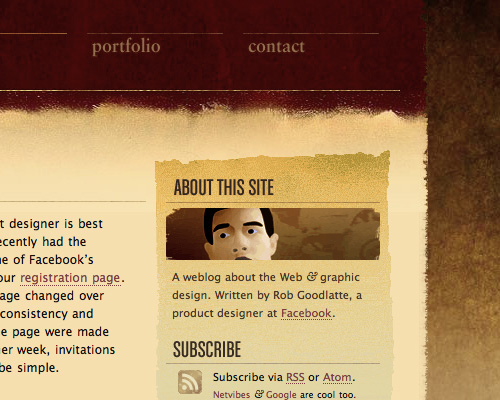
Adding a grungy border to the main content area adds an extra layer of polish to the Glocal Ventures site.
Grunge elements like messy brushes and splatters can be easy to incorporate in otherwise clean sites, as is done in this header.
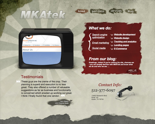
Messy edges and dirty-looking backgrounds are two hallmarks of grungy design.
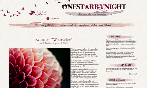
Even something as simple as adding heading backgrounds made with a watercolor brush can give a site a bit of a grunge edge. Adding a subtle dirty background further reinforces that look while still maintaining a professional image.
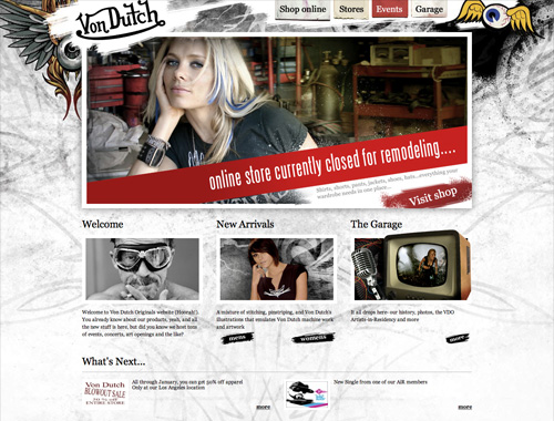
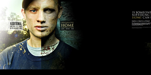
Going all out with grunge elements can make a big impact and works well for a site going for an edgy image.
5. Hand-Drawn Designs.
Hand-drawn and sketched elements can make your site look a bit more casual and even fun. Whether you use complete sketches or just doodled elements, using hand-drawn elements makes your site look a bit more artistic and can sometimes add a whimsical element. It also evokes childhood and cartoons in many circumstances or, less frequently, fine art.
A simple way to get started with hand-drawn elements are to use hand-drawn Photoshop brushes, fonts, and icons. For the most part, there's a wide variety of each available for use for free.
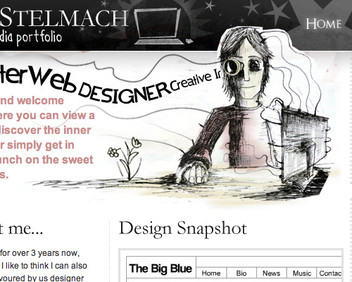
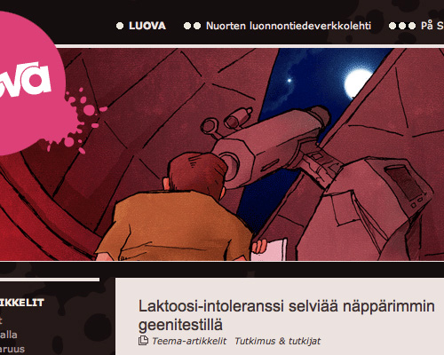
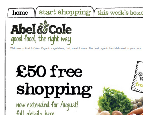
Adding a simple sketch to your home page can make a big impact.
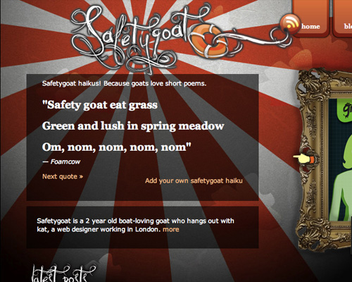
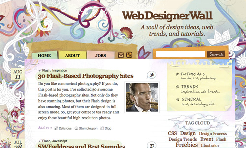
Hand-drawn elements can give your site a fun, laid-back look.
Headers are a perfect place to put a sketch or painting while still maintaining a professional site.
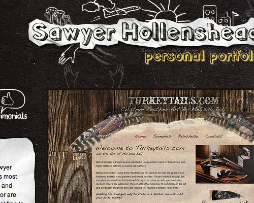
Sketches mixed with fonts that look hand-drawn work especially well.
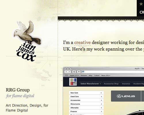
Another great example of sketched typefaces and hand-drawn images.
6. Muted Colors.
Muted colors are a great way to create a subtle, inviting site. Mixing in muted colors with one or two brighter or darker accent colors can be put to good use to make certain elements of your site stand out. Muted colors don't need to be limited to grays or browns. You can use any hue in the spectrum, just toned down or with a grayish-tinge.
Mixing muted colors with a brighter or darker color makes them stand out more.
Muted doesn't have to mean just grays and tans. Mixing in subdued greens, reds, and other colors adds more interest.
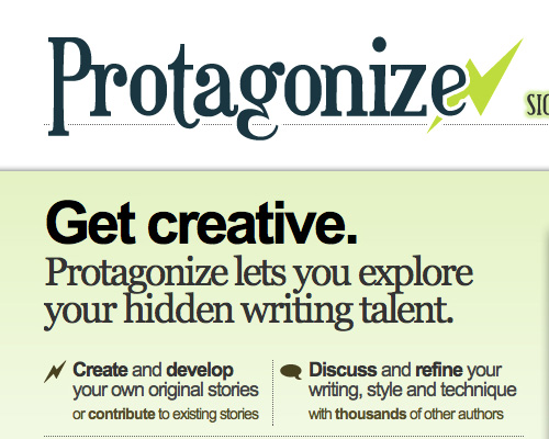
Even a bright color (like the chartreuse in this design) can take on a more muted tone when it's paired with subdued colors in similar hues.
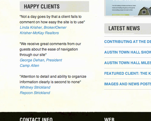
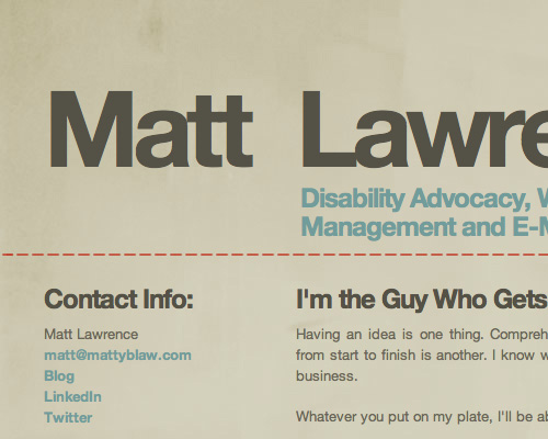
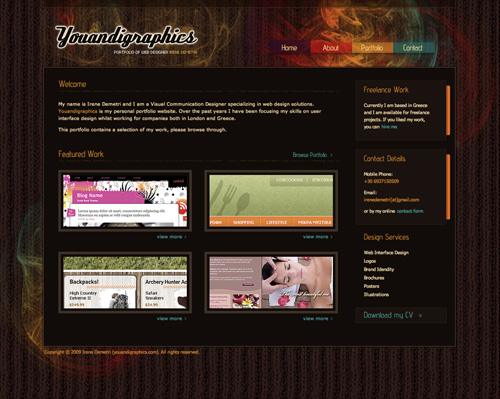
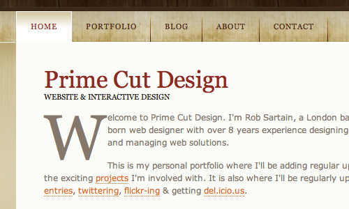
Pairing soft tans and creams with black accents makes for a very professional-looking site.
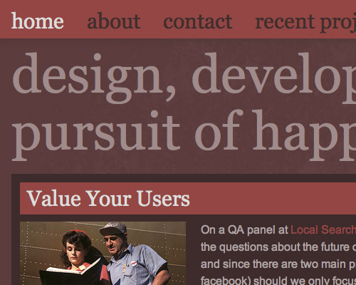
Decreasing the saturation of bright colors gives them a muted quality and makes them look a bit retro at the same time.
7. Watercolor Effects.
Creating a site with watercolor elements has become easier with the wide availability of watercolor Photoshop brushes and textures. Using watercolor effects in headers, backgrounds, and other elements is an important design trend. The beauty of watercolor elements is that they can easily be made to stand out or stay in the background depending on the colors you use and how transparent you make them. Either way works, and what you choose to do should depend on whether you want your site designs to have a bold or subdued appearance.
Watercolor elements don't necessarily have to be light or pastel.
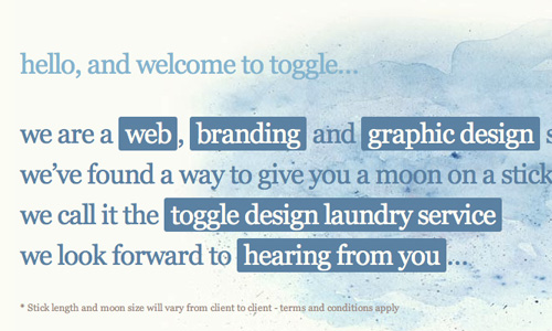
Mixing watercolor painting with line drawings adds extra visual interest.
More abstract watercolor brushes make for a more relaxed look.
Using watercolor brushes over what looks like a watercolor paper background works great, especially when paired with a casual script font.
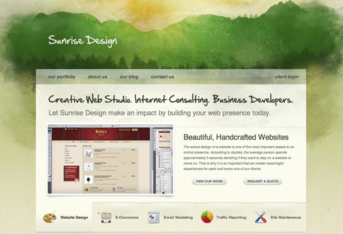
A watercolor scene makes a great header.
8. Nature-Inspired Elements.
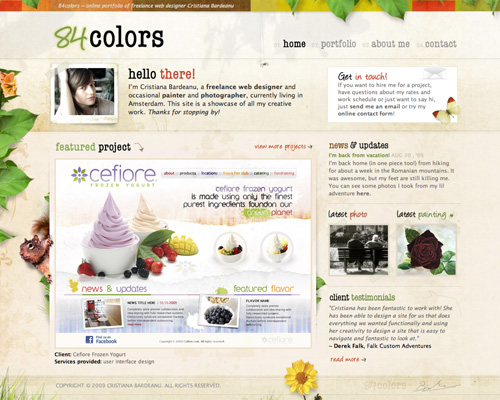
Nature-inspired elements are most popular on environmental and green industry websites, but they're starting to pop up all over the web. Some of the most prevalent places are in designer portfolios and personal blogs.
These elements can be used in a multitude of ways. Some use them as part of a background design. Others incorporate them into headers or icons. Some use them all over the place, wherever they'll fit. Finding creative ways to incorporate nature-inspired elements can be a fantastic and fun design challenge.
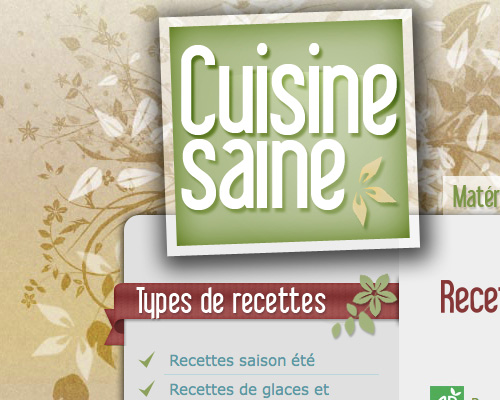
Nature-inspired elements don't necessarily have to be photo-realistic.
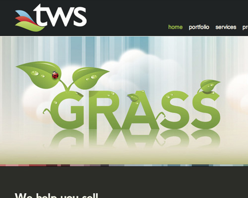
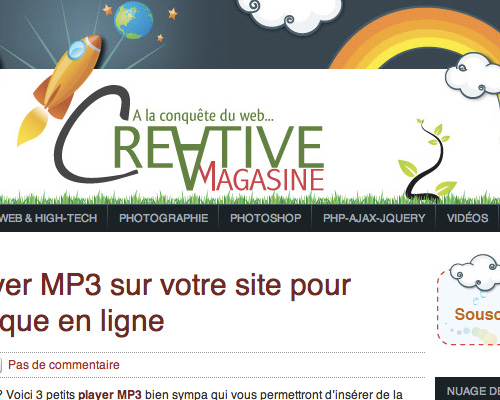
Shiny, glossy nature elements work well in a header.
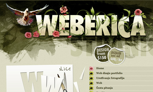
The vines and bird add an organic feel to the header of this site, especially when paired with the watercolor elements.
While it's not visible in this image, the leaves and other nature-inspired elements on this background move slightly, as if they're swaying in the breeze.
A simple lawn background mixed with other man-made elements gives it a bit of a natural feel without going overboard.
9. Photo-Realistic Backgrounds.
Photo-realistic backgrounds in this case are not just photo backgrounds. Most of these are built either out of multiple photographs or have elements added to photos that appear real but are actually digital or computer-generated.
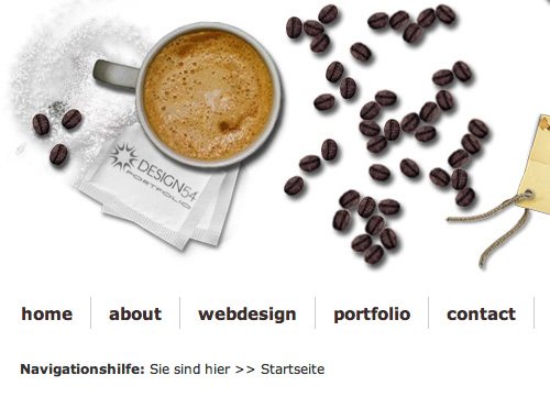
One of the most popular photo-realistic background techniques in the past year or two is the creation of desk-top or table-top backgrounds. These generally consist of a wooden surface with various papers, coffee, cups, and other elements overlaid on them. It's a tough technique to pull off (making sure shadows and light sources are all consistent, etc.) but makes for an awesome effect when done well.
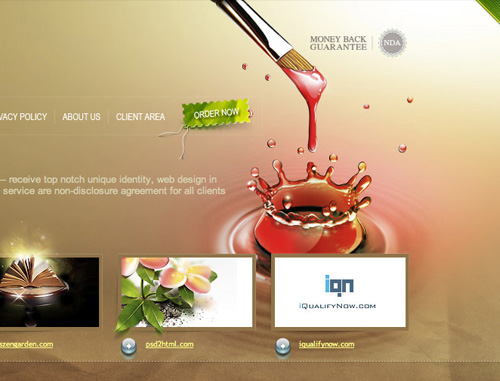
The mixture of a photo-realistic background with other photo-realistic elements (such as the image under the "order now" link) add up to a very polished looking site.
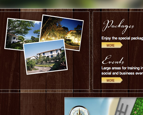
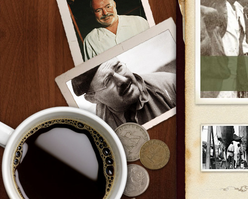
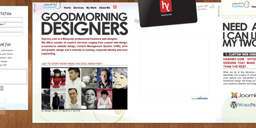
Making a photo-realistic collage that looks like a desk- or table-top is a popular trend.
Photo-realistic backgrounds don't need to be complicated to make an impression.
A photo-realistic background doesn't need to consist of multiple elements.
A simple collage of realistic images along a common theme is also a popular technique.
10. Oversized Typography.
Using oversized type can lend importance to certain text elements. Some sites even opt to use oversized typography for all their text. And you don't necessarily need to make type humongous for it to have an increased impact; making it one or two sized larger than you normally would can work wonders for how much weight it has within the overall design.
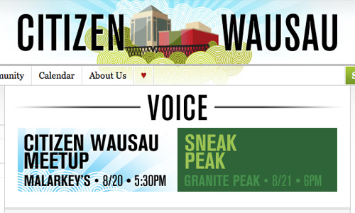
Oversized typography doesn't necessarily have to be huge, just larger that what you'd normally expect.
Sometimes slightly-oversized type can have a bigger impact that giant type.
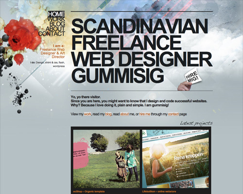
Another great example of type that's just a bit bigger than what we've come to expect. It really makes the type itself stand out.
Limiting oversized type to the header of your site makes a big impact.
Oversized type all around is also an option.
11. Decorative Typography.
Decorative fonts can work wonders for website designs. Using JavaScript and other text replacement tools that replace the text with an image in the desired font make creating these effects relatively simple, too. In most cases, you'll want to limit the number of fonts you want to use, or risk making the site way too busy. But if typography is the primary graphic element within the site, you can use more diverse typefaces as long as you keep color and/or proportion similar.
Limiting decorative typography to just the header of an otherwise-simple site can make it stand out more.
Using a decorative fonton multiple elements throughout your site lends a sense of consistency.
Mixing multiple decorative fonts on a site can make an even bigger impact on the design. Just keep in mind that fonts should have similar elements, scales, or other design elements for the best results.
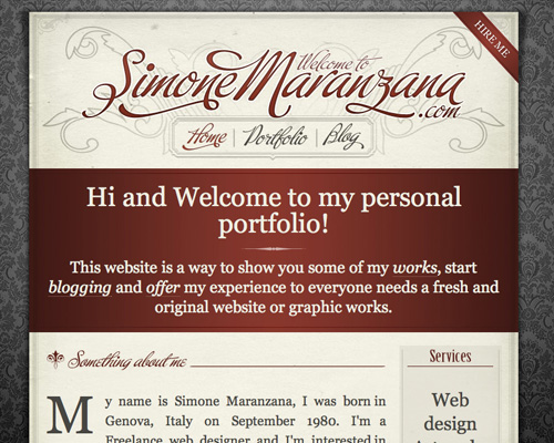
Mixing a script font with a serif font gives a very elegant feel to any website.
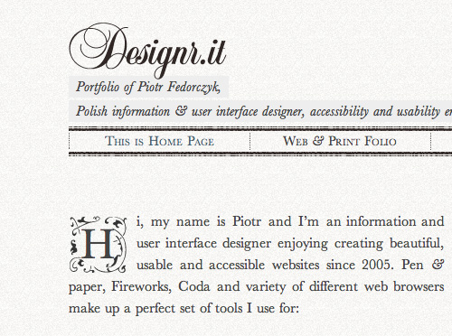
Another great example of decorative fonts mixed with a traditional serif font.
12. Bold Backgrounds.
Using big, bold background images in your designs is another popular trend. There are a number of ways to do this, including creating resizing images. By using more complex or simpler designs, limited or vibrant color schemes, and other, similar design choices, you can change the impact a big background will have.
A bold background that uses a limited color scheme doesn't overwhelm the page's content.
A photographic background of your business can make a huge impact on an otherwise-simple site.
Big backgrounds don't necessarily have to be complicated. The mixture of a repeating photo texture with colorful fractals makes a big statement without being complex.
Mixing elements in your background can also make a big impact, as is done here with the mixture of grunge, watercolor, photo-realistic elements, and lighting effects.
Geometric backgrounds can make a huge impact, especially when mixed with grunge elements.
13. Retro and Vintage Elements.
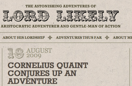
Including retro, vintage, and antique elements in your designs can add a layer of fun or nostalgia to your websites, depending on how you use them. In some cases, they can even add an extra layer of charm or class.
Surprisingly, the inclusion of retro elements in your design can make your site look new and fresh. Vintage designs have yet to really saturate the web, so people aren't as used to seeing them online. Whether you opt to go back to the seventies, forties, or even earlier, these kinds of elements can be fun to add.
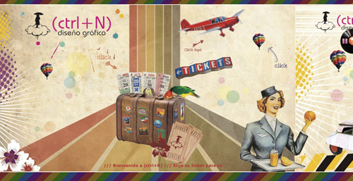
A collage of vintage elements makes a big statement.
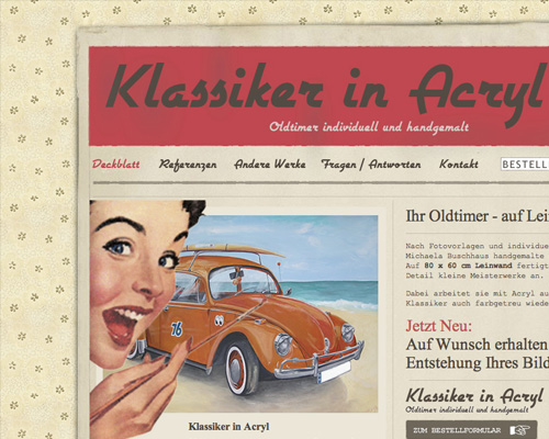
A vintage background paired with a retro font and color scheme creates a 60s feeling.
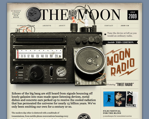
This site pairs vintage radio elements with a newspaper look to achieve a 40s feeling.
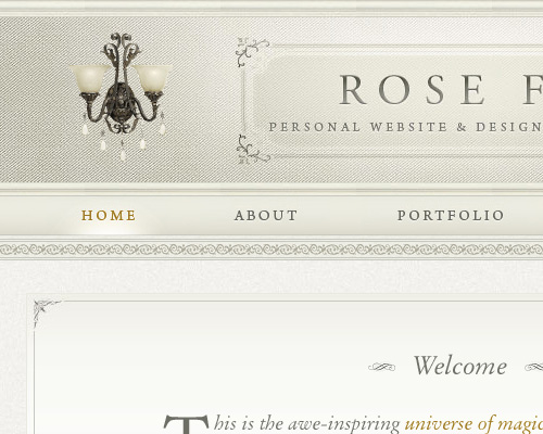
The pairing of antique-looking sconces with fancy border elements lends a Victorian look to Rose Fu.
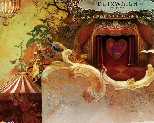
The mixture of vintage and antique elements lends a circus or even Vaudeville feeling to this site.
14. Eye-Catching Headers.
Headers often contain important information you want to stand out to your site's visitors. They can reinforce your company's image, provide vital information, highlight important features, and more. Using a header that's eye-catching, through the use of color, images, and typography, makes it more likely visitors will take the time to look at what's up there.
A bold header closely tied to the content of a site works well for any business website.
A header image that pairs multiple elements (lighting, photos, vivid colors) makes a big statement.
Combining tons of different elements into a header has a really powerful impact and works great for a personal blog or a more casual site.
Eye-catching headers don't necessarily have to be bright and shiny. A more subdued header with good contrast to the rest of the site can be equally impressive.
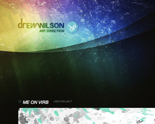
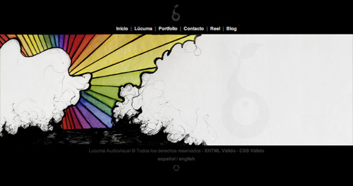
A header with rainbow colors and some subtle hand-drawn elements really draws the eye to the logo and title of Drew Wilson's site.
15. Collage Elements.
Collage elements are some of the most versatile design options out there. Used sparingly with clean edges, they can make a site look more polished and finished. With rough edges or used copiously, they can add a more artsy look to your site. And when they're somewhere in between, they add a real flourish to website designs.
Collage elements with a more digital look work really well for a more professional site.
Collage elements used sparingly can add that little extra something to your site's design that really puts it at the next level.
Torn paper elements really sit on the line between collage and grunge.
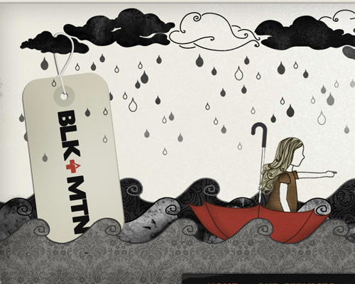
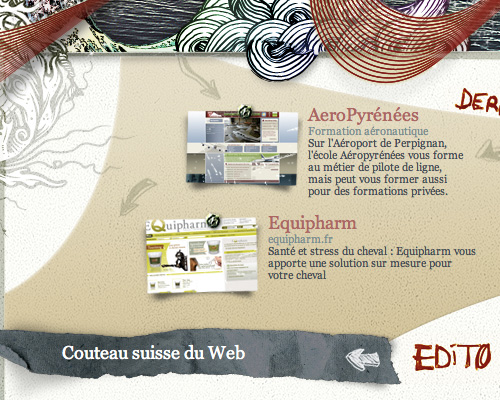
A mixture of hand-drawn elements, paper scraps, and other paper-themed elements add up to a very interesting and unique collage design.
Mixing faux-paper elements with digital collage elements makes this header even more interesting.
16. Textured Backgrounds.
Using backgrounds with a bit of texture can add that extra bit of presence to your site. A textured design, whether dirty and grungy or made to look like cloth or anything in between can really add some punch to the look of your site. There are literally thousands of textured and patterned backgrounds out there you can adapt to the design needs of your sites, or create your own for something truly unique.
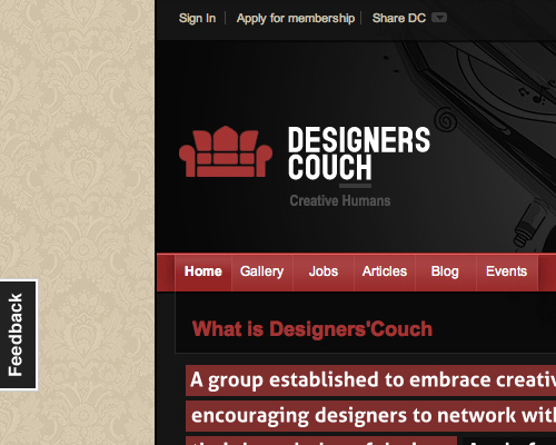
A subtle tone-on-tone background adds the feel of a textured, cloth-like background.
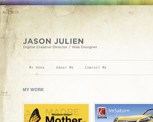
A subtle dirty texture in the background adds a grunge element to Jason Julien's site.
A subtle texture repeated in both the header and the background lends a sense of continuity between elements.
A mixture of textured elements in the background add more visual interest.
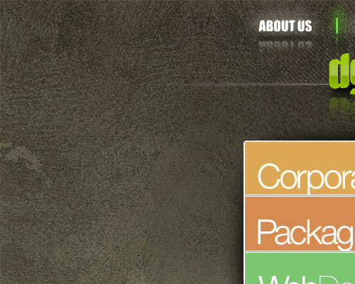
A simple texture similar to concrete or stone adds nice contrast to an otherwise shiny and clean site design.
17. Tabbed Navigation.
Tabbed navigation has a big advantage over button- or text-based navigation. Tabs evoke notebooks or binders, and people have a psychological expectation that clicking on a tab will take them to a new page or section (as a tab delineates a new section within a physical binder or notebook). This psychological connection makes it more likely people will click around on your site and visit different sections.
Tabs can be as simple or complex as you want them to be. Some have rounded corners, some are vertical, some are barely tabs at all and are set apart by little more than a vertical border between them. In any case, tabs really are the best navigation method for major sections of your site and can really increase your page views per visitor.
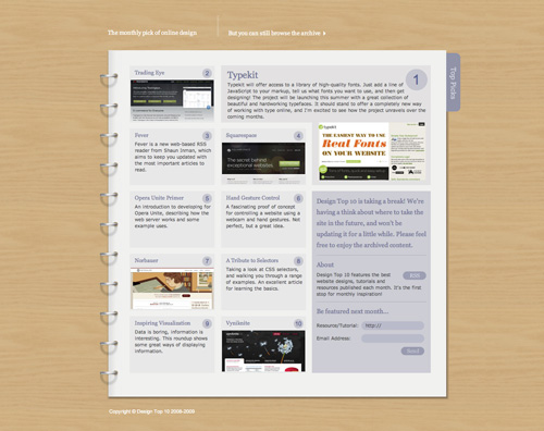
Simple tone-on-tone tabs work well when the active tab is somehow highlighted. It's especially interesting here, as the inactive tabs are grungy while the active tab is clean and glossy.
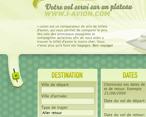
Repeating design elements between different parts of the site add to the overall design continuity. The stitching element repeated here is subtle but really adds that extra level of polish.
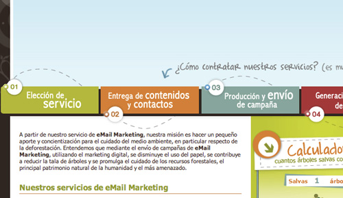
Tabs used to show logical steps make a lot of sense when it comes to usability.
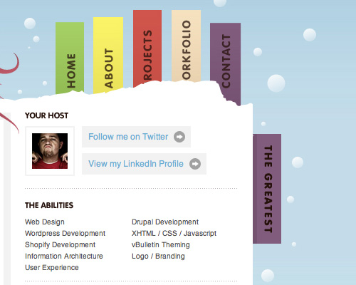
Tabs don't have to be horizontal.
Simple, outlined tabs work well within a simple site design.
18. Black and White.
Black and white color schemes can make a huge design statement. Using stark black and white is the most graphic, but combining shades of white, light gray and cream with blacks, dark grays, and dark browns can all have a significant graphic impact. Experiment with different levels of contrast to come up with the appropriate level for your specific design project.
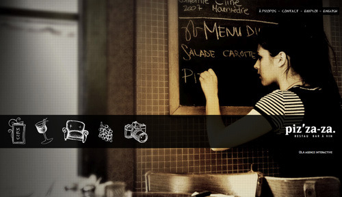
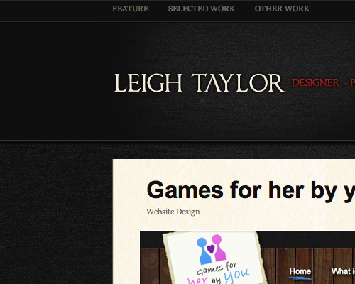
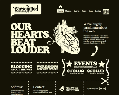
The mixture of a very dark gray with cream give a slightly retro look here.
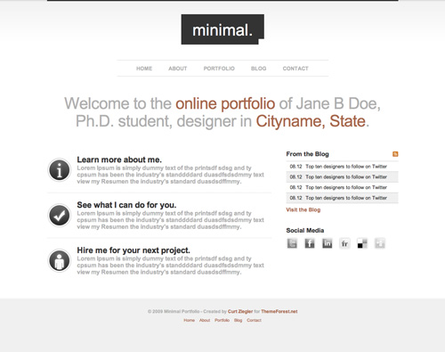
Using a lot of white makes a site feel lighter-weight and more streamlined than a mostly black design.
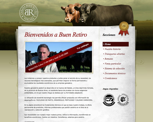
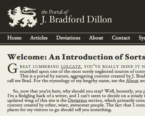
The pairing of a subtle off-white with a dark brownish-gray makes for a very classic and traditional design.
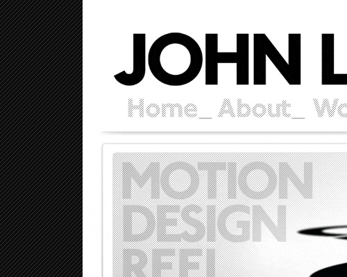
Stark white and black make a bold graphic impact.
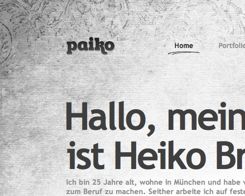
Shades of gray can make a site look more inviting than sites with more contrast.
19. Horizontal Scrolling.
Horizontal scrolling sites can be difficult to pull off and are often best reserved for sites with limited content. But when combined with modal boxes and other content elements, they can make a huge impact on your visitors. It's still something people aren't used to seeing online, and can really stick in the minds of your users.
Making it very obvious how to navigate on a scrolling site adds to its usability.
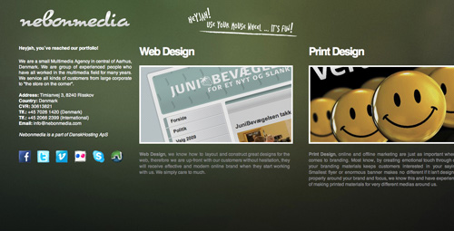
Horizontal designs work especially well for portfolio sites.
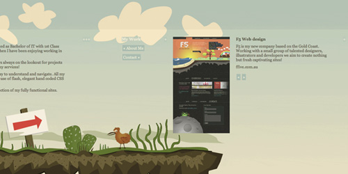
An interesting take on the horizontal site, this site starts near the center and scrolls to both the left and right.
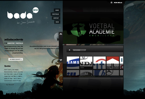
This site uses a combination of horizontal scrolling and modal boxes to display content.
A consistent background across multiple screens in a horizontal scrolling site lends a sense of consistency.
20. Cartoon Elements.
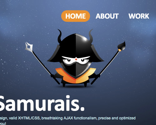
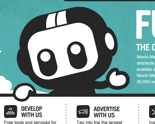
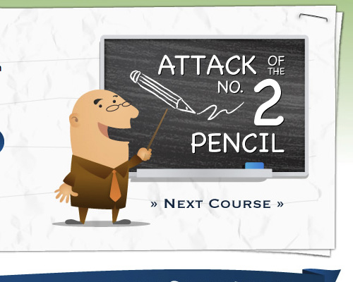
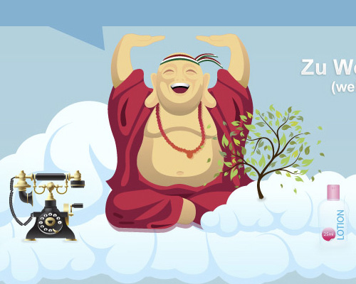
Cartoon elements add a level of fun to your site that few other elements can. Whether you keep them relatively professional and polished in a corporate site or let them get a little looser, cartoon characters and other design elements keep your site looking fresher and younger. One particularly cool technique is to use charicatures of well-known figures (Einstein, Buddha, etc.).
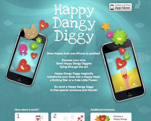
Cartoon elements don't' necessarily have to be caricatures.
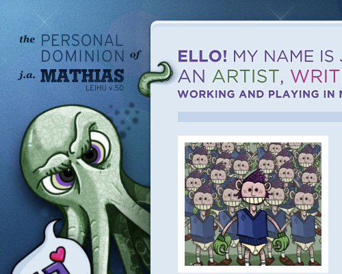
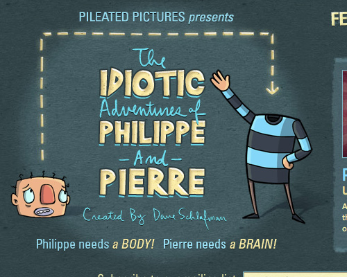
Using a cartoon character as a mascot or logo works really well.
Monochromatic cartoon elements are the most versatile.
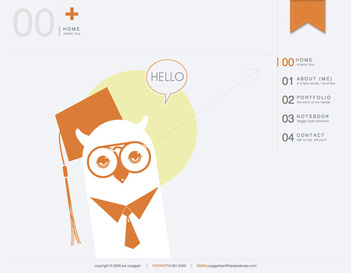
Using a cartoon character that fits with the theme of your site (such as the professor on Spoof University's site) adds a more laid-back and even humorous element.
Cartoon caricatures of commonly-known figures are popular.





thanks for this
____________________________
get your website optimized at Quintema
Excellent Article, Added to favs, keep up the good work.
Love the post, keep up the good work!
What a great collection! Thanks for the inspiration. I’m just starting a new web project and I plan to employ several of the techniques outlined above. Also, thanks for investing the time it took to put such a list together. Much appreciated!
(just saw the guidelines above…sorry.)
Great list for inspiration ! thanks
I look to consent with most of the thoughts and opinions and this post is no different.
Thank you for the wonderful blog and I hope you keep up the excellent do the job. If you do I will carry on reading it.
Use a great day.
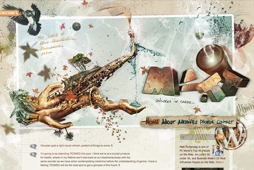
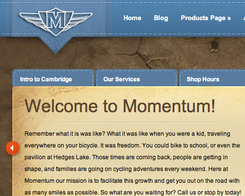
The Momentum picture above (I checked the site and they’ve changed the theme) is actually a WordPress theme called developed by ElegantThemes, as you can see here (look at the background image). They let you choose a color scheme in the theme:
http://www.elegantthemes.com/preview/eBusiness/?cat=8
Cheers,
Scott
Excellent list of web2.0 sites(resources). I was already using few of it. however it is good to know more.
Fantastic! 2 years ago almost all of these techniques & best practices are still topical and widely used. Great article.
Great read, thanks for posting this.