Stack: New Kanban Boards Task- and Projectmanager by Bugherd
The makers of the popular bugtracker Bugherd from Australia are back with another solution designed to make the life of all of us working in the design and development industry easier. Their new product is called "Stack" which offers a nice association as to what we can achieve with it. Stack follows the concept of the popular Kanban board systems. The most well-known specimen these days is Trello. The similarities are striking. We have taken a closer look at Stack. Here are the results...
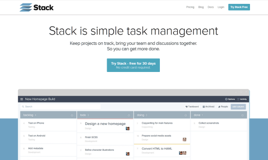
Stack: Cloud- and Team-based Project and Task Management Solution
Stack is a software as a service, a cloud app, running completely from inside your browser with all the modern browsers I was able to test supported. There is no support for languages other than English.
Stack has no native mobile apps by now, which of course is a major drawback. But then, the mobile web app works completely responsive, which allows for the use on your favorite smartphone while still not being the ideal solution. I wouldn't exactly call it fun to use.
Simply register for an account if you are keen on checking out Stack. Name, email and a password are sufficient to create a profile and get the free trial running. You are not asked to enter any credit card details at that moment in time. Your projects will be hosted under the sub domain yourchosenname.getstack.io.
You read it right. Stack is a commercial product without free variants, its competitors, first and foremost Trello offer. At first registration you are entitled to start a 30 day trial, which is perfectly sufficient to help you decide whether Stack is the right tool for you or not. In fact Stack is so easy to understand, half a day of intensive use will suffice to find a decision.
Stack's pricing is simple. There is only one fee you need to keep in mind. Five dollars are what you will need to pay per user and month if you want to stick with Stack. Five dollars are an amount not far from the competition. In fact you can rent almost any solution in the field for a handful of bucks.
Different from the rest is the possibility to pay for the whole team from one account. That way not every team member needs to find his own way of paying for a solution that's most likely been paid for by their employer. Already small companies with that given handful of users will find that helpful. If you want to have third parties participating the mode of payment is even more beneficial.
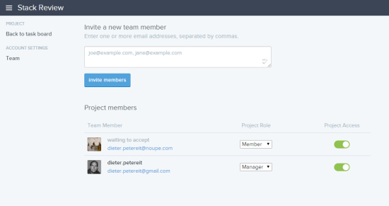
Stack: Team Overview in a Project
What does not appeal to me is that Stack's top hierarchy is the team itself. That means you define a team first and then create projects and tasks below it. At first sight you might find that perfectly logical, but when you take a deeper look the downside becomes obvious. People only exist as part of a team. People do not exist as individual profiles as e.g. Trello sees it. That way a person is always part of one specific team and cannot be part of others. If you want one physical person to be part of different teams with different project stacks you'd need to create this person as many times as teams exist - and pay for it as well.
Take me as an example. I am part of the teams at Dr. Web, Noupe Magazine and Commindo Media. These teams rarely ever work on the same projects, at least not on the same level. In Trello I exist once and the administrators of all three teams have added me to their team, which on that layer is called an organization. I pay the individual fee once and am entitled to be part of as many teams as needed. My personal dashboard in Trello reflects these memberships in one comprehensive overview.
In Stack each team admin would have to "create" me anew and consequently pay for me, too. I then would have three logins and three different dashboards to keep track of. As I still am only one person dependencies wouldn't be properly reflected, I would not feel organized at all. I suggest the Stack makers think that over.
Being invited as a team member is done the classical way by email invite. The team member to-be is sent an email with a sign-in link. He/she clicks on it, comes up with a password and is aboard.
Stack: Intuitive and Versatile
Looking at the user experience, there are no flaws to be identified. Stack needs no learning phase. Take five minutes of your time and you will be able to use the whole feature set without having to think about. That's what I call intuitive. Stack sports a very modern look and follows the trend of flat design. Modern designers will love that part.
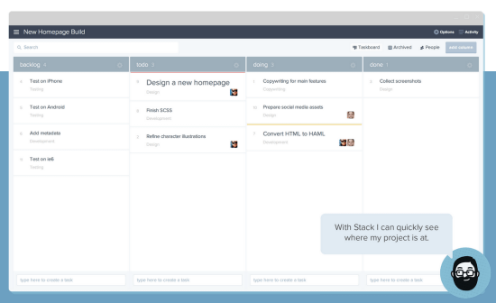
Stack's Intuitive Project Overview aka Taskboard
As with all Kanban variants Stack is no exception. A project in Stack is a board in other systems. These boards consist of lists, named columns in Stack. These lists or columns are containers for whatever you want them to contain. You can name them to your liking and you can have as many of them as you see fit. Columns are lined up side by side. Inside each column reside cards, called tasks in Stack. A card is as flexible as a column and can contain whatever you want it to contain. The cards are the core of the system, but let's stick with the columns for now..
Lists aka Columns Reflect the Workflow, Tasks aka Cards Wander Back and Forth
The way that I use Kanban boards, lists always reflect the workflow. In our editorial team each author owns a board (project and taskboard in Stack). This board contains lists (columns) named "Article Ideas", "Ordered", "Ready for Proofreading", or "Published". In fact there are more lists, but I think you already got the point..
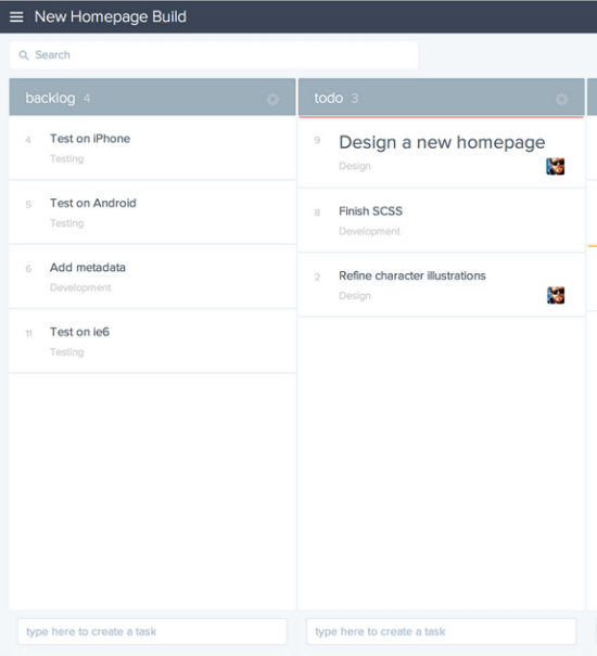
Stack's Project Overview aka Taskboard with Two Columns (in that case)
In our workflow, the individual cards (tasks in Stack) are named after the working titles of the articles proposed or ordered. These articles now wander through the workflow. Once an author has finished writing a given article he'll drag and drop it into "Ready for Proofreading". From there on the article moves forward until it reaches the last column named "Published". At times article might wander back down to the left, too. Maybe when the overall quality of an article needs more attention by the author. The principle has become clear, I suppose...
Stack functions in that exact same way. We could realise our editorial system with Stack, too. The number of columns are not limited, we could rename them to our liking and even work with colors to support clarity. Cards are called tasks in Stack. But what is a task? We defined a task to be an article. What would you define a task to be?
The Task is the Core of the Feature Set
Stack differentiates further and brings to-dos to the table. To-dos are individual steps needed to be done to have the larger task accomplished. To-dos are part of the task and can be entered as checkpoints to be conveniently crossed out when finished. They help in breaking down larger task into smaller chunks, which will help you grasp the project's progress better.
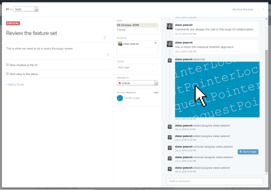
Stack: the individual Task is the core of the feature set
The task is the main element in Stack (and Kanban boards in general). The whole collaboration functionality is tied to the task. Here we add to-dos, which are smaller, more doable chunks of the larger tasks. Here we assign tasks to one or more team members, while it is not possible to delegate individual to-dos. We can define priorities and due dates and last but not least make the whole project more searchable by assigning tags.
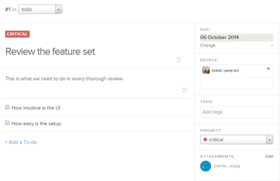
Stack: Closeup of a Task Card (left part)
Tasks are allowed to be equipped with a theoretically unlimited number of attachments, common image formats will be directly displayed as images from the timeline feed to the right. Attachments cannot be served through third-party providers such as Dropbox or Google Drive, though. Everything you want to share needs to sit on your local hard drive or locally accessible network drives. The integration with other products is one of the top priority features Stack's developers have in the making.
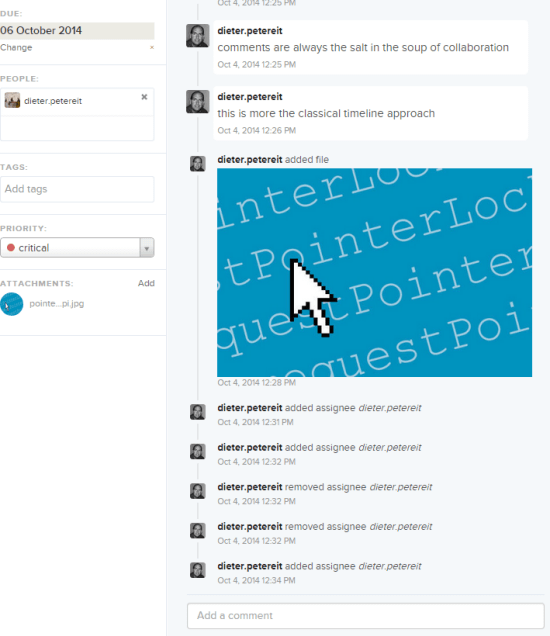
Stack: Closeup of a Task Card (right part)
As we are just talking about it: the timeline-like feed to the right half of the task card shows all activities in a given task in chronological order. This is the place where you enter comments, too. Discuss the task, inform others about your progress or enter whatever you want the team to read.
Stack: Activity Feed, Notifications and More
The more tasks in the more lists you create, the harder it gets to stay on top of things. Fortunately Stack supports us with an Activity feed and their Notifications system.
Look to the top right corner of the browser window while in Taskboard view. You'll notice a link named "Activity" there. Clicking on it will open a chronologically ordered drop down list with all activity entries for the given project. The difference between the feed right on the task cards and this one is that the Activity feed is not limited to an individual task. Instead it shows each and every activity logged throughout the whole project. The Activity feed is limited, too. It is limited to reflect one project at a time. A feed aggregating all activities throughout all projects is not available.
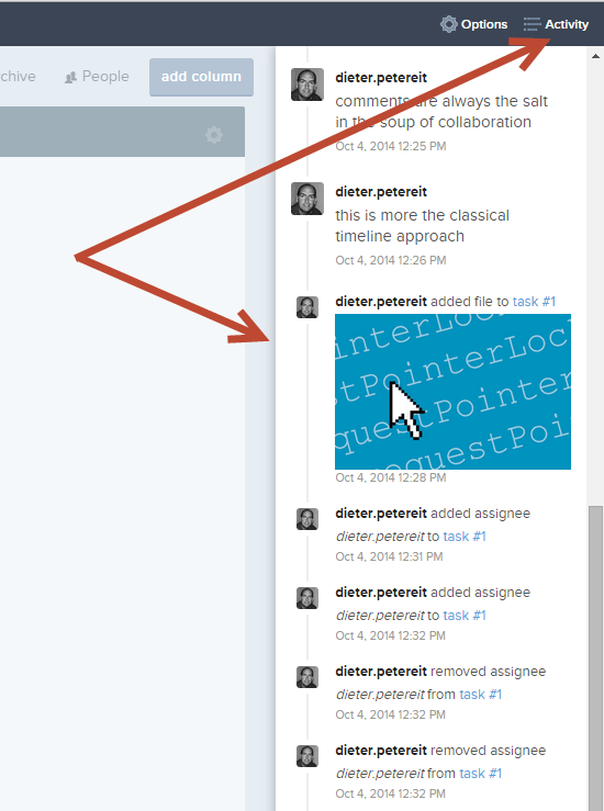
Stack: The Activity feed lists all activities of a given project
Another possibility to keep oneself updated are the so-called Notifications. Activate them once on a per team level and then optionally again on a per project basis. Per default notifications are always on.
At the time of this writing a notification is nothing more than an email, automatically sent out after an activity has been logged. Projects with heavy task-load will soon get your inbox flooded. Unfortunately there are no ways to filter what to get notified of and what not. Receive it or leave it is the motto.
As Stack comes equipped with an API from day one, we will surely see third parties innovate the feature set shortly.
Conclusion: Light and Shade and Loads of Potential
Now in a few words, what is Stack? Stack wants to be a task and project management solution. But then it does not suffice to name it that way. Stack has nothing to do with project management as such. It just names the upper hierarchy administration level, where you add tasks and todos to, "project", but is missing real project management features, such as critical path determination or any other correlations between tasks and their impact on the project flow. What's left is a solid task management based on Kanban boards.
Stack's concept is not new, it is not revolutionary nor overly innovative. It is nothing more and nothing less than a solid implementation of an already existing concept that has been built upon by quite a few competitors already. If you know Trello, you can use Stack with your eyes closed. The user interface is similar, the user experience not less. Trello, being the older product, offers more features, though I'm sure Stack is perfectly able to win the pursuit race in the long run.
Definitely Stack has lots of room for improvement and it has the potential to do so too. Look at Bugherd and you get a solid impression of what these developers are able to create. We have taken a deeper look at Bugherd here at Noupe. Check the Related Links below the article.
Personally I don't entertain doubts about the future of Stack. The biggest flaw in the construction of the service should be consequently rethought, though. The team should not be the starting point, the individual Stack user should be. Another weak spot is the handling of temporary stakeholders such as the client. It does not make too much sense to me having to enter the client as a full-fledged team member on a monthly payment plan. As the client needs participation possibilities but no permanent membership a temporary, limited, free account would be much better suited. As Stack claims to target designers and developers specifically, this problem is bound to occur rather more often than not.
Being able to pay for the whole team from one main account is a good solution for companies. Others (hey, Trello) make you pay for each member individually by entering the same payment details over and over, accompanied by the risk of fraud as you spread payment details far and wide .
Sorely missed are native apps for the diverse platforms we all work with nowadays. At least Android and iOS should have been served. Relying solely on a responsive web app is a little too less, especially at that level of competition. Delivering native apps should be one of the top priorities of the nearest future.
To sum it all up: Stack, there's still a lot to be done. Do it...
Editor's Note
After having finished this review I reached out to Bugherd and introduced them to my findings. Here's what they answered:"We're currently reviewing user accounts. Stack is aimed more towards teams than individuals, but we're taking the feedback on board and will work to improve this for individuals on multiple teams."That's my Bugherd ;-) Always open to criticism, then searching for a customer-oriented solution...
Related Links
- Stack | Homepage
- Bugherd | Homepage
- BugHerd: Lean & Clean Task- and Bug-Management for Web-Projects | Noupe Magazine
- Trello: Kostenloses, projektorientiertes Kollaborationstool nicht nur für Teams (German Language Post) | Dr. Web Magazin

I’ve been using trello for quiet a while . This also sounds interesting !!