The Invasion of Sharing Buttons: Why Less is More

Sharing buttons are a wonderful thing. Every blogger or website operator wants their posts to be shared on social media. However, that is the first step into a thought trap. The assumption that your visitors will share more often the more options you provide is wrong.
The thought trap is very successful. You'll find sharing buttons on almost every blog. On a lot of them, you'll even see an incredibly high amount of sharing options.
Firstly, there's Facebook (shares and likes), then there's Twitter, Google+, LinkedIn, Buffer, Pinterest, Pocket, and a lot more.
 An Overview of My Social Media Traffic. Twitter Has a Significant Lead. Regarding Quality As Well?
To get clearer data, look at the "Network Referrals".
 Find the Important Data Under the Menu Item Network Referrals.
More Sharing Buttons Mean More Shares? Nope.
You really expect to get more shares when you provide more options to do so? Unfortunately, the exact opposite is the case. Here's an Example; Maybe You'll Feel the Same Way I do: I'm a big fan of sweets. It doesn't matter whether it's sweet or salty, as long as it's unhealthy. As this would make me rise like a yeast cake, I decided never to have that stuff bought by my wife for me but only buy these things on my own. Why? Read:I'm standing in front of the giant wall of sweets to choose from. There's plenty of delicious stuff. I walk from side to side, but I can't decide. There are way to many options. Most of the time, I just end up going to the chocolate shelf, as there is much less to pick from. So I end up buying a bar of chocolate, although I would have liked to buy chips instead.The range was too large, so I was unable to decide on one type of chips, which in this case is a good thing. My wife would have just brought me just about everything there was on offer.
Paradox? More Options Make for Less Shares
People are bad at making decisions. The more options to share your articles you give them, the fewer shares you will receive. Five, six, or seven buttons are counterproductive. Some of the world's most successful blogs and magazines know this. Let's take a look at how many sharing buttons these websites provide:- mashable.com - two buttons
- Neil Patel - four buttons
- The Verge - four buttons
- Lifehacker - two buttons
- Smashing Magazine - two buttons
- CoSchedule - four buttons
- Buffer - three buttons
How to Use Google Analytics in an Intelligent Way
So let's look around in Google Analytics to find the most efficient social networks. With this data, you can then limit your sharing options to produce better results.The Sharing Report
First, you need to determine which social network gets you the most traffic. So log into your Analytics account and navigate to:Acquisition => Social => Overview
To get really meaningful information, I recommend displaying the data for a whole year. If your blog does not exist for this long yet, make it display the data from the day your blog was founded up to today.
Remember: You may have received a lot of traffic from one particular network throughout one month. In other months, the traffic from this network might be rather poor. That's why you should look at a whole year.
You need to have an overview of a wide range to be able to build a profound opinion.
Here's an example from my blog; although this orientation of it only exists since the beginning of June. That's why the data is a bit "expandable." The display period only ranges from 01/06/2016 to 10/25/2016.
 An Overview of My Social Media Traffic. Twitter Has a Significant Lead. Regarding Quality As Well?
To get clearer data, look at the "Network Referrals".
Acquisition => Social => Network Referrals
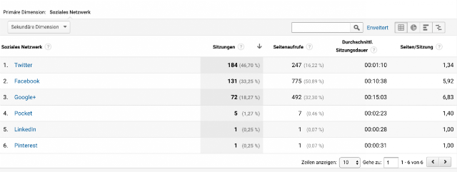
This brings up information that is a lot more meaningful:
 Find the Important Data Under the Menu Item Network Referrals.
Sharing Buttons: The Correct Evaluation
Twitter: When taking a look at the second screenshot, you'll quickly notice that the largest amount of traffic on my blog comes from Twitter. However, the traffic is not of very high quality. Facebook in second place brings visitor traffic of significantly higher quality to my website. With 131 sessions, Facebook at least causes 775 page views and an average session duration of 10 minutes on my website. On average, a visitor will look at 5.92 pages. Google+: However, the best network for Techbrain.de is Google+, although it nets the lowest amount of shares, and leads the least amount of traffic to my page. Nonetheless, it only takes 72 sessions to generate 492 page views and an average session duration of 15 minutes. The viewed pages per visitor rise to 6.83 on average. This is very high quality. I was surprised that I got the most valuable traffic from Google+. I expected it to be Facebook.Summary of the Important Information:
- The Duration of the Session For how long does a visitor stay on your page?
- The Pages/Session How many pages does a visitor look at before leaving your website?
- Page Views What's the average number of pages visitors from a particular network view?
You don't need visitors that will only stay on your page for 30 seconds. This traffic is completely useless.LinkedIn and Pinterest entirely drop out in my case, they are useless visitor traffic. The situation with Pocket is pretty much the same, as their users barely look at other pages, and only spend a bit over two minutes on my blog. What you need is high-quality traffic on your website. You need visitors that look at many pages per session and spend a lot of time on your site. You should optimize your site for these networks. In my case, it's very clear: I should optimize my site for Twitter, Facebook, and Google+. Twitter only because that's where most users are from. Here, I need to test and keep an eye on the data to find out if the numbers will stay the same, or if they will improve over time. If the figures stay the same, I may remove the tweet button.

I agree with less is more. Funny though – this post has nine options.
I think people forget that the content needs to be shareable too. To be honest I only really see things shared on Facebook or Twitter, or Pinterest for more visual posts. Too many options just seems confusing. I wonder if results would be better if it just focused on FB/Twitter and had an actual call to action at the end of a post to share it, rather than just assuming people will click one of the icons.
This is a great reminder about social sharing. One of the biggest issues I am seeing lately is when I am reading posts from my tablet or shrinking a screen on my laptop/desktop the social icons will block the content….usually when they are the flyout from the side of the window types. This is something every website owner really needs to think about!