Professional Website Optimization with A/B Testing: Tips and Tools
As web designers and developers, we often have to take decisions related to user experience. Most of the time, we rely on data collected via surveys and analytics for this purpose. Of late, A/B Testing is gaining popularity among web creators and page operators alike. What is A/B Testing all about and how can it be done? We will answer these questions and provide you with some useful tools in the following article.
 If you’re still confused about where to start, you can head to Which Test Won for inspiration. However, personally, I think websites such as WTW can only provide you with an idea about the impact and power a properly executed A/B Test can have -- at the end of the day, you need to realize the fact that your website’s needs and requirements will be different from those of others.
 Speaking of A/B testing tools, one of the easiest ones is the Visual Website Optimizer. Alternatively, you can opt for Google Website Optimizer as well. Both the products have a decent amount of documentation, and thus, we shall not be discussing their functionality here at length. If neither of these two tools appeal to you, you can set up your own testing mechanism and then analyze it using Google Analytics custom tracking variables. More information about this manual method can be found here. Needless to say that there is a whole industry of testing operators. So, if you've got a budget and do not need to rely on your own skills, you will find plenty of different offerings with different approaches.
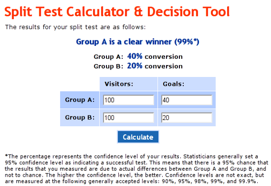 In the given screenshot, we had 200 visitors: 100 each on red and green buttoned pages. Assuming 40 out of 100 clicked the red button and only 20 out of 100 clicked the green one, the result is evident. Of course, an actual test will have larger and more complex numbers!
 Optimizely.com is a handy service that lets you implement A/B tests. This plugin helps you configure your Optimizely.com account to work with a WordPress website. You do not need any coding skills, because the plugin comes with an awesome visual interface.
Convert Experiments
 Convert Experiments can work in assonance with Google Analytics and KissMetrics. It lets you run A/B tests in a hassle-free manner. However, you will need an account to use the plugin.
Max A/B
 Max A/B plugin lets you perform A/B tests on pages in a WP installation. You can have up to three variation pages, and the plugin also provides you with real-time statistics. As of now, this plugin works only with pages and does not support posts.
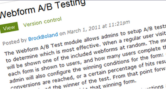 Webform A/B Testing lets you perform tests on your Drupal website by means of forms. It shows your variations of forms to a random selection of visitors, and if the visitors fill the form, a conversion is recorded. It is a simple Drupal module for running A/B tests.
Multivariate
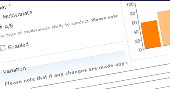 Multivariate is another module that lets you conduct A/B tests on your Drupal website. It supports multiple tests in parallel, and comes with pre-loaded definitions for the most common test types. However, the interface, though simple, is not supplemented with extensive documentation.
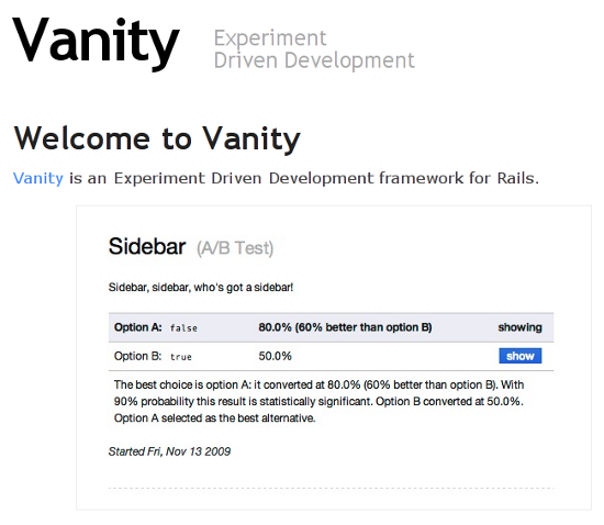 Vanity is an experiment-driven development framework for RoR that can be used for A/B Testing as well. A decent set of documented info is available here.
A/Bingo
 A/Bingo is another Ruby on Rails product, that can act as a plugin to aid you in A/B tests. You will need to work around with some amount of code, and thus, it is not the most apt choice for absolute beginners.
Have you ever conducted A/B Testing? Share your experience with us in the comments below!
(dpe)
What is A/B Testing All About?
Basically, A/B Testing means comparing two versions of the same element for an equal period of time, in order to check which of the two versions performs better. For example, for the Call to Action button on your homepage, you might be confused between red and green colors. So you decide to decide this question based on statistical data. You split your website visitors, such that a particular number of them get the red button, whereas an equal number of visitors are shown the green one. Thereafter, you compare and analyze the performance of each color: visitors might be more attracted or encouraged to click the red button, and this would, in turn, show that the red color is a better choice for your Call to Action button as compared to the green one. If rightly executed, such split testing can prove very useful in helping you decide what and which elements of your web design need to be changed. In fact, A/B Testing is employed in various industries to assess the market growth and conversion rate of a given set of products. In terms of web design, however, in spite of its usefulness and popularity, A/B Testing is not as common a phenomenon as it rightfully deserves to be, though of course, the trends are slowly changing.Before You Start...
First up, even before you actually start executing your test, you need to be clear about what elements you wish to include in your A/B test. The options are plenty: you can test Call to Action buttons, sidebar position, header and logo size, typography, color scheme, content placing, and even email subject lines. Basically, you can test whatever you want. As a result, you need to have a properly defined idea of the target goals: if you wish to enhance user engagement, the areas that need to be addressed foremost include typography, commenting mechanisms and so on. Do not test on areas you do not want to change. Seems obvious, but I've seen people who done that and then wondered... Similarly, if your primary aim is to get zillions of newsletter subscribers, you need to test the newsletter signup button and its position. If you’re still confused about where to start, you can head to Which Test Won for inspiration. However, personally, I think websites such as WTW can only provide you with an idea about the impact and power a properly executed A/B Test can have -- at the end of the day, you need to realize the fact that your website’s needs and requirements will be different from those of others.
Implementing An A/B Test
Typically, there are two major ways of implementing an A/B test: either you can replace the element under testing with the alternative element shortly before the page load, or redirect users to a new page with the alternative element. Thus, coming back to the Call to Action button example, you can either create two colored variants of the button, and the A/B testing tool will then replace the original button (say, red) with the new one (say, green) for a randomly selected set of users. However, if you wish to test an entire page layout, you can create an alternate page with the new layout, and then your A/B testing tool will redirect a random selection of visitors to the new page. Speaking of A/B testing tools, one of the easiest ones is the Visual Website Optimizer. Alternatively, you can opt for Google Website Optimizer as well. Both the products have a decent amount of documentation, and thus, we shall not be discussing their functionality here at length. If neither of these two tools appeal to you, you can set up your own testing mechanism and then analyze it using Google Analytics custom tracking variables. More information about this manual method can be found here. Needless to say that there is a whole industry of testing operators. So, if you've got a budget and do not need to rely on your own skills, you will find plenty of different offerings with different approaches.
How to Measure and Calculate the Results
First up, before you actually start running your calculators, ensure that you have allocated a good amount of time for the test to run. Ending the test prematurely will not give you a precise or even useful result. Statistical awesomeness is achieved only after you have given it some time -- time here, in a way, means the number of visitors. If your website has numerous visitors, you can end your test within a few days. But if you have a lesser number of visitors, it is wiser to stick to the testing mechanism for a longer duration. Page operators should turn to their analytics application to determine the required testing period. It is also advisable to determine exactly when to start the tests as not all industries see the same degrees of traffic day in day out. Once done that, note down the total number of visitors in each of the two cases (in our example, red and green buttons), and then note down the conversion number (that is, the number of visitors in each case who actually clicked that button). The rest of the process is simple: you can even employ a split test calculator to do the mathematics for you. Other tools are available. In the given screenshot, we had 200 visitors: 100 each on red and green buttoned pages. Assuming 40 out of 100 clicked the red button and only 20 out of 100 clicked the green one, the result is evident. Of course, an actual test will have larger and more complex numbers!
Make Sure You Follow These Key Points
I will now enumerate certain key points and ideas that need to be kept in mind while executing an A/B Test:- First, when running an A/B test, make sure you run both the versions simultaneously, served at random. Thus, in our case, if we are trying to choose between red and green buttons, we need to either have a redirect URL with the green button, or have our split testing tool include the color variant before page load itself. In either case, running the red version for the first two weeks and the green one for the next two weeks is a wrong approach. Why? What if you run the red button for the first two weeks, and during the green button’s turn, your product gets tweeted multiple times, probably holidays or other events ensure that visitors flock to your website? In this case, the green button would yield better results even though it may not actually have any merit over the red one.
- Make sure you run the test for a good period of time. There is always a temptation to conclude the test early and analyze the results, but you should note that any statistical observation is a product of the numbers, which in turn depend on the duration of the test. This concept is also termed as “statistical confidence” -- in order to achieve results that are based on the test numerics and not on chance, you ought to have a decent sample of participants/visitors.
- Be consistent with your testing. If you are showing the green button to a user, make sure that particular user sees only the green button during the period of the test, not the red one. Every decent split testing tool has the functionality to let you tweak such settings.
- At times, multiple A/B tests might be needed. Just in case your A/B tests give a neutral result, do not be disheartened. This is a valid result in itself.
Useful Tools for Different Platforms
We shall now take a look at certain tools and plugins that can help you in A/B Testing.Tools for WordPress
Optimizely Optimizely.com is a handy service that lets you implement A/B tests. This plugin helps you configure your Optimizely.com account to work with a WordPress website. You do not need any coding skills, because the plugin comes with an awesome visual interface.
Convert Experiments
 Convert Experiments can work in assonance with Google Analytics and KissMetrics. It lets you run A/B tests in a hassle-free manner. However, you will need an account to use the plugin.
Max A/B
 Max A/B plugin lets you perform A/B tests on pages in a WP installation. You can have up to three variation pages, and the plugin also provides you with real-time statistics. As of now, this plugin works only with pages and does not support posts.
Tools for Drupal
Webform A/B Testing Webform A/B Testing lets you perform tests on your Drupal website by means of forms. It shows your variations of forms to a random selection of visitors, and if the visitors fill the form, a conversion is recorded. It is a simple Drupal module for running A/B tests.
Multivariate
 Multivariate is another module that lets you conduct A/B tests on your Drupal website. It supports multiple tests in parallel, and comes with pre-loaded definitions for the most common test types. However, the interface, though simple, is not supplemented with extensive documentation.
Tools for Ruby on Rails
Vanity Vanity is an experiment-driven development framework for RoR that can be used for A/B Testing as well. A decent set of documented info is available here.
A/Bingo
 A/Bingo is another Ruby on Rails product, that can act as a plugin to aid you in A/B tests. You will need to work around with some amount of code, and thus, it is not the most apt choice for absolute beginners.
Have you ever conducted A/B Testing? Share your experience with us in the comments below!
(dpe)
Just to point out that Google Website Optimizer is no longer available.
Optimizely is a great tool. I’ve used Google Content Experiments as well, but find Optimizely easier to use – especially when you don’t need to create an entirely new page.
I’m glad it went into how to optimize a wordpress website. Sometimes they seem trickier than normal made-from-scratch sites. Thanks for the article!
Thanks for the article and detailed explanations!