Blogging for Beginners Vol. 4: The Optimal Sidebar

So far, our small series "Blogging for Beginners" has dealt with choosing the right domain and web host, and it also gave good advice on an essential equipment of plugins and a theme. On top of that, we have also compiled lots of useful tips, tricks, and resources for excellent content for you. Today, we'll talk about something that even experienced bloggers like to forget - the sidebar.
The sidebar is the element that most blogs from all over the world like to neglect. Most of the time, it's either overloaded with tons of widgets or filled to the brim with advertisements. It seems like nobody puts thought into what makes a sidebar useful, and how it should be structured.
That's why I'll give you a recommendation on what makes sense and what doesn't. But first, let's take a look at the things that can easily be done incorrectly.
 No Google Ads in the Sidebar, it Won't do You Any Good![/caption]
This is easily the worst mistake that novice bloggers can make. When starting a blog, you shouldn't put out any ads at all. Your goal is to gain readers. But that will only work when these readers can trust you.
This can only be accomplished when they feel like you want to help solve a problem, entertain them, or transmit knowledge. On top of that, using Google Adsense will ruin your blog's loading time, which is a part of the Google index' ranking factors.
There's only one reason to use advertisements on a blog: You have to make a living off of blogging. That's the only justification for ads on a blog. My personal blog, for example, is a (still rather small) part of my income that I need to make by writing.
That's why you will find one single ad block of Google in the articles. There's also a static ad block for my eBook listed in the sidebar. That's it, and it will stay like that for a long time.
 A text widget equipped with two recommended posts.[/caption]
Please make sure that you don't support too many posts. It shouldn't be more than four.
Common Sidebar Mistakes
For many bloggers, the sidebar seems to be the panacea for an extreme variety of features. However, this is not a good strategy. So, let's take a quick look at all the mistakes you can make when working on your sidebar:1 - Too Many Widgets
A sidebar should not be overloaded. Not every widget that exists should be used. Here, you should precisely filter what's imperative. Tag-clouds, calendars, latest articles and comments, author biography, social media buttons, the latest videos, multiple newsletter forms, and ad banners. Your visitors will be overwhelmed by the mass of information, and won't perceive any of the features.2 - Confusing Variety of Widgets
If like mentioned in mistake number 1, you simply have too many functions and widgets in your sidebar, it can become confusing very quickly, resulting in the sidebar completely failing its purpose. Additionally, there might be visitors that will be scared off by a "messy sidebar." Visitors will struggle to find the purpose of the sidebar. Many people will then assume that the rest of your blog is likely the same.3 - Keep all Default Widgets Activated
When installing WordPress or activating a new theme, it's no surprise when many of the default widgets move into your sidebar. I recommend checking that, and removing all widgets.4 - The Infamous Blog Networks
Blog networks might be great, but most of the time, they don't do much for you. These backlink banners don't belong into the sidebar. In my opinion, they don't even belong on a website at all. You will barely notice any traffic that comes from these networks, but in return, you give them a follow link to their website. They gain more visibility in the search results while you lose, as you don't receive any value in return. In addition to that, these buttons give your visitors a wrong impression, as they could easily assume that you were dependent on these networks. So, stay away from them! You don't need them.Google Ads in the Sidebar? No!
[caption id="attachment_77322" align="alignnone" width="640"] No Google Ads in the Sidebar, it Won't do You Any Good![/caption]
This is easily the worst mistake that novice bloggers can make. When starting a blog, you shouldn't put out any ads at all. Your goal is to gain readers. But that will only work when these readers can trust you.
This can only be accomplished when they feel like you want to help solve a problem, entertain them, or transmit knowledge. On top of that, using Google Adsense will ruin your blog's loading time, which is a part of the Google index' ranking factors.
There's only one reason to use advertisements on a blog: You have to make a living off of blogging. That's the only justification for ads on a blog. My personal blog, for example, is a (still rather small) part of my income that I need to make by writing.
That's why you will find one single ad block of Google in the articles. There's also a static ad block for my eBook listed in the sidebar. That's it, and it will stay like that for a long time.
When, Where, and Why to Implement Google Adsense?
In General: If you use Google Adsense ads, place them within the post, and only place a single one. For one, that's the best spot for ads, generating the most clicks, and second, users tolerate one Google ad. This space is already sufficient to produce a nice, passive income. However: Google Adsense is only worth it when you already have a decent amount of traffic on your blog. You definitely should avoid that for the first year, and even then, only implement an ad block when you have at least 20,000 visitors on your website each month. It won't be worth it below that since you'll only get a couple of cents. As there's a payment limit of 70 Euro at Google, you could also wait two years for the first money, given a moderate amount of visitor traffic. Is it worth it? Better stay away from ads. Very Clear: Google ads don't belong into the sidebar, neither do similar ads. That would be the best way to put off your visitors, getting less and less traffic, instead of gaining any. However, if you want to use an ad block within the articles, copy it, add this code, and place it in your theme'sfunctions.php:
https://gist.github.com/anonymous/5168bc997f88eda9775989f76736c2d2
The Blog Sidebar as it Should be
An intelligently equipped sidebar can be an important element of your blog, which can support your efforts to build a well-visited blog significantly. Thus, you should think about what features make sense in the sidebar. Always keep in mind that the sidebar is supposed to support and extend the content area. So here's my idea of a sensible equipment in the correct order (from top to bottom):1 - Social Media Follow Buttons
Your readers should be able to see what social networks you use, and where they can follow you on first sight. You should pick the most important networks, and not instantly join every single one, and link it. Less is more. Only connect the networks that you actively use. Don't forget to link your RSS feed as well. Although RSS is going downhill, there still are a lot of people that like to look at, and read new articles in the feed reader. By the way: your feed should always show the full content, and not just the excerpt. Many people perceive that in a negative way.2 - Your Author Bio - At Least an Extract
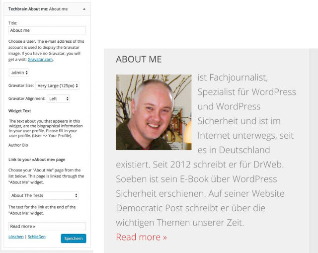
You should at least place a short author biography below your follow buttons. It doesn't matter whether you are a professional blogger, or only run a personal blog, your identity is everything. This will give your blog a human touch, as well as an identity. You also work on becoming a brand at the same time. Visitors of a website also like to know who's writing, who's behind the project. It's also one of the fastest ways to create trust. A good author bio contains an extract of an "about me" page, which you should set up. It's one of the four pages every blog should have.An Optimal Author Bio - Plugin Download
A good author bio in the sidebar contains a brief description of you, your motivation, a good image of you, and a link to your "about me" page. Recently, I wrote a small plugin for that, which will be implemented in the WordPress plugin index in the following days. An English and a German version are available. You can already download it over at Dr. Web: Techbrain About Widget Download Screenshots:
3 - A Newsletter Form
If you were to offer a newsletter, the sidebar would be one of the best places to do so. Just make sure the form catches the eye. You could choose flashy colors to set it apart from the rest because the user has to be able to see it. This will also increase the amount of subscribers.4 - Popular or Recommended Posts
There are tons of plugins that can display your most popular articles. One of them is WordPress Popular Posts. Popular posts are always generated dynamically and determined by the amount of clicks, or comments. However, you have no control over the display of these posts. Your most popular articles might not be your best ones. That's why I recommend linking your best posts, instead of your most popular ones. This is done manually. Pick the posts that you believe are your best ones, and link them via a text widget. Here, you have two options to choose from: you could either create a simple list with text links, or use "speaking" images and link them to the posts.The Optimal Creation of Recommended Posts
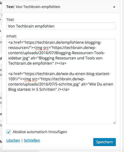
The second option is the most appealing one. Find a suitable image for each article. Here, you'll find free, and free to use images: Noupe: Free Photos: 43 Handpicked Services For Free-to-Use Images After you found a good photo, all you need to do is label it with the title of the article you want to link to it. The online service Canva allows you to do that very easily, and for free. We have already presented the tool before: Noupe: Canva: Create Online Graphics Easily Once you're done creating your graphic, use a text widget and link the graphics to your articles. The code could look as follows: https://gist.github.com/anonymous/26f44b4975189286fa084b68a8c76f8f Text Widget Example [caption id="attachment_77315" align="alignnone" width="400"] A text widget equipped with two recommended posts.[/caption]
Please make sure that you don't support too many posts. It shouldn't be more than four.

In the last section you say that it takes time to grow a blog. I’m wondering how long it usually takes. When is a good time to decide whether to quit or keep going?