eCommerce: Can Taxonomies be Pretty? Yes, They Can!

Everyone is talking about content marketing. Many of us even create content "en masse." Some hire so-called influencers for that. Way too often, the effect fades away quickly, as the material simply drowns in an unkind display.
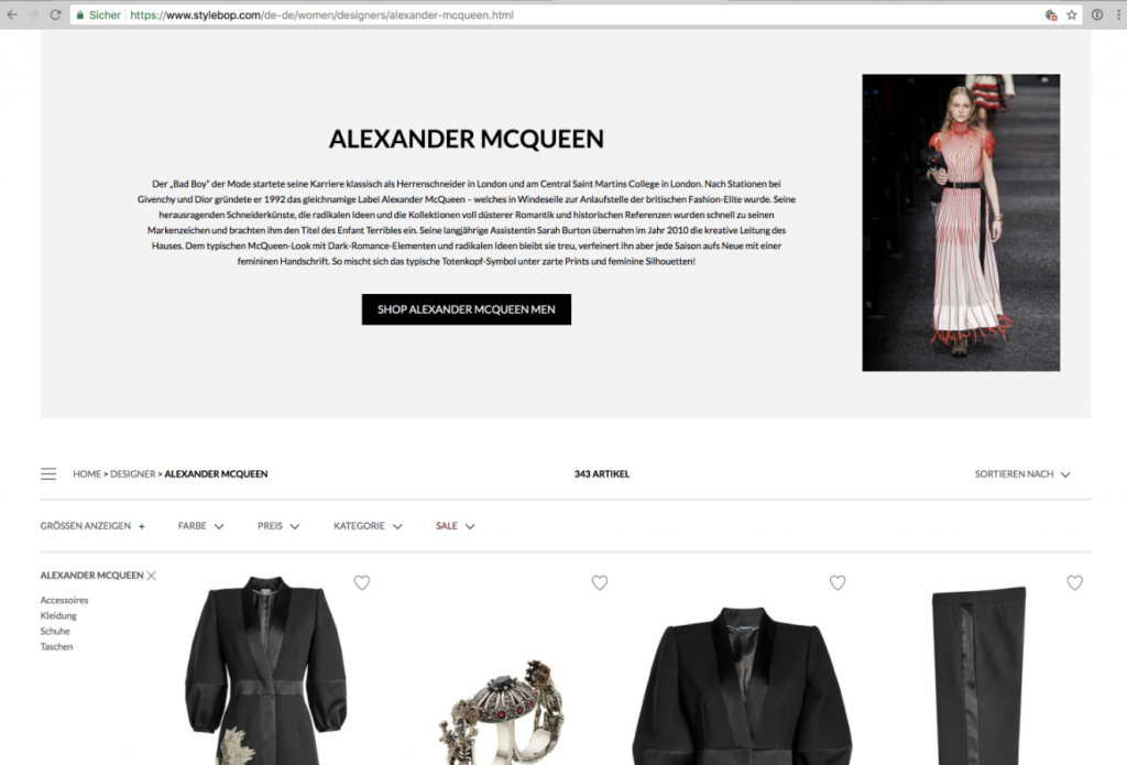
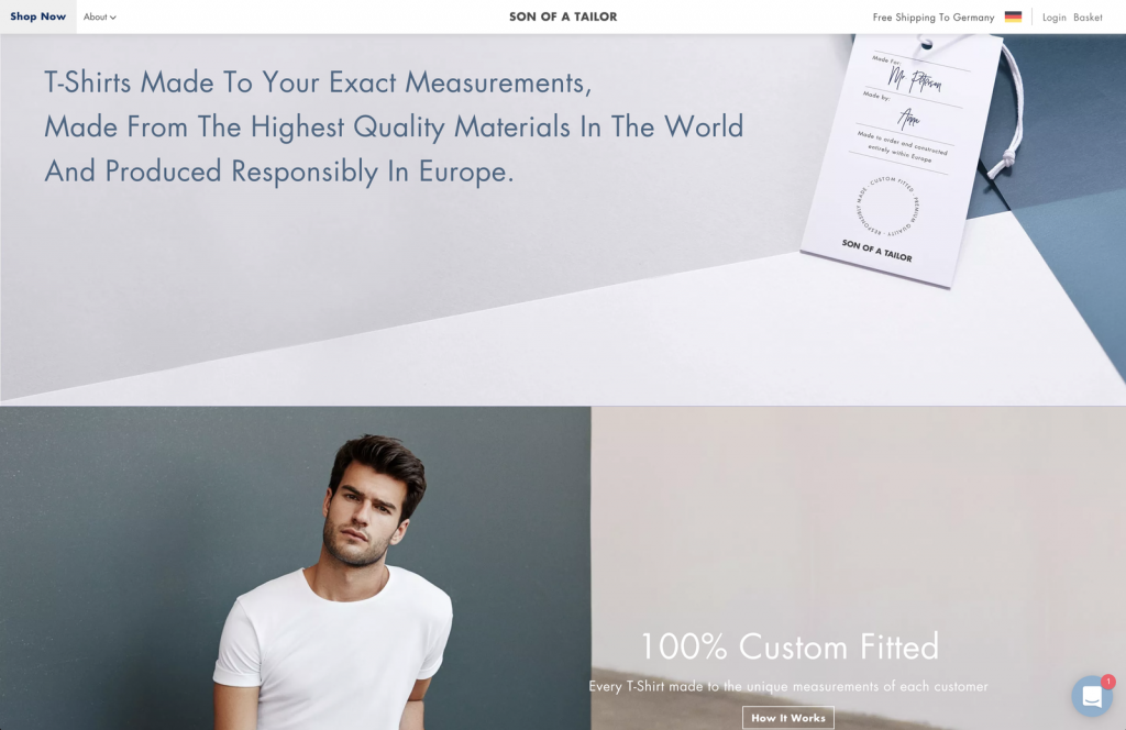
But why do they always have to be published in separate blogs, instead of being presented in conjunction with the offers? Are the shop systems and CMS that bad? Or is it a lack of imagination that makes people think that there were no other ways to present something aside from the stale grid displays of product and content teasers, with a "bit of SEO" somewhere in-between?
 What about putting a few helpful tips and bits of information next to the products or blog posts in the category, and keyword displays?
Is it impossible to add a guide to lists full of shoes, telling users which sneakers can be worn with a suit, which boots are waterproof, and how to take care of them?
Couldn't you add an authentic video to the stale product and content deserts, given the option of inexpensive video production using smartphones? I don't think that online users are immune to visual merchandising.
By straying away from the conventional patterns, and finally discovering the power of content, we could hit multiple birds with one stone! Three good reasons:
 How would it be to see proposals for clothing in the correct, predefined size upon login? Is it that hard to expand user profiles in that regard?
Let's go one step further and also take seasonal results, e.g., the weather, into the equation. Big and small shops alike could easily aggregate all data needed to give daily styling or application tips.
I can imagine lots of users being happy about a (push-)notification telling them that tomorrow, on a rainy day, a new umbrella could come in handy.
Just think about it. And then suggest it to your client. You don't have to tell them it was my idea ;-)
(The article was originally written in the German language by our author Severin Lucks for the bi-weekly newsletter of our sister magazine Dr. Web.)
Featured image by wynpnt on Pixabay
 What about putting a few helpful tips and bits of information next to the products or blog posts in the category, and keyword displays?
Is it impossible to add a guide to lists full of shoes, telling users which sneakers can be worn with a suit, which boots are waterproof, and how to take care of them?
Couldn't you add an authentic video to the stale product and content deserts, given the option of inexpensive video production using smartphones? I don't think that online users are immune to visual merchandising.
By straying away from the conventional patterns, and finally discovering the power of content, we could hit multiple birds with one stone! Three good reasons:
- Helpful content can also help users find their way around taxonomy views.
- The consumption of good advice leads to better user responses: visit duration and click rates increase, bounce rates drop.
- All of this and relevant content that appears in the content area have a positive effect on SEO. As the quality factor rises, the performance of AdWords is improved as well.
 How would it be to see proposals for clothing in the correct, predefined size upon login? Is it that hard to expand user profiles in that regard?
Let's go one step further and also take seasonal results, e.g., the weather, into the equation. Big and small shops alike could easily aggregate all data needed to give daily styling or application tips.
I can imagine lots of users being happy about a (push-)notification telling them that tomorrow, on a rainy day, a new umbrella could come in handy.
Just think about it. And then suggest it to your client. You don't have to tell them it was my idea ;-)
(The article was originally written in the German language by our author Severin Lucks for the bi-weekly newsletter of our sister magazine Dr. Web.)
Featured image by wynpnt on Pixabay