25 Unique uses of WordPress as CMS
WordPress is often thought of as little more than a blogging platform. But it's capable of so much more. Through a little customization and the use of plugins, WordPress can easily be transformed into a full-featured content management system. Here are more than 25 sites who have done just that (and done it well).
This is the second article in the three-part series, "The Comprehensive Guide for a Powerful CMS using WordPress".
The Comprehensive Guide for a Powerful CMS using WordPress - Part 1
The Comprehensive Guide for a Powerful CMS using WordPress - Part 3
UGSMAG
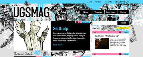
UGSMAG is a Canadian hip hop magazine. The home page is laid out in a grid, with featured articles along the left two columns and news on the right. The color scheme and design choices reflect the young, independent audience they attract. The lack of a category list (other than the top nav, which simply lists "News," "Features," and "Interviews") and archives lend the page to looking more like a traditional news or magazine website than a blog. Subtle changes to individual article pages, such as removing the category labels, the use of a drop cap initial character, and moving the date from it's usual blog-centric location under the title to the upper-right hand corner of the page all also contribute to the site looking more like a magazine and less like your standard blog.The Weather Pops
The Weather Pops are a group of weather-related characters available for licensing. The site is simple and straightforward, and an excellent example of how WordPress can be used to build a simple yet powerful website. The pages included on the site offer great examples of how you can incorporate a gallery, contact form, and standard pages into a WP site. The integration of plugins, such as the NextGEN Gallery plugin used on the gallery page, further improves the functionality of the site. Unless you looked at the code of the site, it's unlikely anyone would have any idea this site was built using WP.Temple Bar TradFest
The Temple Bar TradFest is an Irish music and culture festival held each year. The home page of this site bears absolutely no resemblance to a blog. The same can be said for internal pages, too. Individual pages within the site have no date or timestamp, no category or other tags, and otherwise look nothing like a traditional blog post. Good use of plugins for the gallery and other pages further improves the functionality of this WP installation. This is another site where your average visitor would have no clue it was built on WP unless they checked the source code.Table Talk
Table Talk is an online store selling dining furniture, tableware, and similar products. The home page features a product gallery with rotating images and the product pages show products laid out in a grid format. The site was built using the WP e-Commerce plugin for the online store functionality. E-commerce plugins greatly increase WP's ability to be used as a CMS for virtually any kind of site. Pages within the Table Talk site are set up without comments, date and time stamps, and categories. Categories are used for products, instead.TP Hire
TPs is a teepee rental company serving Sussex and South East England. This site is actually a great example of using WordPress as a CMS. In addition to the standard pages found on most business sites (news, information, about us, etc.), there's also a really great gallery page that uses the Lightbox formatting for viewing larger images and the option to view images in a slideshow. The layout of the events page is also an excellent example of how pages can be thoroughly customized within WP to suit the needs of the individual site.The Art of Catalin Bridinel
The Art of Catalin Bridinel is your basic portfolio site. This site is a bit more blog-ish than most of the others here, but still offers up a good example of how to use WordPress for something other than your traditional blog. Paintings are listed in blog posts, with a large image appearing immediately under the title and a brief description under that. Comments are enabled here, unlike on many other CMS sites. The overall design, lack of sidebars, and other stylistic elements make this look more like a traditional portfolio site than a blog.Search Inside Video
Search Inside Video is a service that provides searchable transcripts for online video content. Their site is one of the more innovative uses of WordPress as a CMS that I've seen. The overall site design is very simple, basically consisting of one long page with anchor tags for different content. Not exactly a revolutionary idea. But the implementation of it is very slick. It's a great example of thinking outside the box in using WP as a CMS.P2P Rescue
P2P Rescue is a non-profit organization working to help Sri Lanka and other Southeast Asian countries. The home page offers up basic information and articles about the organization and their cause. The overall site architecture is very simple, but again, bears little resemblance to a regular WP blog. Use of plugins for allowing donations to be made through PayPal further increases WP's base functionality. The site also includes an online store powered by WP e-Commerce. Other pages include basic information about the organization and a blog (under the "Voices" section).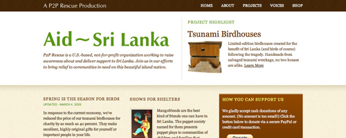
Myshli
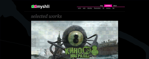
Myshli is the portfolio of Danil Kryvoruchko. The home page of the site offers a gallery of designs, including a JavaScript slideshow of selected works. Individual pages on the site include galleries for each different type of work they do (web, print, etc.) along with an about page. Pages for individual projects show a variety of screenshots and images. The site also includes a blog with a different theme from the rest of the site (the main site has a black background whereas the blog has a white background).Little White Lies
Little White lies is a website that revolves around movies. The home page is not unlike many other news and magazine websites, offering up links to current content, including interviews and reviews of upcoming and recently released films. Category pages (such as for interviews or reviews) use a different layout than the home page, though it does make them feel a bit more blog-like. The article pages have stripped out the majority of blog-centric features, but have left in the comments section (many newspapers and magazines have added comment functionality to their articles both in and outside of blogs). The shop section on the blog appears to be the only section not powered by WordPress. Why this is is unclear, as there are some great plugins for e-commerce on WP.KMX Karts
KMX Karts are manufacturers of recumbent trikes. The home page bears no resemblance to a blog, with the exception of the presence of a somewhat blog-like footer. The site includes a number of different kinds of page templates. There are pages for the different Kart models, pages for accessories, and pages for general company information. Each type of page, because they have their own unique functions, is slightly different from the other pages. The theme, though, is consistent throughout the site. The e-commerce aspects of the site are powered by the Shopp plugin.IconDock
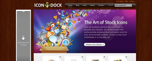
IconDock sells stock icons to designers. This is one of the prettiest sites I've seen using WP as a CMS. The home page is simple while still offering up plenty of content and some icons for sale right on the home page. Navigation is easy, with top nav and links placed within the content (such as the "Browse Icon Library" in the main image on the home page). The e-commerce portion of the site is powered by the WP e-Commerce plugin. The product pages offer up plenty of information about individual icon sets as well as different pricing options. One of the coolest features on this site, though, is the drag-and-drop shopping cart (just drag an icon or set to the box on the left-hand side of the screen to add it to your cart). The box on the side shows your cart's contents and removing an item is as simple as clicking the "x" in the corner. It's definitely one of the slicker shopping cart UIs I've seen.Ginger Restaurant
Ginger is a restaurant in South Africa. The overall site design and architecture are very simple while also being very attractive. The home page offers up basic information, including their hours and phone number. Other pages include more information about the restaurant, an online menu, and a gallery of the restaurant and their food. The gallery uses the JavaScript Thickbox functionality for displaying photos. There's also a slideshow in the header of their offerings. A couple of features that really set this site apart from similar sites, though, are their addition of links to their Facebook page and a page that lets you tell friends about Ginger. This kind of functionality is rarely seen on local business sites but should be utilized more often.Fraai Magazine
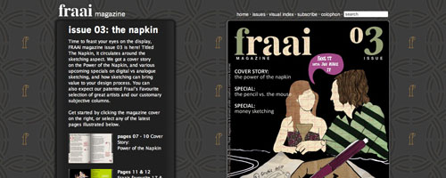
Fraai Magazine is a free online magazine offering up creative inspiration. The site uses a the FLV Embed plugin to embed the Flash magazine into the site. (FYI: There is also a plugin available for WordPress, Page Flip Image Gallery, that allows you to create a flip-book style magazine right within WP.) Other pages on the site include a visual index of articles and a page listing the issues available. The overall site is very simple but it's an effective implementation of WP and appears to work well for what they're doing.Ford Motor Company—Global Auto Shows
This is the site of Ford Motor Company's global auto show coverage. This is another site where you'd never guess it was powered by WordPress if you didn't look at the source code. The home page offers up a gallery of featured vehicles, links to the different Ford brands, and a list of recent articles. Other pages on the site include a show schedule, information on concept cars (including a gallery) and information on vehicle types. From the looks of it, there's a lot of custom programming going on on the site, including some custom Flash modules.Executive Warfare
This is the site for Executive Warfare, a book by David F. D'Alessandro with Michele Owens. The basic layout of the site is very simple, as is the site architecture. The home page features some basic information about the book as well as a couple of sample articles. Pages contained on the site include a sample chapter, "10 Rules", Reviews, an "About the Authors" page, and a video page. The site also has a blog. The page templates are all the same, though the use of images and block quotes gives them each a unique look. Overall, it's a great site that offers up its content in a way that is both aesthetically pleasing and practical.Cubicle Ninjas
Cubicle Ninjas is a design firm offering up web design and development, graphic design and illustration services. The overall design is bold while still being simple. Their portfolio pages are some of the best I've seen, offering up embedded video on some pages in addition to images of individual projects. The Cforms2 plugin (which offers great customization options) is used for their "Request a Quote" page.Camacho Cigars
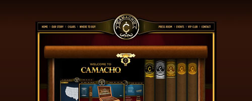
This is the site of the Camacho Cigars company. The site architecture is completely un-blog-like. For example, the "Our Story" page contains subpages ("History of Camacho," "Tobacco in Honduras," and "Production Tour" linked with icons from the page itself. Other pages on the site include a page detailing their cigars, a "Where to Buy" page, a "Press Room" and a contact page. This is another site that does well by linking their social network profiles right from their home page.Alpha Multimedia Solutions, Inc.
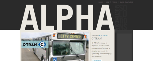
This is the online portfolio of Alpha Multimedia Solutions. The site's design is simple and elegant, as is the architecture and navigation. The offer up case studies for their different clients and the pages for these use a slightly different template than their other pages. The use of slideshows for each project in the header also add to the overall look of the site very nicely.Gaijin Film & Sound
Gaijin Film & Sound is a film, sound and new media production and consultancy company. Their home page offers up basic information about the company, including contact information in the sidebar, a list of services, and an abbreviated list of clients. The top nav on the site is very effective and includes links to "About," "Portfolio," "Production," and other pages. Their portfolio page is one of the nicest on the site, offering up links to videos within a very aesthetically pleasing layout.Frisk Design
Frisk Design is a web design company. Their site makes great use of pages within WP for offering up information about the company, their services, portfolio, and contact. A blog is also included, though it's not the focus of the site. The portfolio has a very elegant layout that offers up information about each site without having to click through to individual project pages.












very nice great article thanks
Thank you so much for providing this great information. That was just what I was looking for, keep the great info coming.
Really helpful information u mentioned in your blog. Thank you for the post.
Nice demo list.wordpress now as the best
web designer
Thanks for resources.Its very useful for me.
When I searched on Monday for articles and posts about technical author uk I came across 25 Unique uses of WordPress as CMS – Noupe, not sure how relevant it is to me but it made interesting reading all the same. I might even come back to see what else follows and what others think of it.
Hold working ,great employment!
I am just learning Information.
And php and this was very easy to follow and helped a lot.
You really took time to explain every little bit.
Thanks again…
I always like Sunny weather and disliked gloomy rainy weather…:
Thanks for the wonderful resources and bits of inspiration.