Web Design Mistakes You Want to Avoid in 2020

When it comes to creating and maintaining a website, the first thing that comes to any person’s mind is a site’s design. Well, design matters indeed, moreover, it can even influence your website’s traffic, which in turn has an impact on the amount of money you make. In fact, a decent layout makes any website look more professional and trustworthy, which attracts more visitors and affects your website’s conversion.
So what are the common mistakes that can actually bring your site down and how to avoid those? Keep reading to find it out.
Web Design Trends
First things first, in order to avoid some basic mistakes, you have to keep up with the main trends, so let us have a brief look at those.
Minimalism

Image by Sarah Dorweiler on Unsplash
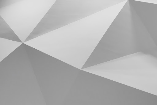
Well, this very trend has been around in web design and not only for quite a while and it will be popular for a long time in the future as well. As a matter of fact, minimalistic design does not distract the visitors from the content you display on your website and is generally lovely. There is a huge amount of minimalistic web templates on various marketplaces such as MasterBundles, Envato or TemplateMonster, so why don’t you take a look at those?
B&W
Black and white is actually the ultimate classic, which means if you want to create a truly classy and elegant website, you have to consider such a color scheme. Certainly, these colors would not work for every type of a website, but if you are going to launch a classy online store, a fancy blog, or an elegant portfolio site, this is definitely the way to go for you. So you can try and find some sophisticated B&W WordPress themes here.
Geometry

Image by Shapelined on Unsplash
Another popular trend of the upcoming year is the usage of geometrical forms and patterns. The shapes and colors can vary from theme to theme, but what makes this trend so important is the fact that it is pretty universal and will surely suit any site. You can use these shapes on the backgrounds, banners, logos, etc. Besides, geometrical patterns will give your website a cool futuristic look, so why don’t you give it a shot?
Large Fonts

Image by Kai Gradert on Unsplash
Yes, large fonts are going to be a huge trend in 2020. In fact, fonts have always been an essential part of web design since they have this ultimate power to either make a site stunning or simply awful. In other words, you definitely want to keep up with the latest font trends because they really are of extreme importance. Well, and at the moment large font sizes are cool, so go ahead and use them. If you don’t know where to get the fanciest and the trendiest fonts, check out MasterBundels.
Animations

Image by KOBU Agency on Unsplash
Contemporary users get sick of websites that look pretty much the same, so living up your site with some animation effects might be a good idea. Speaking about these effects, perhaps the most exciting and fun one is user-triggered animation. Basically, these are the animations that happen after a user clicks on a particular spot or move the mouse. This very type of animation makes any website fun to be on and thus attracts more visitors, so do not hesitate and try it out.
Web Design Mistakes
Well, since we have figured out some of the most popular trends, it’s the very time to move on to the common mistakes you definitely want to avoid while launching or updating your website.
Cluttering
The very first thing you have to know before getting any sort of a site is the fact that it has to be user-friendly. People should be able to easily find the necessary categories or and other stuff they need. That is why you have to follow the KISS strategy, which is pretty much about keeping things simple. Don’t clutter your site with a whole bunch of images, animations, or bright colors and just keep it neat and clean.
Poor Content
Speaking about poor content, we don’t actually mean the quality of the blog posts or product descriptions on your website. We want to point out the way it is designed. Product descriptions have to be short, clear, and easy to comprehend. The users have to be able to easily find the price, reviews, and images. In terms of blog posts, they have to be readable and conveniently located on a page. So pay attention to the fonts, layouts, and buttons you use since they have to make your website’s content easy to digest.
Too Many Ads

Source: Giphy
Advertisements are a good way to earn some money, but they also can make your site incredibly ugly and simply insufferable. So don’t put too much ads and if you do include them, put them into the right places. Make sure that advertisements do not cover any content you display on your website as well as they don’t distract your visitors too much. If you can afford it, try to eliminate any external ads at all.
Missing Contact Information
Contact info not only makes your company seem to be trustworthy but also makes it easier for potential customers to make an order or ask you some questions about the goods you sell. In other words, missing this extremely important for every kind of business section or having it in an inconvenient place is a huge mistake. So make sure you have a contact info section as well as that it is easy to find.
Unresponsive Design
Responsive design is basically a feature that makes a website flawlessly work on all the devices. Well, since more and more people prefer surfing the internet using their phones, responsive design becomes a great deal. So while choosing a web template, double-check whether it is fully responsive and cross-browser compatible.
Final Word
Building or updating a website is actually a big deal that requires a lot of energy and efforts. Hopefully, knowing all these latest trends and main mistakes to avoid, this process would be a least a little bit easier for you. So go through these trends and common mistakes in web design once again and get ready to launch or upgrade your website. If you want to find out more about the world of web design, make sure to check out our blog.
Do you know any other design mistakes developers do as well as the ways to avoid them? Let us know in the comment section down below!

Great article! I know so many web designers who don’t seem to understand the idea of “just because you can, doesn’t mean you should”, and end up cluttering their sites with too many gizmos and animations (yes, Revolution Slider, you’re an enabler here!).
As for responsive design, I find it absolutely essential to view a site on tablet and mobile after I’ve finished the desktop version, and invariably wind up editing the css ~ it’s usually not sufficient to trust totally in the template’s responsive design. Not only should content display correctly on all devices, it should be smooth and elegant, basically making the site look like it’s perfectly tailored for the viewport. It’s a lot of work, but the end result is really worth it!