34 Inspirational Shopping Cart Page Designs
Shopping carts are an integral part of the online shopping experience. E-commerce designers face challenges in creating an attractive, yet user-friendly, website that will provide customers with a pleasant purchasing experience.
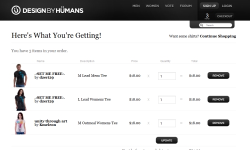
In this post we will feature 35 online shops that have well-designed and appealing shopping cart pages. These pages are what visitors will see after choosing the items that they want, and just before beginning the checkout. Well-designed shopping cart pages can help to increase conversions and minimize abandoned carts by shoppers who change their minds.
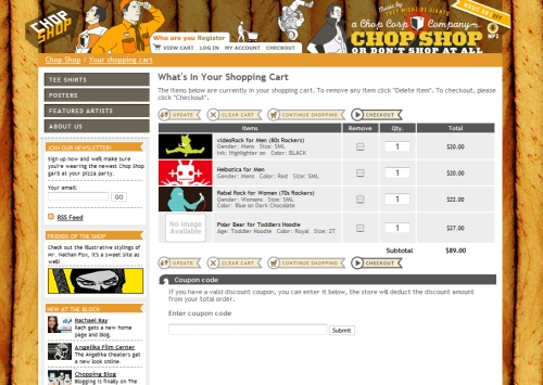
Chop Shop
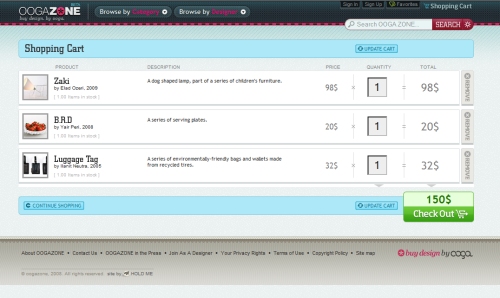
Ooga Zone
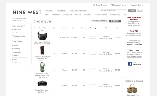
Nine West
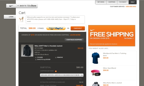
Nike
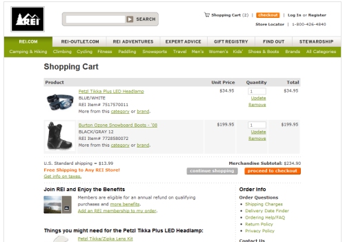
REI
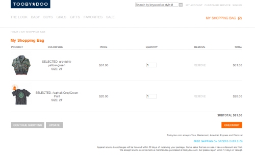
TOOBYDOO
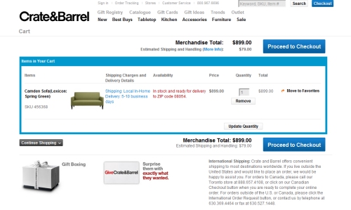
Crate & Barrel
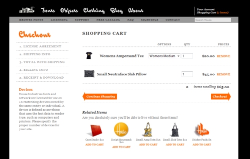
House Industries
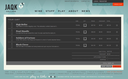
JAQK Wine Cellars
Kansas City Steaks
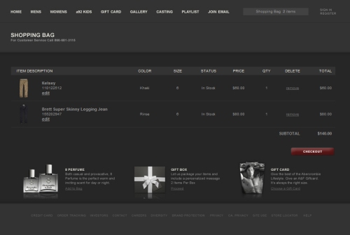
Abercrombie & Fitch
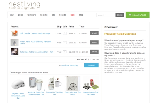
Nestliving
Mouse to Minx
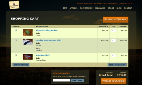
Cacties
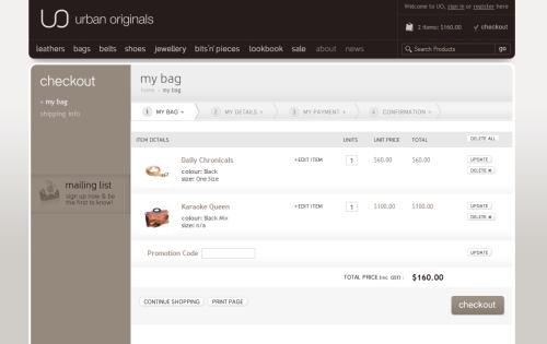
Urban Originals
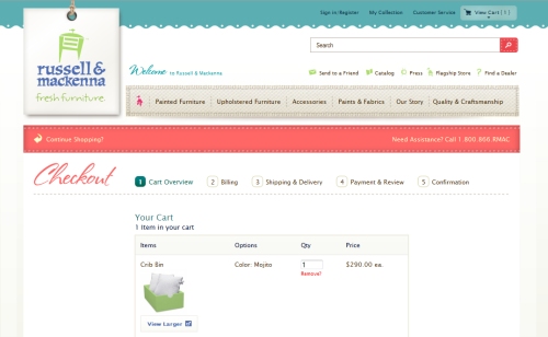
Russell & MacKenna
Lane Bryant
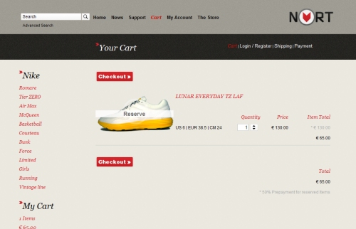
Nort Berlin
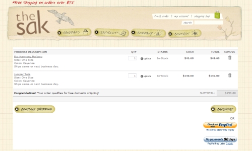
The Sak
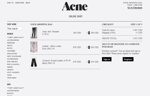
Acne
Lucky Brand Jeans
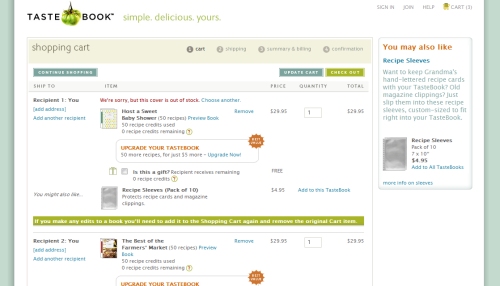
TasteBook
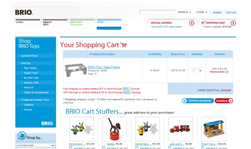
Brio
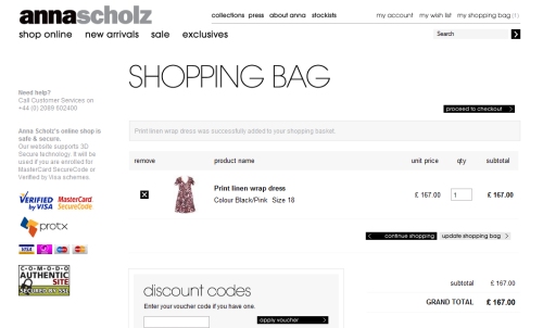
Anna Scholz
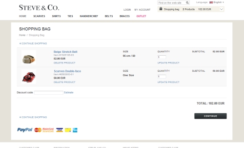
Steve & Co.
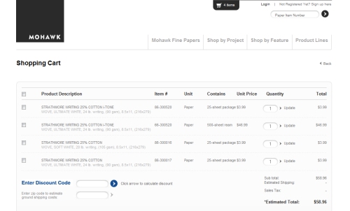
Mohawk Paper Store
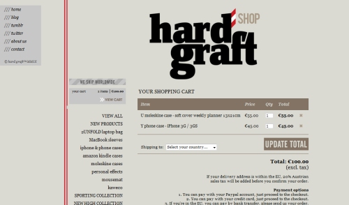
Hard Graft
Nicholas Deakins
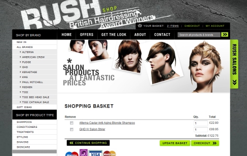
ShopRush
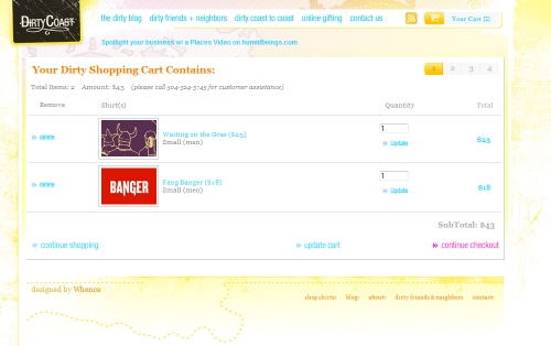
Dirty Coast
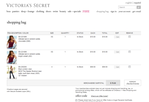
Victoria's Secret
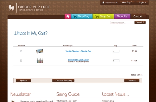
Ginger Pup Lane
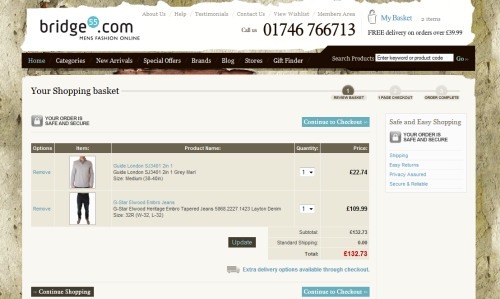
Bridge55







there’s only so much you can do with check out pages, but i guess there’s still something to be made
What I was thinking, nearly. So far I’ve not seen a checkout page which really inspires new layout/design or promotes better usability.
Are these all using custom shopping cart systems?
I’d like to see how good they get using open source software…
Very nice collection – It is inspiring to see people do things a little differently.
Nike and Mouse to Minx both looks cool
Seriously, where’s Threadless?
I second that.
Exactly!!! threadless.com is one hell of a nice e-commerce site.
This WordPress theme was made using WP e-Commerce + Thematic and was inspired by threadless.com – what totally rules about this was that threadless.com contributed a $100 voucher to Jan the winner :)
http://www.instinct.co.nz/threadless-thematic-challenge-winner/
Another site that should be here is panic.com/goods which has a cool drop shop.
The two sites here that really impressed me
1) OOGA ZONE
2) Nike
Both totally cool…
Hi! Who made site for panic-shop?Sorry for my english:)
I don’t get it, where are the big guns ? It’s comparatively simple to design an “add to cart” ecommerce page where you can only change quantity. Dell (complexity), Tesco (loyalty) and others are clearly the inspirational ones !
These are really nice. I really like the first one. Thanks for the inspiration.
Thanks Steven for the excellent roudup, so fresh and inspiring.
I am glad many of our readers found this post interesting, we hope Steven could dedicate more posts for Noupe :)
Maybe it’s just me but I’m not really impressed by any of these except the British Hair Supply and Kansas City site. All the others are uninspiring and don’t really catch the users attention in my opinion.
When will you to post the best Rock’n Roll and heavy Metal Designs?