Putting the Pieces Together: Scrapbook Style Web Designs
Web design has roots in numerous other artistic fields, one of which that blogging not only honors, but often mimics in design and use alike is scrapbooking. Just as scrapbooks capture moments with more artistic accompaniment than photos, collaging various elements together to present a story; blogs capture moments in digital format, usually using images and other elements with the text to complete a story.
Design is another way these two mediums tend to crossover with often fantastic results. That is where today's spotlight is aimed, at some scrapbook style web designs that perfectly capture the feel of this crafty medium. Take a look at the gallery of designs and get ready for a refill of your creative fuel.
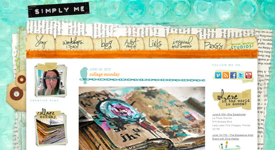
 Simply Me goes for the classic, collage style scrapbook look, complete with a watercolor background and the recycled pages edging the site's main content area. All of the elements work together wonderfully to complete the feel of this design.
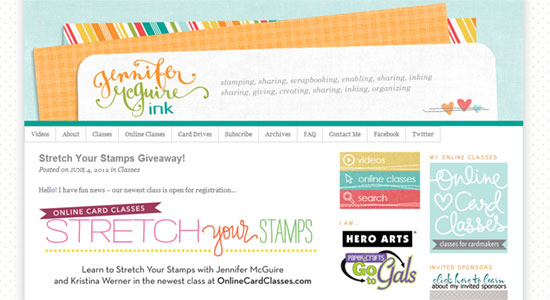
 Jennifer McGuire Ink goes for a cleaner and sharper cut look for the site, while still maintaining the scrapbook theme and pieced together feel. The small, patterned swatches behind the header feel like they came straight from the scrapbooking aisle of a craft store.
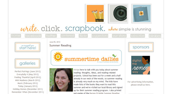
 Write. Click. Scrapbook. goes for a much more minimal approach to scrapbook style web designs. But with the blending of fonts in the header to the crafty button styles and beyond, scrapbooking styles still call out from the design.
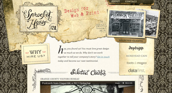
 Sprocket House goes for a very vintage, almost Victorian style to their design, but never veering too far from the recognizable scrapbook fashion those who work in this arena have come to know and love.
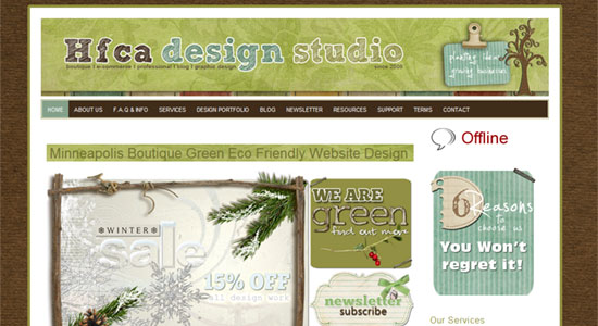
 hfca design studio employs multiple elements that absolutely connect one with this delicate art upon seeing them. While subtly done, the trained (and not-so trained) eye can pick them out.
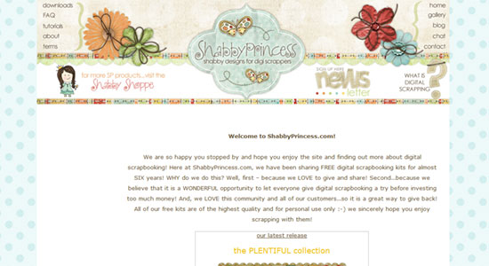
 ShabbyPrincess' multiple floral, decorative elements in the header are just the tip of this playful web designs' proverbial iceberg.
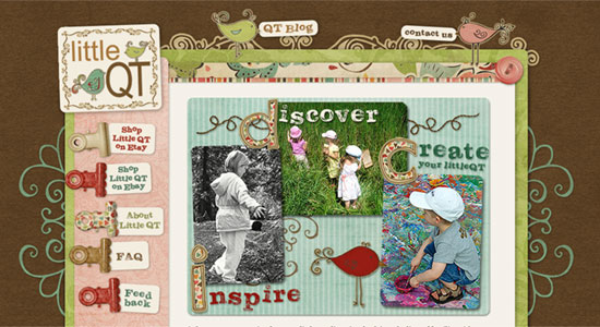
 There isn't much about Little QT's design that isn't immediately recognizable as scrapbook elements. Rich with detail, and full of all kinds of fantastically chosen pieces, this style is flawlessly executed here.
 Keri Smith is known for her crafty project books, so it is no wonder that her website would bring that same feel and style to the web with her. The site's design is exactly what her fans and followers would expect it to be.
 Lanikai Properties uses this collage-type style to promote their picturesque real estate business and properties. With a handful of web design elements aiding this nod to scrapbooking, the site does well bringing the two worlds together.
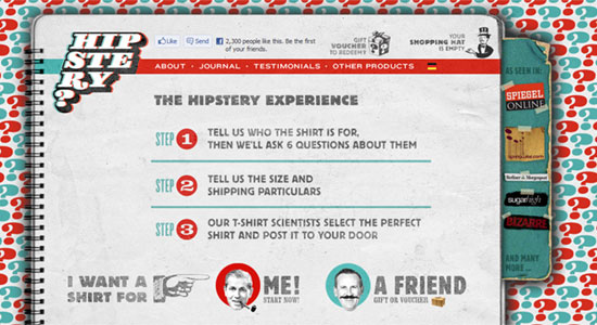
 Hipstery is another example of these two worlds blending together, this time in loud and vibrant fashion. They even use the classic scrapbook spiral binding down one edge of the content section.
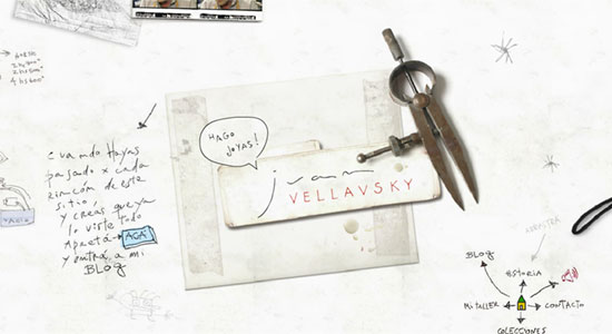
 Juan Vellavsky opts to use a lot of hand-drawn elements to help bring the scrapbook feel to this minimal design. Doing so with personality.
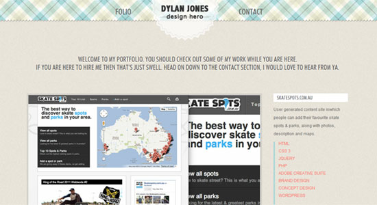
 Dylan Jones goes the subtle route with the design, using header pieces that positively bring scrapbooks to mind. The sheered paper-like edges on the decorative header, along with the pattern really sell this crafty feel.
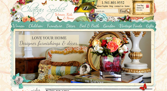
 Chateau Sophie veers far from subtlety, and sails straight into the elaborate collage-heavy scrapbooking waters with this gorgeous design. With one look at the site, it is easy to see where this web design is rooted.
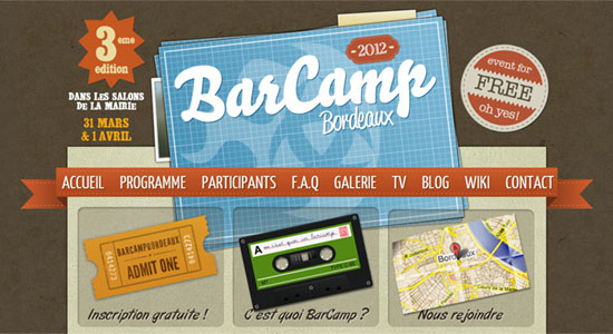
 While obviously using illustrated elements, BarCamp's structure and build is absolutely layered as if modeled after a collaged scrapbook page.
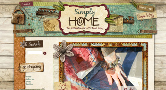
 Simply Home takes us right back into the overly elegant waters, with this lovely layered scrapbook web design. Rich and complex decorative elements piled together with precision.
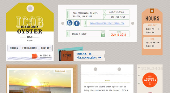
 Island Creek Oyster Bar steers away from the layers with another very segmented and separated web design, where each of the scrapbook styled elements have their own place.
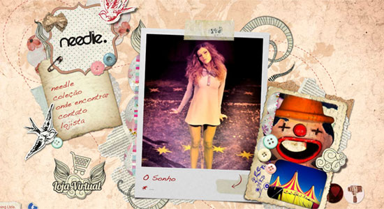
 Needle has so many decorative elements that feel like they came right off of the page of a scrapbook, being combined together with the classic style one would expect from this collage-type of design.
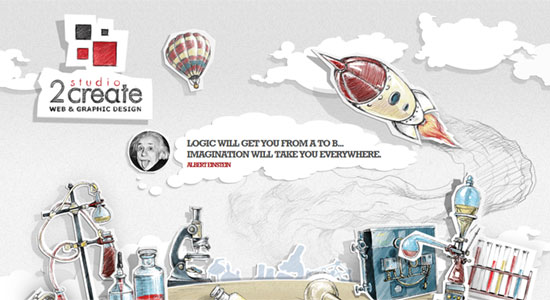
 2create studio combines scrapbook feeling illustrative elements with lots of shading to give the elements a three dimensional feel, so they rise off the page like a pop-up book.
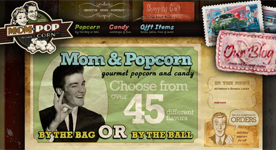
 Mom & Popcorn, while featured before for it's overall vintage style, this unique design, with hints of scrapbooking elements fits well in the company of it's collaged contemporaries.
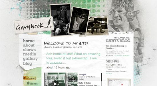
 Gary Nock uses multiple halftones to add a modern graphic design edge to the various scrapbook elements incorporated into the site. Smartly combined with skill and imagination.
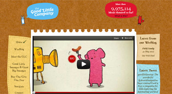
 The Good Little Company" goes the subtle route we have seen from others in this showcase, using light instances of scrapbooking decoration in the web design.
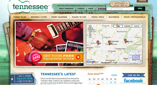
 Tennessee Vacation is not as subtle as the last example, but as with others uses more modern graphic styles, layered in with scrapbook elements to really give the design a well blended feel.
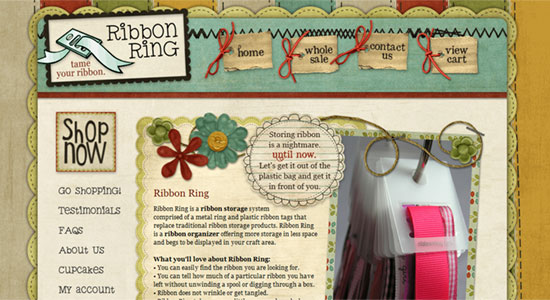
 Ribbon Ring has multiple 'stitched' graphic elements that complete the scrapbook style of this complex, crafty looking web design.
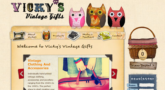
 Vicky's Vintage Gifts closes out the showcase with a design that is easily recognizable as scrapbook based. The hand-drawn elements perfectly compliment this style of choice.
Putting the Pieces Together
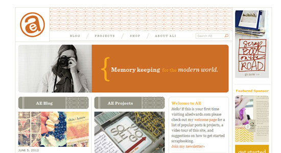
Ali Edwards' site has a look that most would not recognize as scrapbook derivative, however, she is following a popular style of scrapbooking called Project Life (which is what her site is dedicated to). So visitors will instantly recognize the boxed off look and make the association. Simply Me goes for the classic, collage style scrapbook look, complete with a watercolor background and the recycled pages edging the site's main content area. All of the elements work together wonderfully to complete the feel of this design.
 Jennifer McGuire Ink goes for a cleaner and sharper cut look for the site, while still maintaining the scrapbook theme and pieced together feel. The small, patterned swatches behind the header feel like they came straight from the scrapbooking aisle of a craft store.
 Write. Click. Scrapbook. goes for a much more minimal approach to scrapbook style web designs. But with the blending of fonts in the header to the crafty button styles and beyond, scrapbooking styles still call out from the design.
 Sprocket House goes for a very vintage, almost Victorian style to their design, but never veering too far from the recognizable scrapbook fashion those who work in this arena have come to know and love.
 hfca design studio employs multiple elements that absolutely connect one with this delicate art upon seeing them. While subtly done, the trained (and not-so trained) eye can pick them out.
 ShabbyPrincess' multiple floral, decorative elements in the header are just the tip of this playful web designs' proverbial iceberg.
 There isn't much about Little QT's design that isn't immediately recognizable as scrapbook elements. Rich with detail, and full of all kinds of fantastically chosen pieces, this style is flawlessly executed here.
 Keri Smith is known for her crafty project books, so it is no wonder that her website would bring that same feel and style to the web with her. The site's design is exactly what her fans and followers would expect it to be.
 Lanikai Properties uses this collage-type style to promote their picturesque real estate business and properties. With a handful of web design elements aiding this nod to scrapbooking, the site does well bringing the two worlds together.
 Hipstery is another example of these two worlds blending together, this time in loud and vibrant fashion. They even use the classic scrapbook spiral binding down one edge of the content section.
 Juan Vellavsky opts to use a lot of hand-drawn elements to help bring the scrapbook feel to this minimal design. Doing so with personality.
 Dylan Jones goes the subtle route with the design, using header pieces that positively bring scrapbooks to mind. The sheered paper-like edges on the decorative header, along with the pattern really sell this crafty feel.
 Chateau Sophie veers far from subtlety, and sails straight into the elaborate collage-heavy scrapbooking waters with this gorgeous design. With one look at the site, it is easy to see where this web design is rooted.
 While obviously using illustrated elements, BarCamp's structure and build is absolutely layered as if modeled after a collaged scrapbook page.
 Simply Home takes us right back into the overly elegant waters, with this lovely layered scrapbook web design. Rich and complex decorative elements piled together with precision.
 Island Creek Oyster Bar steers away from the layers with another very segmented and separated web design, where each of the scrapbook styled elements have their own place.
 Needle has so many decorative elements that feel like they came right off of the page of a scrapbook, being combined together with the classic style one would expect from this collage-type of design.
 2create studio combines scrapbook feeling illustrative elements with lots of shading to give the elements a three dimensional feel, so they rise off the page like a pop-up book.
 Mom & Popcorn, while featured before for it's overall vintage style, this unique design, with hints of scrapbooking elements fits well in the company of it's collaged contemporaries.
 Gary Nock uses multiple halftones to add a modern graphic design edge to the various scrapbook elements incorporated into the site. Smartly combined with skill and imagination.
 The Good Little Company" goes the subtle route we have seen from others in this showcase, using light instances of scrapbooking decoration in the web design.
 Tennessee Vacation is not as subtle as the last example, but as with others uses more modern graphic styles, layered in with scrapbook elements to really give the design a well blended feel.
 Ribbon Ring has multiple 'stitched' graphic elements that complete the scrapbook style of this complex, crafty looking web design.
 Vicky's Vintage Gifts closes out the showcase with a design that is easily recognizable as scrapbook based. The hand-drawn elements perfectly compliment this style of choice.


Cheers for this extremely useful blog on websites using a scrap book theme and style on their websites. My personal favourite is the simply home website, i really love the use of textures on this website, it compliments the content on the website brilliantly. I have bookmarked this blog post for future inspiration in my web projects.
Excellent post, thanks for sharing cool scrapbook designs. Though it looks easy but very creative and eye catching.
Inspirador!!!! Genial :) …
the mom&popcorn design is my favorite. Its creative and adheres to the “scrapbook” design while finding a way to standout by going for an old-fashioned style. It also doesn’t seem as convoluted as some of the other designs making it easier for navigation.