How to Find the Perfect Font For Your Web Project

Reading text on a lighted display has become part of our daily routine. Web fonts have established themselves, and more and more content is read on tablets or mobile devices. This raises the bar on font quality on different displays. Nonetheless, most fonts used today were not designed for a digital environment. Font drafts from pre-digital times are often optimized for onscreen usage using technological means, like hinting, for example. But onscreen optimization has to start much earlier!
I have compiled a few characteristics that improve the readability on screens. When looking for a well-made font for onscreen texts, pay attention to these aspects:
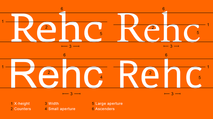 For small font sizes, counters, the non-printing insides of the letters, quickly fill up, creating dark spots in the font's gray level, capturing the reader's attention, and thus, hindering the reading flow. To keep the non-printing white spaces visible on small font sizes, as well as allowing for a well-visible light incidence, open apertures, and a large x-height in relation to the ascenders are helpful.
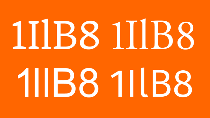 Unique letter shapes may be the most important criterion of them all! If the characters are too similar, a word has to be read multiple times. When the word image is not clear enough, reading takes a lot more time, especially when it contains known difficult candidates such as "I" and "l," or "B" and "8". Because of that, the design needs to have a certain shape variety when it comes to glyphs, without affecting the harmony of the entire character set.
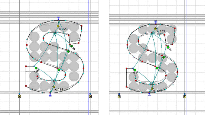 Fonts are based on vectors but have to be displayed as pixels on screen. Normally (without hints), the computer takes care of this automatically, without the designer having an influence on it. During hinting, information is deposited in the font, telling the computer how the font should be displayed in the pixel grid. With the TrueType technology, these instructions can even be defined for every single pixel size (Delta Hints).
Especially with small font sizes and low resolutions, this drastically improves the readability. It's worth taking care of this process manually, and not relying on the automatic hinting of the font design software.
When vectors need to be converted onto a small pixel grid, it is helpful when horizontal and vertical elements have the same stroke width. Since this is the case for most non-serif fonts, the rumor that serif fonts are less suitable for the screen is very persistent. But many serif fonts have a stressed horizontal axis with massive horizontal elements as well, making them an equally good choice for the screen.
If you want to find out how Alex Rütten and I used the traditional broad quill writing style to increase the onscreen readability of our new font "Tuna," or simply want to test the web font, take a look at this microsite: Tuna Typeface.
Check Out: Beautiful Fonts
Open Counters, Generous Tracking (Fonts Left to Right: Tuna, Garamond, Arial and Fira)
 For small font sizes, counters, the non-printing insides of the letters, quickly fill up, creating dark spots in the font's gray level, capturing the reader's attention, and thus, hindering the reading flow. To keep the non-printing white spaces visible on small font sizes, as well as allowing for a well-visible light incidence, open apertures, and a large x-height in relation to the ascenders are helpful.
Generous Tracking and Wide Letters
Pay attention to the pitches! Tight, slim fonts are suitable for headings and high font sizes, but fonts need more space in a running text. The individual characters need to be wider, in order for the white space within a glyph to be large enough. Generous pitches avoid clashes between the characters, while clear word spaces ease the forming of word groups when reading quickly.Unique Letter Shapes (Fonts Left to Right: Tuna, Garamond, Arial and Fira)
 Unique letter shapes may be the most important criterion of them all! If the characters are too similar, a word has to be read multiple times. When the word image is not clear enough, reading takes a lot more time, especially when it contains known difficult candidates such as "I" and "l," or "B" and "8". Because of that, the design needs to have a certain shape variety when it comes to glyphs, without affecting the harmony of the entire character set.
Clarity
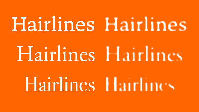
Too many details blur the appearance of the running text sizes; they interrupt the letter's basic form, which is important for quick identification - clarity improves the word image.Hairlines Get Lost Easily (Serif Fonts: Tuna, Garamond, and Bodoni)

Low Contrast and Sturdy Serifs
A common problem of serif fonts on screen are thin lines. Hairlines get lost easily under bad printing conditions, or lighting from behind, as the letters seem to crack, and fall into segments. Sturdy serifs and a low stroke width contrast, but also serif fonts can be designed this way.Arcs Approximated to the Rectangle
Most fonts that work under bad conditions when printed, also look good onscreen, but some criteria are especially significant for the screen, and are directly or indirectly related to the display on the pixel grid. The "edgier" a curve, the better it fits onto the pixel roster. Thus, arcs should be approximated to the rectangular shape as much as possible, which also leads to a larger counter.The Letter's Manual Hinting Information (Font Tuna)
 Fonts are based on vectors but have to be displayed as pixels on screen. Normally (without hints), the computer takes care of this automatically, without the designer having an influence on it. During hinting, information is deposited in the font, telling the computer how the font should be displayed in the pixel grid. With the TrueType technology, these instructions can even be defined for every single pixel size (Delta Hints).
Especially with small font sizes and low resolutions, this drastically improves the readability. It's worth taking care of this process manually, and not relying on the automatic hinting of the font design software.
When vectors need to be converted onto a small pixel grid, it is helpful when horizontal and vertical elements have the same stroke width. Since this is the case for most non-serif fonts, the rumor that serif fonts are less suitable for the screen is very persistent. But many serif fonts have a stressed horizontal axis with massive horizontal elements as well, making them an equally good choice for the screen.
If you want to find out how Alex Rütten and I used the traditional broad quill writing style to increase the onscreen readability of our new font "Tuna," or simply want to test the web font, take a look at this microsite: Tuna Typeface.
Check Out: Beautiful Fonts
Photo by Magda EhlersAbout the Author
Felix Braden lives in Cologne and works as a font designer and art director. On his website Floodfonts you can find a diverse array of free fonts to download. His commercial offerings are distributed by Fontshop International, URW++ and Volcanotype and are available through MyFonts. His most successful font so far is named FF Scuba and was one of the winners of Communication Arts' Typography Annual 2013. It also found wide-spread perception due to its listing in several best-of overviews.

Wow…. all of these fonts are amazing. i always looking for design inspiration about web and graphic design.