Compilation of Well Designed Donation Pages
As web designers and developers we tend to view the web somewhat differently than most. Our work keeps our focus tuned to the finer points of the field as we browse, even in our time off. We tend to get inspiration from this way of seeing the web. Hints of techniques or approaches to attempt for our next projects emerge from all corners of the web. And given that our next client could emerge from any arena, we need to be prepared for any and everything. Like for instance our next client could be some sort of charitable organization that works off of donations, and as such, they might need us to design them a site complete with a donation page.
Now there are many considerations that need to be made when we are designing, especially a page whose calls to actions are often vital to the mission for the client behind it. Which is why we have gathered together a showcase of well designed donation pages for our readers, complete with some resources at the end of the post to help prepare them for those potential clients to come calling. Take a peek down through to see some examples of both subtle and more extravagant designs that have tackled this task with style.
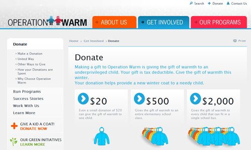 Manna FoodBank uses a natural, earth-tone color scheme which goes well with their mission. The call to action button stands apart nicely even with only the slight changes in color, next to the information about their cause.
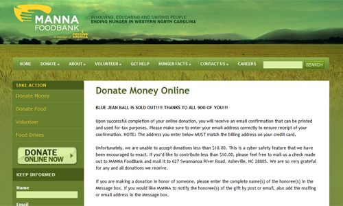 The Red Nose Day site uses a simple two tone color scheme. The red colors pervading the donation page denoting the passion for the mission, and driving people to take action.
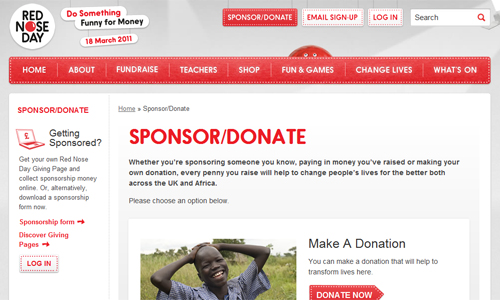 Oxfam is another site whose donation page design focuses all of its attention on the necessary mission and calls to the readers.
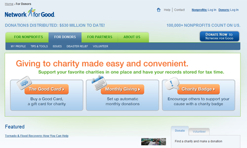
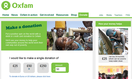 Network for Good has a wonderful design, with three courses of action that their readers may follow. Each with a large, eye catching call to action button.
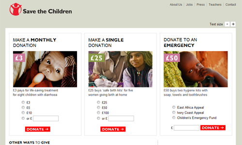
 Save the Children has a sleek design for its donation page with designated avenues for assistance that the users have at their disposal. With so many courses of action for users, it could easily become a cluttered mess, but the design keeps it all organized well.
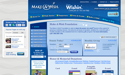
 The Make-A-Wish donation page, while constructed well, does suffer from a lack of distinction for its calls. The blue becomes somewhat overwhelming with the amount of information it contains.
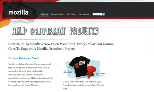
 Mozilla has a subtle donation page design with a creative header attached to their site where fans and users can donate to keep their mission alive.
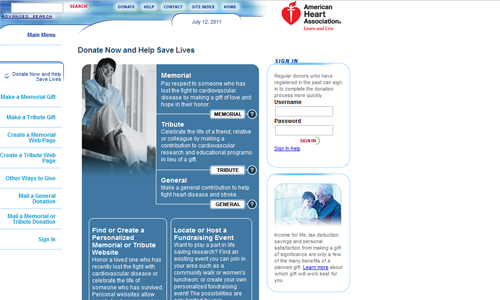
 American Heart Association's donation page is stylish and focuses the users attention directly towards the calls. The color scheme works well, with the subtle uses of white inserted into the blue.
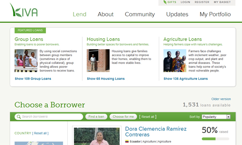
 The Kiva site's donation page is sharp and focused on multiple routes to lending a helping hand, and the large boldly colored call to action buttons stand out from the rest of the page nicely.
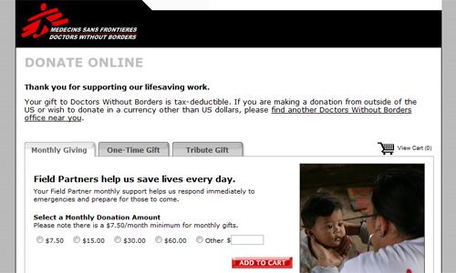
 Doctors without Borders has a great donation page design, using tabbed windows to separate the various paths that users can take to pitch in. Overall the design is simple and effective.
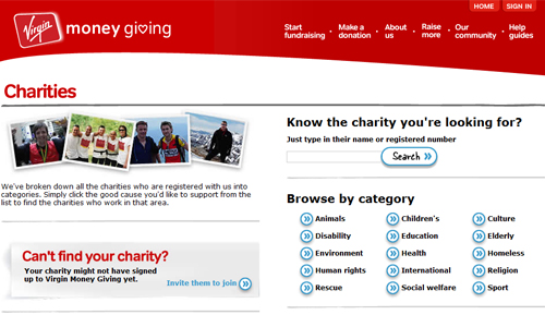
 Virgin Money Giving is a unique donation page, with a category breakdown so users can find the type of charitable organization they are looking to support.
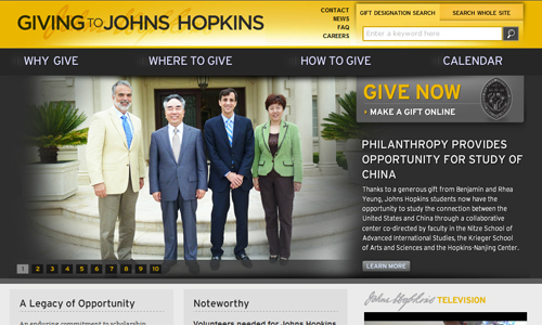
 Giving to Johns Hopkins has a stylish design pushing its cause. The contrast in colors on the header and call to action button work wonderfully in making them stand out.
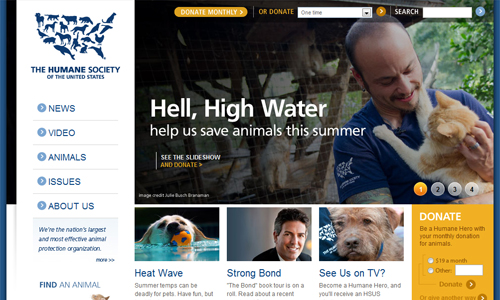
 Humane Society's donation page uses large images and bold buttons to draw the users attention and persuade them to take action.
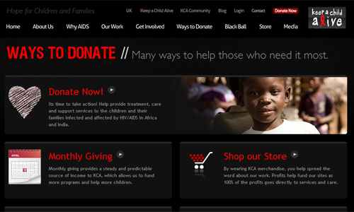
 Keep a Child Alive has a very sleek design with large buttons with various ways to contribute to the mission. With a slight grungy effect used to highlight areas of the page, the design stands out.
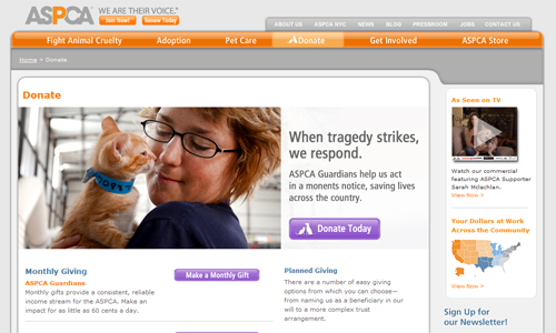
 ASPCA has another subtle donation page design with the purple calls standing out from the overall orange design colors. Soft coloring imparts a sense of comfort and eases the readers into the cause and taking action.
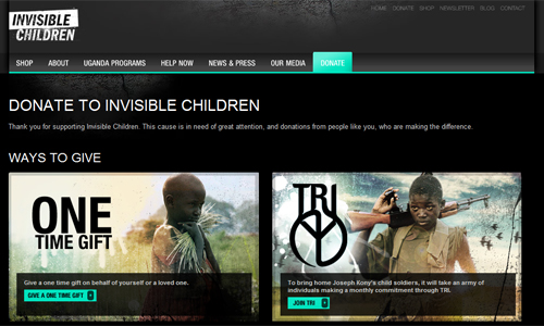
 Invisible Children has a donation page that is as stirring and emotive as their mission. With large images of the children the world tends to overlook connects the design with the cause in a simple yet effective way.
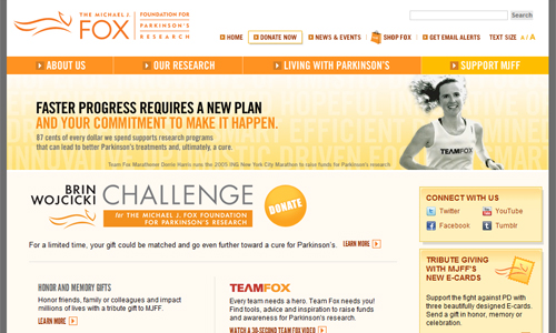
 MJFF uses warm and inviting colors which work well for engaging the readers. The gradient on the actual donate button does help it stand out, but the coloring is still a bit too similar to the rest of the accents to really draw the eye.
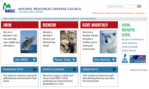
 The Natural Resources Defense Council has a very simplistic design with overly large and bold call to action buttons. This no frills approach puts pure focus on the mission.
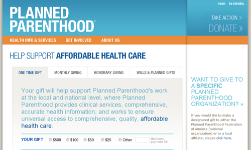
 Planned Parenthood's donation page uses a form for the main appeal to the readers, with secondary (more subtle) calls in the upper right corner. Overall, the large header and large body text compliment each other leading the reader into the 'action center'.
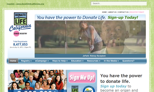
 Donate Life California has a somewhat whimsical design, with pink calls to action buttons that really stand out from the rest of the site, yet match with the logo of the organization.
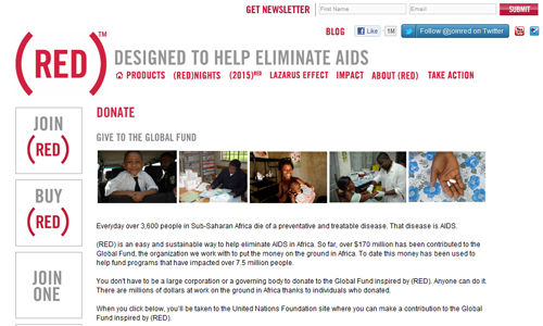
 Red takes minimalism to stylish levels with their donation page design. The overly large typographical elements really do wonders for boldly drawing the eyes to the action areas.
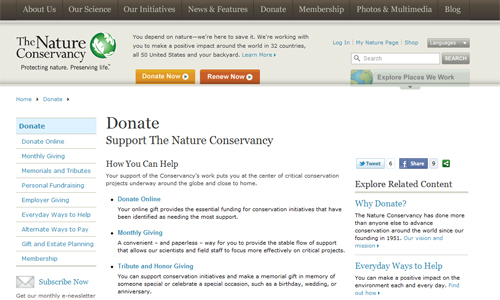
 The Nature Conservancy has another simple, sleek donation page. Mostly text covers the page, with two subtle calls positioned under the header where users tend to expect the navigation to be.
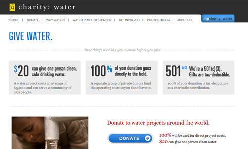
 Charity: Water's donation page is keeps the focus on the mission with the aid of this understated design.
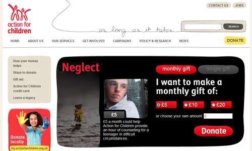
 The Action for Children page design has a large, eye catching call to action area which sets off the donation area nicely and effectively pulls the reader to it.
 Wordpress Donate Plugin
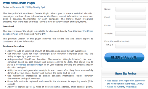 Increasing Online Giving: 10 Tips to Optimize Your Donation Landing Pages
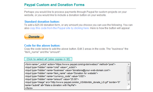
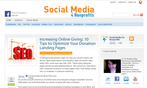 Paypal Custom and Donation Forms
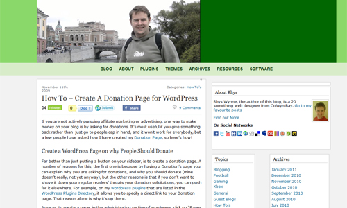
 How To – Create A Donation Page for WordPress
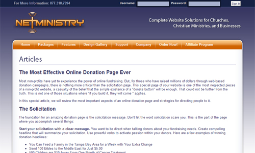
 The Most Effective Online Donation Page Ever
 (rb)
(rb)
The Showcase
Operation Warm is a nice site with comfortable, welcoming color scheme. The donation page calls vary in color, however the main calls to action blend with a majority of the site given that they are the same color. The secondary calls stand out a bit more as they break from the blue. Manna FoodBank uses a natural, earth-tone color scheme which goes well with their mission. The call to action button stands apart nicely even with only the slight changes in color, next to the information about their cause.
 The Red Nose Day site uses a simple two tone color scheme. The red colors pervading the donation page denoting the passion for the mission, and driving people to take action.
 Oxfam is another site whose donation page design focuses all of its attention on the necessary mission and calls to the readers.
 Network for Good has a wonderful design, with three courses of action that their readers may follow. Each with a large, eye catching call to action button.
 Save the Children has a sleek design for its donation page with designated avenues for assistance that the users have at their disposal. With so many courses of action for users, it could easily become a cluttered mess, but the design keeps it all organized well.
 The Make-A-Wish donation page, while constructed well, does suffer from a lack of distinction for its calls. The blue becomes somewhat overwhelming with the amount of information it contains.
 Mozilla has a subtle donation page design with a creative header attached to their site where fans and users can donate to keep their mission alive.
 American Heart Association's donation page is stylish and focuses the users attention directly towards the calls. The color scheme works well, with the subtle uses of white inserted into the blue.
 The Kiva site's donation page is sharp and focused on multiple routes to lending a helping hand, and the large boldly colored call to action buttons stand out from the rest of the page nicely.
 Doctors without Borders has a great donation page design, using tabbed windows to separate the various paths that users can take to pitch in. Overall the design is simple and effective.
 Virgin Money Giving is a unique donation page, with a category breakdown so users can find the type of charitable organization they are looking to support.
 Giving to Johns Hopkins has a stylish design pushing its cause. The contrast in colors on the header and call to action button work wonderfully in making them stand out.
 Humane Society's donation page uses large images and bold buttons to draw the users attention and persuade them to take action.
 Keep a Child Alive has a very sleek design with large buttons with various ways to contribute to the mission. With a slight grungy effect used to highlight areas of the page, the design stands out.
 ASPCA has another subtle donation page design with the purple calls standing out from the overall orange design colors. Soft coloring imparts a sense of comfort and eases the readers into the cause and taking action.
 Invisible Children has a donation page that is as stirring and emotive as their mission. With large images of the children the world tends to overlook connects the design with the cause in a simple yet effective way.
 MJFF uses warm and inviting colors which work well for engaging the readers. The gradient on the actual donate button does help it stand out, but the coloring is still a bit too similar to the rest of the accents to really draw the eye.
 The Natural Resources Defense Council has a very simplistic design with overly large and bold call to action buttons. This no frills approach puts pure focus on the mission.
 Planned Parenthood's donation page uses a form for the main appeal to the readers, with secondary (more subtle) calls in the upper right corner. Overall, the large header and large body text compliment each other leading the reader into the 'action center'.
 Donate Life California has a somewhat whimsical design, with pink calls to action buttons that really stand out from the rest of the site, yet match with the logo of the organization.
 Red takes minimalism to stylish levels with their donation page design. The overly large typographical elements really do wonders for boldly drawing the eyes to the action areas.
 The Nature Conservancy has another simple, sleek donation page. Mostly text covers the page, with two subtle calls positioned under the header where users tend to expect the navigation to be.
 Charity: Water's donation page is keeps the focus on the mission with the aid of this understated design.
 The Action for Children page design has a large, eye catching call to action area which sets off the donation area nicely and effectively pulls the reader to it.

Tutorials & Tools
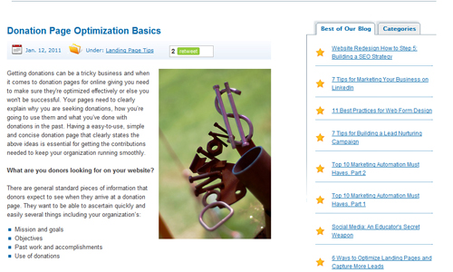
Below are a small handful of resources that you can use for making the most of any donation page you have to design. Go through them now, or save them for when your next client needs their site to go this route. Either way, we hope you find them useful. Donation Page Optimization Basics Wordpress Donate Plugin
 Increasing Online Giving: 10 Tips to Optimize Your Donation Landing Pages
 Paypal Custom and Donation Forms
 How To – Create A Donation Page for WordPress
 The Most Effective Online Donation Page Ever
 (rb)
(rb) 
These are really awesome. I’ve been considering setting up a donation page for some time but didn’t want it to look or feel cheesy. These are really inspiring, thanks!
Awesome
The Make a wish Website looks really awsome
A very good article.
It is a nice collection of a different sort of web sites that you don’t see them every day.
They are simple, effective and down to earth and consequently innovative.
I like them.
Thanks for sharing it.
Very nice collection….