101 CSS Techniques Of All Time- Part 1
CSS has fundamentally changed web design, it has provided designers with a set of properties that can be tweaked to make various techniques to make your pages just look right.
Today we are presenting a round-up of 101 CSS techniques designers use all the time. Definitely worth taking a very close look at! This is just the first series , the second part will be coming soon, stay tuned and Enjoy!
CSS Sprites
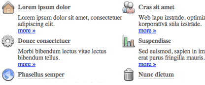
CSS sprites save HTTP requests by using CSS positioning to selectively display composite background images. To maximize accessibility and usability, CSS sprites are best used for icons or decorative effects.
- CSS Sprites: Image Slicing’s Kiss of Death- Say goodbye to old-school slicing and dicing when creating image maps, buttons, and navigation menus. Instead, say hello to a deceptively simple yet powerful sprite-based CSS solution.
- CSS Sprites: What They Are, Why They’re Cool, and How To Use Them - CSS-Tricks
- CSS Sprites: How Yahoo.com and AOL.com Improve Web Performance- Learn how AOL and Yahoo! use CSS sprites to improve performance for their busy home pages
CSS Rounded Corners
Rounded corners is one of the most popular and frequently requested CSS techniques. There lots of ways to create rounded corners with CSS, but they always require lots of complex HTML and CSS. Here are easy ways to achieve this effect.
- Even More Rounded Corners With CSS- Single-image, PNG-based, fluid rounded corner dialogs with support for borders, alpha transparency throughout, gradients, patterns and whatever else you could want.
Demo :
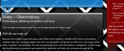
- Rounded corners in CSS- Simple bordered div which contained four divs that each had a background-image and that were positioned in each of the corners.
- Liquid rounded corners- For liquid design and transparent scrolling - tutorial and stylesheet
- Mountaintop Corners- easier way for creating decent rounded corners.

Image Replacements Technique
Thierry Image Placement: Image Placement vs. Image Replacement (FIR)
This technique is mostly for headlines by using CSS to replace normal HTML text, with a background image in order to achieve a particular look.Several different image replacement methods have been proposed, each with their pros and cons.
when you need image replacement you can check the Gilder/Levin Method as described by Dave Shea or, if the replaced text is linked and CSS support for IE/Mac is required, the Gilder Levin Ryznar Jacoubsen IR method.
Sliding Doors
Sliding Doors of CSS introduced a new technique for creating visually stunning interface elements with simple, text-based, semantic markup.Beautifully crafted, truly flexible interface components which expand and contract with the size of the text can be created if we use two separate background images.
Sliding Doors" Box– Rounded Corners for All- The goal of this technique was to create rounded-corner boxes with visual flare and the absolute minimal amount of semantically correct markup. While making sure they could resize while keeping their backgrounds intact.
Image Text Wrap Technique
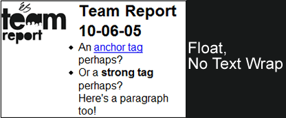
How many times do you have an image floated left in a block of content, but want to keep that content from wrapping around your image?
This technique allows you to wrap around image text flow control to emulate magazine style page layouts.
- BIG BAER advanced CSS technique - the sandbag div.
- CSS Image Text Wrap
- Fancy text wrapping around an image
Equal Height Technique
One of the somewhat frustrating properties of CSS is the fact that elements only stretch vertically as far as they need to. So how can we make all columns appear to be the same height? Several techniques was introduced to solve this issue.
- Faux Columns- The simple secret is to use a vertically tiled background image to create the illusion of colored columns.
- Equal Height Columns - revisited- A method to make all columns appear to be the same height but without the need for faux column style background images.
- Equal height boxes with CSS- The trick is to use the CSS properties display:table, display:table-row and display:table-cell to make containers (in this case div elements) behave like table cells. The basic XHTML structure looks like this:
<div class="equal"> <div class="row"> <div class="one"></div> <div class="two"></div> <div class="three"></div> </div> </div>Here is the CSS used to make this structure behave like a table:
    .equal {
            display:table;
    }
    .row {
            display:table-row;
    }
    .row div {
            display:table-cell;
    }
Turning A List Into A Navigation bar
Why use a list? Because a navigation bar, or menu, is a list of links. The most semantic way of marking up a list of links is to use a list element. Using a list also has the benefit of providing structure even if CSS is disabled.
- Turning a list into a navigation bar- The markup is very simple. It’s an unordered list, with each link in a separate list item.

- Uberlink CSS List Menus

- CSSMenus - Horizontal and Vertical 4 Level Deep List Menu
- Listamatic
- 7 Advanced CSS Menu- A fresh round-up of 7 Advanced CSS Menus techniques, that might be useful for you in your next design project.
Making Headlines With CSS
Headers in Web pages--marked up with h1, h2, h3, h4, h5, or h6 elements--help the reader determine the purpose of sections in content. If your header is visually stimulating, the odds are better that the section will capture your reader's eye.
- Heading Style Gallery- Want something a little more stylish for your content headings (h1,h2,...) than a different font or color? Try one of the heading styles listed here to spruce up your content.
- Typography for Headlines- Improve the typography in your headlines by being more creative, give them more 'pop', that sort of thing.
- Making Headlines With CSS- With a dash of design, we can utilize CSS to stylize those Web page headers to catch the reader's eye and encourage them to read on.
CSS Shadows Techniques
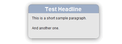
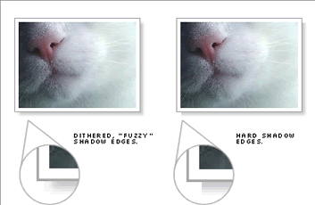
A technique to build flexible CSS drop shadows that can be applied to arbitrary block elements that can expand as the content of the block changes shape.
- CSS Drop Shadows-Build flexible CSS drop shadows that can be applied to arbitrary block elements that can expand as the content of the block changes shape.
- Fun with Drop Shadows- Most of the existing techniques use negative margins, while this one is a really simple version wich uses relative positioning.
- Drop Shadows By Phil Baines- This set of tests are based on an article found on A List Apart's technique, but with less CSS coding.
- CSS Drop Shadows II: Fuzzy Shadows- Picking up where Part I left off, in Part II designer Sergio Villarreal takes his standards-compliant drop-shadow to the next level by producing warm and fuzzy shadows.
- An improved CSS shadow technique- A very robust and easy-to-use technique for applying snazzy looking shadows using only Web technology and a few little image elements prepared beforehand.
CSS Transparency
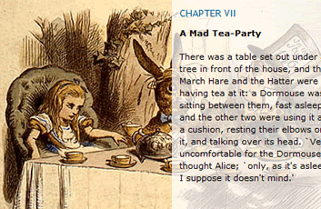
One of the trickiest things to control, in a CSS-driven design, is the transparency of the interaction between foreground and background content.Below is a list of the best examples of the differing transparency approaches possible with CSS.
- Partial Opacity- Placing text over an image can sometimes make it difficult to read, but with Stu Nicholls's methods the background for the text is made 'opaque' using various methods of opacity (including css3) and the black text is then quite readable.
- Cross-Browser Variable Opacity with PNG- How to overcome flaky browser support for PNG so you can take advantage of this graphic format’s lossless compression, alpha transparency, and variable opacity.
- Two Techniques for CSS Transparency
Various Link Techniques
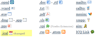
- Showing Hyperlink Cues with CSS- The CSS Guy shows us how to get the little icons next to hyperlinks that signify if that link will take you offsite, open a popup, or link to a file (as opposed to another html page). Here's how to do it in a way that's supported in IE7, Firefox, and Safari.
- The ways to style visited Links- CSS offers various possibilities to make links more usable and preserve text readability at the same time. We need to differentiate visited and unvisited links, but we must keep text scannable and readable.
- Link Thumbnail- Shows users that are about to leave your site exactly where they're going. When that curious mouse pointer hovers over a link pointing to somewhere outside of your site, the script displays a small image of the destination page.
- Iconize Textlinks with CSS- If you're looking for more icons to implement, Alex provides a nice start.





Very good! look forward to next part!
Great!!!!
Nice list, one technique that I use I found at Style Meltdown, it kinda combines the using a list as a navigation and also uses an image sprite. The cool thing is that it only uses 1 image for the entire nav instead of an image for each button. Cheers and thanks for the list!
Nice one!
And now an article about js and DOM tips of all times? ;)
This is all good stuff !
Thanks
nice technique.. now i know.. thanks!
Great information for designers. i think this is going to help me a lot
I thought I posted here. Your knowledge of CSS is great perhaps you might be able to help me.
I’m having problem inserting video or picture on my blog. How do I get around that?
Hi – just wanted to say good design and blog – cu
Great Post! I especially liked the css image shadow effects.