10 Design Trends to Watch Out For in 2018

The only constant in the world is “change”. Thus, from time to time we see new trends in technologies, healthcare, education, and everything else. Naturally, art and design are no different.
If you are planning to design your logo with Tailor Brands or through a graphics studio in 2018, then it may help to learn about the top 10 design trends in the year to come:
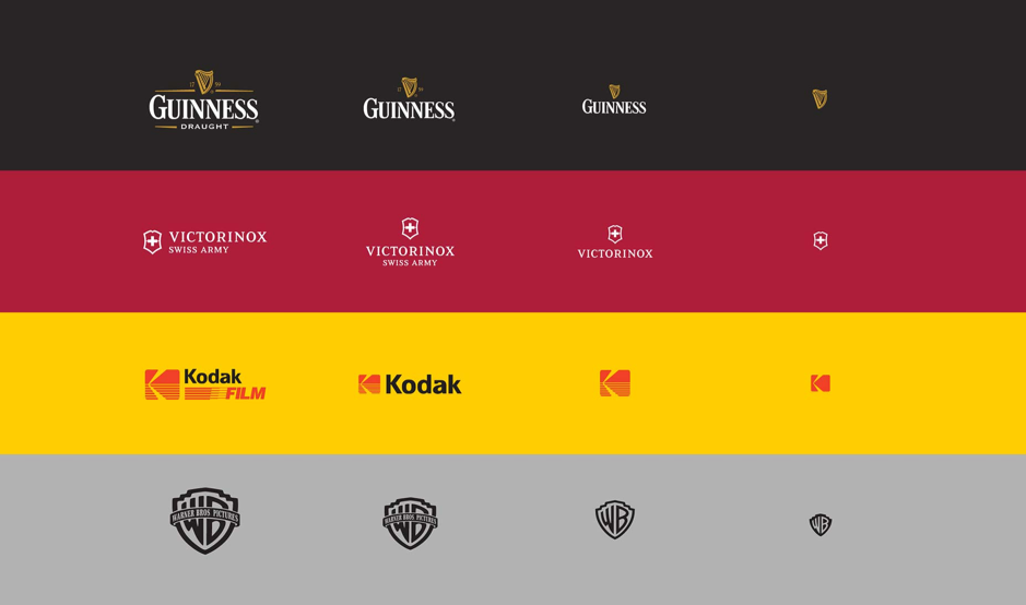 A responsive design is a technique that allows for a graphics image/design to upscale or downscale according to the size of the display it’s being viewed. So, if it’s opened on a mobile display then it will be smaller in size. Similarly, if it’s opened on a desktop, then it will use the ample space available and appear bigger in size.
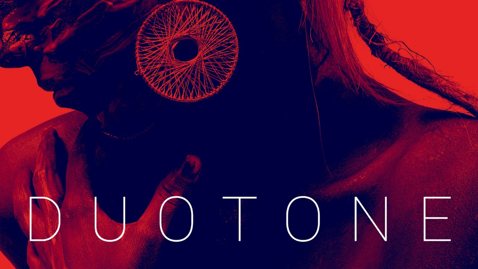 Traditionally, a duotone was created with a halftone printing process in which a halftone was printed over another one which had a contrasting color, thus creating an image with two tones, or duotone. However, this old technology is becoming quite popular in the digital designs as well.
The good news about working with digital media is that there are various imaging software that you can use to easily give your logo designs or other branding designs a duotone-effect.
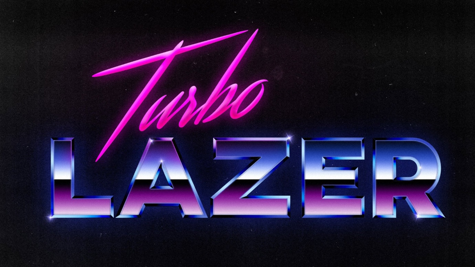 If you are targeting the millennials and your brand can support it, then going for 80s-inspired designs could be a good idea.
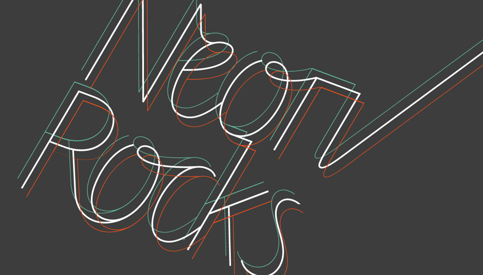 The Neon Rocks logo shown above is a perfect example of this style. Notice how the text is slightly cropped so that it maintains full readability but at the same time looks distinct and interesting.
 However, one particular change that’s taking place now is the emphasis on the wavy or zigzag patterns in comparison to other geometric styles. So, you may wanna keep that in mind.
 So, in a way, it’s taking “keeping it simple” to a whole new level.
So, these were some of the major design trends are will be the highlight of the design industry in 2018. Hopefully, these will help you create the perfect designs for your brand.
Featured image by whitedaemon on Pixabay
1. Responsive Design
Although the concept of responsive designs, including the responsive SVG, is quite old, the next year will be its year. This is mainly because of the rapid rise of mobile browsing. A responsive design is a technique that allows for a graphics image/design to upscale or downscale according to the size of the display it’s being viewed. So, if it’s opened on a mobile display then it will be smaller in size. Similarly, if it’s opened on a desktop, then it will use the ample space available and appear bigger in size.
2. Bold Colours and Duotones
All through 2017, graphics designers didn’t shy from using braver colors for a variety of projects, including company logos. Clearly, designers are coming out of their comfort zone and experimenting with bold choices regarding the color palette and the trend is expected to prevail in the next year as well. Traditionally, a duotone was created with a halftone printing process in which a halftone was printed over another one which had a contrasting color, thus creating an image with two tones, or duotone. However, this old technology is becoming quite popular in the digital designs as well.
The good news about working with digital media is that there are various imaging software that you can use to easily give your logo designs or other branding designs a duotone-effect.
3. Photographic Intervention
Photographic intervention is a design style in which you take a photograph as a base and then apply a design or illustration over it. There are a variety of designs that you can use to experiment with the original photograph. In fact, you can even use scaled-down versions of other photographs and place them on the base photograph for a unique effect.4. Animations
While static images have their importance, when you want to grab attention, then incorporating movements in the same can be of great help. Animated images, whether in the flash format or gif are not only rich to look at, they also give you more range and possibilities to work with.5. Hand-Drawn Designs
In the age of computerized art, hand-drawn designs clearly stand out, which is why they are becoming highly popular. Unlike a digital design which lacks a human touch and is just “too perfect”, a hand-drawn design has its flaws and imperfections that actually make it unique and special.6. 80s-Inspired
Call it nostalgia or simply a new way to approach design, the 80s style of patterns and color-palette are heavily used by some of the top design agencies. These include the electric hues to the flashy and colorful patterns. If you are targeting the millennials and your brand can support it, then going for 80s-inspired designs could be a good idea.
7. Cropped Elements
In this, you take a minimalist approach so that a portion of the text is missing. However, it’s still readable. The Neon Rocks logo shown above is a perfect example of this style. Notice how the text is slightly cropped so that it maintains full readability but at the same time looks distinct and interesting.
8. Geometric Patterns
Geometric patterns have been trending for quite some time now, and it’s most likely that they will rule the design realm next year as well. However, one particular change that’s taking place now is the emphasis on the wavy or zigzag patterns in comparison to other geometric styles. So, you may wanna keep that in mind.
9. Distinct Layouts
Most logos are based on a similar layout pattern that has a high emphasis on symmetry. Thus, the designers are now experimenting with different styles and asymmetric designs so that the logos stand out and look distinct.10. Little Big Idea
You can call it a minimalistic approach, but what the “little big idea” is about is focusing on a singular element and giving it a unique touch. It could be the typography, a geometric shape, or just the colors. So, in a way, it’s taking “keeping it simple” to a whole new level.
So, these were some of the major design trends are will be the highlight of the design industry in 2018. Hopefully, these will help you create the perfect designs for your brand.
Featured image by whitedaemon on Pixabay